

I have an exciting news & massive post for you.
![]() As of Jan 19, 2011, our little blog has registered our 20,000th RSS Subscriber. While this is not a huge achievement or anything, It certainly calls for celebration. I am so happy to see our mission to make people awesome in Excel is reaching out to more people everyday. Thank you.
As of Jan 19, 2011, our little blog has registered our 20,000th RSS Subscriber. While this is not a huge achievement or anything, It certainly calls for celebration. I am so happy to see our mission to make people awesome in Excel is reaching out to more people everyday. Thank you.
To celebrate this milestone, I am doing a massive post with 220 Excel tips, tricks, tutorials & templates.
Share on Facebook
Tweet This!
Join our FREE Newsletter
Add Chandoo.org RSS Feed to your Newsreader
These 220 tips are broken down in to following areas. Click on the links to access them.
- Formulas [52 tips]
- Formatting & Conditional Formatting [36 tips]
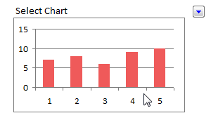
- Charting [60 tips & templates]
- Tables & Pivot Tables [15 tips]
- Using Excel [47 tips]
- Free Downloads [5 downloads]
- Recommended Resources [5 resources]
Formulas [52 tips]
Learn 5 tips on how to use IF formula, CHOOSE Formula in Excel. [link]
Find out how you can sum or count values that meet a criteria. A must have tool for any analyst or manager using Excel. [link]
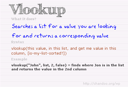
Lookup formulas are famous for a reason. In this article, you will learn how to use them to find anything, well, almost! [link]
While VLOOKUP is awesome, it can-not go left. That is why you must learn how to use INDEX+MATCH combination. [link]
OFFSET formula becomes very important if you ever plan to make an excel dashboard. So go ahead and learn. [link]
I just love SUMPRODUCT formula. And read this to find out why. [link]
SUMIFS & COUNTIFS formulas are like Swiss army knifes. They can do pretty much anything and still look slick. [link]
Find out how you can use ROWS or COLUMNS formulas to generate sequential numbers [link]
Learn how to calculate moving average using Excel. [link]

Learn how to write formulas to test Between condition. [link]
Calculate weighted average using Excel formulas [link]
Learn to write either-or (XOR) conditions using excel formulas [link]
SUBTOTAL is a powerful & low profile formula. In this article we explore the possibilities and show you some cool examples. [link]

If you use Excel to do anything more than counting your chickens, chances are you use VLOOKUP quite often. Read this to learn 6 important VLOOKUP tips. [link]
15 Formulas for Advanced Users
Anyone can write a SUM or IF formula. But how well do you know some of the powerful formulas in Excel. Read this to know 15 very useful formulas in Excel. [link]
10 Formulas & Tips for working with Date & Time in Excel
Dealing with dates is not something only for young people. Analysts and managers work with dates & times all the time. In this article, we explain 10 powerful ways in which you can work with Excel Date & Time values. [link]
Formatting & Conditional Formatting [36 tips]
16 Paste Special Tips & Tricks
Paste special is one of my favorite features in Excel. In this article, we explore various ways paste special can save us time. [link]
5 Ways to become Awesome using Conditional Formatting

Conditional formatting is your way of asking excel to change a cell’s formatting when a certain condition is met. You can use it do some pretty awesome things. In this classic chandoo.org article, learn 5 ways to use conditional formatting to become awesome. [link]
15 Fun things you can do in Excel in less than 15 seconds
How well do you know Excel? See this list to find out 15 simple but fun things you can do in less than 15 seconds. [link]
Charting [60 tips]
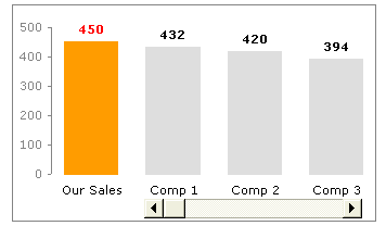
Thermo-meter Chart – Excel Tutorial & Free Template
Prepare a thermo-meter chart to compare actual performance with targets. [link]
Bullet Graph – Excel Tutorial & Free Template
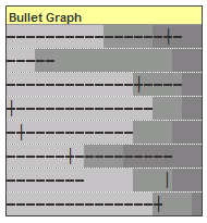
Learn how to make bullet graphs using Excel. [link]
Comparison chart – Excel Tutorial & Free Template
Learn how to make an interactive comparison chart to compare one value with several others. [link]
Pareto Chart – Excel Tutorial & Free Template
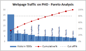
Pareto analysis is very important in quality control, decision making etc. In this tutorial learn how to create pareto charts using Excel. [link]
Water Fall Chart – Excel Tutorial & Free Template

Water-fall charts are a good way to visualize how various components contribute to the overall outcome. Like how net profit is arrived etc. Know how to make these charts using Excel. [link]
Panel Charts – Excel Tutorial & Free Template
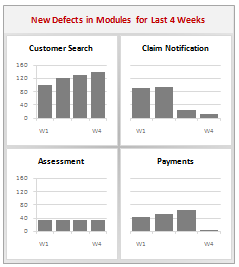
What are panel charts and how to make them using Excel? [link]
Gantt Chart – Excel Tutorial & Free Template
Gantt charts are an excellent way to plan for a project and track it. Learn how to use Excel’s conditional formatting, cell grid structure etc. to make Gantt charts. [link]
Project Timeline Chart – Excel Tutorial & Free Template
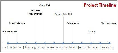
Timeline charts are a great for showing project progress and macro level picture. In this article, we show you how to make such milestone / timeline charts using Excel. [link]
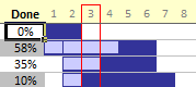
Burn Down Chart – Excel Tutorial & Free Template
Burn down charts help you in visualizing how far the project has progressed. Learn how to create these charts using Excel. [link]
Dynamic Chart – simple example – Excel Tutorial & Free Template
Learn how to make simple dynamic chart using Excel data validation feature. [link]
Dynamic Chart with Checkboxes – Excel Tutorial & Free Template
Learn how to make a dynamic chart with checkboxes and interactivity. [link]
More Dynamic Charts – Excel Tutorial & Free Template
Get more examples, templates & tutorials on Dynamic charts using Excel [link]
In-cell Charts – Excel Tutorial & Free Template
Get more examples, templates & tutorials on incell charts using Excel [link]
Make compelling, effective charts by following these 5 simple rules. [link]
5 Chart formatting tips that cost you nothing and make your charts look cool. [link]

Come what may, do not make any of these 6 types of charts. They are ugly. Period. [link]
Charting Lessons from Optical Illusions
We come across optical illusions all the time. But do you know they also teach valuable lessons on chart formatting & Selection? [link]

Pie charts are ineffective in all but few scenarios. But how do you show composition of several values? Read this post to find 10 alternatives to pie charts. [link]
Back in 2009, we ran a contest on how to visualize budget vs. actual data. You can see 14 different charting ideas in this article. [link]
Tables & Pivot Tables [15 tips]
Excel tables are a new and powerful feature introduced in Excel 2007. Ever since I learned them, I have been much more productive while making dashboards or reports. Read these 10 tips to learn how to use Excel tables better. [link]
Pivot tables are a great way to analyze data and make reports. In this post, learn 5 powerful pivot table tricks & tips. [link]
Using Excel [47 tips]
Learn how to use Double click feature on your mouse to save time and become awesome in Excel. [link]

Learn how to use Mouse to become even more productive in Excel [link]
10 Ways to make your Excel Workbooks Boss-proof
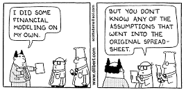
While not all bosses are like Dilbert’s boss, we do realize that they like to press things and test. So it is a good idea to make your workbooks boss-proof. Learn 10 tips to do so. [link]
15 Excel Productivity Tips & Tweaks
Do you know that you can customize excel to make yourself more productive? You can turn off annoying features and set default formatting options to save precious time and make better worksheets all the time. Read this post to learn 15 such customizations & productivity tips. [link]
12 Rules for Making Better Spreadsheet Models
It is a good idea to follow a set of principles while designing a complex workbook model or dashboard. In this post you can find 12 rules for making better excel workbooks. [link]
Free Downloads [5 tips]
Using this handy one-pager, you can quickly remember the syntax for the most used formulas. Also find out what to do if there is an error. [link]
Get this e-book (available only on subscription to my newsletter) to enjoy 95 excel tips & tricks. [link]
Learn how to use Excel 2007 Ribbon
Learn how to use Excel 2007’s ribbon based user interface using this handy guide. [link]
12 Rules for Better Spreadsheets – Poster

Larry’s spreadsheet rules in a simple poster. Very useful if you work on spreadsheet models often [link]
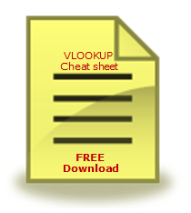
Use this cheat-sheet to write better VLOOKUP formulas [link]
Recommended Resources [5 tips]
Join my Excel school program to learn Excel in a step-by-step fashion and become awesome. We have 23 hours of instruction on Excel & 8 hours of lessons on Dashboards. Click here to learn more. [link]
Excel Project Management Templates
Get a copy of my Excel Project Management templates so that you can save time and become a better project manager. The template pack has 24 templates to take care of various key areas of project management like planning, status reporting, tracking, timesheets etc. [link]
Learn 75 Excel Formulas [e-book]
In this easy to understand e-book, I explain 75 very important Excel formulas in plain English. Get a copy today and learn something new. [link]
Jon Peltier’s Charting Utilities

I recommend Jon’s charting utilities. You can make some of the custom charts that are not part of Excel charting gallery in minutes using his tools. They can save you lots of time and money. [link]
Excel Everest Training Kit for Learning Excel
I recommend using Sean’s Excel Everest if you are an Excel beginner. This is an interactive excel workbook designed to teach you various features of Excel. You can read my review. [link]
Thank you
Thanks for your support to Chandoo.org. Without you this milestone or anything else that we achieve is meaningless. I wish you even more awesomeness and knowledge in the months and years to come.
Share on Facebook
Tweet This!
Join our FREE Newsletter
Add Chandoo.org RSS Feed to your Newsreader


39 Responses to “Make a Quick Thermometer Chart to Compare Targets and Actuals”
You'll probably have some readers insist on bullet charts, which in my experience are no easier to read.
Note on the case where actuals may exceed targets, the target has to be the second series in the chart, not the first, so it appears in front of the actual.
@Jon.. good point. And yes, readers are already saying bullets are the way to go. Atleast @dmgerbino said it on twitter: http://twitter.com/dmgerbino/status/6761754333
But I feel the same as you did. Bullets need orientation to get started and not that easy to construct (here is a tutorial btw... http://chandoo.org/wp/2008/07/21/dashboard-bullet-graphs-excel/ )
When you just have to compare 2 sets of values, a chart like above is good and easy enough.
And yes, thank you for saying that data series order should be correct to show the target on top.
I think bullet charts are a good alternative. I'm not a huge fan of the formatting that you used above where the outline is so thick.
Another option would be to combine a line graph (plan/goal amounts) with the columns (actual) and select the option to remove the line. This leaves just the value (marker), which can be increased in size to leave only a line about the size of the bar. It's an easy and cleaner way to show actual to plan/goal. Does that make sense?
Tony -
I would use columns (or area) for goal, and lines and markers for actual.
What about if you go over the target? The chart doesn't work so well then.
The technique described today is a near bullet chart. As I stated early this morning on Twitter (link: http://bit.ly/4K3yPM ) , I am a fan of Stephen Few's Bullet Graph.
Hubert Urruttia and I started with Charlie Kyd's method, but as Jon Peltier and Chandoo said, they are not easy to contruct. We moved onto prototyping with Fabrice Rimlinger's SPARKLINES FOR EXCEL and now use XLCube's (BonaVista) Micro Chart tool. Both of these tools allow you to create bullet charts just as easy as any Excel chart type.
As far as reading and interpreting them, this chart type has been the easiest for us to present.
There are many chart types. Today's "Make a Quick Thermometer Chart to Compare Targets and Actuals" is fine for a start, but your ultimate goal should be to create Bullet Graphs. AS Stephen Few states in his overview, "The bullet graph was developed to replace the meters and gauges that are often used on dashboards. Its linear and no-frills design provides a rich display of data in a small space, which is essential on a dashboard. Like most meters and gauges, bullet graphs feature a single quantitative measure (for example, year-to-date revenue) along with complementary measures to enrich the meaning of the featured measure. Specifically, bullet graphs support the comparison of the featured measure to one or more related measures (for example, a target or the same measure at some point in the past, such as a year ago) and relate the featured measure to defined quantitative ranges that declare its qualitative state (for example, good, satisfactory, and poor). Its linear design not only gives it a small footprint, but also supports more efficient reading than radial meters."
@dmgerbino
Since @dmgerbino had to bring my name up I guess I should throw in my two cents.
@dmgerbino and I have both implemented Bullet Charts with great success. What is most interesting about this fact is that we have had a harder time implementing Sparklines than Bullet Charts. The reason for this revolves around the simple fact of familiarity. I will explain. People look at a Sparkline and they think it is a really small Line Chart and it is not. People are familiar with Line Charts since they have been around since 1786 when they were created by William Playfair. Bullet Charts on the other hand are different so they almost demand an explanation. Because of this there was a lot of face time that was needed to explain these charts but once people got them they understood the concept. This is similar to when I introduced Cycle Plots http://bit.ly/87ydVG (Thank you @nbrgraphs!) or Horizon Charts http://bit.ly/6PVavj.
Now about the Thermometer Charts… The first thing I want to address is Tony Rose’s statement. I totally agree that the outline on the chart is too think. It might come of as being a whole new series or a new variable. What I have done in instances like this is I have created a Bar Graph and Scatter Plot mixture. Then I have turned off the Data Series on the Scatter Plot and turned on the Horrizontal Error Bars on the Scatter Plot. The new horizontal line stands for the Plan and the Bar is the actual. The reason why I find this more useful is because this technique works if you have exceeded plan. Actually, I do not understand how Chandoo’s method would display the data if Plan is surpassed.
This reminds me of another blog post that @dmgerbino, @Jon_Peltier, and myself commented on over a year ago. http://bit.ly/PNdO Actually, I talk about similar things in regards to familiarity to charting techniques.
- @hubert_urruttia
[...] we have a post on using thermometer charts to quickly compare actual values with targets. Today we follow up the post with 10 charting ideas you can use to compare actual values with [...]
Hi Chandoo
How do I increase the width of the bar chart and also make the long axis labels come in the same line?
Thank you,
Rajiv
@Rajiv
Select the outer part of the chart "Chart Area" and note the cursor will change to arrows
drag the edges to what ever size you want
You can hold the Alt key as you drag and the chart will snap to the cell boundaries
Now click on the chart area inside the chart "Plot Area" and note that a box with small circles appears around it
drag the circles on the edge of that box to suit
You can hold the Alt key as you drag and the chart will snap to the cell boundaries
@ Hui
Thank you for your comments. But my question was not for the "Plot Area" instead I wanted to know about how should I increase the width of the individual bar charts because with my data all the individual bars are coming to be thin and I want to make them appear broader.
Thank You
@Rajiv
Right click on the Series you want to change and select Format Data Series
Under Series Options goto Gap Width and decrease it to suit
[...] Make a Quick Thermo-meter Chart using Excel [...]
Thank you for the great chart and explanation!
How do I show two amounts (Signed Revenue and Pipeline) as stacked within the Target amount?
@CL... you can use stacked column charts and follow the same technique to get this. See attached file for an example - http://img.chandoo.org/playground/thermo-meter-with-additional-details.xlsx
Chandoo - thanks for the quick response! What if I want the data label for the pipeline to be the actual pipeline value, not the signed rev + pipeline value? i.e. 15 instead of 55
Thanks!
How would i do this in excel 2003?
[...] Thermo-meter charts are very good to show how actual value compares with target (or budget). But how can we add another point for say Last Year value to the chart with out cluttering it. [...]
Hi Guys,
As Matt said,
"What if you if you go over the target?"
Is there a way to make it change color? or at least to show what the target was?
I am planning to use this with a "Forecasted vs Real" production chart but I do not know how to show overproduction.
Any clue?
Thanks
How do I do this if I have 2 bars I want side-by-side? ie 2012 Mean with 2012 benchmark overlapping and then 2013 mean with 2013 benchmark overlapping? I want the 2012 and 2012 mean bars sie by side to compare multiple categories.
Sorry, I meant to say the 2012 and 2013 mean bars side by side
I have a problem in that my PM wants a chart that shows a stacked column (Labor and Expense) and then have the overall buget shown as a thermo.
Everytime I try to do this, I either end up with all three being stacked or all of them being seperated.
Help?
Or if someone knows how to only outline the top and sides of a chart series....then I would have this solved. (Make a stacked column with labor, expenses, and remaining budget, then clear the fill and outline only the top and sides.) I just can't figure out how to do that/ not sure if excel will let me only outline part of a chart series.
[...] Thermometer chart to show budget vs. actual performance [...]
Your home is valueble for me. Thanks!...
I've created the thermometer chart as the Chandoo tutorial described. How do I move my columns closer together? I don't want wider columns; I want to move my narrow columns closer together. Thank you!
Dear Elite members,
could you please let me informed whether we could incorporate color formating in this thermometer approach i.e. if my actual performance is <Min then meter color sud go Red, in between min & target it sud change to Amber & target and above sud change to Green. pls advise. thanks,
I think the only way to do that would be with VBA programming.
@Abhinav
Yes, Simply use a stacked column chart, colored appropriately
Or
You may also want to read about Bullet Charts
@ Hui,
Could you pls demonstrate this with the help of an example.
let's have the below sample data
Actual=12
Min=10
Target=15
Max=20
if Actual>=Min then bar color sud be Red
in between Min & Target= Amber
between target(inclusive) & Max = Green
greater than or equal to Max= Blue
Thanks in advance
Abhi
Great blog post with awesome sample data. I've implemented two of the top "power tips" by changing the colour of the actual values, AND setting Actual to be 40% transparent. Looking good.
[…] easy with these charts. Use them sparingly. As a rule a thermo-meter chart would be better (easy to make, takes less space, scalable) for situations like […]
[…] easy with these charts. Use them sparingly. As a rule a thermo-meter chart would be better (easy to make, takes less space, scalable) for situations like […]
I recently purchased the template bundle and love the ease of use - thank you!
I would like to ask if it is possible to add an important 'block' to the dashboard to illustrate an important status for my executive team; 'billing status'? (ie budget / amount billed) something like that?
Thank you!
@Cheif449.. Thanks for your purchase and kind words.
You can add this easily to the dashboard. Follow below steps.
1. Unprotect the dashboard worksheet.
2. Add a text box (Insert > Drawing Shapes) to the dashboard
3. Put any text inside it as per your need.
4. Format it as needed.
5. Protect the dashboard again.
How do you do this in Excel 2010 - I am not seeing that option in Format data series.
how would we check target and actual sale for multiple years
Select any of the bar, right click and format data series