
Excel table is a series of rows and columns with related data that is managed independently. Excel tables, (known as lists in Excel 2003) is a very powerful and super-cool feature that you must learn if your work involves handling tables of data.
What is an Excel table?
![]() Table is your way of telling excel, “look, all this data from A1 to E25 is related. The row 1 has table headers. Right now we just have 24 rows of data. But I can add more later!”
Table is your way of telling excel, “look, all this data from A1 to E25 is related. The row 1 has table headers. Right now we just have 24 rows of data. But I can add more later!”
When you make a table (more on this in a sec) you can easily add more rows to it without worrying about updating formula references, formatting options, filter settings etc. Excel will take care of everything thus making you a data guru.
How to create table from a bunch of data?
To create an excel table, all you have to do is select a range of cells and press the table button from Insert ribbon in Excel (or use the shortcut CTRL+T).
See this simple tutorial:

Today we will learn 10 excel data table tricks that will make you a data guru, no let’s make that DATA GURU.
The most important thing after you create a table – Give it a name
Once you have a table, go to design ribbon and give your table a name. If you don’t name it, Excel will call it Table2 or whatever. But once you name it, you can write meaningful formulas thru sweet sweet structural references feature. So name your tables.
1. Change table formatting without lifting a finger
Excel has some great predefined table formatting options. Just select any cell in your table and change the table formatting by going to “format as table” button in the home ribbon.

If you are bored with the predefined formats, you can easily define your own table formatting color schemes and apply them.
2. Add Zebra Lines to Tables without doing Donkey Work
When you create a table, zebra lines come as a bonus. And when you add new rows to the table, excel takes care of zebra lining or banding automatically. You can turn on / off the banded rows feature from “design ribbon tab” as well.

That means you don’t need to use conditional formatting or manually format alternative rows in different color.
3. Tables come with Data Filters and Sort Options by default
Each data table comes with filters and sorting options so that you can filter and sort the data in that table independently. That also means, if a worksheet has 2 tables, they each get their own data filters (usually excel wont allow you to add more than one set of filters per sheet, but when it comes to tables, all exceptions are made, just for you)

4. You can also Slice your tables with slicers
![]() That is right. When you have a table of data, you can insert a slicer (either from design ribbon or insert ribbon) and use that to filter your table data intuitively.
That is right. When you have a table of data, you can insert a slicer (either from design ribbon or insert ribbon) and use that to filter your table data intuitively.
Learn all about Excel Slicers.
5. Bye, bye cell references, welcome structured references
The most important advantage of tables is that, you can write meaningful looking formulas instead of using cell references. When you create and name the table (you can name the table from design tab), you can write formulas that look like this:
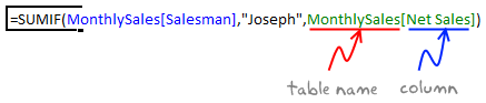
The beauty of structured references is that, when you add or remove rows, you don’t need to worry about updating the references.
Learn all about structural references in Excel.
6. Make Calculated Columns with ease
Any tabular data will have its share of calculated columns. Excel tables make having calculated columns very easy. With structured references, all you need to know is English to make a calculated column. The beauty of calculated columns in table is that, when you write formula in one cell, excel automatically fills the formula in the rest of cells in that column. That would make you an instant data guru.

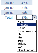
7. Total your Tables without writing one formula
 The ability to summarize data with pivot tables is extended to excel tables as well. You can add total row to your table with just a click.
What more, you can easily change the summary type from “sum” to say “average”.
8. Convert table back to a range, if you ever need to
If you ever wanted to go back to a normal range of data, you can easily convert the tables back to named ranges.
Excel will take care of the formulas and change the references to cell references.
9. Export Tables to Pivot Tables, Woohoo
What good is a bunch of data when you can’t analyze it? That is where Pivot tables come in to picture [pivot table tutorial]. Thankfully, you don’t need to do much. Just click a button and your table goes to pivot table.

10. Push the table data to Sharepoint Intranet Site
If you have a corporate intranet Sharepoint portal, you can easily publish the excel tables as share-point lists. This can be handy if you want to publish, say the top 10 sales persons of the quarter on the intranet.

11. Print Tables Alone, with out all the other stuff around

Select the table, hit CTRL+P and in settings area, select “Print Selected Table” option to print your beautifully formatted Excel table.
12. Change, reshape or clean your table data with Power Query
When you have data in a table, you can easily load it to Power Query (Get & Transform Data) using the “From Table” button.

Here is an an example of what Power Query can do for you.
13. Got multiple tables? Connect them to make a multi-table pivot

When you have more than one table, you can also connect them using Excel’s relationship feature. This way, you can build multi-table pivots to create powerful analysis of your data.
Learn all about Excel Table Relationships.
So, What do you think about Excel tables?
I say, give them a try. They have been around for more than a decade, but I still see people not using them. Setting up your data as a table is the easiest and most awesome thing you can do it. You can find some cool uses for tables in your day to day work. They are intuitive, easy to use and provide great power without added complexity.
Related Material
- Beginner:
- Advanced:
- More sources about tables:


8 Responses to “Top 5 keyboard shortcuts for Excel Charts”
As far as I remember (checked, again, 2 minutes ago) in my "Excel 2013" in order to select various chart elements I need to use the Arrow keys and not the TAB key.
Practically, the TAB key does nothing (within a Chart).
----------------------------
Michael (Micky) Avidan
Thanks for pointing this out. This is how I remember it too, but when I was recording the video yesterday, only TAB key worked. MS must have changed the keys in Excel 2016. I have edited the post to include both keys.
The key navigation on charts is different in 2016.
TAB cycles through a layer of objects (SHIFT+TAB cycles backwards)
ENTER move down a layer
ESC moves up a layer
So on a column chart with title/legend/data labels if you select the plotarea the TAB will go through Title > Legend > Plotarea.
ENTER at plotarea will then select Vertical axis. Tab will take you through
Horizontal axis > gridlines > Series > Horizontal Axis.
ENTER with series selected will then allow you to TAB through individual data points and data labels.
If you ENTER on datalabels you can TAB through each data label.
ALT + F1 : to create default chart
ALT+E S T = CTRL + ALT + V, T : I find that easier to remember
I second what Michael already said about TAB and arrow keys. I can't help but think if this is related to the "," or ";" as separator. I prefer to use the chart tools - layout- drop down box, anyway.
Got to be F11 for instant charting. Highlight your data , hit F11 and voila! ?
Ctrl+1 is the most important chart shortcut. In fact, it works for any Excel object: whatever is selected, Ctrl+1 opens the task pane or dialog to format that object.
Somewhere along the line, maybe when Excel 2016 came out, the arrow keys stopped working to cycle through the elements of a chart. But what works is holding Ctrl while clicking the arrow keys. I haven't gotten used to the Tab and other keys, but as long as Ctrl+Arrow works, I'm good.
And F4 used to be so helpful when formatting a lot of charts. But since Excel 2007 came out, it has been mostly useless. It used to remember a whole set of changes at once, so I get that the newer modeless dialogs make that impractical. But now it only seems to work with formatting of lines and borders, and maybe fills. I find myself writing a lot of VBA one-liners in the Immediate Window to handle these tedious formatting tasks.
after clicking on a chart, is there a shortcut key to copy it?
Thank you for the Alt E S T - tip. This is more than a time saver. Because of dynamic charts or de-activated external references to data when you make the charts, you often have empty charts that are otherwise impossible to format. So this shortcut helps adressing that. I will work with it more and see if there remain some obstacles.