
Dynamic charts are like my favorite food, Mangoes. They tempt, tease and taste awesomely. In this post, we are going to learn how to create a dynamic chart using check boxes and formulas. Are you ready for some excel chart cooking?
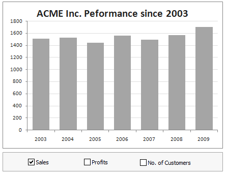
What our mouth-watering chart will look like when its done:
Ingredients:
Some data, Few check-boxes, IF formula and a dash of espresso
Instructions for preparation:
- First get your data. Make sure its clean and arranged neatly, like below, in the range B4:E11.
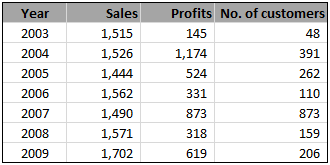
- Since our data has 3 series (sales, profits and number of customers), we will take 3 check boxes and place them somewhere on our worksheet.
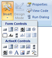
Insert check boxes from developer ribbon / forms tool bar (tip: show developer ribbon in excel 2007)
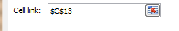
- Now, we want the check boxes to tell whether to show or hide a particular series of data in the chart. So, link each check box to one cell, say C13, D13 and E13.
- We will use IF formula to roast our data based on what the check boxes say. So, create a similar table and load it with IF formulas like this:
=IF(C$13,C4,NA())

- Finally, make a chart with the data in this new table you created.
- Put everything together and neatly arrange with your favorite colors and labels.
- Serve hot and see your boss drool.
Download the prepared chart:
You can download FREE dynamic chart template and serve it instantly.
More recipes on dynamic charts:
- Select & show one chart from many
- Make a chart that grows as you add data
- Dynamically group related events in a chart
- More Dynamic Charts
Do you use dynamic charts?
I like dynamic charts a lot. They provide a wealth of information in a compact form. I use them whenever possible, especially in dashboards and analytical outputs.
What about you? Do you use dynamic charts often? What techniques do you use when implementing dynamic charts? Share your experience and tips using comments.
http://chandoo.org/wp/2009/08/27/dynamic-event-grouping-in-charts/


140 Responses
Nice and simple.
Small suggestion: Sales and margins share a similar scale (or should share). However number of customers are of completely different order of magnitude. So, make the line chart use a Secondary Y-axis instead of sharing it with sales and profits.
Subhash
@Subhash.. agree. The number of customers should be on a secondary axis for clarity.
A very simple and very good idea. I liked it a lot. Thanks for sharing.
Flavio
Nice simple technique.
Awesome, just changed my current KPI reporting format to this style of dynamic chart for a customer. For Excel newbies this is an impressive tool but simple for them to use as well.
Hey Chandoo, nice functionality in chart.
That’s pretty sneaky how you “modified” the color of the text in the check boxes? You really had me scratching my head for a while. 🙂
Hi Chandoo,
I’m fairly new here and an amateur to boot so please bear with any stupid
questions.
I found this article very interesting and am trying to work my way through
making the chart myself from scratch (I learn a lot this way!) – I am
completely stumped on how you got the font colors in the checkboxes to
change. Can you point me to where you have (possibly) explained this
in a different article?
Much thanks!
@Sandy: Welcome to Chandoo.org. There is nothing like a stupid question. By asking, you have actually proved the opposite 🙂
I have removed the text from checkboxes completely and then added text box (insert ribbon) and colored it. To make the clicks work, I just re-sized checkboxes’ width to overlap the text box.
Tricky! Thanks for the explanation – that explains it!
As many other posts about dashboards analytics that I read with pleasure, thanks for sharing this simple but efficient excel tip!
While the Chart works well, adding a legend is tricky. Unable to remove say no. of customers once unchecked.
Great work Chando, another proof that clever design can deliver great impact with limite resources
Your charts are simple but easy to read – I’ve learned a lot about designing information from just reading your posts let alone doing the tutorials.
Thank you, Chandoo.
Hi Chandoo,
Great tip! If one wanted to hide the reference table (or the “similar table”), what is the best way to do it?
Move the graph to a separate tab? Hide the similar table?
Thanks for your great work.
David
Nice trick. My boss would be confused as to the chart being a stacked or a100% overlapping bar chart. I almost never use 100% overlapping because of this confusion. Though by toggling it is so obvious that they are not stacked, but print out a graph with profit and sales and the confusion would be there.
Keep up the excellent work!
Simple and Brilliant. I was just thinking of making it for one of my presentations and here I got it, readymade!!!!!!!.
Served hot for supper……..
Delicious indeed………Burp!!!!!!!!!!!!!
Regards,
Pankaj Verma
Apologies for asking what I’m sure is a very basic question, but it’s something I can’t quite get a handle on.
How exactly do you create the type of combined column design in this example? ie with the sales & profit columns appearing together. Is it a stacked column chart?
I use Excel 2003 and I can’t seem to match this design. Many thanks.
so simple and yet so cool.
Hi Chandoo,
Thx for the tip, I was a the moment building the same kind of graphics but didn’t think to use the check boxes. It’s clever.
However the “linked cell” (don’t know the name in the english Excel version) has to use the True/False format. How can we change that ? I used a simple y/n (yes/no)format in front of a group of lines I want to hide or not. It is much more simple to use.
But I think the Tru/Falese format is automatically implemented in Excel and we can’t use something else except some trick involving macro ; and I can’t use it since I have to run the file on both Mac and PC.
I hop I’m wrong 🙂
Bye,
G.
I use dynamic charts a lot. I usually use a lot of named ranges. Earlier I used to use offset to create xValues but now a days I learnt the technique of using index instead of offset (as suggested by a lot of mvps – offset should be avoided wherever possible.)
However to import data from various worksheets I use offset. The various formulas I use are as follows to get an idea. e.g. The chart will have its own data worksheet. The data for various departments may be stored on different worksheets and pulled as per the dropdown selection.
1. To pull data on the data worksheet… =indirect(address(row(),column(),,,$A$1)) where A1 contains the name of the worksheet.
2. xValues = Index(Data!$D$1:$D$10,A1):index(data$!D$1:$d$10,A2) where a1 and A2 contain the indexes of selected months from the dropdown.
3. yValues1 = Offset(xvalues,0,A4), yValues2 =Offset(xValues,0,A5) etc.. again this comes from the categories you select.
May be a bit complex but one chart fits all scenarios
Hi Chandoo
Congrats on your fantastic site. I’ve the same query as Malachi. How can you create the overlapping column design that you have here in Excel 2003?
I thought I was pretty good at Excel until I tried this. Am I missing something obvious?
Thanks
@ Martin, Malachi
To create the overlapping chart, setup a chart with 2 Series
Right Click on one of the series and select Format Data Series
On the Series Options Tab, change the Series Overlap slider to 100% Overlap
Set the gap width to suit
@ Martin, Malachi
That’s a Clustered Column chart by the way.
@ Martin, Malachi
In Excel 2003
To create the overlapping chart, setup a chart with 2 Series and create a Clustered Column chart
Right Click on one of the series and select Format Data Series
On the Options Tab, change the Overlap slider to 100% Overlap
Set the gap width to suit
Thanks Hui. Really appreciate that. It worked a treat.
Hello,
I tried copying the dynamic chart in excel 2003 by changing input data but the sheet is protected. can you walk me through creating a new list?
Thanks!
@LDAllen… I do not think the sheet is protected. Can you pls. clarify?
Hi Chandoo,
love this chart. I managed all the way to get it set up in excel, but how do I get it into powerpoint with the option that the check boxes are still working?
Thanks so much
Anne
@Anne… Thank you … Powerpoint is another beast. I do not any reasonable way to port this chart in to ppt with all the dynamism. You should try embedding the whole workbook in to ppt. That way, during the presentation, you can double click on the excel object to open the chart from excel directly and show the interactivity.
Thanks, will give it a try…Happy birthday to the twins 🙂
I just wanted to share that I used the ideas in this dynamic chart to create a comparison chart for our commissioning dept. There are 17 PCTs (health groups) in our region, so I have set up 2 charts – monthly and cumulative – so that they can choose up to 3 PCTs to chart and compare. They love it and think I’m fantastic!! Thank you Chandoo. I am enrolled in the latest school and hope I can wow them with more innovative ideas!
@KateB: Wow, I am so happy for you. Welcome to the class btw.
Love it! 🙂
You rock! I just used it for a budget analysis I’m building, worked like a charm.
Hi dear, I was going through the dynamic chart, till point #2 I could understand but please guide me asto how can we link a checkbox to a perticular cell (point#3)
Hi Jignesh, after you’ve added the check box, right click it and go to properties. then either type in the cell reference, or click the box at the end and click on the link cell. Does that make sense?
Great…Thanks KateB 🙂 it worked.
@KateB: Donut for you 🙂
Thanks guys!
Hi Kedar
Can you send me a sample excel sheet with the formula you have mentioned above
Thanks a ton Chandoo, had a presentation w/ my CRO this morning and used this technique to track large deals for the last 4 quarters, and yes you were right, they were drooling over it.. Keep on doing the good work, really appreciate it..
Hi, Chandoo. Thank you for this tip – it’s incredible! I’m using this with a clustered column chart. My series are fiscal years 2006-2010, with the months along the horizontal axis. I was wondering if there’s a way to eliminate the gaps for years that have been de-selected – for example, I may want to compare data from FY 2006 and FY 2010, and I’d like to see these next to each other in the chart; however, when I de-select FYs 2007. 2008, and 2009, I’m left with a chart that has a sizable gap between the two selected series.
Using Auto Filter works, but it’s not dynamic – when I re-select a fiscal year (say I now want to show 2006, 2008, and 2010, so I re-select 2008), I have to re-select the year in the Auto Filter’s drop-down boxes. Is there a way in Excel 2007 to have these rows hide and unhide automatically when you select/de-select a check box?
Thanks!
Chris
Hi Chandoo,
The Idea is classic.
But pls tell me, from where you picked this chart i.e. Standard types or Custom types.
I am using office 2003.
Thanx in advance
Swap
The chart types are standard types, they may have custom colors
The techniques used are available in all versions of Excel
I mean in the above exmple the one which is used, overlapping bar-chart with line.
What is the name of the type?
Hi Kedar
Can you upload a sample excel sheet with the formula you mentioned above?
Re : Becha, Prashant.. I will try to mail the example to Chandoo.. Hope he will publish it somewhere 😉
i chandoo,
can u help me with a VBA to extract data from a URL and dump in a set file location within a give time schedule.
tanks
Hey chandoo,I work for Nabler Web Solutions and i was thinking of using the same in my next report.
I have tried making this dynamic chart, but i am not getting any success in that. Every time i try to make it the bars in my chart changes. Can you tell me how have you keep the length of those bars fixed.
@Shrey… Welcome to Chandoo.org, thanks for your comments.
you need to set axis min and max to fixed values. Select vertical axis, goto format axis (right click) and then choose fixed for min and max of axis and enter 0 and a large value (based on your data). This should do the trick.
I am new to your website and I love excel but get very discouraged when it comes to using formalas and manipulating different functions. But this one was very beginner friendly. Now, I am excited to learn more. Thank you!
@Vetrina
Don’t be discouraged by formulas
If you understand that 20+10=30
Then a Cell will have =20+10 and display 30
And you can link cells =B2+B3 will simply take the values from B2 and B3 and add them
eg:
=Sum(20, 10) will add up 20 & 10 and return 30
=Sum(B2, B3) will take the values from B2 and B3 and add them
=Sum (B2:B10) will take the values from the range B2:B10 and add them
Other formulas keep working on the exact same principle
Hi Chandoo,
Dynamic charts are awesome! But, is there any way to add individual data labels to this chart? I have created three histograms and three line graphs, but when
I am adding a data label, excel is showing #N/A at the bottom which is not looking good. So is there any way to have individual data labels ?
Thanks!
so cool!! thanks
Thanks for sharing it. Very simple and easy to understand. I used this technique and it was very impressive. One question, is there any option by which we can use dynamic chart in ppt??
Also had the same doubt that Abhishek Sinha asked about the data labels..
Chandoo, I love this website. It was suggested to me by some of my MBA classmates and it is simply fantastic.
I have made it a point to go through a new item on your blog everyday and learn a new item on Excel. I am the go to guy for Excel for my class and I am sure this will make me AWESOMER.. thanks again
-PM
I just created these charts 100% because of this site, and although no one has told me yet, I am totally a rock star for doing this (and I even impressed my husband!). I’m a Business Analyst at a hospital and this has taken my work to a whole new level….thanks so much for this blog and these wonderful posts and comments! (although I could use a bit more detail in the implementation details since I’m not as technically capable as others are on this site…)
Hello All,
I am so happy to have found this site! Thank you Chandoo. I have a question: My data has daily prices, for multiple years, of different metals. I have recreated the dynamic chart explained above, but now I’d like to be able to select specific year, month, or number of days, and have the charts update instantly. Please help! Thank you.
This was very helpful.It helped me in presenting my data in a nice way in office.At the end of the meeting,people were impressed with my chart.Thanks.
I am adding a data label, excel is showing #N/A at the bottom which is not looking good. So is there any way to have individual data labels ?
I am facing the same issue as well 🙁
Its awesome info you provided and i checked the excel file after downloading. Will be a regular visitor in your site from now.
I use Excel on a day to day basis; so I find your tips very valuable. The tutorial is so easy to follow and the outcome is fantastic. I had a great time trying it out. Thanks for these tips; I will definitely apply the things I learned from your site to make awesome and professional looking report.
Chandoo,
Thank you for giving us this project and to all of the others who explained the extra steps involved (@Hui.. & @KateB). I will surely amaze my colleagues as soon as I get a chance to use this technique at work!
Just to add a little help for any who come after me: The check boxes will not work unless you are out of “Design Mode” in Excel2010. That took me a few minutes to figure out. 🙂
http://chandoo.org/wp/2010/08/31/dynamic-chart-with-check-boxes/
Hi
its possible add more sales volume
its possible add more sales item
like product name ( eg: iron , steel, copper, )
Thanks
Thowfeek M
Hi
its possible add more sales volume
its possible add more sales item
like product name ( eg: iron , steel, copper, )
Thanks
Thowfeek M
Hey Chandoo, such charts makes your work alive. But I have a confusion.
what to do if we want to compare sales of 2 quarters in this same data. For example, sales of November and march for year 2003. Rest all is same.Then how will we link two cells with one check box.
Please reply
I really love to get here by google!! 😀 Almost literaly you save my life!!! It’s a good trick!! Tnx lots and lots!!
U r the man in graphs. tnx lots
Hi Chandoo, I’m really at my wits end! I did up a dynamic chart similar to yours, but everytime i checked the third option (ie. the line graph), the plot area will auto resize and shrink. when I unchecked, the chart will take it upon itself to expand itself to presumably “optimize” the plot area. But yours does not seem to resize at all. I have tried twiddling with object positioning properties, horizontal axis options, horizontal axis alignment auto refit is grayed out, etc…
@Ken
.
Can you either post your file or email it to me and I’ll have a look
Thanks Hui for the reply! Well actually I accidentally solved it when I remove the legends since I can use the checkboxes as my legends (better that way too). But in any case, I have uploaded in the link below, so you can have a look at the problem if you want.
http://www.mediafire.com/?z38bs03cifzruy8
@Ken
Great you solved the problem, as the link isn’t working ?
Great Article,
I need help in getting the different chart types as I implemented every check box i have the same graph for every attribute. can you help me get different chart types for each attribute.
Thanks.
I’m puzzled over that too.
Each checkbox is currently formatted to show the same type of chart and i don’t see anything on the Checkbox options to change that. if you click on the chart itself and then click “Change Chart Types” and then click on Templates, you can see that there are 3 templates saved (2 column and 1 Line), but they don’t seem to be linked correctly as the line chart does not display.
Anyone know what to do?
I have followed all the above steps correctly but it does not work. Why could this be?
@Kam
Can you send me your file?
Click my name, email at bottom of page
Point 3) Now, we want the check boxes to tell whether to show or hide a particular series of data in the chart. So, link each check box to one cell, say C13, D13 and E13.
Not connecting, please help
Hey Chandoo, How can we link the graph only into a powerpoint presentaion
Hi Chandoo,
Great little file – thanks!
I am just trying to manipulate it, but am having some issues. I am trying to break-down the sales and profits by each business unit (but keeping the year as well).
Any suggestions?
Hi Chandoo/Anyone,
I am new to excel and have seen the above dynamic chart. When i followed the instructions i get graph only when i select profit but dont get graphs for sales and customers, please help me in learning how to get graphs when select/tick on other options aswell.
Regards,
Satish K
@Satish
If you email me your file i’ll have a look
Click my name email is at the bottom of the page
Now, how to get something like this into powerpoint so when infront of clients I can change that graphs being displayed while remaining in the powerpoint presentation?!?! HELP!
Can you explain this formula?=IF(C$13,C5,NA()).
Please!!!
Hi!! Also one more query when i do the above steps…
and when i click on check boxes the data doesnot disappear frm the chart it shows NA.
Quick question: I have created a chart just like this, and I was wondering if it would be possible to add a dropdown menu in the chart that would let me focus on only a single months worth of data.
You had another tutorial that sort of explained this, I just couldn’t figure out how to make it work with this.
Thanks!~
Can you explain the formula in step 4 please…
Damn Awsome!!
Thanks man…I feel so awsome today…actually was bored sitting in front of the Idiot box, so started surfing and stumbled upon this..
One more thing ..Can I make this site invisible to my bosses? plz…:P
Hi!! one more query when i do the above steps…
and when i click on check boxes everything works file except that data label comes as N/A.
Why?
Regards
KPJ
Hi Chandoo,
How you create sales and profits metrics in one bar.
Thanks,
abhi
Hey Chandoo,
Awesome stuff.
But I am getting stuck at the last part of process. How do you create this kind of “all in one chart” from the data table??
Thanks & Regards,
Sundeep
Hi, I wanted to know how I can upload this site on to a website. Google gives you an embed code so we can put that in a report and publish it. But how does it work for this particular chart on top using excel.
(I regularly use interactive charts for stories so need to figure out a fast and easy way of making them work)
Thanks
Sanjit
Hello Chandoo & Other Dynamic Chart Users!
Thanks for the tutorial. It works great and looking forward to showing off. The instructions were easy to read and implement.
Have a couple of questions if anyone else has run into the same issues:
1.) I have two columns and one line in my chart. All of my data is based on the calendar year, so data today forward does not exist yet. Therefore the line runs on the X axis for the remaining year. Is there a way where no data (=IF populates zero) values do not appear on the chart? To describe better, my line illustrates the actual values from JAN – JUL then falls to zero and runs the X axis for AUG – DEC. I’d like to have nothing there until the actual data is populated. I hope this makes sense what I am trying to describe.
2.) In my example, the line on the chart is based on data for a particular region. I have three regions that I’d like to use the dynamic chart with check box feature (my checkboxes are not in the printed dashboard, but are in the worksheet and data entry section on worksheet.) However, the legend shows all items even when not checked, therefore sort of “junking up” the real estate and showing the audience that there are other items available but aren’t being shared with this particular audience. Is it possible to have the legend only visible as it relates to the check box? For example, the legend would only show the line that is checked?
I’ve rambled quite a bit. Thanks for reading and hope to hear some suggestions from all the great Chandoo users. Good evening!
Hi Cheetahs of Excel,
In this scenario profit will never be higher than Sales… What if we have to deal with the data like Target V/s Achievement where achievement can be higher than target or vice versa? This can make one of our scale (target or Ach.) hide behind the other….. Kindly guide how can we tackle this situation…. I was looking for any transparency sort of technique to implement in here but no success yet…
Thanks in Advance!
@Shahbaz
I’d suggest offsetting the two Columns slightly so they are not directly on top of each other
How does one remove the labels- “Sales”, “Profits” & “No. of Customers” from the check boxes.
Just right click on the check box, edit text and remove the labels.
Thank you, sir….
Is there any way to shift the ‘No of Customers’ to the secondary axis (maybe, on the RHS) so that a bit more clarity.
Apologies to trouble you, i got it….
Just one quick question, could you please share the templates of the charts shown in ‘Why No One Likes Your Pie Charts (And What to Do About It)’
Thanks
I prepared in the same way but all three sets of data are showing in same chart. Eg – Sales, profit and Year are coming in bar graph, how to show two sets of value in bar and one in line graph.
Awesome Chandoo baba, you made my day
I am waiting….Can someone please tell me how to create a 2-in-1 chart such as both column & line added over here.
@Sundeep
Have a look at:
http://chandoo.org/wp/2009/01/05/excel-combination-charts/
&
http://chandoo.org/wp/2009/07/02/secondary-axis-combination-charts-howto/
I am using pivot charts, are these charts better than pivot ones ?
I need some help pls.
Trying to understand the IF statement: IF(C$13,C4,NA())
Why there is no dollar sign in front of C
IF($C$13,C4,NA(), is this wrong)
Thanks in advance,
Anita
@Anita
Either case is ok if you are using the formula in a single cell
Where the $ sign comes in is when you go to copy the formula
In the case of =IF(C$13,C4,NA())
If you copy that down the next cell down will show
=IF(C$13,C5,NA())
The $ sign locks the reference to Row 13 to Row 13
With the second formula =IF($C$13,C4,NA())
If you copy that down you will get
IF($C$13,C5,NA())
in the next cell down
A similar thing happens if you put the $ sign in front of the C eg $C$13
That locks the Column when you copy across
So the use is up to you and what you plan on doing with the formula
You might want to have a read of: http://chandoo.org/wp/2008/11/04/relative-absolute-references-in-formulas/
Excellent, amazing, outstanding tutorial, thanks a lot!! I am sure that everyone that shows this interactivity will get surprised with ooh and ahhs. Thanks a lot for this fantastic and easy-to-follow explanation
Hi,
Is there any provision to check that how may times i have worked on xyz excel sheet in a month?
@Keyur
Excel as no built in Audit functionality which allows this.
In older versions of outlook there used to be a Journal module which when enabled would display a timeline of file type usage so you could see what files and when they were opened
http://www.dummies.com/how-to/content/keeping-records-with-the-outlook-2007-journal.html
I have created a similar graphic but I would like to know if there is a way to just allow the user to select on check box at the time in order to avoid select more than one.
@Daniel
Instead of using Check Boxes use Radio Buttons ( the small round ones) instead
Thanks! and the way to setup the radio button is the same as check box?
@Daniel
Yes
There actually called Option Buttons, not Radio Buttons
With Option Buttons you can only have one selected at once
But you can group them using a Group Box so that you can have different groups of Option Buttons and each group can only have one Option Button selected
Refer: http://chandoo.org/wp/2011/03/30/form-controls/
Thanks! but I´m still can´t run the buttoms as I need. How can I share my workbook?
This is my email: danigabis@hotmail.com
Please include all steps, difficulty level, and reasoning behind each formula (etc.) for each example that your website provides. Thanks!
Hello, nice article. I have a question, when I try to do it i can’t erase the nº customer line when is not selected, it always appears in the bottom as if the result is zero. How can I make to make it dissappear at all when not selected? Thank you in advance. Great web, following!
Hello,
I made the same graph with a secondary axis for the no. of customers. The problem is that when I uncheck the # of customers, the secondary axis defaults to something like 1.2, 1.0, 08, 0.6, etc…
How do I change it so that the secondary axis only shows up when I check # of customers?
@Colin
Select the Right Axis
Right Click, Format Axis
Number
Custom
[>2]#,##0;””;””;””
Note: You might have to retype the ” characters above as they get scrambled in here by WordPress sometimes
Genius! thanks
Hi Chandoo,
I did practise how to do this, but I am not able to bring in different chart types.
Please help me in that.
Chaitu
Thanks a lot for the tip. It is very useful.
I would like to know only one thing.. when I create the chart and uncheck sales..I get N/A in place of the sales value.
What can I do so that I will avoid the N/A?
Is there a way to do this with a pivot table. This works great for looking at a complete set of data. I want to setup a workbook that will be added to periodically. I have setup of pivot chart that allows you to select by check box a number of selections but it always wants to sum everyting and chart one line.
I am having trouble figuring out how and where to do the “IF” statement
I would just like to say that your dynamic charts are fabulous. I’m working on a project and they have been invaluable, thank you so much!!!
Thanks for this, Chandoo
Sorry for what may seem like a basic question but you lost me at step #4. How does one “load” the new table with formulas. When i create and insert IF formula on the new table everything turns to “NA”
Any help with step 4?
Dear Chandoo,
First of all hats off to you man. You are doing marvelous work. I am learning from your site.
Regarding this dynamic chart, I have a small question if that can be done in power point? You know all analysis and data are presented mainly in power point slides and I was thinking if it could be possible to execute same charts with checkboxes in power point that will be great.
Please advise if it can directly be done or through a macro, etc.
Thanks in advance and Best regards
Hey,
Loved the post..
But I want little difference and I don’t know how to do it.
I want to make the charts appear separately- next to each other.
If I am selecting sales the chart must appear and now if I am selecting Sales and Profits both, both the chart must appear next to each other.
How is that possible???
Awaiting your reply..
Thanks.
Regards,
Prajakta
This is wonderful, shows the power of excel. To do or achieve this with other applications would cost a fortune.
Who then says Excel will go into extinction when there’s no application today that does not at one point import or export from Excel?
Thanks and God bless
Oladapo Sorinola
Nigeria
HI chandoo! I’m a fresh grad who was recently hired as an accounting staff. My office mates are awesome in excel, so here I am, trying to cope up. I am very amateur in excel, but thanks to a certain website which referred your website to me. Now I’m learning… bit by bit.
I tried to follow your instructions, but when I copied the formula it says, “Reference Not Valid”. Could you help me where I went wrong? Thanks so much!
All,
I tried to create this on top of a pivot table, but did not work. Pivot table will help me refresh the data on the chart as and when data set changes. Is that possible ?
Thanks.
Hi, Thank you for this great tutorial. I am unable to recreate this with pie charts though. Tried a lot of stuff, but just bnot getting my head around using checkboxes and generating pie-charts like these bar-graphs. Please help.
Thanks
Rumii
Sorry for what may seem like a basic question but you lost me at step #4. How does one “load” the new table with formulas. When i create and insert IF formula on the new table everything turns to “NA”
I am unable to prepare this chart as I could not traced how to make three charts and club them together. Further to that how to select data i.e year and formula based new data