
This is the third installment of project management using excel series.
Preparing & tracking a project plan using Gantt Charts
Team To Do Lists – Project Tracking Tools
Part 3: Project Status Reporting – Create a Timeline to display milestones
Time sheets and Resource management
Issue Trackers & Risk Management
Project Status Reporting – Dashboard
Bonus Post: Using Burn Down Charts to Understand Project Progress
Why Create Project Timeline Chart?
There are 2 key elements in all the successful projects I have been part of.
- They had exceptional individuals who are also exceptional team players
- The communication and collaboration is really good.
While there is little that project management software can do when it comes to first point, the second point can be addressed by using right tools and visualizations. In this installment and the part 5 and 6 of this series, we will learn some excel based visualizations / charts that can help you to communicate about the project status and progress to your team and stake holders.
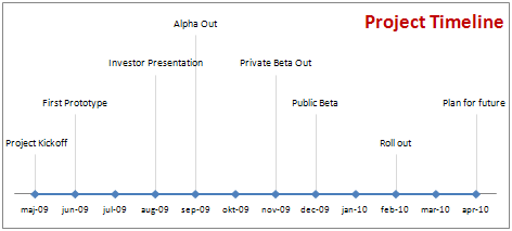
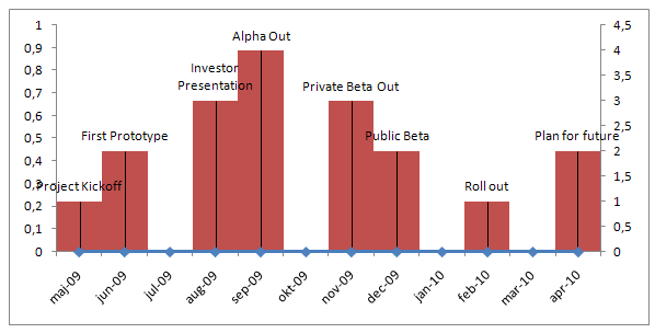
Project milestones can be shown in a simple time line chart in excel. While the chart doesn’t look complicated, it can provide good amount of information on project progress in a simple and understandable chart.
We will learn to create a project milestone chart like this:
Steps to create a project milestone chart in excel
- In order to create a project milestone chart, we need to have the milestone data. The simplest format for milestone data is Date and the milestone. But since our chart requires the milestone to be displayed at a certain height on the chart, we will add the third column – height.
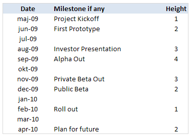
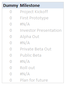
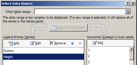
PS: the height column can be easily calculated using formulas. I leave it to your imagination. - Once you have the data in the above format, we will add 2 more helper columns – named DUMMY and Milestone. The Dummy column is used to create the timeline (where Y axis value is zero). The milestone column is a more cleaned up version of milestones (see how it is showing #NA where the milestone is blank.)
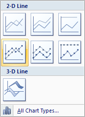
- Now, select the date and dummy columns and insert a line chart.
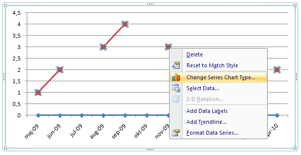
- To this chart, we will add one more data series – Height column.
- Now select the height data series and change the chart type to a bar chart. Also set the height series to be plotted on secondary axis. Learn more about combining 2 chart types and adding secondary axis in excel.
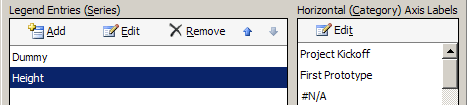
- We will also set the horizontal / axis labels for the height series as the “milestones”. We need to do this so that when we set the data labels for the height series, we will see the milestone instead of month.
- At this point our chart should look like this:
- Now, we will add data labels to the height series. Set the label type as “category”
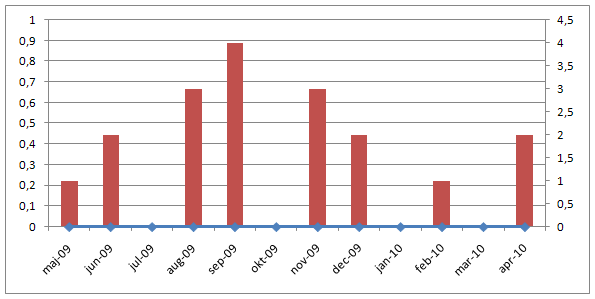
- We will also add error bars to the height series (the bar chart). We will configure the error bar in such a way that they are shown 100% on the negative side only.
- After doing this, the chart should look like this:
- Finally we will do some formatting like,
- Removing fill color / line from height series by setting them to None / transparent.
- Changing the error bar color to a dull shade of gray.
- Adding chart title and aligning it.
- Removing vertical axes and gridlines.
- Formatting horizontal axis – changing label orientation, removing tick marks.
After all this is done, our project milestone time line chart should look like this:
- That is all, we now have a cool looking project milestone chart ready. Now go and achieve a milestone.
Download the Project Milestones Time Line chart template:
I am sure you are overwhelmed reading the above tutorial. You are probably thinking if it is easier to work towards the project milestones than creating this chart. Well, don’t worry. You can download the time line chart template and play with it to suit your needs.
Download 24 Project Management Templates for Excel
What next?
Project timelines are a great way to tell the story of project to strangers and new people joining your project. They are a good addition to project status meetings and reports.
In the next installment of this series, we will learn how to use Excel to manage timesheets and resources.
If you are new, please read the first 2 parts of this series: Project planning using gantt charts, Tracking day to day project progress with team todo lists.
Your thoughts and suggestions?
What are your ideas on communicating project progress to stakeholders and new comers? What do you think about this tutorial? Please share through comments.


86 Responses
Interesting, I would try using it for a life-line project.
Chandoo as always I learn something easy and very usefull from your site. In fact I’ll be using this chart tomorrow for a presentation to my boss.
Thanks and keep excelent stuff like this comming!!!!
Great example, very clear explanation. I’m training a class on advanced charting techniques, can I use your examples in my notes and also direct the students to this web site for further reference?
This is an extremely useful series / post. I enjoyed reading this and the 2 earlier posts. Looking forward to part 5 and 6. And, thanks for the downloadable templates – you have saved me some time.
@Invisalign: Thank you.
@Zaxl: Cool. Thanks.
@Oliver: That is good to know. Let me know what your boss thinks.
@Sandra: Thank you. You can use this material on your training class as long as you acknowledge PHD. All the best.
@Koushik: You are welcome. I have learned quite a few techniques myself writing the series. I am happy you liked it.
I purchased the Excel templates for Windows 10. Working out great so far but there is an annoying invalid reference error message that pops up every time I enter data in a field. Should this be happening? IS there a quick fix?
Chandoo
When you run a series and start naming them with the the convention 1 of 6, 2 of 6, how about you maintain the naming convention for the whole series. Some of us save up series articles to read them all in one session – consider your wrist slapped
Chandoo
When you run a series and start naming them with the the convention 1 of 6, 2 of 6, how about you maintain the naming convention for the whole series. Some of us save up series articles in our reader and read the lot in one session – consider your wrist slapped
@Steve: thanks for reminding. I have updated the post title. Next time you visit reader, the title should be changed.
Hi Chandoo,
I’m learning so much from you posts, they are very creative and makes me redesigning a lot of my reports for better and clear presentation !
I have a little question ( with big impact I suppose ) …
Is there a way to create this chart in portrait ?
I would like to include the milestones into your Gantt chart but for presentation I think it would be better if the milestones are in portrait.
I can’t find a way however to put a line chart in portrait ….
You have any ideas ?
Thanks in advance
Phill, use the camera tool to capture the chart. This way, you can rotate the chart on demand.
Hi Miguel,
Thanks for the tip !
Unfortunately with the camera tool the text ( milestone description ) is not presented correctly and you have to turn the page to read it.
So unless I’m doing something wrong the camera tool won’t help me here.
Phil – you can rotate the milestone descriptions, so that when you rotate the camera object picture of them, they appear the right way. Right click on them, select Format Data Labels, then click on the Alignment tab, then select ‘Rotate all text 270 degrees’ from the Text Direction dropdown. That should do it, if I’ve understood your question correctly.
Or you could probably do the chart as a bar chart.
Noob me, why did’nt I think of that one myself … thanks Jeff !
Great tip !
Very well explained too … thanks 🙂
No problem. You can rotate the axis entries also.
@Phill… As Jeff suggested, you may want to try a bar chart instead of column chart based approach and make the dummy as the Y values instead of X values. This will rotate the whole thing while retaining the ability to scale etc.
@Abhi.. you are welcome 🙂
@Miguel and Jeff: Donuts for you for helping out Phill.. come and claim, any day in copenhagen…
@ Chandoo… and Miguel: I’ve got my donut. It was at http://flowingdata.com/2009/07/14/how-does-the-average-consumer-spend-his-money/
It tasted as good as it looks….
Chandoo,
Very nice! Say, how can I add a visual indicator for today’s (current date)? This will give my boss a better perspective. Times marches on and he sometimes forgets (“oh crap…it’s August already?”) Is =TODAY() doable?
Chandoo,
Nevermind…figured it out for myself. Works great.
@Hatman: Very cool. You are welcome
I could use some help on tweaking the graph to show more detail and multiple milestones within a month. I noticed the graph works because the horizontal date axis uses increments of one (e.g. time period = 1 month), but how to configure it to include a milestone on 1 Sep ’09 and 15 Sep ’09? Many thanks.
@Richard.. sorry for such a late reply. I havent noticed your comment till now. You can change the horizontal axis major-tick-marks from 1 month to say 2 weeks or 15 days. Or if you prefer having arbitrary time points, make a helper series and use data labels. Align the labels to the bottom and remove axis labels. If you are familiar with chart formatting, then this should be cake walk.
I tried using this idea, and i have found a few ways to improve it and make it more user friendly to the viewer. First off, change the text direction so it reads vertically. Then keep all entries at the same height. Now make sure your entire period is their for me this was the november->december months, i filled the milestones in on the correct day(s). This prints well and is very easy to read. Just a thought 🙂
To make it even easier to read you can use some nice formatting to highlight the weekends… have one cell with the start date and use this in each cell for the days in your timeline.
=IF(OR(WEEKDAY($B$36+ROW()-(ROW($B$36)+2))=7;WEEKDAY($B$36+ROW()-(ROW($B$36)+2))=1);TEXT(+$B$36+ROW()-(ROW($B$36)+2);”ddd mmm-dd”);TEXT(+$B$36+ROW()-(ROW($B$36)+2);”dd”))
@Dom.. thank you for sharing such a valuable trick… Vertically aligned texts are sometimes difficult to read. I generally avoid them for onscreen charts, print is ok I guess. (Also, it is kind of annoying that excel doesnt anti-alias properly when you vertically align texts).
this is very useful!!
simple and cool .. just like i need it, thanks mate
I made a timeline using this guide, it worked perfectly. I was even able to add a “today()” line, a horizontal buffer-line that moves with the appropriate milestone and an indicator to show how much of the buffer is consumed.
But now I’m testing in excel 2010 and it stopped working. Opening the old 2003 files in 2010, the milestones-lines are in the correct places, and the names are still in the labels, but the names are no longer attached to the correct milestone. Attempting to recreate the milestone chart in excel 2010, I can’t seem to get the milestone-names in the labels. Seeing how I skipped 2007 all together the ribbon layout is to much of a challange for me to figure this out, so any help would be greatly appreciated!
This is awesome information.
using Excel 2010.
having difficulty with the height series…the to calculate heights, I set up a range with the heights I wanted (1,2,3,4,3,2) and using the MOD function to iterate between them when appropriate entry was provided in the milestone column.
when I add this series to my chart, it assumes a “0” (zero) value for the cells where none is provided…so when I add data labels, I have zeros appearing at every month that has no milestone. is there any way to do this differently so that I don’t have to turn the data label on or off for every data point?
thanks. I really appreciate the creative stimulation and guidance I find on this site.
Isaac: Welcome to chandoo.org. Thanks for your comments.
Please visit http://chandoo.org/wp/2009/12/14/how-to-hide-0-in-chart-axis/ to understand how get rid of zeros.
excellent. thank you.
I was using this method to create a timeline (thanks btw!) but have found a much easier way to get a similar result. By using a “Line Chart with Markers” and changing the ‘Shape Outline’ of the line to ‘No fill’ you can get more accurate plotting points. I used drop lines in the chart to connect them to the time line at the bottom and format the axis to show increments of 1 month. I set similar values to each date that you had (1,2,3 etc..) to vary the height of the points and created custom data labels which I assigned to each point (eg Project Start, Release 1 etc…). This way you can create a timeline just using the relevant dates, with no need to create a dummy series. Note: You have to set the axis Minimum to the 1st of the month as otherwise it can appear as though the dates are plotted inaccuratly on the axis if you display only the month name in the axis. I can email my example if you like.
First thanks for this timeline chart. It looks so much nicer than the big box charts that we are used to create for timeline. I can get the month chart to work fine but have trouble doing the same timeline chart at the day level. I have milestones that are a few days apart and I tried the same concept to apply to it but the timeline on the X axis and the bars on the secondary Y axis don’t always coincide. Has anyone have any helpful tips or workarounds to make it working. My X axis base is set at Days and majoor unit is at 7 days. I am using Excel 2007.
any help or insight is appreciated.
thanks
shae
I would really appreciate it if someone shared their Today() functionality within this timeline (a moving vertical line). Thanks in advance!
You need to give better instructions (more detail and screen shots). The timeline works differently in Excel 2007. A bar chart comes out horizontally not vertically.
I like it too much
this looks like a simple and useful approach, but I have found it infuriating.
Crash after crash and failure to manage to get a simple timline into anything useful. I don’t want to be a troll, but I cannot recommend this approach at all on the basis of my experience –
like trying to nail jelly to a wall, but corrosive, noxious boiling jelly… deeply uncomfortable and frustrating
@Tim
I’ve just tried this in Excel 2010 and it works perfectly
Can you be more explicit in regards after which step it goes astray ?
Hui…
I worked off the downloaded template
Adjusted the tables to the data I need to present
The graph disappeared (initially just a white background, then nothing at all)
Not responding when I try to edit the layout of the template
tried from several different angles, always managing to edit some of the items into the shape I need (hence retaining interest), but without exception ending in “not responding” crash and graph disappearance, leaving tables.
Try to rebuild graph from tables, only for repeated crash falilures >:[
waste of a morning
Tim,
Do you want to email me the data you have
Click my name for email address (at bottom of page)
Hi Chandoo, would you mind showing me how to calculate the height automatically, provided the height will be skipped if event is empty? I haven’t figured it out yet 🙁 many thanks!
Hi Chandoo,
thank you so much for this wonderful tutorial
would you mind showing me how to calculate the height ?I haven’t figured it out yet
This chart worked fine for me until a the dates in the referenced column are not in chronological order. How do you get this chart to show the data correctly if the dates listed are not in chronological order, i.e. the first date 1/2/2012, the second date is 2/2/2012 but the third date is 1/15/2012.
Just wanted to register my thanks for this great tool and your instructions!! I have used it several times now. It is much easier to use than a full blown project plan in MS Project!
Here is an improve:
You can add a column named Type. If you apply a filter on that colunn the timeline only show the selected events.
luiscaballero@terra.es
@Luis.. very good idea. Thanks for sharing.
Chandoo,
Many thanks for this, an excellent idea. I’d like to show a baseline project timeline but I’d also like to add another series of data. This additional series of data would show the impact of an event on the timeline (i.e. if X risk occurs then the timeline will look like the this). I assumed that I’d be able to do this as the bars are clustered so I could just add another series, however I can’t find a way to add different names to the additional bars. I could of course just set up two different timelines and use a mouse-over to switch between them as you show elsewhere on this site, but I’d like to be able to show the two timelines in the same chart. Any suggestions would be greatly appreciated! I’m using excel 2010.
Thanks.
Love it…. I want to share my version of your dashboard.
Is there anyway to make this a vertical timeline?
i would like to make flow diagrams,performance pie-charts,graphs(all types) for fleet management and maintenance/ how do you help me on this? do you have specific templates?
Please help!!! My boss is on my neck!!!
DICKSON
Thanks for this information. I am in the process of really learning how to make use of these resources. I know that many people are visual learners, so project timelines are a must at my next presentation.
This is awesome and very close to what I am looking for. I need to be able to have the dates on a daily range instead of monthly, and would also like the date range to be dynamic based on start and end dates provided by a user. I am using Excel 2010 to try to accomplish this. Does anyone know how to modify this examle to do as I describe?
Hello
This is my first post as I’m new to the Chandoo website but so far have found everything I’ve seen on the site absolutely brilliant!
I’m stuck however on the formula to autocalculate the row height, I’m trying to use a combination of INT, MOD and arrays but failing badly! Can anyone help please?
Thanks
Kenny
Kenny,
In order to make it work for me, I set up a helper range that specified the heights I wanted in the sequence that I wanted to use them (1,2,3,4,3,2) — Then I set up a helper column beside my milestones with a MOD formula:
=IF(D7=””,NA(), INDEX(milestoneheight,(MOD(COUNT($E$4:$E6),6)+1)))
If the milestone column is blank for a given month, it returns NA, and leaves that month on the milestone chart blank. If the milestone column is not blank, it takes the next value from the “milestone height” range and uses this value as the height of the milestone marker on the milestone chart.
Isaac,
You’re a life saver. I was going crazy trying to figure it out! Greatly appreciate it.
Isaac, you’re a life saver! I was going crazy trying to find out how to do this. Thank you very much!
Hi
Thanks for the useful template in tracking milstones. I would like to show in my report to the top management the baseline milestone and against it, the trending milestones (in 1 graph), so that management is aware whether we are on track or not.
Any help in this regard would be helpful..
thanks
Robert
Robert — I’ve not tested this suggestion yet, but what about creating a second data series (with negative values rather than positive values) that shows the baseline milestones — then plot both series on the same x-axis, with columns above the axis showing actual milestones and columns below illustrating your baseline.
Isaac
Hi Isaac,
I was able to get a line graph wherein i have 1 line for the baseline milstone and another line for the trending milestones.
You could provide me your email-id and i can send the same to you (i guess there isn’t any option in this website to upload files).
Now i am trying to search the web, to see whether thru the MS Project 2007, i can generate the same graph. This option would be the best, so i needn’t maintain a seperate XLS document to generate this graph.
thanks
Robert.
your coooooooooooooooooooooooooool
I am a novice with excel. It would be helpful if you actually gave STEP by STEP and not assume people know what thell they are doing with Excel. I really need this template, but couldn’t figure how to use the damn thing or to even create on from the instructions given
Chandoo,
I love your milestone chart, but am having some problems with it. I read through all the comments to see if others were having the same issue and how you addressed it. I only found one comment, from Emma, similar to my problem; however, you didn’t address her issue.
From Emma: “I’m testing in excel 2010 and it stopped working. Opening the old 2003 files in 2010, the milestones-lines are in the correct places, and the names are still in the labels, but the names are no longer attached to the correct milestone. Attempting to recreate the milestone chart in excel 2010, I can’t seem to get the milestone-names in the labels. Seeing how I skipped 2007 all together the ribbon layout is to much of a challange for me to figure this out, so any help would be greatly appreciated!”
I am having the same issue. It all seems to work fine if I just load your example. The minute I add a row or change something, the labels start moving around and are no longer associated to their actual data from the tables. Please help.
Hi Chandoo,
I used this method and got fantastic results with it – basically I started using your template which worked, then rebuilt from scratch following your instructions, which worked. It looked awesome.
However I am encountering similar problems to Emma and Jeff – I can make a lovely looking timeline, once. Huge kudos at work. Then I get asked to make a last minute change to something very simple – adding in an extra line, or even as simple as changing the date of a milestone, and all the formatting goes completely wrong.
The column charts themselves work OK – but the labels are wrong. They change colour and may not show the correct text. I have tried experimentally adding and removing rows, and it seems like wherever the information about the labels is stored in Excel, it is getting out of sync with the data point it was originally written for. Only re-building the graph from scratch will fix the problem.
It seems not to be possible in Excel to conditionally format the data point labels which would be great to distinguish which group each point on the timeline belongs to.
I thought I could get around this easily by sorting the data out into different sets for each group, and then plotting on the chart a new data series for each, overlaid on the same X axis. But when Excel says ‘ plot on secondary axis’ it really seems to mean 2 of a maximum of 2. This is very frustrating – is there a way around it?
You can find this limitation by adding another data series, which works, and shows a third and different set of category labels in the right hand side. However when trying to add in the category labels from your table, they also change the labels of one of the previous data series 🙁 This happens whether or not you choose to plot on the secondary axis – it just changes which of the data series you impact with the change!
These feel like bugs within Excel itself (I am on V2010) and ruin the usability of this superb use case you have kindly shared with us. I wonder if you or someone knows how to fix in VBA, or maybe someone from Microsoft can chip in and help please?
Thanks!
Jeff,
Your description matches my issue also. I now have a copy of Excel 2013 and will be testing this ASAP… it feels like half-finished functionality. Any fix for 2010 might need to involve running a macro to re-apply formatting?
Cheers
Alex
Another great chart, thank you. Could you guide the solution to having another helper column B RAG with black for milestone not reached. The chart legend text to be individually conditionally formatted, black, red, amber or green (Green for achieved, red for missed etc.)
Same issue as Emma, Jeff and Alex. Any additional change to something very simple – adding in an extra line, or even as simple as changing the date of a milestone, and all the formatting goes completely wrong, the labels are not correct.
Chandoo or Hui, some help here please.
I was looking for a way to present a resource chart for project managers Manday allocation. To see what the resources are. Any ideas?
Good morning,
What a fantastic chart! I was able to recreate it however I am not sure how to get the chart to adjust when there is no data. There is just a diamond – how do I get the diamond to disappear and reappear when data is entered?
Any help is greatly appreciated!
Thanks 🙂
I stumbled across your site about a month ago and it’s been so helpful I signed up for one of your classes. I have a dashboard that I am creating that gathers milestone data from a database, filters to just the tasks that are required for the specific project and then uses that data for the gant chart and the milestone chart.
I am having trouble with the milestone chart in that I cant get it to put the tasks in order by date. It keeps them in the list order instead.
The “more cleaned up version of milestones” column is unnecessary for this chart. The original one works perfectly well.
Great concept there though.
I did not figure out how to do the same using a bar chart instead of a column chart
Amazing! Very useful. Thanks
Hi there…
i need to do very simple thing but i am unable to… I am working on few deployment projects of different sizes. I have planned dates for each and keep updating actuals as and when. I need to pull out the delayed sites per week for Management Dashboard.
My plan is to have 2 pivots one should have a pivot for the plan with “to be completed milestones per project till this week and the other with done up to this week. Is it doable?
Regards
Lina
@ Lina
Please ask the question at the Chandoo.org Forums
https://chandoo.org/forum/
Please attach a sample file to ensure a quicker more accurate answer