
Larry sent me a list of 12 beautifully defined rules for making better spreadsheets with this comment:
I thought I would share with you a set of “rules” for building spreadsheets. I developed these over many years of financial analysis and reviewing the work of other analysts.
His rules are not only comprehensive, but valid for all types of spreadsheets, not just financial models. Here is the complete list:
- Most important rule: never start a spreadsheet without first being able to define in one sentence or less why you are creating the spreadsheet.
- Second most important rule: a spreadsheet should explain itself. Six months from now, someone else will not be able to tell what you were thinking when you created the spreadsheet. You may not even remember your own thoughts as to why you created it. A well-defined spreadsheet should justify its own existence.
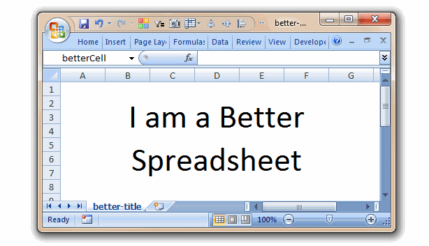
- Every spreadsheet should have a title. This should help explain “second most important rule” and allow the reader to understand what they are looking at.
- The footnote section of a spreadsheet should include the path/filename/date and creator’s name.
- Audit trail: whenever possible, formulas should be used in the spreadsheet rather than inputting numerical values. This way you, or someone else, can follow the logic of the spreadsheet.
- Assumptions: mathematical assumptions should be identified in separate cells, not buried within formulas. That way they can be printed out as required. It is very easy to forget that you have a formula that says (C5 X 200). If instead, it says (C5 X D7) and then D7 shows 200, it is less likely to forget what assumptions are included in the spreadsheet.
- Assumptions: document your assumptions. If you’re increasing a value by an inflation rate, make note that this is an inflationary increase. A few words to the right hand side of a cell can save many hours of hunting and digging at a later date.
- Unless your data source is obvious, you should document where you obtained your data. A few words to the right hand side of a cell can save many hours of hunting and digging at a later date. (Yes, you read that in the last bullet as well).
- Presentation format: all spreadsheets, should be designed so that it is easy to follow the process flow and result. Almost every spreadsheet should be presentable and understandable to senior management without additional formatting or explanation. (tips: how to design boss-proof excel sheets)
- It is okay to add notes, procedures steps or other explanations in text format within your spreadsheet. Any guidelines provided to the next person who looks at or works on the spreadsheet will be highly appreciated.
- Learn to use the intermediate level functions within Excel. These include: sum, sumif, macro’s, logic (if, then, else), auto sum, filtering, auto subtotal, sorting, charting, pivot tables, auto formatting, conditional formatting and formula auditing. None of these functions are at advanced level or particularly difficult. If you need help on how to use them; please ask someone else in the department, use the Excel help function, or look up the function on the web. The use of these functions will save you a great deal of time and make your spreadsheets more accurate.
- Do the common sense test. Look at the spreadsheet as though you didn’t create it. Does it answer the question asked? Can you follow the logic? Does the result seem OK? If all this is yes, then ask what decision will be made from knowing this information. If you can’t answer this, go back to step one.
If we summarize all these rules in one sentence, it will be,
Your spreadsheet should have a purpose, it should be well documented & easily understandable and you should make use various features in Excel to achieve this.
 Download Larry’s Rules for Better Spreadsheets Poster:
I took the liberty of putting all these 12 rules in small poster. Take a print and stick near your workspace to remind you how to make better spreadsheets.
Download it here [PDF].

Additional Material on Making Awesome Spreadsheets:
Thank you Larry
Thank you so much for sharing these rules with all of us Larry. I am sure our readers are going to dig this one 🙂
Send your tips / downloads for Reader Awesomeness Week:
You too can participate and share what you know by simply filling up online form. Be awesome. (details here)


15 Responses
There is a small problem with the link to the pdf.
Besides that – great rules!
Interesting list which is not complete but is better than nothing 😉
What should be added is:
Add a time stamp when the data was collected the last time. In that way we can evaluate if the data is still valid or if it has become obsolete.
Measure the quality of the data. If many rows lack entries for central parameters than the outcome should be treated as indications only and not as the “true”.
In this context I would address the importance of keeping it simple, very simple.
For larger solutions create manuals (i.e. help files) for them. By writing instructions on how to use larger solutions tend to reveal the logic of the solutions.
Think “Green”; instead of printing on paper print, for instance, to PDF files.
Kind regards,
Dennis
Good summary!
Except for the spreadsheet specific items, the chart could well be labeled as Rules for Making Better Charts/Graphs/Reports/Tables.
Great list with some very useful rules. In fact, I will be linking to it from my blog. One I would add is what I call my OAP rule. I always advise my clients to separate out the job into three separate stages, Obtain the data, Analyse it, Present it.
By storing the data in its raw format, analysing it using tools such as VLOOKUP and Pivot Tables and presenting it in those pivot tables or using, say, GETPIVOTDATA<, you can present the same data in any way required.
When the job is not split out in this way, the tendency is to do all this in one sheet. When you are then asked to present the data in a slightly different way, you are pretty much back to square one.
Using named ranges in formulas helps immensely, especially if someone has to decipher your formula at some distant time in the future.
Go way easy on color, both font and cell interior. Bright colors can cause severe injury to old eyes and lead to great irritation and general grumpiness. Going nuts using multiple font styles and sizes will also not endear you to someone who has to READ and WORK with your spreadsheet.
Good points made.
I’m not sure if this fits here, but I would really love to start a campaign preventing people to leave empty sheets on excel files, I always have to go over sheet2 and sheet3 just to verify I’m not missing anything. Now everybody has updated it’s preferences to start with only one sheet per book.
Am I to picky for noticing this?
@Marek: Thanks for pointing it out. I have fixed it.
@XL-Dennis: Good points. I agree that keeping your files, applications simple is key to success. Any one can complicate things, it takes guts to simplify stuff.
@Glen: Thanks for the link. I like your OAP rule 🙂 Simple and easy to use.
@notBRL: good points on using less color and fewer styles. Actually, I recommend using just 2 fonts – one for titles and one for content.
@Kaliman: Agree, I usually set one sheet as the default number from excel options. This way I dont have to delete them everytime.
nice article
Minor point I know, but “…define in one sentence or less why you are creating…” even one word is technically a sentence – you can’t have less than one sentence !
Kaliman – spot on re:leaving empty sheets. You’re quite correct – in doing any spreadsheet audit work, it is mandatory to check all sheets for data (including that old favourite hidden sheets – not to mention hidden rows and columns / data and comments formated in white font etc.)
I use to assume my spread sheets just made sense to everyone else who did not live in my head, but I shortly realized that it was not the case. And therefor I’m now a big fan of adding notes to explain my self. I also love all the little tricks I learned, you can never know too many specially since they do cut down on the amount of time you spend working. I’m very thankful for post like this one that helped me get going. I also got allot of great help form <a href=”http://www.reportingguru.com/”> Reporting Guru </a> they are a great resource when it comes to any type of reporting system
Why does the poster for Larry’s rules have the rule numbers inexplicably jump to the right side of the poster halfway through? Gross.
Problem:
“Learn to use the intermediate level functions within Excel. These include: sum, sumif, macro’s, logic (if”
‘macro’s’ is not possessive but plural, therefore: macros.
I use spread sheet (micro soft excel) in my office. so I understand what your are talking about. I always use formulas for my computations.