How to Create a Power BI Dashboard for Insurance Analytics (With Examples)
Last updated on April 6, 2025
Chandoo
Share
Facebook
Twitter
LinkedIn
1. Introduction
Insurance is a perfect industry for data analysis. There is plenty of data – right from lead generation to to underwriting to policy issuance to administration to claims processing. With a careful and well thought data strategy insurance companies can become profitable.
Power BI makes data analysis in insurance space a breeze. Whether you’re tracking profitability, claim patterns, or policy lapse rates, Power BI let’s us understand the insights and patterns buried in the data easily.
In this article, we’ll walk through how to design an impactful insurance analytics dashboard in Power BI. Let me share essential KPIs, DAX formula patterns behind key metrics, and break down a real-world design example to help you build dashboards that drive business value.
2. Why Insurance Needs Data Dashboards
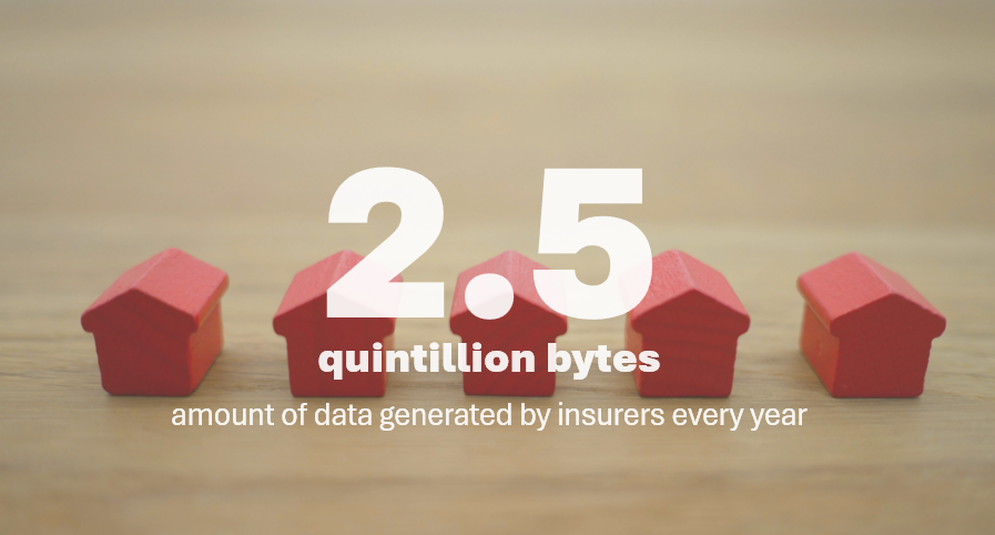
… it is estimated that 2.5 quintillion bytes of data are generated every day, with factors such as claims processing, customer interactions, and regulatory compliance contributing to this staggering figure.
Insurance is one of the most data-rich industries — every customer, policy, claim, and vehicle interaction generates data. The problem is, this data is often scattered across multiple systems, spreadsheets and silos.
Dashboards can consolidate and visualize this information in a single, interactive format. This enables decision makers & managers to:
Monitor performance across policy types, agents and regions.
Track key metrics like claim ratios, underwriting profit, and policy lapses
Spot trends and outliers (e.g., rising claims in a specific region or vehicle type)
Assess risk and profitability at both macro and micro levels
With Power BI, we can build dashboards that update automatically, allow role-based access (e.g., for underwriters, actuaries, or claims assessors), and integrate with internal data systems (databases, underwriting tables, claims processing systems, call center data etc.)
3. Why Power BI Is Perfect for Insurance Analytics
If your organization is running Microsoft stack for data & internal systems (SQL server, Azure, SharePoint, MS Office & Windows), then Power BI becomes a natural ally in the data analytics journey. Here are some of its key strengths.
Seamless Data Integration
Connects to Excel files, SQL databases, policy admin systems, and even cloud platforms like Azure and AWS. You can also merge claims, premiums, and customer data from disparate systems.
Advanced Analytics with DAX
Want to calculate claims to premium ratio? Understand what percentage of policies are lapsing from a specific region? We can use DAX to quickly and elegantly analyze data even when you have billions of records.
Interactive Visuals for All Roles
Whether you are an underwriter or claims assessor or policy administrator, you can use Power BI visuals to interact and understand data better. Power BI features like slicers, drillthrough and visual interactions coupled with RLS (Row Level Security) enables us to present right data to right people at correct time.
Security and Scalability
Row-Level Security (RLS) ensures the right people see only the data relevant to them. We can even auto-refresh data when there is new information. Managers & users of the report can subscribe and monitor KPIs with built-in alert system. What more, Power BI integrates naturally with teams & MS Power Point for easy sharing and comms of your data.
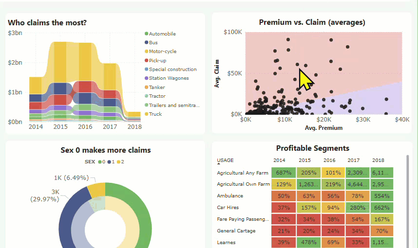
4. Example Insurance Analytics Dashboard with Power BI
Here is an excellent Insurance BI dashboard example. I created this for a recent training session and everyone loved it. You can see the “interactive” report below. Click on the slicers or select any item to see values updated. You can also check the dashboard online on Power BI service here.
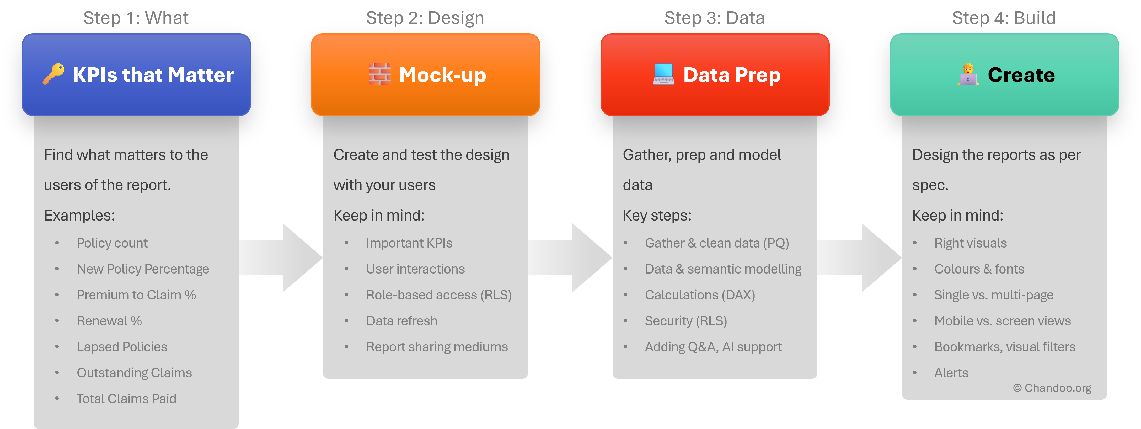
5. How to design Insurance data analytics dashboard?
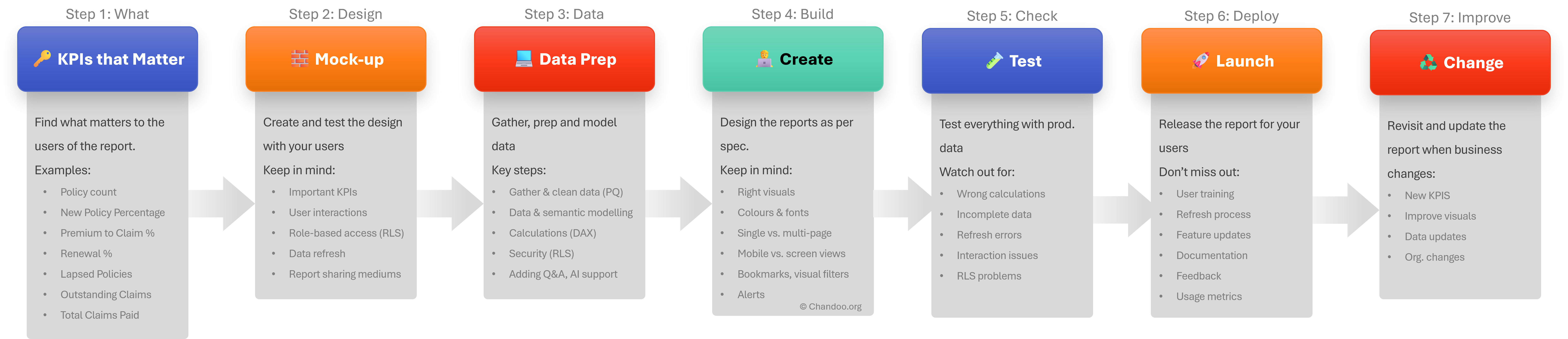
Here is how we can design a successful dashboard with BI tools like Power BI for insurance industry. The 7 key steps of the process are,
Identifying KPIs that matter
Designing the mock-up report
Data preparation
Report building
Testing the report
Deployment
Improving when your business (needs) change
I have illustrated the first 4 steps below.
6. Examples of Insurance KPIs to Track (with Context)
Identifying KPIs (Key Performance Indicators) is the first step of getting your insurance dashboard right. Here are some of the most useful and relevant KPIs for insurance data analysis.
Policy Metrics
Policies Opened: Total count of active or new policies issued during the selected period.
Policy Lapse Rate: Shows the percentage of policies not renewed — a key retention metric.
Retention Rate: Indicates customer loyalty; higher is better.
Sum Insured Booked: Total exposure covered — important for risk profiling.
Premium Metrics
Total Premium Earned: Gross income from policies.
Average Premium: Helps identify shifts in customer spending or policy value.
Net Written Premium: Premiums retained after reinsurance costs — useful for profit calculations.
Total Claims Paid: Overall amount paid across claims.
Average Claim: Indicates claim severity and possible fraud or cost control issues.
Claim Frequency: Claims per 1,000 policies — a good indicator of risk per product.
Loss Ratio: Claims Paid ÷ Premium Earned. A core metric for insurer profitability.
Underwriting & Risk Metrics
Underwriting Profit: Premiums – Claims – Expenses. Direct profit from insurance operations.
Combined Ratio: A benchmark profitability KPI; values <100% are desirable.
High-Risk Policy Ratio: Helps isolate segments or demographics prone to higher claims.
Segment & Demographic Insights
Profitable Segments (Heatmap): Product or usage segments ranked by profitability across years.
Top Claiming Demographics (e.g., by gender, region, vehicle type): Useful for targeted risk mitigation.
Vehicle Make/Model Trends: Can highlight which brands are associated with higher risk or profitability.
Together, these KPIs give decision-makers a 360° view of business health, risk exposure, and customer behavior. Each one can be calculated with a combination of base data and DAX formulas, which we’ll cover in detail in the next section.
7. Example DAX measures & formula patterns
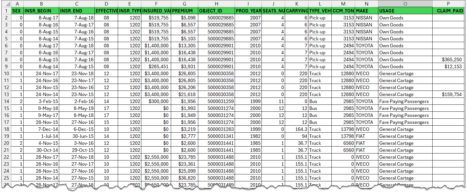
The exact syntax of DAX measures depends on your insurance data & how you modeled it in Power BI. For the sake of our discussion, assume you have policy data in below format. You can download sample Policy data from my github page. This data is sourced from Edossa Terefe on Mendeley Data.
DAX Measures for Policy Analytics:
Here is the sample code for DAX measures using the above insurance data.
// Total PoliciesPolicy Opened:=COUNTROWS(policies)// ? Total Premium collectedTotal Premium:=SUM(policies[PREMIUM])// Average premiumAvg. Premium:=DIVIDE([Total Premium], [Policies Opened])// ? Total Claims paid outTotal Claims Paid:=SUM(policies[CLAIM_PAID])// ? Ratio of Premiums to Claims - tells us how profitable we are, >100% is goodPremium to Claims Ratio:=DIVIDE([Total Premium], [Total Claims Paid])// Claim countClaim Count:=CALCULATE(policies[Policies Opened], policies[CLAIM_PAID]>0)// Average claim paidAvg. Claim:=DIVIDE([Total Claims Paid], [Policies Opened])// Simple underwriting profit, as we don't have any other expense columns.U/W Profit:=[Total Premium]-[Total Claims Paid]
8. Design Best Practices for a successful insurance dashboard
The dashboard design process is a living process. Here is the extended process with all the 7 steps. If you ignore one or few of these steps, your analytics project will fail. Here are some of the key things to keep in mind, when it comes to the “Design”.
Color: Use clear, simple colors to indicate various Key metrics & alerts. (e.g. green = profitable, red = unprofitable).
More info on demand: We can use Power BI features like tooltips to show relevant, useful information on demand. Here is a quick demo.
Filter to what matters: Use slicers, visual & page filters to narrow down data to important and useful factors.
Use simple charts: Insurance is a data rich space. So don’t clutter your reports with too many and too complex visuals. Stick to basic chart types like bars, columns, lines, cards & tables for best results. Here is a guide on how to select Power BI visuals.
9. Going Live: Sharing your Report
Congratulations on building your insurance report and thoroughly testing it (you did test everything right?). The next step is to go live with your report and share it with the users. Here is a go-live ? check list:
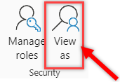
Row Level Security: Check right people can see the right data. Use the “view report as” feature in Power BI to test this. You can also try this in Power BI service.
Refresh Process: See if your refresh process runs smoothly. If needed, set up any data flows or Power Automate based automations to synchronize various systems and their data update frequencies.
Screen vs. Mobile view: Check how the report renders on mobile screens and whether important information can be accessed on smaller devices (if your users rely on this).
Analyze in Excel: Power BI offers helpful “analyze in Excel” option. If your users (power users…?) prefer this option over Power BI reports, educate them how to access the semantic model in Excel.
10. Performance Tips & Troubleshooting
If for whatever reason your Power BI insurance report is loading slow or unresponsive, try below strategies.
Optimize your data model: Power BI prefers and works faster with star-schema models over large flat tables or network models (typically found in transactional production databases). Design dimension and fact tables and set up proper star schema to optimize query and DAX performance.
Pre-aggregation: You can also use pre-aggregation of your large data tables. You can do this at data layer or with in Power BI (right click on table and use Manage Aggregations).
Minimize unwanted interactions: Interactions or cross-filtering can take a lot of time when you have lots of data and too many visuals. Customize interaction behaviors to reduce this unwanted effect and speed up your report.
Measure what is slowing things down: Using the Power BI’s performance analyzer tool, benchmark each page and interaction and see what is taking too much time. Then improve your DAX or visual set up to attack the problem.
11. Bonus: What’s Next? AI + Insurance Dashboards
Of course, no report or data analytics project is complete without AI integration. We can use CoPilot or other native AI features of Power BI to enhance our insurance dashboards. Check out below features to add a layer of AI insights to your analytics reports.
Key Influencers Visual: Use the Key Influencer visual to understand how one KPI is impacted by a set of dimensions (for example underwriting profit and how it is impacted by various vehicle makes & driver sex).
Smart Narratives: You can generate narrative statements to explain the data using “smart narrative” feature of Power BI.
CoPilot for creating measures: Use Copilot in Power BI to create necessary DAX measures from your insurance data model.
CoPilot for insights: We can also use CoPilot to find insights, abnormalities and patterns in the data or even create complete reports.
12. Conclusion
As you can see, Power BI is a great choice for analyzing and exploring insurance data. If you need help with Power BI based Insurance data analytics reach out to me. I am happy to offer our consulting services for your next analytics project.
Thank you so much for visiting. My aim is to make you awesome in Excel & Power BI. I do this by sharing videos, tips, examples and downloads on this website. There are more than 1,000 pages with all things Excel, Power BI, Dashboards & VBA here. Go ahead and spend few minutes to be AWESOME.
Read my story • FREE Excel tips book
Here is a fabulous New Year gift to you. A free 2025 Calendar Excel Template with built-in Activity planner. This is a fully dynamic and 100% customizable Excel calendar for 2025.
[...] & tracking a project plan using Gantt Charts Team To Do Lists - Project Tracking Tools Part 3: Preparing a project time line [upcoming] Part 4: Time sheets and Resource management [...]
the templates are great (I bought the combo).
What I'm missing is a way to have the project gantt chart and reporting with the data per resource, in such a way that I can also show the occupation per resource on an extended gantt chart.
So with hours entered per person per project or sub-activity, to show a gantt chart of how many hours/days a person spent on which project (or plans to spend).
Funny I have a post on the value of MS project lined up which I will post when the current monster project I'm working on finishes and I get some free time!
I'm not sure this would help with any of the projects I've worked on, closing down a to do list seems like more effort than it's worth, but it might be useful for some things. I guessing it doesn't, but does the time stamp not update when you recalculate the work book?
@Ross.. Thanks for sharing your ideas... I think to do lists are a great way to keep up with project activities and ensure accountability from individual team members, when they are implemented right.
"I guessing it doesn’t, but does the time stamp not update when you recalculate the work book?"
Your guess is right. When you change the calculation mode to "iterative", excel takes care of the nittygritties and retains older values in circular references in formulas.
[...] & tracking a project plan using Gantt Charts Team To Do Lists - Project Tracking Tools Project Status Reporting - Create a Timeline to display milestones Part 4: Time sheets and Resource [...]
[...] & tracking a project plan using Gantt Charts Team To Do Lists - Project Tracking Tools Project Status Reporting - Create a Timeline to display milestones Part 4: Time sheets and Resource [...]
[...] make sure you have read the first 4 parts of the series - Making gantt charts [project planning], team todo lists [project tracking], project time lines chart [reporting] and Timesheets and Resource Management using Excel. Also [...]
I really do not see any befit to this function in Excel unless it was somehow tied into some other chart. That is say a scheduled activities % complete is based on the to-do list.
The only way this chart would be useful is if no one was assigned none dependent task that could be done by anyone. The cases were both of these conditions are true are so few and far between it really makes this chart worthless.
@Brian... Once you have a todo list up and running, it is easy to get metrics out of it. I didnt propose it as it might look a bit too micro-management-ish.
I am able to understand what you meant by "The only way this chart would be useful is if no one was assigned none dependent task that could be done by anyone. The cases were both of these conditions are true are so few and far between it really makes this chart worthless."
What I mean is this. Lets say you have 10 task which are part of one activity/WBS that is in your schedule. One there are very few cases were many people would be assigned to complete this one scheduled activity with no direction being given who should what of the 10 task. It is poor management, and the task 90% of the time would not get done in a timely manner if say 4 people were responsible. Secondly, you are assuming all 10 task are independent of each other. You might need to do task 1 thru 3 before you can do task 4, and to do task 7 you might need to do 4 and 6. Thirdly, the time it would take to compile and then fill out the to-do-list even in limited applications is really not worth it.
I just see almost no applications why a team would need to inform others separate from the schedule that they have completed a task on a to-do list unless anyone of the 4 people could of completed that task.
My point is, there might be a few very limited applications for this type of list but this list would be worthless as a Project Management tool in every other case.
However, change this from a to-do-list to a document change log and it is perfect. Instead of to-do it is the documents name or summary of what changed in the document. The person is who edited the document, and the time stamp is when they checked it in. But I do not know why you would use excel when there is free software you can use commercially that is 10 times better that does document management.
I think using excel to do Project Management over a real Project Management application is a bad idea. Unless you are running a very small, simple project, the time and effort is a lot more to use excel compared to the cost of the Project Management software.
This comes back to my point, I love your site, however, just because you can do something in excel does not mean you should do it. To often the time it takes to use excel is wasted 10 times over from the cost of doing it in an application designed to for the specific application.
@Brian: The todo list mentioned here is meant to keep track of all the tasks for which detailed planning is not necessary but some sort of tracking is needed. These are not be confused with project activities (a la gantt chart).
I like your suggestion about using this as a document tracker. Pretty cool use.
Coming to your point about excel as a real project management tool, well, I have my views, but in a serious project environment, it would surely payoff to have a dedicated project management application.
[...] & tracking a project plan using Gantt Charts Team To Do Lists – Project Tracking Tools Project Status Reporting – Create a Timeline to display milestones Time sheets and Resource [...]
[...] Preparing & tracking a project plan using Gantt Charts Part2: Team To Do Lists – Project Tracking Tools Part3: Project Status Reporting – Create a Timeline to display milestones Part4: Time sheets and [...]
I've combined this with the issue tracker since I like the automatic date stamp, but one thing I'm noticing is that I can't replicate the chart that goes along with the issue tracker because the cells that are referenced have the formula that inserts the time stamp instead of a the actual date value. All the dates of the last 30 days display 0 when they should have a value.
I have edited the chart so that my team members can update the percentage completion of the assigned tasks. When the cell is updated, i would like the time stamp to update. How would I manipulate the formula to update whenever the drop-down list is changed?
Excel is great however sometimes you need to get a better idea of what tasks each person on your team is working on at any given time. We've developed a web app that can do just that! Each person has a list of tasks, listed in the order they have to complete them.
I want to expand the database through excel where i am working on 11 cities as of now and i want to expand it upto 50 cities and hence forth the data related to it will also expand so i want to make it precise where i can get updates also that this work is required to be done at that particular day or date
Thanks for making all of this information available for free. I am currently using excel to track everything for the first time. I later plan to output our information here with a more visual presentation. Wish me luck!
Can some one point me out to some additional direction on the "Who Finished it?" column? Something more 'basic' for a newbie excel guy? lol I got everything else working on this tutorial but that column. I can't seem to recreate it and I know a lot of it is due to lack of knowledge with VB code. I'd like to recreate this column very much 🙁
I know u all are the best programmers in the world!!! that's I am here to rectify my issues. here is my question please ans me as soon as possible before 8-3-2017 its really urgent.
I have a project named the production tracker.
1) I require the user form which shows the names of the Associates which are linked to the different tracks. when the user is selected the particular track related details and dropdowns should appear.
2) I need to track the associate needs how much of the time to complete the particular task. with start stop and pause and resume timer.
3) It should display the daily count of the production and save the data to the another Excel file.
this production tracker should save all the data no matter how many people logs in into it.
Please help me for this it will be very appreciated.
28 Responses to “Team To Do Lists – Project Tracking Tools using Excel [Part 2 of 6]”
[...] & tracking a project plan using Gantt Charts Team To Do Lists - Project Tracking Tools Part 3: Preparing a project time line [upcoming] Part 4: Time sheets and Resource management [...]
the templates are great (I bought the combo).
What I'm missing is a way to have the project gantt chart and reporting with the data per resource, in such a way that I can also show the occupation per resource on an extended gantt chart.
So with hours entered per person per project or sub-activity, to show a gantt chart of how many hours/days a person spent on which project (or plans to spend).
[...] from: Team To Do Lists - Project Tracking Tools using Excel [Part 2 of 6] 25 Jun 09 | [...]
Hi Chandoo,
Funny I have a post on the value of MS project lined up which I will post when the current monster project I'm working on finishes and I get some free time!
I'm not sure this would help with any of the projects I've worked on, closing down a to do list seems like more effort than it's worth, but it might be useful for some things. I guessing it doesn't, but does the time stamp not update when you recalculate the work book?
keep up the good work!
Ross
@Ross.. Thanks for sharing your ideas... I think to do lists are a great way to keep up with project activities and ensure accountability from individual team members, when they are implemented right.
"I guessing it doesn’t, but does the time stamp not update when you recalculate the work book?"
Your guess is right. When you change the calculation mode to "iterative", excel takes care of the nittygritties and retains older values in circular references in formulas.
[...] Project Management in Excel [New Series] - Gantt Charts | To Do Lists [...]
[...] & tracking a project plan using Gantt Charts Team To Do Lists - Project Tracking Tools Project Status Reporting - Create a Timeline to display milestones Part 4: Time sheets and Resource [...]
Hi Chandoo,
The template give me lot of convenience to monitor the thing to do. It simple. Thank You
[...] & tracking a project plan using Gantt Charts Team To Do Lists - Project Tracking Tools Project Status Reporting - Create a Timeline to display milestones Part 4: Time sheets and Resource [...]
[...] make sure you have read the first 4 parts of the series - Making gantt charts [project planning], team todo lists [project tracking], project time lines chart [reporting] and Timesheets and Resource Management using Excel. Also [...]
Chandoo,
I really do not see any befit to this function in Excel unless it was somehow tied into some other chart. That is say a scheduled activities % complete is based on the to-do list.
The only way this chart would be useful is if no one was assigned none dependent task that could be done by anyone. The cases were both of these conditions are true are so few and far between it really makes this chart worthless.
@Brian... Once you have a todo list up and running, it is easy to get metrics out of it. I didnt propose it as it might look a bit too micro-management-ish.
I am able to understand what you meant by "The only way this chart would be useful is if no one was assigned none dependent task that could be done by anyone. The cases were both of these conditions are true are so few and far between it really makes this chart worthless."
Can you explain?
"Chandoo"
What I mean is this. Lets say you have 10 task which are part of one activity/WBS that is in your schedule. One there are very few cases were many people would be assigned to complete this one scheduled activity with no direction being given who should what of the 10 task. It is poor management, and the task 90% of the time would not get done in a timely manner if say 4 people were responsible. Secondly, you are assuming all 10 task are independent of each other. You might need to do task 1 thru 3 before you can do task 4, and to do task 7 you might need to do 4 and 6. Thirdly, the time it would take to compile and then fill out the to-do-list even in limited applications is really not worth it.
I just see almost no applications why a team would need to inform others separate from the schedule that they have completed a task on a to-do list unless anyone of the 4 people could of completed that task.
My point is, there might be a few very limited applications for this type of list but this list would be worthless as a Project Management tool in every other case.
However, change this from a to-do-list to a document change log and it is perfect. Instead of to-do it is the documents name or summary of what changed in the document. The person is who edited the document, and the time stamp is when they checked it in. But I do not know why you would use excel when there is free software you can use commercially that is 10 times better that does document management.
I think using excel to do Project Management over a real Project Management application is a bad idea. Unless you are running a very small, simple project, the time and effort is a lot more to use excel compared to the cost of the Project Management software.
This comes back to my point, I love your site, however, just because you can do something in excel does not mean you should do it. To often the time it takes to use excel is wasted 10 times over from the cost of doing it in an application designed to for the specific application.
@Brian: The todo list mentioned here is meant to keep track of all the tasks for which detailed planning is not necessary but some sort of tracking is needed. These are not be confused with project activities (a la gantt chart).
I like your suggestion about using this as a document tracker. Pretty cool use.
Coming to your point about excel as a real project management tool, well, I have my views, but in a serious project environment, it would surely payoff to have a dedicated project management application.
[...] & tracking a project plan using Gantt Charts Team To Do Lists – Project Tracking Tools Project Status Reporting – Create a Timeline to display milestones Time sheets and Resource [...]
Chandoo,
Wonder how the timestamp column will maintain its previous data. Both Today() and Now() functions will update as and when the next timestamp happens.
[...] Preparing & tracking a project plan using Gantt Charts Part2: Team To Do Lists – Project Tracking Tools Part3: Project Status Reporting – Create a Timeline to display milestones Part4: Time sheets and [...]
I've combined this with the issue tracker since I like the automatic date stamp, but one thing I'm noticing is that I can't replicate the chart that goes along with the issue tracker because the cells that are referenced have the formula that inserts the time stamp instead of a the actual date value. All the dates of the last 30 days display 0 when they should have a value.
Is there a way around this?
I have edited the chart so that my team members can update the percentage completion of the assigned tasks. When the cell is updated, i would like the time stamp to update. How would I manipulate the formula to update whenever the drop-down list is changed?
[...] … ??? To Do List [...]
Excel is great however sometimes you need to get a better idea of what tasks each person on your team is working on at any given time. We've developed a web app that can do just that! Each person has a list of tasks, listed in the order they have to complete them.
HII,
I want to expand the database through excel where i am working on 11 cities as of now and i want to expand it upto 50 cities and hence forth the data related to it will also expand so i want to make it precise where i can get updates also that this work is required to be done at that particular day or date
Thanks for making all of this information available for free. I am currently using excel to track everything for the first time. I later plan to output our information here with a more visual presentation. Wish me luck!
Can some one point me out to some additional direction on the "Who Finished it?" column? Something more 'basic' for a newbie excel guy? lol I got everything else working on this tutorial but that column. I can't seem to recreate it and I know a lot of it is due to lack of knowledge with VB code. I'd like to recreate this column very much 🙁
Dear Chandoo,
Thanks for the team to do list, kindly let me know how to set the column who " finished it " from another work sheet
Hi Chandoo,
Unable to download it - can you please check the link and confirm.
Great inhisgt! That's the answer we've been looking for.
Hi Team,
I know u all are the best programmers in the world!!! that's I am here to rectify my issues. here is my question please ans me as soon as possible before 8-3-2017 its really urgent.
I have a project named the production tracker.
1) I require the user form which shows the names of the Associates which are linked to the different tracks. when the user is selected the particular track related details and dropdowns should appear.
2) I need to track the associate needs how much of the time to complete the particular task. with start stop and pause and resume timer.
3) It should display the daily count of the production and save the data to the another Excel file.
this production tracker should save all the data no matter how many people logs in into it.
Please help me for this it will be very appreciated.
you can directly email me on my mail ID: tusharkch694@gmail.com