
I have an exciting news & massive post for you.
![]() As of Jan 19, 2011, our little blog has registered our 20,000th RSS Subscriber. While this is not a huge achievement or anything, It certainly calls for celebration. I am so happy to see our mission to make people awesome in Excel is reaching out to more people everyday. Thank you.
As of Jan 19, 2011, our little blog has registered our 20,000th RSS Subscriber. While this is not a huge achievement or anything, It certainly calls for celebration. I am so happy to see our mission to make people awesome in Excel is reaching out to more people everyday. Thank you.
To celebrate this milestone, I am doing a massive post with 220 Excel tips, tricks, tutorials & templates.
Share on Facebook
Tweet This!
Join our FREE Newsletter
Add Chandoo.org RSS Feed to your Newsreader
These 220 tips are broken down in to following areas. Click on the links to access them.
- Formulas [52 tips]
- Formatting & Conditional Formatting [36 tips]
- Charting [60 tips & templates]
- Tables & Pivot Tables [15 tips]
- Using Excel [47 tips]
- Free Downloads [5 downloads]
- Recommended Resources [5 resources]
Formulas [52 tips]
Learn 5 tips on how to use IF formula, CHOOSE Formula in Excel. [link]
Find out how you can sum or count values that meet a criteria. A must have tool for any analyst or manager using Excel. [link]
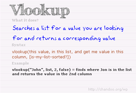
Lookup formulas are famous for a reason. In this article, you will learn how to use them to find anything, well, almost! [link]
While VLOOKUP is awesome, it can-not go left. That is why you must learn how to use INDEX+MATCH combination. [link]
OFFSET formula becomes very important if you ever plan to make an excel dashboard. So go ahead and learn. [link]
I just love SUMPRODUCT formula. And read this to find out why. [link]
SUMIFS & COUNTIFS formulas are like Swiss army knifes. They can do pretty much anything and still look slick. [link]
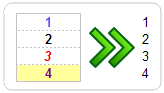
Find out how you can use ROWS or COLUMNS formulas to generate sequential numbers [link]
Learn how to calculate moving average using Excel. [link]

Learn how to write formulas to test Between condition. [link]
Calculate weighted average using Excel formulas [link]
Learn to write either-or (XOR) conditions using excel formulas [link]
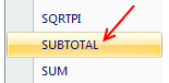
SUBTOTAL is a powerful & low profile formula. In this article we explore the possibilities and show you some cool examples. [link]

If you use Excel to do anything more than counting your chickens, chances are you use VLOOKUP quite often. Read this to learn 6 important VLOOKUP tips. [link]
15 Formulas for Advanced Users
Anyone can write a SUM or IF formula. But how well do you know some of the powerful formulas in Excel. Read this to know 15 very useful formulas in Excel. [link]
10 Formulas & Tips for working with Date & Time in Excel
Dealing with dates is not something only for young people. Analysts and managers work with dates & times all the time. In this article, we explain 10 powerful ways in which you can work with Excel Date & Time values. [link]
Formatting & Conditional Formatting [36 tips]
16 Paste Special Tips & Tricks
Paste special is one of my favorite features in Excel. In this article, we explore various ways paste special can save us time. [link]
5 Ways to become Awesome using Conditional Formatting

Conditional formatting is your way of asking excel to change a cell’s formatting when a certain condition is met. You can use it do some pretty awesome things. In this classic chandoo.org article, learn 5 ways to use conditional formatting to become awesome. [link]
15 Fun things you can do in Excel in less than 15 seconds
How well do you know Excel? See this list to find out 15 simple but fun things you can do in less than 15 seconds. [link]
Charting [60 tips]
Thermo-meter Chart – Excel Tutorial & Free Template
Prepare a thermo-meter chart to compare actual performance with targets. [link]
Bullet Graph – Excel Tutorial & Free Template
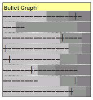
Learn how to make bullet graphs using Excel. [link]
Comparison chart – Excel Tutorial & Free Template
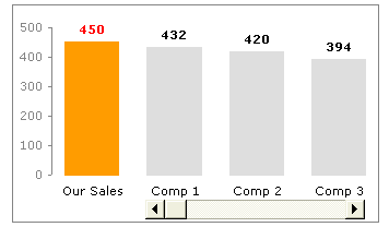
Learn how to make an interactive comparison chart to compare one value with several others. [link]
Pareto Chart – Excel Tutorial & Free Template
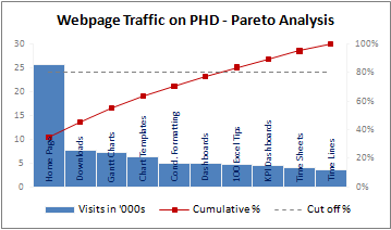
Pareto analysis is very important in quality control, decision making etc. In this tutorial learn how to create pareto charts using Excel. [link]
Water Fall Chart – Excel Tutorial & Free Template

Water-fall charts are a good way to visualize how various components contribute to the overall outcome. Like how net profit is arrived etc. Know how to make these charts using Excel. [link]
Panel Charts – Excel Tutorial & Free Template
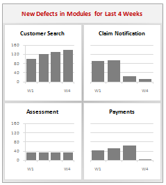
What are panel charts and how to make them using Excel? [link]
Gantt Chart – Excel Tutorial & Free Template
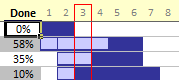
Gantt charts are an excellent way to plan for a project and track it. Learn how to use Excel’s conditional formatting, cell grid structure etc. to make Gantt charts. [link]
Project Timeline Chart – Excel Tutorial & Free Template
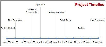
Timeline charts are a great for showing project progress and macro level picture. In this article, we show you how to make such milestone / timeline charts using Excel. [link]
Burn Down Chart – Excel Tutorial & Free Template
Burn down charts help you in visualizing how far the project has progressed. Learn how to create these charts using Excel. [link]
Dynamic Chart – simple example – Excel Tutorial & Free Template
Learn how to make simple dynamic chart using Excel data validation feature. [link]
Dynamic Chart with Checkboxes – Excel Tutorial & Free Template
Learn how to make a dynamic chart with checkboxes and interactivity. [link]
More Dynamic Charts – Excel Tutorial & Free Template
Get more examples, templates & tutorials on Dynamic charts using Excel [link]
In-cell Charts – Excel Tutorial & Free Template
Get more examples, templates & tutorials on incell charts using Excel [link]
Make compelling, effective charts by following these 5 simple rules. [link]
5 Chart formatting tips that cost you nothing and make your charts look cool. [link]

Come what may, do not make any of these 6 types of charts. They are ugly. Period. [link]
Charting Lessons from Optical Illusions
We come across optical illusions all the time. But do you know they also teach valuable lessons on chart formatting & Selection? [link]

Pie charts are ineffective in all but few scenarios. But how do you show composition of several values? Read this post to find 10 alternatives to pie charts. [link]
Back in 2009, we ran a contest on how to visualize budget vs. actual data. You can see 14 different charting ideas in this article. [link]
Tables & Pivot Tables [15 tips]
Excel tables are a new and powerful feature introduced in Excel 2007. Ever since I learned them, I have been much more productive while making dashboards or reports. Read these 10 tips to learn how to use Excel tables better. [link]
Pivot tables are a great way to analyze data and make reports. In this post, learn 5 powerful pivot table tricks & tips. [link]
Using Excel [47 tips]
Learn how to use Double click feature on your mouse to save time and become awesome in Excel. [link]

Learn how to use Mouse to become even more productive in Excel [link]
10 Ways to make your Excel Workbooks Boss-proof
While not all bosses are like Dilbert’s boss, we do realize that they like to press things and test. So it is a good idea to make your workbooks boss-proof. Learn 10 tips to do so. [link]
15 Excel Productivity Tips & Tweaks
Do you know that you can customize excel to make yourself more productive? You can turn off annoying features and set default formatting options to save precious time and make better worksheets all the time. Read this post to learn 15 such customizations & productivity tips. [link]
12 Rules for Making Better Spreadsheet Models
It is a good idea to follow a set of principles while designing a complex workbook model or dashboard. In this post you can find 12 rules for making better excel workbooks. [link]
Free Downloads [5 tips]
Using this handy one-pager, you can quickly remember the syntax for the most used formulas. Also find out what to do if there is an error. [link]
Get this e-book (available only on subscription to my newsletter) to enjoy 95 excel tips & tricks. [link]
Learn how to use Excel 2007 Ribbon
Learn how to use Excel 2007’s ribbon based user interface using this handy guide. [link]
12 Rules for Better Spreadsheets – Poster

Larry’s spreadsheet rules in a simple poster. Very useful if you work on spreadsheet models often [link]
Use this cheat-sheet to write better VLOOKUP formulas [link]
Recommended Resources [5 tips]
Join my Excel school program to learn Excel in a step-by-step fashion and become awesome. We have 23 hours of instruction on Excel & 8 hours of lessons on Dashboards. Click here to learn more. [link]
Excel Project Management Templates
Get a copy of my Excel Project Management templates so that you can save time and become a better project manager. The template pack has 24 templates to take care of various key areas of project management like planning, status reporting, tracking, timesheets etc. [link]
Learn 75 Excel Formulas [e-book]
In this easy to understand e-book, I explain 75 very important Excel formulas in plain English. Get a copy today and learn something new. [link]
Jon Peltier’s Charting Utilities

I recommend Jon’s charting utilities. You can make some of the custom charts that are not part of Excel charting gallery in minutes using his tools. They can save you lots of time and money. [link]
Excel Everest Training Kit for Learning Excel
I recommend using Sean’s Excel Everest if you are an Excel beginner. This is an interactive excel workbook designed to teach you various features of Excel. You can read my review. [link]
Thank you
Thanks for your support to Chandoo.org. Without you this milestone or anything else that we achieve is meaningless. I wish you even more awesomeness and knowledge in the months and years to come.
Share on Facebook
Tweet This!
Join our FREE Newsletter
Add Chandoo.org RSS Feed to your Newsreader


14 Responses
Congrats on the milestone- your work is such a high quality and presented in such a fun way that I am convinced that this is only the beginning!
It’s a big deal chandoo. Congrats man.
Personally I think you blog is slipping. You have moved away from what people want (look at your ‘TOP EXCEL & CHARTING TIPS’ list) and have to less interesting topics (look at your ‘LATEST EXCEL TIPS’ list).
Don’t get me wrong. I love the stuff in your ‘TOP EXCEL & CHARTING TIPS’
Bookmarked. Thanks.
Awesome post, congratulations on the milestone.
Hey, that could have been me! I found you yesterday and signed up!
@All: thank you for your blessings and support.
@Another Steve: Thanks for your feedback. As I proudly state in my disclaimer, I prefer to write what I want. Once in a while I get brilliant ideas and I share them openly. But most of the time my ideas and techniques are quite simple.
You are right that I have moved away from full blown tutorials. But I am hoping to revive these in this year.
Congratulation Chandoo,
ur site inspired me to become awesome in excel, and also celebrating the achievement with all the team members is very nice,
Cheers
Hi , This is Jayant
Many Many congratulations …………..
You are not Chandoo , you are champ … All the best & good bless you
Congragulations Mr Chandoo
I am happy to be one of 20K member. You have all the reason to celebrate since you are in the process of teaching others…. May god bless you and your family.
Regards
V S Venkatraman
Hi Chandoo and team,
Congratulations on your landmark. This site has now become my go to for anything in excel.
For people like me who have recently joined via newsletter, we are missing out on the tips that have already been posted in the past. Apart from manually visiting each tip, is there any other way by whcih I can get earlier tips (from the archive?)? Fro example, mailed to me on a daily basis?