All articles with 'Microsoft Excel Formulas' Tag
A better chart to visualize “Best places to live” – Top 100 cities comparison Excel chart
Recently, I saw this chart on Economist website.
It is trying to depict how various cities rank on livability index and how they compare to previous ranking (2014 vs 2009).
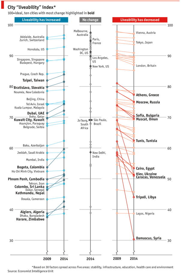
As you can see, this chart is not the best way to visualize “Best places to live”.
Few reasons why,
- The segregated views (blue, gray & red) make it hard to look for a specific city or region
- The zig-zag lines look good, but incredibly hard to understand % changes (or absolute changes)
- Labels are all over the place, thus making data interpretation hard.
- Some points have no labels (or ambiguous labels) leading to further confusion.
After examining the chart long & hard, I got thinking.
Its no fun criticizing someones work. Creating a better chart from this data, now thats awesome.
Continue »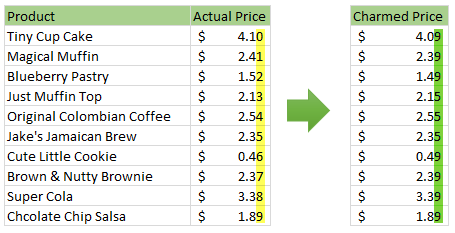
Here is a charming little problem to kick start your day.
Lets say you run a cute little bakery around the corner. Since you want your prices to look charming, you have a policy to round them down or up based on below rule.
If the price ends with 0, 1 or 2 cents, round it down to 9 cents.
If the price ends with 3, 4 or 5 cents, round it up to 5 cents.
If the price ends with 6, 7, 8 or 9 cents, round it up to 9 cents.
For example,
So how do you round to nearest charmed price? You could do it manually. But you would rather bake a few more of those Tiny Cup Cakes than waste time rounding the prices. So you want an automatic way to round prices. This is where Excel helps.
Continue »ABC Inventory Analysis using Excel
ABC analysis is a popular technique to understand and categorize inventories. Imagine you are handling inventory at a plant that manufactures high-end super expensive cars. Each car requires several parts (4,693 to be exact) to assemble. Some of these parts are very costly (say few thousand dollars per part), while others are cheap (50 cents per part). So how do you make sure that your inventory tracking efforts are optimized so that you waste less time on 50 cent parts & spend more time on costly ones?
This is where ABC analysis helps.
We group the parts in to 3 classes.
- Class A: High cost items. Very tight control & tracking.
- Class B: Medium cost items. Tight control & moderate tracking.
- Class C: Low cost items. No or little control & tracking.
Given a list of items (part numbers, unit costs & number of units needed for assembly), how do we automatically figure which class each item belongs to?
And how do we generate above ABC analysis chart from it?
Continue »Thank you, Houston meetup & Bonus tip
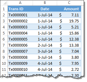
My mom will be very unhappy with this post. She always told me to focus on one thing at a time. But in this post we are talking about 3 things, not one. Sorry mom.
1. Thank you
I want to thank you for visiting chandoo.org & supporting us.
As I am about to leave to USA for attending Excelapalooza conference, I couldn’t help but be amazed at how much you have given me & my family. Almost 4.5 years ago, when I left my plush corporate job to work full time on Chandoo.org, I had no clue how the future will unfold. Today my heart is full of happiness, my family is secure, my site has grown by heaps and our community (especially you) is awesome.
Without your enthusiasm to learn and keen desire to become awesome, I would not have a job (of running this website). You inspire me to learn new things everyday so that I can share them with you.
Thank you for all the visits, clicks, comments, emails, tweets, likes, signups, purchases & love.
Thank you.
Continue »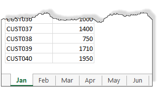
We all know about the MAX formula. But do you know about 3D Max?
Sounds intriguing? Read on.
Lets say you are the sales analyst at ACME Inc. Your job involves drinking copious amounts of coffee, creating awesome reports & helping ACME Inc. beat competition.
For one of the reports, you need to find out the maximum transactions by any customer across months.
But there is a twist in the story.
Your data is not in one sheet. It is in multiple sheets, one per month.
Continue »Convert fractional Excel time to hours & minutes [Quick tip]
![Convert fractional Excel time to hours & minutes [Quick tip]](https://img.chandoo.org/q/convert-fraction-to-hours-minutes-in-excel.png)
Time for another quick Excel tip.
Lets say the park near your house rents tennis courts by hour. And they charge $10 per hour. At the end of an intense tennis playing week, Linda, the tennis court manager called you up and said you need to pay $78 as rent for that week.
How many hours did you play?
Of course 78/10 = 7.8 hours.
But we all know that 7.8 hours makes no sense.
We also know that 7.8 hours is really 7 hours 48 minutes.
So how to convert 7.8 hrs to 7:48 ?
Continue »Mapping relationships between people using interactive network chart

Today, lets learn how to create an interesting chart. This, called as network chart helps us visualize relationships between various people.
Demo of interactive network chart in Excel
First take a look at what we are trying to build.
Looks interesting? Then read on to learn how to create this.
Continue »What is the average speed of this road trip? [homework]
Its homework time again. This time, lets tackle an interesting & everyday problem. Lets introduce our protagonist of the story – Jack. Jack likes long road trips, smell of freshly brewed Colombian coffee, clicky-clack sound of his computer keyboard. He hates toll plazas (they slow him down) & Potassium permanganate. And oh yes, Jack is […]
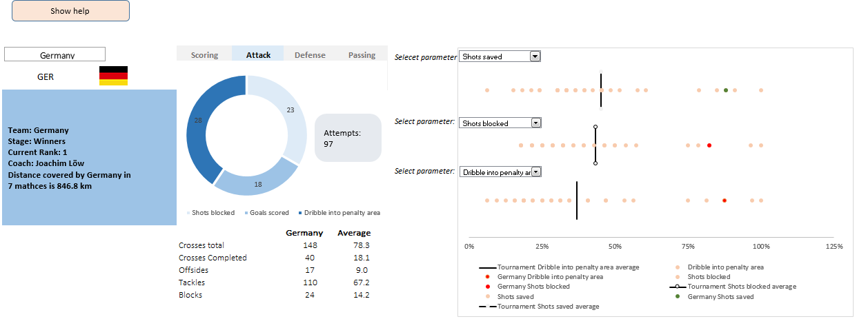
Continue »This is a guest post by Krishna, a football lover & one of our readers.
The wait for lifting the most valued priced in football for Germans was finally over. For a football fan, world cup is best time that is scheduled every four years and that if your favorite team lifting the trophy is like your crush is going on a date with you. 🙂
A sneak-peek at the final dashboard
Here is the final dashboard (it has more functionality than depicted). Click on it to enlarge.
Continue »
Ok people. Let me tell you that this post is almost not about Excel. It is about how one Excel blogger’s (yours truly) dream of long distance cycling came true. So sit back, grab your favorite drink and read between sips.
So what is this all about?
Last Sunday (27th July) & Monday (28th), I finished my first ever 200KM bicycle ride. I rode for a little more than 12 hours, burned 5,179 calories & rode 206 kilometers.
It is definitely one of the most memorable, tiresome & uplifting experiences in my life. So naturally, I want to share the story with you.
Continue »CHOOSE() me, an introduction to Excel CHOOSE function
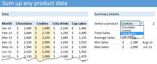
Today lets learn about Excel CHOOSE() function.
CHOOSE eh? What does it do?
To understand CHOOSE() and appreciate its uses, lets invent an imaginary boos-subordinate pair.
Jasmine is the boss. She is, well, lets call her peculiar. She likes olives, Tuesdays & color Red. She hates potatoes.
Martin is the faithful butler of Jasmine. He is obedient, quirky and tall. He likes lotuses, Fridays & color blue. He hates potassium.
Enter Jasmine’s scarf problem:
Jasmine likes to wear a different colored scarf every weekday. She likes to wear Red colored scarf on Mondays & Tuesdays. She likes to put on the blue polka dot scarf on Wednesdays. On Thursdays, she wears her olive colored scarf. On Fridays & Saturdays, she prefers the lovely orange blue scarf. Sundays are no scarf days.
No wonder she is peculiar.
Continue »Top 10 things we struggle to do in Excel & awesome remedies for them

Recently we asked you, what do you struggle doing in Excel? 170 people responded to this survey and shared their struggles. In this post, lets examine the top 10 struggles according to you and awesome remedies for them.
Continue »Hello everyone. Stop reading further and go fetch your helmet. Because what lies ahead is mind-blowingly awesome.
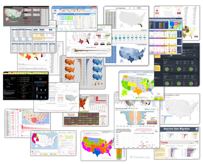
About a month and half ago, we held our annual dashboard contest. This time the theme is to visualize state to state migration in USA. You can find the contest data-set & details here.
We received 49 outstanding entries for this. Most of the entries are truly inspiring. They are loaded with powerful analysis, stunning visualizations, amazing display of Excel skill and design finesse. It took me almost 2 weeks to process the results and present them here.
Click on the image to see the entries.
Continue »Matching transactions using formulas [Accounting]
![Matching transactions using formulas [Accounting]](https://img.chandoo.org/f/example-of-matching-transactions.png)
Imagine you are the head of Accounts Receivable department at a large company. Drab, I know, But humor me and imagine.
Now, every month you get a transaction report.
And you want to know which numbers are matching up.
i.e, if your company gave Vendor-0002 $872.34 on 1st of April, 2014 and your received below payments from them subsequently,
- $427.77 on 1st April
- $152.88 on 2nd April
- $291.69 on 2nd April
Then you consider the account matched since the total received is same as total payable.(427.77 + 152.88 + 291.69 = 872.34).
Continue »CP010: Averages are Mean – 8 Techniques for making your analysis above average
Podcast: Play in new window | Download
Subscribe: Apple Podcasts | Spotify | RSS
This is a continuation of Session 9 – Averages are mean
In the earlier episode, we talked about AVERAGE and why it should be avoided. In this session, learn about 8 power analysis techniques that will lift your work above averages.
In this podcast, you will learn,
- Re-cap – Why avoid averages
- 8 Techniques for better analysis
- #1: Start with AVERAGE
- #2: Moving Averages
- #3: Weighted Averages
- #4: Visualize the data
- …
- Conclusions

