Sales reports and dashboards are very common in any company. There are several ways in which you can visualize sales data to understand the trends and sales performance. So in November, I have asked you to visualize sales data using sample data. The visualization challenge #2, sponsored by Zoho Reports generated a huge buzz around the community and fetched 32 incredible entries. The response was so overwhelming that it took me almost 24 hours to write this post.
Thanks everyone for participating and making this a huge learning experience for everyone. Personally I have learned several useful dashboard and charting tricks. I will be sharing some of these lessons with all of you in the coming weeks.
How read this post?
This post is HUGE, I mean 2600 words huge. So you may want to maximize your browser window and fill up your coffee mug. Each of the 32 entries start with a title including authors name and tools used. Each entry includes a small image of the dashboard along with a link to see bigger version. All dashboards have links to original source files for you to download and play with.
Please note that these files are copyrighted to original authors and you cannot use them for commercial purposes.
I have included 3 comments against each entry based on my understanding of dashboard. Please share your opinions and reviews using the comments section of this post.
Javascript based Sales Dashboard by Ahmad (Option 01)
![]() larger version |
My Comments:
|
Excel based Sales Dashboard by Aires (Option 02)
![]() larger version |
My Comments:
Download Source Files: Link 1 |
Excel based Sales Dashboard by Ajay (Option 03)
![]() larger version |
My Comments:
Download Source Files: Link 1 | Link 2 [Ajay’s website] |
Excel based Sales Dashboard by Alex Kerin (Option 04)
![]() larger version |
My Comments:
Download Source Files: Link 1 | Link 2 | Link 3 [Alex Kerin’s website] |
Excel based Sales Dashboard by Arti (Option 05)
![]() larger version |
My Comments:
Download Source Files: Link 1 | Link 2 [Arti’s website] |
Excel Dashboard Training by Chandoo.org
![]() |
My Comments:
|
Excel based Sales Dashboard by Cole Burdette (Option 06)
![]() larger version |
My Comments:
Download Source Files: Link 1 |
Excel-Palo based Sales Dashboard by Cuboo (Option 07)
![]() larger version |
My Comments:
Download Source Files: Link 1 [Cuboo’s website] |
Excel based Sales Dashboard by Duezzz (Option 08)
![]() larger version |
My Comments:
Download Source Files: Link 1 |
Jmp based Sales Dashboard by Erin Vang (Option 09)
![]() larger version |
My Comments:
Download Source Files: Link 1 | Link 2 | Link 3 | Link 4 [Erin Vang’s website] |
Excel based Sales Dashboard by Esteban (Option 10)
![]() larger version |
My Comments:
|
Excel based Sales Dashboard by Hernan (Option 11)
![]() larger version |
My Comments:
Download Source Files: Link 1 |
Excel based Sales Dashboard by Karimmo (Option 12)
![]() larger version |
My Comments:
|
Excel based Sales Dashboard by Karimmo (Option 13)
![]() larger version |
My Comments:
|
Excel based Sales Dashboard by Karimmo (Option 14)
![]() larger version |
My Comments:
Download Source Files: Link 1 |
Excel based Sales Dashboard by Karimmo (Option 15)
![]() larger version |
My Comments:
|
Excel based Sales Dashboard by Karimmo (Option 16)
![]() larger version |
My Comments:
Download Source Files: Link 1 |
Excel based Sales Dashboard by Leandro (Option 17)
![]() larger version |
My Comments:
Download Source Files: Link 1 [Leandro on twitter] |
Excel based Sales Dashboard by Lee (Option 18)
![]() larger version |
My Comments:
Download Source Files: Link 1 |
Excelcius based Sales Dashboard by Mahesh (Option 19)
![]() larger version |
My Comments:
Download Source Files: Link 1 |
Excel based Sales Dashboard by Mahesh (Option 20)
![]() larger version |
My Comments:
Download Source Files: Link 1 |
Excel based Sales Dashboard by Mahesh (Option 21)
![]() larger version |
My Comments:
Download Source Files: Link 1 |
Excel based Sales Dashboard by Martin (Option 22)
![]() larger version |
My Comments:
Download Source Files: Link 1 |
Excel based Sales Dashboard by Matt Cloves (Option 23)
![]() larger version |
My Comments:
Download Source Files: Link 1 |
Excel based Sales Dashboard by Miguel (Option 24)
![]() larger version |
My Comments:
Download Source Files: Link 1 |
Excel based Sales Dashboard by Nick (Option 25)
![]() larger version |
My Comments:
Download Source Files: Link 1 |
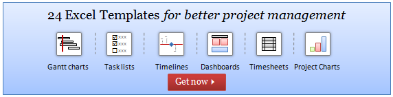
Project Management Dashboards (recommended product)
Excel based Sales Dashboard by Pawel (Option 26)
![]() larger version |
My Comments:
Download Source Files: Link 1 |
Excel based Sales Dashboard by Pompadour (Option 27)
![]() larger version |
My Comments:
Download Source Files: Link 1 [Pompadour’s website] |
Excel based Sales Dashboard by Stephane (Option 28)
![]() larger version |
My Comments:
Download Source Files: Link 1 | Link 2 [Stephane’s website] |
Flot-Jquery-Ajax based Sales Dashboard by Steven Ng (Option 29)
![]() larger version |
My Comments:
Download Source Files: Link 1 | Link 2 | Link 3 | Link 4 [Steven Ng’s website] |
Excel based Sales Dashboard by Tessaes (Option 30)
![]() larger version |
My Comments:
|
Tableau based Sales Dashboard by Edouard (Option 31)
![]() larger version |
My Comments:
Download Source Files: Link 1 |
Excel based Sales Dashboard by Faseeh (Option 32)
![]() larger version |
My Comments:
Download Source Files: Link 1 |
Excel Dashboard Toolkit (recommended product)
Tutorials & Examples to Make Excel Dashboards
Thank you everyone
Thanks everyone once again for participating. All these entries are truly world class. Such beautiful display of skill. Thank you so much for teaching me how to make better dashboards.


39 Responses to “Some charts try to make you an April fool all the time (or why 3d pie charts are evil)”
Another little trick they've used in that pie chart is in the positioning of the car sales in relation to each other. The way in which you present them in the column chart is from highest seller to lowest seller, left to right, which is what we're used to seeing. But in the dastardly pie chart, the two smallest selling cars (the SX4 and the Scala) are placed one either side of the Verna, which serves to make it look bigger again.
Also the perspective at which you look at the pie chart makes the Verna look bigger. From my experimintation, a perspective of around 35-37 degrees makes it look like an even bigger slice, which appears to be what the advertiser has done.
All of this manipulation would make you think of the "photoshopping" or "air-brushing" that is done on photos of models, film stars, and so on, in magazines, to give them the unattainable looks, skin, shape, etc., etc., that many aspire to, but can never reach.
This post is quite the learning experience, thanks very much.
please help!!!! im taking a computer class at SPC in clearwater. i have an excel worksheet to turn in and my pie charts are just blank no pie at all, all the other charts are working but i need #D pie chart can anyone help me to restore the 3D Pie chart??? Emergency
@Amanda
Select the Chart
Right Click it
Change Chart Type
Select a 3D Pie chart type
This is a great example of why I do not like pie charts.
I promise to never make a 3d pie chart. If I ever see one, I promise to not rotate or explode it. I also promise to create alternative charts (usually column, bar, line or scatter plots) so that my audience can see the truth better.
And oh yeah, I promise to bake & eat pies whenever possible. Apart from cakes, pastries, ice creams, biscuits and other assorted fun foods that is.
signed David Onder
Reminds me of the quote ... statistics are like bikinis ... what they reveal is suggestive, what they conceal is vital.
I love that Quote and you are so right, now to get the upper management to understand that!!!
Oh .. and wont it be awesome if u can create a quick decision tree tool for jo so that she can buy shoes :p ... perhaps link it to jabong.com or flipkart.com account and boom ... a spreadsheet shopping tool!
There are a only two acceptable pie charts: actual pie and cheesecake.
My own commitment to the truth is to incorporate pereto graphs (Few, 2006) into most of my bar/column graphs. The pereto is activated by a non-printing check box form control. This method has proven its worth on a number of occasions when presenting data and demonstrating its integrity when challenged - Also gets a kudos point from the boss for foresight, preparedness and professionalism :-).
Leonk
Hi Leon,
Can you elaborate? I'm aware of pareto as the 80/20 rule what do you mean by you "include" it?
@JungleJme
A Pareto Chart is a Ranked Column chart
With the column of the highest Rank occurring at the left and the Smallest column at the right
It highlights the issues with most impact easily
Have a read of: http://chandoo.org/wp/2009/09/02/pareto-charts/
A little part of me dies inside whenever I see presentations from upper level technical management that includes exploded 3D pie charts.
I promise to never make a 3d pie chart. If I ever see one, I promise to not rotate or explode it. I also promise to create alternative charts (usually column, bar, line or scatter plots) so that my audience can see the truth better.And oh yeah, I promise to bake & eat pies whenever possible. Apart from cakes, pastries, ice creams, biscuits and other assorted fun foods that is.signed Luke M
So if the goal is to mislead, 3-D pie charts are great. There is a use for everything.
Definitely agree with you. They did the appropriate thing as a marketing scheme. The chart is not "wrong" in any way, just misleading to the eye.
I think it's an excellent ploy.
I think these are an excellent display of the versatility of storytelling that is allowed by the champion of charts, the pie. Great work Chandoo. See my site for some further examples of effectively working with pie charts. eagerpies.com
Well done Chandoo, all points clearly made; I'd add that there are lies, damned lies, statistics, pie charts and tweaked pie charts.
I never recommend a pie chart but some of my custoners are so stupi are sure their requirements are correct. And the customer is always right (when he is the boss). So no pledge but lots of support.
When I teach charts I ask what is the purpose of charts? Fairly sharp students talk about information over data. The purpose is to make better decisions happen. The accuracy is essential, the usability is essential, but the real gain is when the manager sees what to do to make the figures better.
Why do you have strikethru option in replies that is visble when editing but lost when posted? Of course is this does show a strikethru I must have got it wrong; let's see..
... no thought not. Register aplea for strikethru to work. Thanks
Hand on experience, thank you for sharing this.
My favourite (if that's the right word) is Stve Jobs at
http://www.myspace.com/crazyalaskandude/photos/30206354
Some people must be assumed to know better, in which case it must be intentional.
There's a classic book called How to Lie with Statistics, and another called How to Lie with Maps. Time for How to Lie with Charts?
A time and a place for everything, in my opinion. E.g. pie charts are good for communicating specific things to a wide and general audience, because everyone feels comfortable with the form at least.
3D pie charts are good for giving the appearance of analysis to people who wouldn't read them anyway.
In Excel, I use flattened 3D pie charts because they let me control the rotation of the chart to put the most important slices where I want them. That said, I don't use pie charts very often because my audience doesn't demand them
Sorry, but all kind of 3d stuff is horrible! Better, let's back a pie!
Sorry, but all kind of 3d chart stuff is horrible! Better, let's back a pie!
Ha Ha you are right, but why 3D on a flat screen that doesn't work I think and in the end it's all about the data right..
Call this the chandoo effect!!! Did u check out the same advertisement with a different type of chart in yesterdays newspapers??? Even the marketing managers listen to chandoo.
I've always disliked pie charts for this reason and exploded 3d pie charts makes a liar out of their creators. its like the old man and his fish story.... I promise to never make a 3d pie chart (unless its as a joke). If I ever see one, I promise to not rotate or explode it. I also promise to create alternative charts (usually column, bar, line or scatter plots) so that my audience can see the truth better.
And oh yeah, I promise to bake & eat pies whenever possible. Apart from cakes, pastries, ice creams, biscuits and other assorted fun foods that is.
I teach mathematics at high school, and this article will now feature as a regular teaching tool in the topic Misleading Graphs. Thank you.
...and along those lines, I realise I need to create more exploded 3D pie charts, more over-formatted graphs and more line graphs for categorical data to demonstrate poor graph choice.
...and the staircase graph is even worse than the 3D pie chart. When you analyse it in terms of the amount of yellow on the graph compared to any other colour - particularly green which was second - it appears that Verna holds at least 50% market share.
I ran through this graph as a lesson on Misuse of Graphs. We placed a 5mm grid over the image of the graph and counted the squares. The image is 58% yellow. This surprised the students because they were analysing the chart and interpreting it as about 40%. I remarked that the 58% yellow was influencing their judgement. It was a very good lesson.
Thanks for this great teaching resource.
For most practical reasons, I believe there is no need to use a 3D chart unless a Z-axis is needed for your data -- and pie charts need not be 3D since they don't need to show any axis!
Your method of telling the whole thing in this paragraph is genuinely good, every one be capable of simply
understand it, Thanks a lot.
I agree about pie charts. I didn't recognize the name "Verna" so I had to Google it: Hyundai sells the same car in the US as the "Accent."
I cant stand 3d pie charts. 2d ones are bad enough. And im my opinion the staircase chart is even worse. Note that with the verna we see two sides which gives it a visible width on the page/screen about three times as wide as the second highest scoring one, where we can only see one side of it.
However, I won't make the promise. Whilst I think acurate representation of stats is a morale obligation of those who need to present impartial data, you have to admire the marketing team for not missing a single trick.
Unfortunately with slick charts with the lighting and 3d effects, it makes acurate flat charts look boring and unprofessional to the uniformed 90% who view style over substance.
As an example of this, I was reading information packs from vendors, and out of the dozen or so, not a single one had flat charts....
Hi, Chandoo!
Can we download some chart template like in your post? ))
It is really pretty.
[…] Ah good day to my Tableau disciples. Peace be with you. May your day be free of exploding 3D pie charts… […]
[…] ovšem uvádí Chandoo, kolá?ové grafy lze naproti tomu dob?e využít k manipulaci. Linkovaný p?íklad s videem […]
[…] Even people who have the best of intentions create graphics that mislead just because they don’t know about statistics, they don’t know about logic, they about the principles of visualization. It’s not their fault, just like it was not my fault 10 or 15 years ago. Nobody had educated me. It was only through the process of reading books, studying, and learning from other people that I discovered the many mistakes that I’d made in the past, for example, creating 3D pie charts. […]
I think if the point is to create BS, everything should be not only in 3d but in 4d!
4d FTW
[…] makes it very difficult to visually compare data. A good example of how misleading a 3-D charts can be found here. Less is more. Make your visualizations as simple and clean as possible, it makes them much easier […]