All articles with 'sparklines' Tag
6 Must Know Line Chart variations for Data Analysis

Line charts in Excel are essential for trend analysis, spotting distribution and outliers. Use these 6 variations to get more out your line chart.
- Indexed Line Chart
- Sparklines
- Spaghetti Line Chart
- Smoothed Line Chart
- Forecast Line Chart
- Line Chart Combinations

Do you run an e-commerce website? You are going to love this simple, clear and easy website metrics dashboard. You can track 15 metrics (KPIs) and visualize their performance. The best part, it takes no more than 15 minutes to setup and use. Here is a preview of the dashboard.
Click to download the template.
Continue »What are Excel Sparklines & How to use them? 5 Secret Tips

Of all the charting features in Excel, Sparklines are my absolute favorite. These bite-sized graphs can fit in a cell and show powerful insights. Edward Tufte coined the term sparkline and defined it as,
intense, simple, word-sized graphics
Sparklines (often called as micro-charts) add rich visualization capability to tabular data without taking too much space. This page provides a complete tutorial on Excel sparklines.
Continue »Play spreadsheet soccer with Excel Penalty Game [VBA]
![Play spreadsheet soccer with Excel Penalty Game [VBA]](https://chandoo.org/wp/wp-content/uploads/2018/07/penalty-game-excel-download.png)
We love spreadsheets. And of course, once every four years, we also get mad about soccer. So why not merge both of them in to one awesome, frivolous and fun thing: Introducing….
The best part is you don’t have to run up to play this. Set your aim and let RANDBETWEEN() decide your fate.
Continue »Employee Performance Panel Charts – Excel vs. R [video]
![Employee Performance Panel Charts – Excel vs. R [video]](https://chandoo.org/wp/wp-content/uploads/2017/08/panel-charts-excel-vs-r.png)
Recently, I had to make a bunch of panel charts. After wrangling with Excel (and a tiny bit of VBA) to create them, I wondered if we are suffering needlessly by being too loyal to Excel. I switched to R and could create these panel charts in almost no time (well, first I had to learn how to pivot the data using dplyr). Today, let me share the experience.
Continue »Joyplot in Excel

Over on Twitter, I came across this beautiful chart, aptly titled – Joyplot. It is the kind of chart that makes you all curious and awed. So I did what any Excel nerd would do. Recreated it in Excel of course. This post takes you thru the process.
Take a look at final outcome above. Read on to learn more.
Continue »Introduction to Forecasting in Excel 2016 [Charts & Visual Analysis]
![Introduction to Forecasting in Excel 2016 [Charts & Visual Analysis]](https://chandoo.org/wp/wp-content/uploads/2016/07/forecasting-in-excel-2016.png)
One of the coolest features of Excel 2016 is forecasting. Today, let’s understand how it works with a sample data set.
Watch below video to understand forecasting in Excel 2016.
Continue »How to create dynamic sparklines for latest 30 days [video]
![How to create dynamic sparklines for latest 30 days [video]](https://chandoo.org/wp/wp-content/uploads/2015/08/dynamic-sparklines-v2.png)
Sparklines are fun and very insightful. They are easy to create, easy to maintain and fit into any dashboard.
But there is one tiny problem with them. Usually we have a lot of data, but we don’t to visualize all of it. We just want to visualize latest 30 days trend or last 12 months trend or QTD or something similar. What then?
In this video, learn a powerful and very simple way to create dynamic sparklines using Excel.
Continue »Shading above or below a line in Excel charts [tutorial]
![Shading above or below a line in Excel charts [tutorial]](https://img.chandoo.org/c/shaded-line-charts-tell-a-better-story.png)
When comparing 2 sets of data, one question we always ask is,
- How is first set of numbers different from second set?
A classic example of this is, lets say you are comparing productivity figures of your company with industry averages. Merely seeing both your series as lines (or columns etc.) is not going to tell you the full story. But if we can shade our productivity line in red or green when it is under or above industry average… now that would be awesome! Something like above.
Continue »Excel Links – Lets meet in Chennai this Sunday edition
Hi readers… I am in Chennai this week, conducting in-house training at Renault Nissan on Advanced Excel. As I am busy teaching Excel & making young graduates awesome in it, I will not be able to write much on the blog. But don’t worry. We have some great articles coming up from Hui & other […]
Continue »
Ladies & gentleman, put on your helmets. This is going to be mind-blowingly awesome.
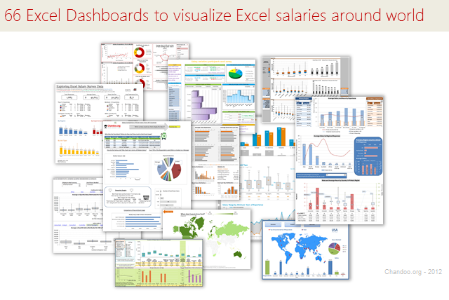
See how many different ways are there to analyze Excel salary data. Look at these 66 fantastic, beautifully crafted dashboards and learn how to one up your dashboard awesomeness quotient.
Continue »Analyzing 20,000 Comments

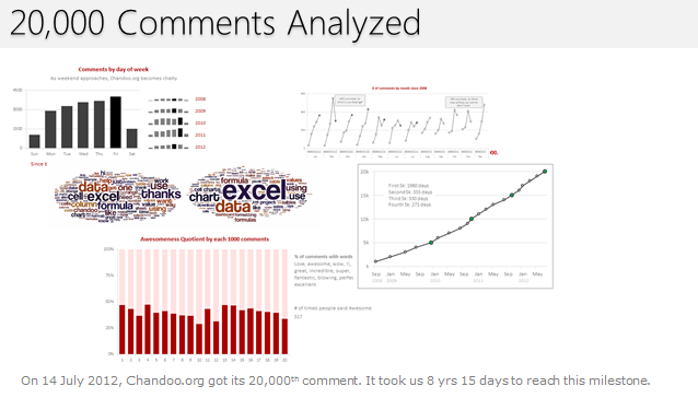
On 14th July, evening 4:51 PM (GMT), Chandoo.org received its 20,000th comment. 20,000!
The lucky commenter was Ishav Arora, who chimed, “Like super computers…Excel is a super calculator!!!!” in our recent poll.
It took us 8 years & 15 days since the very first comment to get here. And it took just 1 year 7 months & 23 days to add the last 10,000 comments (we had our 10,000th comment on 21st November, 2010).
Out of curiosity, I wanted to understand more about these 20,000 comments. So I downloaded our comment database, dumped it in Excel and start analyzing.
Continue »Creating Customer Service Dashboard in Excel [Part 3 of 4]
![Creating Customer Service Dashboard in Excel [Part 3 of 4]](https://img.chandoo.org/dashboards/constructing-charts-customer-service-dashboard.png)
Welcome back. In third installment of our Customer Service Dashboard series, we will learn how to construct the charts in our dashboard. We will understand the sparklines, traffic lights & dynamic chart setup. To help you learn better, I have recorded a short video too. Go ahead and enjoy.
Continue »Data and Calculations for our Customer Service Dashboard [Part 2 of 4]
![Data and Calculations for our Customer Service Dashboard [Part 2 of 4]](https://img.chandoo.org/dashboards/variables-in-our-customer-service-dashboard.png)
Welcome back. In part 2 of Making a Customer Service Dashboard using Excel let us learn how the data & calculations for the dashboard are setup.
Designing Customer Service Dashboard
Data and Calculations for the Dashboard
Creating the dashboard in Excel
Adding Macros & Final touches
In this installment, we will examine all the variables, named ranges & various formulas that drive our dashboard. Also, you can download the full dashboard workbook and play with it to examine these formulas and learn better.
Continue »Designing a Customer Service Dashboard in Excel [Part 1 of 4]
![Designing a Customer Service Dashboard in Excel [Part 1 of 4]](https://img.chandoo.org/dashboards/customer-service-dashboard-excel.png)
Sawadee Krup folks. Today, we begin a new series on Chandoo.org – Making a Customer Service Dashboard using Excel. This 4 part tutorial teaches you,
Designing Customer Service Dashboard
Data and Calculations for the Dashboard
Creating the dashboard in Excel
Adding Macros & Final touches
Customer service is one area where a lot of data is collected regularly. Understanding all this and making business decisions is quite complex task. This is where dashboards shine.
Read on to learn how to design customer service dashboards.
Continue »

