All articles with 'pivot charts' Tag

Excel pivot tables are very useful and powerful feature of MS Excel. They are used to summarize, analyze, explore and present your data. In plain English, it means, you can take the sales data with columns like salesman, region and product-wise revenues and use pivot tables to quickly find out how products are performing in each region.
In this tutorial, we will learn what is a pivot table and how to make a pivot table using excel.
Continue »{ 2 Comments }
A slicer that doesn’t slice [Pivot Table Tricks]
Published on Mar 30, 2016 in Pivot Tables & Charts, Power Pivot
![A slicer that doesn’t slice [Pivot Table Tricks]](https://chandoo.org/wp/wp-content/uploads/2016/03/slicer-chart-confusion.gif)
Mary Ellen, one of our readers, has an interesting conundrum,
I have some data that goes to Pivot table then to pivot chart. There is a slicer to filter the data. But when I slice, my pivot chart gets messed up. How to have the slicer, but still see the insights in the chart?!?
See above demo to understand:
This is because when you slice by a school, the pivot table gets filtered and hence % row total for that school becomes 100% (as there are no other schools).
How to fix the problem? The easy answer is to remove the slicers. But we want to have our slicers and eat a slice of them too. So we crank up the Excel awesomeness valve and get to work. There are two ways to achieve what we want.
- Old school method: Two pivot tables, some formulas & a line chart
- New Excel method: Power Pivot and a line chart
Read the rest of this article to know more.
Continue »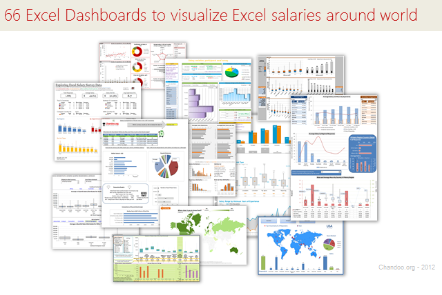
Ladies & gentleman, put on your helmets. This is going to be mind-blowingly awesome.
See how many different ways are there to analyze Excel salary data. Look at these 66 fantastic, beautifully crafted dashboards and learn how to one up your dashboard awesomeness quotient.
Continue »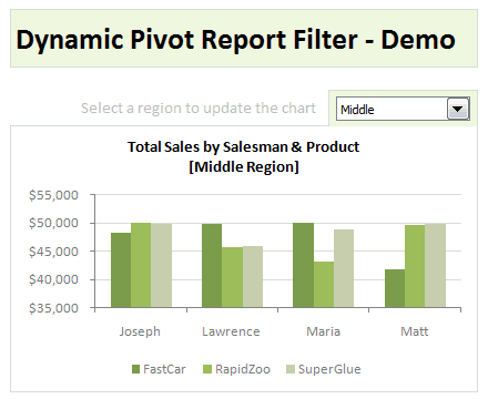
Last week, we have learned what Pivot Table Report Filters are & how to use them.
Today, I am going to show, how you can use simple macro code to change the report filter value dynamically.
We will learn how to create the chart shown here.
Continue »{ 65 Comments }
Make Dynamic Dashboards using Pivot Tables & Slicers [Video & Download]
Published on Dec 8, 2010 in Charts and Graphs, Pivot Tables & Charts
![Make Dynamic Dashboards using Pivot Tables & Slicers [Video & Download]](https://chandoo.org/img/dashboards/dynamic-excel-dashboard-using-pivot-slicers-demo.png)
Do you know that Excel 2010 makes creation of dynamic dashboards very simple?
Yes, that is right. Using slicers feature, you can create dynamic excel dashboards from your data in very little time. Today we are going to learn a technique that will help you create a dashboard like below.
Read rest of this post to find out how to construct a dynamic dashboard in Excel & download the example workbook.
Continue »{ 24 Comments }
What is PowerPivot? (and does it really wear underwear on top of pants !?!)
Published on Jan 8, 2010 in Charts and Graphs

Along with Excel 2010, Microsoft released a free add-in called PowerPivot. According to MS, PowerPivot gives users the power to create compelling self-service BI solutions, facilitates sharing and collaboration on user-generated BI solutions in a Microsoft SharePoint Server 2010 environment, and enables IT organizations to increase operational efficiencies through Microsoft SQL Server 2008 R2-based management […]
Continue »{ 115 Comments }
Sales Dashboards – Visualizing Sales Data – 32 Dashboard Examples & Implementations
Published on Jan 4, 2010 in Charts and Graphs, Featured

Sales reports and dashboards are very common in any company. There are several ways in which you can visualize sales data to understand the trends and sales performance. So in November, I have asked you to visualize sales data using sample data. The visualization challenge #2, sponsored by Zoho Reports generated a huge buzz around the community and fetched 32 incredible entries. The response was so overwhelming that it took me almost 24 hours to write this post. Thanks everyone for participating and making this a huge learning experience for everyone. Personally I have learned several useful dashboard and charting tricks. I will be sharing some of these lessons with all of you in the coming weeks.
Continue »{ 115 Comments }
Grouping Dates in Pivot Tables
Published on Nov 17, 2009 in Learn Excel, Pivot Tables & Charts
Do you know you can group dates in pivot tables to show the report by week, month or quarter? I have learned this trick while doing analysis on a pivot table today. In this online lesson on pivot tables, I will teach you how to group dates in pivot tables to analyze the data by month, week, quarter or hour of day.
Continue »
