
Yesterday we have a post on using thermometer charts to quickly compare actual values with targets. Today we follow up the post with 10 charting ideas you can use to compare actual values with targets.
I have added my comments to each option along with useful links to learn how to make such a chart.
There is a poll too, at the end.
(1) Gauge / Speedometer Chart
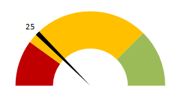
What is good about this approach?
- Familiar metaphor thus easy to understand
- Easy to construct
- Good for communicating one data point
What is bad?
- Takes too much space
- Bad design choice for most professional situations
Tutorials to make Gauge / Speedometer Chart
(2) Thermometer Chart
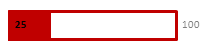
What is good about this approach?
- Familiar metaphor thus easy to understand
- Easy to construct
- Good data to ink ratio
What is bad?
- Do not say anything about trends
- Not appropriate when actual values exceed targets
Tutorials to make Thermometer Chart
(3) Bullet Chart
What is good about this approach?
- Comprehensive
- Aesthetic and very good data to ink ratio
What is bad?
- Difficult to construct in Excel
- Takes time to read the first time
Tutorials to make Bullet Chart
Tutorial 1 | A bullet chart alternative
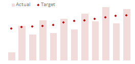
(4) Area Chart
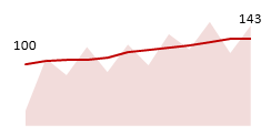
What is good about this approach?
- Shows trend along with current status
- Easy to construct
- Easy to compare
What is bad?
- Not good for small data sets
(5) Line Charts
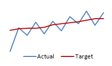
What is good about this approach?
- Easy to construct
- Shows trend along with current status
- Easy to read and understand
What is bad?
- Looks too simple
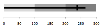
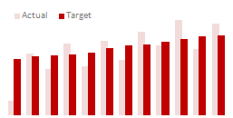
(6) Column Chart with Markers
What is good about this approach?
- Easy to compare & read
- Easy to construct
What is bad?
- Not good for small data sets
Tutorials to make Column Chart with Markers
(7) Partially Overlapped Chart
What is good about this approach?
- Easy to construct
What is bad?
- Difficult to compare
(8) Traffic Lights
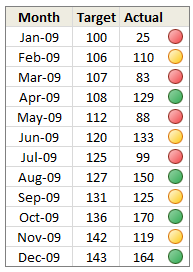
What is good about this approach?
- Familiar metaphor thus easy to understand
- Easy to construct (with Excel 2007 Conditional Formatting)
- Good for tables
What is bad?
- Do not tell the entire story, so should be used only in tables or with other displays
(9) Pie Charts

What is good about this approach?
- Familiar metaphor thus easy to understand
- Easy to construct (with Excel 2007 Conditional Formatting)
- Good for tables
What is bad?
- Works when targets are 100%
- Cannot show when actual values are more than targets
- Pie charts can be hard to read
Tutorials to make Pie Charts
(10) Using Text – Just say the thing
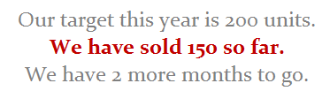
What is good about this approach?
- Easy to read
- Highest Data to ink ratio
- Very easy to construct
What is bad?
- Too simple
- Leaves the finer details out
If you are reading this post on email or feed reader, please click here to access the poll.


18 Responses
Great post. I can’t vote, though, because the answer I want to put down is “it depends”. As with all visualisations, you’ve got to take into account your audience, your purpose, technical skills, where it will be viewed, etc.
I’m with Andy: It depends. Some I would use, some I might use, some I won’t touch with a barge pole.
Naturally I have comments 🙂
The dial gauge, though familiar, is less easy to read than a linear type of chart (thermometer or bullet). It’s really no better than the traffic lights, because all it can really tell you is which category the point falls in: red, yellow, or green.
By the same token, pie charts are so familiar, people don’t know they can’t read them. Remember how long it takes kids to learn to read an analog clock?
Bullet charts don’t show trends.
With any of the charts that have a filled component and a marker or ine component, it makes more sense to use the filled component (area/ column) for target, and the lines or markers for actual.
I voted for #6 even though I agree with the other comments that it depends.
The majority of the votes are for the #2, thermometer chart. I still have yet to understand what happens when you are above plan/goal, which was brought up in yesterday’s post.
Also, I agree with Jon in that it would be better to flip the series and make the filled part the target or goal and the line or marker the actual.
I am also a fan of using text when appropriate if the data is among other metrics in a type of dashboard. Calling it out by saying actual and % achievement is a good option.
Another “it depends” vote. Are you just looking at one or are you comparing a number of targets with actuals? You didn’t include a text box. The problem with sentences is that they can get lost in a page of gray text. A text box can call attention to the numbers and line them up effectively.
I’m with Jon: “Some I would use, some I might use, some I won’t touch with a barge pole” and I’m surprised that some of your readers voted for the last group.
Jon says:
With any of the charts that have a filled component and a marker or line component, it makes more sense to use the filled component (area/ column) for target, and the lines or markers for actual.
Why does this make more sense? I like 6 the way it is, although I would use a heavy dash for the plan/target marker.
“It depends” is also my take. What I usually try to drill into my clients dashboard design is the fu ndamental difference between spot results (am I on target for this month) and long term trends.. I always try to create 3 different set of graphs to represent real perormance:
– spot results vs objectives
– cumulative results vs objectives
– long-term trend (moving average) mostly) to see where we’re going
Jon says:
With any of the charts that have a filled component and a marker or line component, it makes more sense to use the filled component (area/ column) for target, and the lines or markers for actual.
Why does this make more sense? I like 6 the way it is, although I would use a heavy dash for the plan/target marker.
I totally agree, Bob. I would normally favour a line for the target and a column for the actual, you can see quite easily then which columns break through the line, then.
Thermometer charts: “Not appropriate when actual values exceed targets” – this is easily solved by making the “mercury” portion a different color from the border, then you can clearly see where the expected range ends and the actual values keep going.
People seem to knock gauges quite a bit in dashboarding, but trying to show comparison of realtime data between operating sites and targets for each site can easily be done with a bank of gauges that have the optimal operating points at 12 o’clock.
The human eye is great at pattern stripping, and any deviation of a gauge from the expected 12 position will quickly register with an operator and attract his attention. Using a colour background, or meter edge, will also indicate the sensitivity of a particular site.
I am wondering how will the plotting work, for some of the targets which may have been achieved before time. E.g. for the month of Jul the target was 226 and the actual was 219. So the chart will show a deficit in meeting the target by 7 points but what if this 7 may have been completed earlier in month of June. So ideally it not a deficit.