All articles with 'in-cell charting' Tag
6 Best charts to show % progress against goal

Back when I was working as a project lead, everyday my project manager would ask me the same question.
“Chandoo, whats the progress?”
He was so punctual about it, even on days when our coffee machine wasn’t working.
As you can see, tracking progress is an obsession we all have. At this very moment, if you pay close attention, you can hear mouse clicks of thousands of analysts and managers all over the world making project progress charts.
So today, lets talk about best charts to show % progress against a goal.
Continue »What are Excel Sparklines & How to use them? 5 Secret Tips

Of all the charting features in Excel, Sparklines are my absolute favorite. These bite-sized graphs can fit in a cell and show powerful insights. Edward Tufte coined the term sparkline and defined it as,
intense, simple, word-sized graphics
Sparklines (often called as micro-charts) add rich visualization capability to tabular data without taking too much space. This page provides a complete tutorial on Excel sparklines.
Continue »Employee training tracker & calendar – tutorial & download

Imagine you are the head of training department at ACME Inc. You arrange training programs round the year to empower your team. It is hard work, coordinating between employees, trainers, department heads, venues and coffee machines. What if there is something to help you keep track of all this? I am not talking about getting you a shiny new iPad, you silly. I am talking about a tracker & calendar built in Excel that ties everything together (well, almost everything, you still have to fill the coffee machine.)
We are going to build a training program tracker & calendar using Excel.
Continue »In-cell 5 star chart – tutorial & template
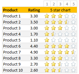
Whenever we talk about product ratings & customer satisfaction, 5 star ratings come to our mind. Today, let’s learn how to create a simple & elegant 5 star in-cell chart in Excel. Something like above.
Read on to learn how to create the above chart.
Continue »Creating In-cell charts with markers for average (or target) values
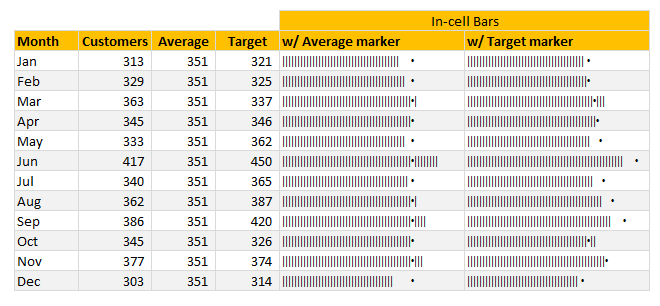
Today, lets talk about an interesting extension to the idea of in-cell charts. Adding average or target markers to the chart.
Adding a marker (like average or target or last year value) can enhance your charts greatly and provide more context. Lets understand how to add marker symbols to in-cell charts.
Continue »Speeding up & Optimizing Excel – Tips for Charting & Formatting [Speedy Spreadsheet Week]
![Speeding up & Optimizing Excel – Tips for Charting & Formatting [Speedy Spreadsheet Week]](https://img.chandoo.org/optimize/speeding-up-optimizing-excel-charts-formatting.png)
Is Excel acting slow & taking ages? As part of our Speedy Spreadsheet Week, today lets talk about optimizing & speeding up Excel by formatting & charting better. Use these tips & ideas to super-charge your sluggish workbook.
No matter how much data you got, how many formulas you wrote, the end users seldom see them on your workbook. They see the finalized dashboard, they play with the model, they look at the report. And if you make poor choices, your end users will thing your workbook is slow.
So let me present you 7 charting & formatting tips to optimize & speed up Excel. Read on…,
Continue »
Sales Funnel or Sales Process refers to a systematic approach to selling a product or service. [more on sales process] Whether you run a small business or part of a large corporation, chances are, you heard about Sale Funnel. Understanding & analyzing your sales performance from a Funnel point of view is a great way […]
Continue »Suicides & Murders by US States – An Interactive Excel Chart
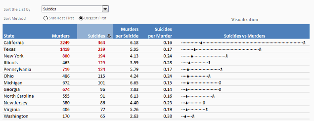
Over at PTS Blog, my dear friend & charting guru, Jon Peltier has an interesting post on using dot plots to visualize Murders & Suicides data by US States.
Not that murders & suicides fascinate me, but I wanted to play with this data myself and see how we can visualize it. So I emailed Jon and asked him to share the raw data. Being a lovely chap Jon is, he immediately sent me the data. So here we are, playing with gory data on a Friday.
Suicides & Murders by US States – An Interactive Excel Chart
You can see a demo of the chart I came up with above. Read on to learn how this chart is constructed.
Continue »
Two weeks ago we asked you what you wanted to see at Chandoo.org and you responded.
We have had 71 responses giving us 101 ideas to date.
Here are the results…
Continue »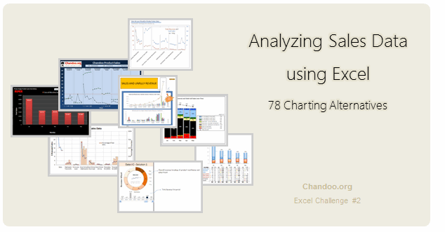
Recently, I ran a contest asking you to analyze a bunch of sales data and present your results in charts. We received a total of 78 charts from 45 people. The contest entries had a mind-boggling variety of excel charts, techniques and ideas. It took me a while to go thru all the files and compile the results. Thanks for your patience. In this post, you can find all the charts along with my comments & links to download files.
Continue »How to create a Win-Loss Chart in Excel? [Tutorial & Template]
![How to create a Win-Loss Chart in Excel? [Tutorial & Template]](https://img.chandoo.org/c/win-loss-chart-excel-template.png)
Win Loss Charts are an interesting way to show a range of outcomes. Lets say, you have data like this:
win, win, win, loss, loss, win, win, loss, loss, win
The Win Loss chart would look like this:

Today, we will learn, how to create Win Loss Charts in Excel.
We will learn how to create Win Loss charts using Conditional Formatting and using In-cell Charts.
Continue »![Show Details On-demand in Excel [Tutorial + Training Program]](https://img.chandoo.org/c/on-demand-analysis-and-details-in-excel-demo.gif)
Yesterday, we have seen a beautiful example of how showing details (like distribution) on-demand can increase the effectiveness of your reports. Today, we will learn how to do the same in Excel.
Continue »Use Analytical Charts to Make your Boss Love You
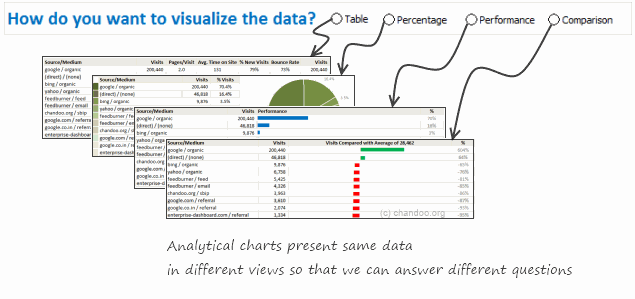
There are beautiful, powerful & awesome charting examples all around us. Today, I want to show you how we can harness the power of Excel to create Analytical Charts.
Analytical What?!?
To be frank, I do not know what to call these charts, so I choose the term Analytical Charts. But this is what I have in mind when I say Analytical charts:
A chart is analytical chart,
(1) If it is interactive
(2) It it can answer different questions by re-structuring same data differently
Excel Links – My First International Excel Workshop Edition

Stage is almost set for my first international Excel workshop. That is right. I am doing a physical excel workshop on Intermediate & Advanced Excel at Maldives between January 23 and 27, 2011. I feel quite excited to do this.
While I derive immense pleasure and learn lots of new things by running Excel School, there is one nagging problem. It is an online program, so the scope of physical interaction with students is limited.
Doing a physical class is a great way to meet new people, gather material for new content, get ideas, learn new things and get challenged. And that is why I am looking forward to do my workshop in Maldives next week.
If you would like to join this workshop: Please call Mr. Guru Raj, Training Manager at IIPD, Malè. His number is +960 7625338. (Workshop agenda)
Because I will be busy with the workshop next week, I will not be able to post much on the blog. I have requested Hui, our guest author to keep you all engaged. So expect some delicious stuff from him while I am away.
Continue »Happy Birthday Hui, An Excel Dashboard to prove you are awesome!
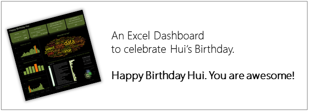
Some of you know our guest author and Excel ninja Hui. Yesterday was his birthday. And I wanted to create nice birthday gift for him. So I took a database dump of our forums data and created a dashboard.
Read rest of this post to see the dashboard & download workbook.
Continue »

