![Sales Dashboards - 32 Examples, Vote for your option now [Visualization Challenge #2]](https://chandoo.org/img/v/sales-dashboards-contest-sponsor.png) Sales reports and dashboards are very common in any company. There are several ways in which you can visualize sales data to understand the trends and sales performance. So in November, I have asked you to visualize sales data using sample data. The visualization challenge #2, sponsored by Zoho Reports generated a huge buzz around the community and fetched 32 incredible entries. The response was so overwhelming that it took me almost 24 hours to write this post.
Sales reports and dashboards are very common in any company. There are several ways in which you can visualize sales data to understand the trends and sales performance. So in November, I have asked you to visualize sales data using sample data. The visualization challenge #2, sponsored by Zoho Reports generated a huge buzz around the community and fetched 32 incredible entries. The response was so overwhelming that it took me almost 24 hours to write this post.
Thanks everyone for participating and making this a huge learning experience for everyone. Personally I have learned several useful dashboard and charting tricks. I will be sharing some of these lessons with all of you in the coming weeks.
How read this post?
This post is HUGE, I mean 2600 words huge. So you may want to maximize your browser window and fill up your coffee mug. Each of the 32 entries start with a title including authors name and tools used. Each entry includes a small image of the dashboard along with a link to see bigger version. All dashboards have links to original source files for you to download and play with.
Please note that these files are copyrighted to original authors and you cannot use them for commercial purposes.
I have included 3 comments against each entry based on my understanding of dashboard. Please share your opinions and reviews using the comments section of this post.
Javascript based Sales Dashboard by Ahmad (Option 01)
 larger version |
My Comments:
|
Excel based Sales Dashboard by Aires (Option 02)
 larger version |
My Comments:
Download Source Files: Link 1 |
Excel based Sales Dashboard by Ajay (Option 03)
 larger version |
My Comments:
Download Source Files: Link 1 | Link 2 [Ajay’s website] |
Excel based Sales Dashboard by Alex Kerin (Option 04)
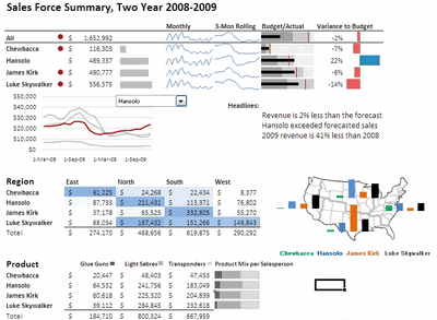 larger version |
My Comments:
Download Source Files: Link 1 | Link 2 | Link 3 [Alex Kerin’s website] |
Excel based Sales Dashboard by Arti (Option 05)
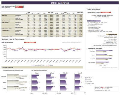 larger version |
My Comments:
Download Source Files: Link 1 | Link 2 [Arti’s website] |
Excel Dashboard Training by Chandoo.org
 |
My Comments:
|
Excel based Sales Dashboard by Cole Burdette (Option 06)
 larger version |
My Comments:
Download Source Files: Link 1 |
Excel-Palo based Sales Dashboard by Cuboo (Option 07)
 larger version |
My Comments:
Download Source Files: Link 1 [Cuboo’s website] |
Excel based Sales Dashboard by Duezzz (Option 08)
 larger version |
My Comments:
Download Source Files: Link 1 |
Jmp based Sales Dashboard by Erin Vang (Option 09)
 larger version |
My Comments:
Download Source Files: Link 1 | Link 2 | Link 3 | Link 4 [Erin Vang’s website] |
Excel based Sales Dashboard by Esteban (Option 10)
 larger version |
My Comments:
|
Excel based Sales Dashboard by Hernan (Option 11)
 larger version |
My Comments:
Download Source Files: Link 1 |
Excel based Sales Dashboard by Karimmo (Option 12)
 larger version |
My Comments:
|
Excel based Sales Dashboard by Karimmo (Option 13)
 larger version |
My Comments:
|
Excel based Sales Dashboard by Karimmo (Option 14)
 larger version |
My Comments:
Download Source Files: Link 1 |
Excel based Sales Dashboard by Karimmo (Option 15)
 larger version |
My Comments:
|
Excel based Sales Dashboard by Karimmo (Option 16)
 larger version |
My Comments:
Download Source Files: Link 1 |
Excel based Sales Dashboard by Leandro (Option 17)
 larger version |
My Comments:
Download Source Files: Link 1 [Leandro on twitter] |
Excel based Sales Dashboard by Lee (Option 18)
 larger version |
My Comments:
Download Source Files: Link 1 |
Excelcius based Sales Dashboard by Mahesh (Option 19)
 larger version |
My Comments:
Download Source Files: Link 1 |
Excel based Sales Dashboard by Mahesh (Option 20)
 larger version |
My Comments:
Download Source Files: Link 1 |
Excel based Sales Dashboard by Mahesh (Option 21)
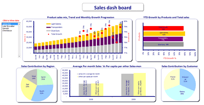 larger version |
My Comments:
Download Source Files: Link 1 |
Excel based Sales Dashboard by Martin (Option 22)
 larger version |
My Comments:
Download Source Files: Link 1 |
Excel based Sales Dashboard by Matt Cloves (Option 23)
 larger version |
My Comments:
Download Source Files: Link 1 |
Excel based Sales Dashboard by Miguel (Option 24)
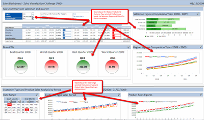 larger version |
My Comments:
Download Source Files: Link 1 |
Excel based Sales Dashboard by Nick (Option 25)
 larger version |
My Comments:
Download Source Files: Link 1 |
Project Management Dashboards (recommended product)
Excel based Sales Dashboard by Pawel (Option 26)
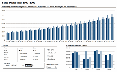 larger version |
My Comments:
Download Source Files: Link 1 |
Excel based Sales Dashboard by Pompadour (Option 27)
 larger version |
My Comments:
Download Source Files: Link 1 [Pompadour’s website] |
Excel based Sales Dashboard by Stephane (Option 28)
 larger version |
My Comments:
Download Source Files: Link 1 | Link 2 [Stephane’s website] |
Flot-Jquery-Ajax based Sales Dashboard by Steven Ng (Option 29)
 larger version |
My Comments:
Download Source Files: Link 1 | Link 2 | Link 3 | Link 4 [Steven Ng’s website] |
Excel based Sales Dashboard by Tessaes (Option 30)
 larger version |
My Comments:
|
Tableau based Sales Dashboard by Edouard (Option 31)
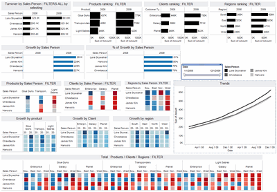 larger version |
My Comments:
Download Source Files: Link 1 |
Excel based Sales Dashboard by Faseeh (Option 32)
 larger version |
My Comments:
Download Source Files: Link 1 |
Excel Dashboard Toolkit (recommended product)
Tutorials & Examples to Make Excel Dashboards
Thank you everyone
Thanks everyone once again for participating. All these entries are truly world class. Such beautiful display of skill. Thank you so much for teaching me how to make better dashboards.


115 Responses to “Sales Dashboards – Visualizing Sales Data – 32 Dashboard Examples & Implementations”
Chandoo
Good to see the variety of styles of sales reporting. Too bad I missed this contest, will there be another?
Hi Chandoo.
Hope you well.
I've been using your sight for information for a while now.
I was wondering if you can assist me with a Sales Dashboard?
I know have all the data and I know exactly what Metrics i want to display and how.
Even if I have to pay you? what are the options?
I want to create a top shelf dashboard!
Examples of what i want to display.
SALES value (Jan - Feb) - ACTUALS vs BUDGET vs PRIOR YEAR
SALES GROWTH %
PRICE,VOLUME,EXCHANGE
Please advise if you can assist?
Regards
Kyle
@ Kyle
Please ask the question at the Chandoo.org Forums
https://chandoo.org/forum/
There is a Forum there called "Excel Jobs, consulting gigs & freelancing"
Post the question there
Please attach a sample file to ensure a quicker more accurate answer
Lots of variety.
Many of these examples show only one chart, which hardly constitutes a dashboard. Many of the charts are bar charts, where line charts (i.e., time series) might have been more appropriate or more readable. Some of the color schemes are distracting.
Yet there were a few good examples: Alex, Ajay, Cuboo, Tessaes.
Wow, this is great. And --- source files too! Thank you for organizing this.
Jon,
The aim was not to build exclusively dashboards but: "all you have to do is a make one chart (dashboards are ok too) to visualize this sales data effectively".
Chandoo,
I didn't realize you will post every intermediate step of my chart 🙂 Option 16 (final version of my chart) misses the source file: http://bit.ly/8HwVSm
Some very good dashboards here.
Particularly like the funky rotate on Matt Cloves' example, and Ajay's example looks pretty pro too.
Isn't it better to consider entries 12-16 as one entry? The same goes for 19-20.
I think Cuboo is my favourite at the moment but I need to examine them more closely 🙂
I'm partial to chart 5. I get enough information from the visuals to give me a suitable overview, and then I'm given clear consciece analysis on specific metrics.
Karimmo -
Sorry, the post was entitled "Sales Dashboards", so I made the natural assumption.
Some amazing dashboards and clever methods of making the data dynamic.
In many of the examples the methods used only become clear once hidden working sheets are displayed.
Chandoo, thanks for putting this together, looking at the content here I am glad that I did not submit mine..... lol. But there's a lot to be learning here in the coming days and may be the next time around I'll be ready for it! Thanks so much for the source files... and of course to the contributors!
@Andy.. thanks, Yes, there will be more contests. I will announce one when we reach the 10k subscriber base. I am also open for new contest ideas and sponsors.
@Jon: I named all the entries as dashboards out of convenience. Agreed that some of them are just charts (or pivot charts).
@Chris: You are welcome.
@Karimmo: I have considered each of your submissions as separate entries (my bad). I can add up the votes, but it might give you unfair advantage 😉
@Doozerboy: Even I liked Matt's rotate option. Watch out for a tutorial on that very soon 🙂
@m-b: Good point, I have considered them as separate entries as it wasnt clear if the authors made multiple or single entries. Sorry for the confusion.
Also, agree with you on Cuboo's entry. As always very well done.
@ericlind, Tony: Thanks
@Chrisham: You should have tried. Next time, you must submit one.
Hi Chandoo,
Could you please publish a dashboard for Project Tracking.
1. 3 Activtiy (SIT1, SIT2 and SIT3)
2. Total Projects (6 projects)
Additionals: Defects (open/closed), Timelines(project dependent)
@Nishit
Have a look at:
http://chandoo.org/pmt/pmt-index-1.html
Excellent work from almost all the contestants. Loved many and I'm eager to try some of the designs and to participate in the next contest. I specially liked options 26, 22, 03, 05 and 11. Very professional, clean and bug free. Too bad one can't vote for more than one 🙁
Thanks to Chandoo for doing this contest and to all participants. Looking forward for more iterations.
Great stuff!!!!
Excellent work putting all of this together Chandoo, - hours of work I would guess. Some really good examples here. Thank you.
One thing to think about when voting is that the original remit was to design a visualization for a "senior manager [to] understand how the sales people have done in the 24 months". I'm certainly not saying this because I feel that my example is any better then others, more that so often in our field the resulting visualization does not fulfill the original objective.
Breaking this down - a 'senior' manager does not have time, or want to dive into data exploration. He or she wants quick, easy to see, immediate answers on the most important questions with more data to help explain trends and allow decisions to be made.
Equally, the visualization should primarily display "how the sales people have done", so the chart(s) should be all be sales person centric. Questions like: "who performed best, against their expected performance, who sold what, who sold it where, what size companies did they sell to?" are likely wanted and useful. Finally, "24 months" implies the requirement for time trending information.
Again, please don't read this as any push for votes, simply that these excellent examples are assessed by their ability to meet the objective.
I have downloaded the zip file link to Alex Kerin's dashboard (Option 04) but do not know how to look at the numerous files contained within.
Perhaps someone can explain please.
@Tony. The first link is the Excel file. The second is a link to the free (excellent) sparkline add-in I used. You don't need to load it, but you may get some #NAME errors, and some cells won't update if you change the data.
If you do want to load it, select the correct version from the linked page (there are basically two - 2003 and before, and 2007). Load these up by opening them in Excel, allowing any macros if prompted, then open Link 1.
Hence the problem with third-party add-ins - Office 2010 has its own sparklines, but this add-in is still much better...
Alex -
Depending on how "senior" this executive is, I don't think you used enough pie charts.
Seriously, I agree with your comment. A dashboard is nice if it's interactive, but it's useless if it doesn't show a broad overview of information in a single view.
Alex
The first link gives me a zip file to download. I do not see an Excel file to open other than several .xml files. Can you give me any further guidance please.
Clearly there is plenty here I am not familiar with.
@Oliver: I am happy you liked it.
@Alex: Very good points. I have realized this as soon as I saw the second entry in my inbox. There is no way I can compare one dashboard with another. Even though the stated objective is "help a senior manager understand how sales people have done in the last 24 months" several people interpreted this in several ways and some went all the way to show trends and messages based on product, region or customer as well.
Since my unstated objective is "help Chandoo learn new and awesome-kickass-cool dashboard and charting tricks" I kept quiet.
I have tried to do some justice by adding comments next to each dashboard to help the voters. But I already know that each of these entries is a winner. Just the fact that these people could do something with the data and make a dashboard showing how they understand it is a HUGE achievement. Not many people (not even 1% of the population) can articulate ideas like these. Kudos...
@Jon... We need a Pie chart add-in, we need it now. Go release !!! 🙂
@chandoo: Many thanks for the working-hours writing this post. It's brilliant! So many good visualization ideas ... lot's of things to learn from!
@alex: I agree with you totally - a dashboard for senior executive has to be as simple as possible and focussed on the performance of salespersons. We should never forget: It's all about decision-supporting!
Me neither met a manager who did OLAP-Analysises; they rarely use their computer - here in Germany! They wanted their infos on paper and very often the dashboard - is it a dashboard or a report? - needs to be printed out. That's the reason, why I didn't use colours extensively. This makes my dashboard looking grey and not very "sparkling", even though I used the excellent open-source sparklines-addin from Fabrice as you did 🙂
@Tony: sorry, the link goes to an xlsm file, which is an Office 2007 file with macros - if you have this it will be automatically recognized. This URL: http://bit.ly/6owMD5 will take to an Excel 2003 file (xls). There will be some loss of fidelity, but you should get the idea.
@Jon, Chandoo. My example actually contains 5 pie charts, see if you can spot them - couldn't resist doing that 😉
Cuboo -
A good dashboard report (see, it's both a dashboard AND a report) is not defined by a fancy color scheme. It is defined by the information it conveys, its clarity, its comprehensiveness, its succinctness. It's best to use color sparingly, so when it appears, it really means something.
We don't pay managers to use their computers (even in the US), we pay them to make wise decisions. One good decision they make is who they rely upon for their information, that is, who runs their OLAPs for them.
@Alex. Thanks for the link to the Excel 2003 file which I have downloaded successfully. I have also downloaded the Sparklines add-in and will take a lokk when I have some time.
I am still baffled, however, when you say that Link 1 above takes me to an xlsm Excel 2007. It downloads a zip file (data-visualization-challenge-alexkerin.zip) with many .xml and .rels files.
@Jon: Good to read, that things are similar in the US - I do not live "behind the mountains" 🙂
@Alex: I didn't see you last attempt, but I do not condemn pie charts totally. I like them as small multiples in a table, to visualize the distribution in rows or columns. For example here at the lower end: http://bit.ly/6ZiFJ0 ... or here: http://bit.ly/7JVtmj where I used them as a "traffic-light plus".
@Tony: your browser/operating system/virus software is preventing you downloading a macro laden file just in case it has viruses - instead it's packaging it as a a zip and screwing it up (I would guess)
@cuboo: my pie charts are actually only the red bullets on the top table with some if statements - don't know why I used them instead of anything else - because I could?
@Jon: Couldn't resist - here's your 'senior' dashboard - spot the egregious visualization mistakes: http://bit.ly/84lET6
@Alex: something is clearly getting in the way. I have tried another PC at home with the same result.
Unless you or someone else can help further I will have to speak to my IT manager. I have never had a problem downloading files before.
Would you perhaps be able to create a valid zip file for me to download?
@alex: gorgeous dashboard ... if you don't mind I will start all my presentations with this. I'm quite sure: parts of my audience will love the gauges and 3D-Charts.
@Mr. Chindoo....I am amazed how do U manage these things 🙂 ? It takes me an hour to compose an email...some times..
@ Cuboo........a lovely chart.
Also liked very much charts of Aris & Ajay for color complexion & that of Arti for the complex look that it gives.
[...] der Gestaltung von Dashbords inspirieren lassen will findet bei ihm auch zahlreiche Beispiele für Excel-Dashboards aus dem Vertriebsbereich. Dort gibt es auch viele weitere Links zur [...]
[...] Wer möchte, kann hier bis zum 15.01. für meine Lösung – cuboo, Option 7 – stimmen. Würde mich freuen [...]
Hey Chandoo, you played Santa a bit late, thanks for this very wonderful New Year`s Gift
Woohoo! I've just come back from my vacation trip (I was afraid of losing senses due to computer abstinence 🙂 ), and am able to see such a delightful set of templates. Thanks everyone, and particularly Chandoo for putting it all together.
I am not going to vote on anyone, because I am also part of the competition (in fact, it's because it's too hard to choose a better dashboard, but justifying by the moral argument sounds better. :o) ). What I would really appreciate, however, is feedback about what I should do to make my charts better (I am particularly curious to understand why Jon left me out his favourite list 🙂 ). As I told Chandoo before, I am really looking after learning about how can I do better dashboards. So, please, help me by criticizing my dashboard. 🙂
All the best, and a great 2010 to all of us!
[...] (details) [...]
@ Tony17. Some browsers rename the XLAM files downloaded from Sourceforge or Box.net into "XLAM.ZIP"
Delete the ".zip" extension and things should work out properly or visit
sparklines-excel.blogspot.com for alternative download links.
Beautiful job,
I haven't walked through this yet,
[...] Sales Visualization Challenge? We got 32 extremely good dashboards submitted and finally you voted Alex Kerin’s entry as the winner. So when I informed Alex that he is the winner, I also asked him to send me a pic of [...]
hi everyone, I'm amazed how far can U all get with this challenge
I want to learn too many thing from here, congrats to all participants and people commenting on this
single question: I've downloaded some files for excel 2003 but I haven't been able to select a "total" instead of just one Sales Person... my error?
if so, please tell me how to navigate some of the dashboards aboard starting on the big picture/figure
regards from Chile
Jp
[...] Dashboards – A dashboard showing your current performance and positioning in the sales process. – We have provided a great set of excel spreadsheet visuals for you from chandoo.org. [...]
[...] Email: Last time, when I did the sales dashboard contest, I got a ton of emails with entries. It took me countless hours to sort thru the email and [...]
[...] Sales Dashboards – Visualizing Sales Data – 32 Dashboard Examples & Implementations http://chandoo.org/wp/2010/01/04/sales-dashboards/ [...]
wanted to look at #13, but the file is protected and has a password - so i can play with the dashboard but not see how it is made, which sort of defeats the purpose... any suggestions? 🙂
oops, never mind, found it (cell B31). a light-gray note on a white background is particularly easy to see! 🙂
I need someone to do a sahboard for me if i supply the data. It is a sales dash board - How much could I expect to pay
@Fred... Depends on your dashboard. Based on my experience, a typical dashboard takes 6-8 hours of construction time, if the data and outputs are clearly specified. Now, the rates depend on the consultant. I charge $75 per hour, so you can expect to pay roughly $500 if you hire me. Let me know if you are interested.
[...] an year ago, we had a memorable dashboard contest on Sales Dashboards. We got 32 beautiful, outstanding, well crafted entries and it was a lot of fun learning new tricks [...]
hi
veryyyyyyyyyyyyyyyy good
[...] Sales Dashboards – 32 Examples & Downloads 0.82% page views [...]
In Option 24, how are the four main kpi circles made? That is, those pictures can be moved along with the data inside the picture and they are not groups of objects. So what are they? Are they results of using the Camera tool?
I like the ease of moving them around.
@Hellomoto
The 4 Circles are in fact camera tools
The Left most, Best Qtr 2008, is linked to a hidden sheet Control via the formula =Control!$G$16:$I$25
Unhide the sheet and go to that area
You will see a circle with a cell reference and a Title and box outline
Thanks Hui. Just did what you suggested and now I am a bit bummed. I thought the circles were cool and thought that the color would change due to the value. But they are fixed objects (i.e. the colors don't change only the numbers do).
oh well, i am now inspired to use those colored circles and figure out how to switch between them to show status. Do you have any suggestions on how I might do that (use custom objects as the traffic lights, instead of the standard conditional formatting ones)?
@Hellomoto
Have a read of:
http://chandoo.org/wp/2009/05/19/dynamic-charts-in-excel/
Thanks Hui, I will read it today.
One quick question on Dashboards..
Can we export these to Powerpoint and do a presentation as we do in Excel?
Pls ..
@Ganesh... You can take snapshots of the dashboards and put them in PPT. But if you want full interactive experience, opening them in Excel is your best bet.
I made a kick ass dashboard based on my learning from here.....How do I attach the pdf so that others can see what I made......let me know plz.
@Andy
Have a read of http://chandoo.org/forums/topic/posting-a-sample-workbook
A big thanks to everyone who shares his excel-files! Very useful for noobs like me 😉
[...] Sales Dashboards – 32 Examples & Download workbooks [...]
Excel is very useful for building dashboards (among other things).
If your company is calculating sales commissions in Excel I have found a tool which takes your commissions spreadsheet and generates custom reports for you. I know Excel has their own reports they don't have any sales specific functions.
Check out the tool at http://www.oneclickcommissions.com/cha.html
Thanks for all the documents everyone.
-Michael
Thanks for getting this compiled, sorted,.. to the point etc(overwhelmed with what i have found on this page.. cant find words).. I now know, how to get started to report a great\WOW looking sales DashBoard .. couldnt have done without this page. Thanks Again!!
Great Site different from the rest.
[...] Sales Dashboards to analyze sales data – 32 variations [...]
Great job, thanks for the site manager and for everybody who contribute in this wonderful files.
[...] Sales Dashboards using Excel [...]
Hey Chandoo,
first of all thank you very much for giving us such a nice website.
your excel templates are too helpful for me in data analysis.
some graphs became handy for me after i learn it from template.
thank you again.....
your work is really appreciable...
wonderful site! thanks for the file sharing
I cannot open the links at work because it is blocked on my cpu. Would it be possible to have these emailed to me - tbutler515@gmail.com. Many thanks.
Greetings!
It seems problematic downloading the above. I am not sure what caused it. I hope to hear solutions from you if possible. Anyway I am downloading spreadsheets for teachers and it seems working fine. It is still yet completed but I will comment on it once downloaded.
Thank you
help me to get excel notes
[...] or procedure & improve it using readily available tools like Excel. For example, you could improve the sales dashboard that gets emailed every month or manage projects [...]
[...] con esta página, que tiene varios modelos, para que podáis comparar con los [...]
Hey Chandoo!
Thanks for all the great information - I especially appreciate the design books you recommend. The Non-designers Design book is a gem!
[...] Download Link [...]
[...] Sales Dashboard Contest – 32 entries [...]
What a exhalant excel supporter u r sir
I like the: Excel based Sales Dashboard by Pawel (Option 26)
I clicked on the download option, but it is password protected. It does not allow me to make modifications to any of the fields. I contacted Chandoo, and was asked to comment here to receive a reply from "Pawel" in order to find out more on how I can use this dashboard for my use. Thank you.
I like the: Excel based Sales Dashboard by Aires (Option 02)
I clicked on the download option, but I have the same problem like Luis-Alejandro - it is password protected. It does not allow me to make modifications to any of the fields. WIll you enable me to use this dashbort for my use. I would be very greatful
I like Excel based Sales Dashboard by Duezzz (Option 08)
But like Luis-Alejandro, I faced the same problem of not being able to download the file because it's password-portected. Please let me know what I should do in order to download this excel template. Thank you very much!!
[...] that a sales dashboard constructed in Microsoft Excel can have, visit the post titled “32 Examples of Sales Dashboards” at Chandoo.org. This post is literally the largest grouping of excel sales dashboards [...]
great compilation...however duezz's dashboard is not downloadable anymore and pawel's is password protected.... why would you protect it ? i thought the whole idea was to share the info and to learn something new...
[…] more Sales Dashboards from Chandoo. PC, […]
Duezzz file is no longer available. Such a pity.
I like the : Excel based Sales Dashboard by Pawel (Option 26).
The date range is useful for my work but I am unable to access the hidden sheet 'calcs' due to password protected. Appreciated if you could please email to me the password 🙂
[…] Sales Dashboard Contest – 32 entries […]
Matt Cloves - I really like your dashboard! Can someone tell me how you were able to link the multiple selection criteria into your sumif function? I'm trying to build a dashboard that allows the user to select multiple months and then create a graph based on those months selected. Help!!
Hi Chandoo,
I am very glad that I visited your website and now I can say I have learnt so many things because of you. Thank you so much for such valuable information you provided. I have few question related to VBA and would really appreciate it you could help me.
1-How we can connect to mysql database using VBA.?
2-As these dashboard are dynamic (https://onedrive.live.com/?cid=b663e096d6c08c74&id=B663E096D6C08C74!361) . Could you advise me please how can make such a good dashboard like one of your example for cricket world cup one.
I would really appreciate your valuable time and advise.
Thanks,
Ricky Dobriyal
@Ricky
I'd suggest posting this in the Chandoo.org Forums
http://chandoo.org/forum/
i want to download Excel based Sales Dashboard by Esteban (Option 10) but i can't. Help Please!
Hello! This is a great resource! I am trying to use Dashboard #11 created by Hernan but I am having trouble getting the graphs to represent the data I'm entering. When I hit Refresh Data the graphs go away. I am no where near an expert with this so I know it's something I'm doing wrong. Your help would be greatly appreciated!
Thanks!
I also like the Excel based Sales Dashboard by Pawel (Option 26). But
the data cannot change and password protected. Appreciated if you could please email to me the password, really thanks for your help^^
Hello,
I am trying to download Sales Dashboard by Alex Kerin (Option 04), but link expired. Can you please send active link.
Thanks
[…] Chandoo has many sales dashboards to help you visualize and interpret sales data to adjust your strategies and better understand the impact your tactics are having on your bottom line. There are numerous Javascript-based and Excel-based dashboards to download for free. […]
Hi,
Could you please help me with samples of Price trend charts
As in my org. We have different prices( Some times two OR More price points for one customer in One region). & same applies to our competitors also. So we need to compare our price trend & our competitors price trend of each product for all customers region wise for each month.
Please suggest...
I’m still learning from you, as I’m trying to reach my goals. I absolutely liked reading all that is posted on your site.Keep the information coming. I loved it!
I have been absent for a while, but now I remember why I used to love this blog. Thank you, I'll try and check back more often. How frequently you update your website?
I am trying to download the dashboard titled Excel based Sales Dashboard by Duezzz (Option 08) but the link is expired. This would be a great starting point for our business sales tracking chart. Could you please send active link?
Some helpful fun examples to get us thinking, thanks!
A proof reader would be helpful for you.
Spell checkers do not find correctly spelt words in the wrong place.
Very cleaver use (clever):
Gives me an interesting picture of a butcher chopping up a dashboard with his cleaver.
From another page: for those who are weary of downloading (wary)
Us poor people get tired of exhausting downloads,
Surely it is more tiring to copy the code into an Excel module?
Hi
some of download links are disabled. for example dashboard number 9, 11 to 16 and ....
please reload the source file
thank u so much
[…] all information needs as identified in Rule #1. For some inspiration, see these pages • Sales Dashboards – 32 Examples • Simple KPI Dashboard in Excel • 33 Resources for making better […]
[…] http://chandoo.org/wp/2010/01/04/sales-dashboards/ […]
My personal favourite is option 23 by Matt Cloves. Its a very vibrant and rich chart, yet it looks neat.
Could you pl. guide on how to create dashboard without using pivot & slicer?
Many thanks for your perfect dashboards, hope update with new inspiring dashboards.
I need combination of option 5 & option 31 to prepare my dashboard.
Could you please help me to prepare it.
I just found this blog and have high hopes for it to continue. Keep up the great work, its hard to find good ones. I have added to my favorites. Thank You.
It seems that none of the direct links work any longer (I've tried about 12 of them.
Are you hearing this, or do you think it's on my end.
Hey... the files on this contest were hosted on various links by participants. I am sure most of them have expired by now. I will have to look thru my backups to see if I got a zip file somewhere. Give me 2 weeks.
Thanks for getting this compiled, sorted,.. to the point etc(overwhelmed with what i have found on this page.. cant find words).. I now know, how to get started to report a great\WOW looking sales DashBoard .. couldnt have done without this page. Thanks Again!!
The Resource Talk blog is the social service news destination for King County, brought to you by King County 2-1-1. It provides critical resource changes,
this is good blogs mman to read....
Greate Info, Longer content has more organic traffic. Longer content has more social engagement. The data proves it.
Please, download file error onedrive 😉