How your country did in Commonwealth Games – Power BI Viz and Tutorial

Commonwealth games 2018 have ended in the weekend. Let’s take a look at the games data thru Power BI to understand how various countries performed.
Here is my viz online or you can see a snapshot above.
Looks good, isn’t it? Well, read on to know how it is put together.
A simple trick to make your dashboards user friendly [video]
Whenever you have a dashboard that is quite long or spans across multiple worksheet tabs, it can be hard to use. Here is a simple trick to make your dashboards user friendly. If your dashboard has form controls, create duplicate sets of them and place them in locations where users are looking. For example, If your […]
A better chart to visualize “Best places to live” – Top 100 cities comparison Excel chart
Recently, I saw this chart on Economist website.
It is trying to depict how various cities rank on livability index and how they compare to previous ranking (2014 vs 2009).
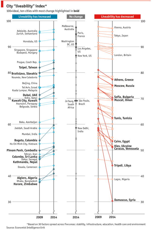
As you can see, this chart is not the best way to visualize “Best places to live”.
Few reasons why,
- The segregated views (blue, gray & red) make it hard to look for a specific city or region
- The zig-zag lines look good, but incredibly hard to understand % changes (or absolute changes)
- Labels are all over the place, thus making data interpretation hard.
- Some points have no labels (or ambiguous labels) leading to further confusion.
After examining the chart long & hard, I got thinking.
Its no fun criticizing someones work. Creating a better chart from this data, now thats awesome.
How the tax burden has changed over the years – Excellent chart by NYTimes & Redoing it in Excel
If I need some charting inspiration, I always visit New York Times. Their interactive visualizations are some of the best you can find anywhere. Clear, beautifully crafted and powerful. Long time readers of Chandoo.org knew that I like to learn from visualizations in NY Times & redo them using Excel.
Today let me present you one such chart. This is based on an interactive visualization prepared by NY Times explaining how the tax burden has changed over years for various income groups.
Take a look at tax burden chart – Excel implementation
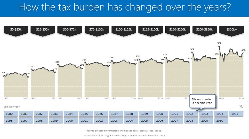
Read on to learn how to create this chart using Excel.
Growing a Money Mustache using Excel [for fun]
Mustache and Excel?!? Sounds as unlikely as 3D pie charts & Peltier. But I have a story to tell. So grab a cup of coffee and follow me.
Today, lets talk about how to construct a dynamic chart that can show us how much progress we have made against a financial goal (in this case, accumulating a big chunk of money). I call this growing mustache chart, inspired from the wonderful Mr. Money Mustache.
Excel Salary Survey Dashboards – Choose the winner [poll]
Recently, we published 66 dashboards visualizing Excel salaries around the world. Each of the contestants have put in great effort and hand-crafted these beauties. Now its time we picked a winner.
How does the voting work?
The voting has 2 components
- Readers (that is you) pick a winner and runner-up using online voting.
- Judges (2 of them) will also pick winners. Judges vote carries 20% weight.
How to make Box plots in Excel [Dashboard Essentials]
Whenever we deal with large amounts of data, one of the goals for analysis is, How is this data distributed?
This is where a Box plot can help. According to Wikipedia, a box plot is a convenient way of graphically depicting groups of numerical data through their five-number summaries: the smallest observation (sample minimum), lower quartile (Q1), median (Q2), upper quartile (Q3), and largest observation (sample maximum)
Today, let us learn how to create a box plot using MS Excel. You can also download the example workbook to play with static & interactive versions of box plots.