
Excel Dashboards – Tutorials, Templates, & Examples
Dashboard reports allow managers to get high-level overview of the business. Excel is an excellent tool to make powerful dashboards that can provide analysis, insight and alert managers in timely manner. In this page (and others linked here) you can find a lot resources, templates, tutorials, downloads and examples related to creating dashboards using Microsoft Excel. Use the below links to quickly access various sections of this page.
- What is a Dashboard?
- How to Make a Dashboard? [Dashboard Tutorials]
- Dashboard Demos
- Dashboard Do’s & Don’ts
- Ready to use Dashboard Templates
- Excel Dashboard Examples (200+)
- Additional Resources on Dashboards
- Books for Dashboard Makers
- Recommended Tools & Training for Dashboard
What is a Dashboard?
Dashboard reports allow managers to get high-level overview of the business and help them make quick decisions. Dashboards are often called as management dashboards or information dashboards or dashboard reports.
How to Make a Dashboard?
You can create dashboards using a lot of different tools. However, in my opinion, Microsoft Excel is an excellent choice for creating and distributing dashboards due its ease of use and universal availability.
Read the following tutorials to understand how to make Excel Dashboards:
Creating KPI Dashboards in Excel [6 part tutorial]
In this 6 part tutorial, you will learn how to create a KPI (Key Performance Indicator) Dashboard ground up using MS Excel. You can download the example files with full details at each step so that you can practice the techniques and fine tune your dashboard development skills. The final dashboard looks something like this:

Customer Service Dashboard in Excel [4 part tutorial]
In this 4 part tutorial, learn how to create a fully interactive & dynamic customer service dashboard using Excel & VBA. We will be using features like form controls, picture links, conditional formatting, advanced formulas& tables in this. The final outcome is shown below,

Financial Metrics Dashboard
Financial dashboards help you understand how a company is performing, what are the threats & opportunities available and how to optimize revenue or profit. In this comprehensive tutorial, learn how to create a financial dashboard to explore various metrics and themes.
Project Management Dashboard
This tutorial is part of our project management using excel series. In this article, I explain the process of dashboard creation along with a free downloadable template for you. This is how the final dashboard looks:

More Dashboard Tutorials:
Over time I have written a lot about Excel Dashboards on this blog. Here is a sample of the tutorials on Excel Dashboards. You can find all the dashboard articles under excel dashboards tag.
- Information Dashboard on Survey Results
- Simple Sales Dashboard in Excel
- Visualizing Cricket Statistics in a Dashboard
- Best Cities to Find a Job – Dashboard
- Visualize Search Terms on Travel Sites
- Excel Dashboard for Visualizing 10,000+ data points
- … More Dashboard Tutorials
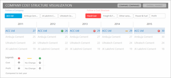
Dashboard Demos, Examples & Reviews
You can learn a lot about dashboard design by just observing dashboards designed by others. In this section, you can find links to various dashboard reviews I have done over time.
- Sales Dashboards – 32 different sales dashboards prepared by our members for a contest. This post has tons of useful examples and visual inspiration. You can download the source files for most of the examples.
- Marketing & Sales Dashboard – Demo & Video
- A review of Google Analytics Intelligence Report Dashboard
- Resume as a Dashboard – Fail or Success?
- Web Analytics Dashboard Review
- Project Dashboard Example
You can also find a great variety of dashboard demos & examples at Dashboard Spy.
Dashboard Do’s and Don’ts:
Dashboard design is a complex process. It is very easy to make mistakes and choose wrong alternatives along way. In this section, you can find practical advice that can be immediately applied to your next dashboard project.
Should you use Gauges / Speedometer charts in Dashboards?
Gauge or Speedometer chart is a very popular way to display a single metric in dashboard. In my opinion, they are a bad choice for depicting the status of one metric (or KPI). You can use a better alternative like bullet chart or thermo-meter chart to show the same information with more context. Also, read the discussion on best charts to depict actual vs. target performance.
How to show Budget vs. Actual, Target vs. Actual performances?
A common feature in most dashboards is the budget vs. actual performance charts. We have discussed and explained various alternatives on this here at Chandoo.org.

- Budget vs. Actual Charts
- Awesome budget vs. actual chart template
- Best Charts to Depict Actual vs. Target Performance
- Thermo-meter Charts in Excel – A quick tutorial
- Bullet Charts in Excel
How to Select the Right Chart based on your Data?
Selecting right chart is very important as right charts lead to quicker decisions. Please go thru the below links on advice related to chart selection:
General Dashboard Advice & Tips:
- Use Freeze Panes to prevent users from scrolling on dashboards
- Use shapes to make prettier charts
- Use alerts to draw attention in dashboards
- Advice for dashboard makers from Seth Godin
- Use Symbols in Dashboards
- Publishing Excel Dashboards to Web
- … More Dashboard Tips & Tricks
Ready to use Dashboard Templates, Dashboard Excel Workbooks
Use the following links to download ready to use dashboard templates and complete workbooks so that you can practice dashboard making and become even more awesome.
- Excel Dashboard Templates from Chandoo.org
- KPI Dashboard Template for Excel [ZIP]
- Dynamic Dashboard Template for Excel [ZIP]
- Project Management Dashboard Template for Excel [XLSX , 2003 version here]
- Project Portfolio Dashboard Template
More dashboard templates can be found in the dashboards tag page.
Dashboard Examples
Click here to explore more than 200 dashboard examples.
Additional Resources on Dashboards
If you make dashboards or you are about to enter the exciting world of dashboard visualizations, then the following links should greatly help in improving your knowledge:
Dashboard & Charting Related Resources on Chandoo.org
- Charting Principles & Advice
- Excel Charting Tutorials & Templates
- Dynamic Excel Charts
- Excel Formula Tutorials
- Advanced Excel Skills
Dashboard Resources in the Web
There are tons of website talking about dashboards. These are my favorites:
- Stephen Few’s Perceptual Edge – for insightful commentary on various BI and Dashboard solutions and examples.
- Robert’s Clearly & Simply – for excellent Excel and Tableau based dashboards and tutorials
You can find the latest posts from these blogs in the sidebar area too.
PS: If you know a great resource for dashboard design & implementation please share it with me thru e-mail. I would be very glad to include that site here.
Books on Dashboard Design & Implementation
I recommend the following books,
Information Dashboard Design by Stephen Few
Big book of Dashboards by Steve Wexler et al
Story telling with Data by Cole Knaflic
Of course, checkout my book too.
Excel Dashboards by Chandoo & Jordan
Recommended Training Programs
I conduct an online course on Excel dashboards where you call learn how to create world class Excel dashboards. All the tricks & ideas you see here are explained in that program. Please consider joining our course to learn more. Click here to know more.
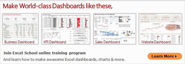
Recommended Tools for Dashboard Design in Excel
I am very glad to tell you about my Ready to use Excel Dashboard Templates, which can help you create beautiful, awesome, informative & elegant dashboards in just a few minutes. Take a look at below 3 minute video to understand how they work. If interested, click here to know more


