All articles with 'bar charts' Tag
{ 25 Comments }
Start your bar charts from zero – Excel geeks screaming at you from mountain top
Published on May 15, 2017 in Charts and Graphs

Here is a simple but vital charting rule.
Start your bar (or column) charts from zero.
To illustrate why you should do this, let me share a personal example.
Over the weekend, the Jon Peltier visited Wellington. He is staying with Jeff (who occasionally guest blogs on Chandoo.org). On Sunday, we all decided to hike up a small mountain near my house for a leisurely family picnic.
While on the top of the mountain, Jo (my wife) took a few pics of us three Excel geeks. As we were standing on a sloping mountain face this is how the pictures look.
Looking at the picture on left, you would confidently say that I am way shorter than other two. But picture on right tells a different story.
Continue »{ 15 Comments }
“How Trump happened” in Excel [visualizations]
Published on Mar 2, 2016 in Cool Infographics & Data Visualizations, VBA Macros
![“How Trump happened” in Excel [visualizations]](https://chandoo.org/wp/wp-content/uploads/2016/03/how-trump-happened-excel-replica.png)
During last week, an alert reader of our blog, Jørgen emailed me a link to “How Trump happened“. It is an interactive visualization by Wall Street Journal. Jørgen asked me if we could replicate the visualization in Excel. My response: “Making a new chart in Excel? Hell yeah!”
Read on for awesome visualizations and full explanation.
Continue »{ 16 Comments }
Analyzing half a million consumer complaints [Part 1 of 3]
Published on Feb 16, 2016 in Analytics, Charts and Graphs
![Analyzing half a million consumer complaints [Part 1 of 3]](https://chandoo.org/wp/wp-content/uploads/2016/02/analyzing-consumer-complaints-interactive-treemap-th.png)
How would you analyze data when you have lots of it? That is the inspiration for this series.
Let’s meet our data – Finance Industry Consumer Complaints
As part of open data initiatives, US government & Consumer Financial Protection Bureau maintain a list of all consumer complaints made against financial institutions (banks, credit unions etc.) You can download this data from the catalog page here. I have obtained the data on 1st of February, 2016. The download has 513,824 records. Each row contains one complaint.
In this and next two parts of the series, we are going to analyze these half a million complaints to find insights.
Continue »{ 1 Comment }
CP046: Gantt charts & project planning using Excel
Published on Oct 8, 2015 in Chandoo.org Podcast Sessions, Charts and Graphs

Podcast: Play in new window | Download
Subscribe: Apple Podcasts | Spotify | RSS
In the 46th session of Chandoo.org podcast, let’s talk about gantt charts and project plans.
What is in this session?
In this podcast,
- A brief intro to Excel 2016
- What is a Gantt chart?
- How Gantt charts can help us?
- How to create Gantt charts in Excel
- Using bar charts with invisible series
- Using conditional formatting and formulas
- Using ready-made templates
- Resources on Gantt charts & project planning
- Conclusions
{ 4 Comments }
Make bar charts in original order of data for improved readability [charting tip]
Published on Aug 10, 2015 in Charts and Graphs
![Make bar charts in original order of data for improved readability [charting tip]](https://chandoo.org/wp/wp-content/uploads/2015/08/fixing-bar-chart-order-for-better-readability.png)
To make friends in a new town hit the bars – Old saying.
To make sense of a new data-set, make bar charts – New saying.
Bar charts (or column charts if you like your data straight up) are vital in data analysis. They are easy to make. But one problem. By default, a bar chart show the original data in reverse order.
See the above example.
Unfortunately, we humans read from top to bottom, not the other way around.
Continue »{ 15 Comments }
Creating In-cell charts with markers for average (or target) values
Published on Dec 3, 2014 in Charts and Graphs
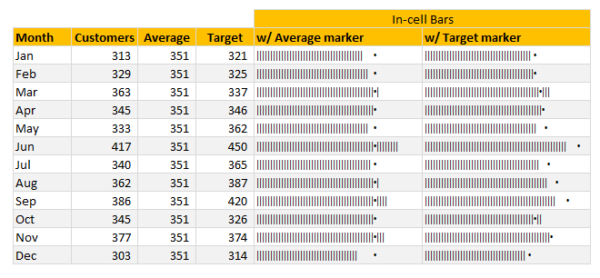
Today, lets talk about an interesting extension to the idea of in-cell charts. Adding average or target markers to the chart.
Adding a marker (like average or target or last year value) can enhance your charts greatly and provide more context. Lets understand how to add marker symbols to in-cell charts.
Continue »{ 14 Comments }
Bar chart with lower & upper bounds [tutorial]
Published on Jan 8, 2014 in Charts and Graphs, Learn Excel
![Bar chart with lower & upper bounds [tutorial]](https://img.chandoo.org/c/bar-chart-with-lower-and-upper-bounds.png)
Bar & Column charts are very useful for comparison. Here is a little trick that can enhance them even more.
Lets say you are looking at sales of various products in a column chart. And you want to know how sales of a given product compare with a lower bound (last year sales) and an upper bound (competition benchmark). By adding these boundary markers, your chart instantly becomes even more meaningful.
Lets learn how to create a column chart with lower & upper bounds in this tutorial.
Continue »{ 38 Comments }
Pie of a Pie of a Pie chart [Good or Bad?]
Published on Nov 9, 2012 in Charts and Graphs
![Pie of a Pie of a Pie chart [Good or Bad?]](https://img.chandoo.org/c/water-stats-pie21.jpg)
There are some charts that look so stunning and yet confusing. You cant make up your mind whether it tells a compelling story or it is just plain wrong.
Today, let me present you one such chart. I call this Pie of a Pie of a Pie chart.
Continue »{ 17 Comments }
Thermo-meter chart with Marker for Last Year Value
Published on Jun 11, 2012 in Charts and Graphs, Excel Howtos

During a recent training program, one of the students asked,
Thermo-meter chart is very good to show how actual value compares with target (or budget). But how can we add another point for say Last Year value to the chart with out cluttering it.
Something like above.
Sounds interesting? Read on
Continue »
Recently, I ran a contest asking you to analyze a bunch of sales data and present your results in charts. We received a total of 78 charts from 45 people. The contest entries had a mind-boggling variety of excel charts, techniques and ideas. It took me a while to go thru all the files and compile the results. Thanks for your patience. In this post, you can find all the charts along with my comments & links to download files.
Continue »![Show Details On-demand in Excel [Tutorial + Training Program]](https://img.chandoo.org/c/on-demand-analysis-and-details-in-excel-demo.gif)
Yesterday, we have seen a beautiful example of how showing details (like distribution) on-demand can increase the effectiveness of your reports. Today, we will learn how to do the same in Excel.
Continue »{ 14 Comments }
August 2010 – Best Month Ever (and 2 charting tips inside)
Published on Sep 3, 2010 in blogging, Charts and Graphs
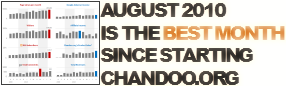
Time to stop everything we do and celebrate, for, our little community at chandoo.org had the most fantastic, awesome month ever.
That is right. August 2010 has been the best month since I started chandoo.org. We have broken a majority of previous records in terms of conversations, connections, content and revenues.
In August, we had 17 posts, with 604 comments. We had 178,000 visitors reading 453,000 pages. Our RSS subscriber base grew to 11,917 (it was 5738 an year ago). August has been the best month in-terms of revenues too. We sold highest number of project management templates & excel formula e-books since launch. We had a stellar launch for wedding planner with 22 customers.
Read rest of this post to find statistics about chandoo.org and get 2 charting tips.
Continue »{ 8 Comments }
Immigrants in Denmark – An Excel Infographic
Published on Aug 3, 2010 in Charts and Graphs, Cool Infographics & Data Visualizations
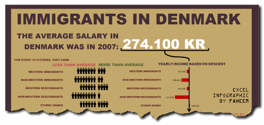
Faheem (@FaheemH) from Denmark sent me this beautiful infographic depicting various facts about Immigrants in Denmark. Immigrants in Denmark – Excel Infographic: [view high res] How is this Info-graphic made? Faheem used a variety of tricks to create this infographic. Some of the key ideas are, Using text boxes and drawing shapes Using bar charts […]
Continue »{ 12 Comments }
5 Rules for Making Better Charts (and one fun chart)
Published on Jul 30, 2010 in Charts and Graphs
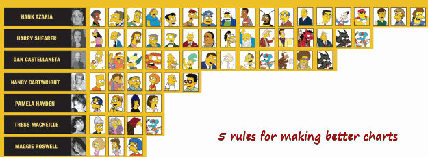
Jeff Weir, an alert reader of this blog points me this chart showcasing voice-over artist’s for various Simpson’s characters. I am a hard-core Simpon’s fan, so I naturally wasted quarter-hour looking at the chart. That is when I realize this chart is not only fun, it also teaches 5 valuable lessons on making better charts. Read the rest of this post to find out the five rules.
Continue »{ 49 Comments }
New Features in Excel 2010 Conditional Formatting
Published on May 19, 2010 in Charts and Graphs, Learn Excel
Conditional formatting is one of favorite features in Excel. CF has helped me save the day at work more than a dozen occasions. I almost became project manager just because I knew how to make a gantt chart in excel using conditional formatting. I have written extensively about it.
So, I was naturally curious to explore what is new in Excel 2010’s Conditional Formatting. In this post, I will share some of the coolest improvements in CF.
Continue »
