
How many times you created a chart in Microsoft excel and formatted it for minutes (and sometimes hours) to reduce the eye-sore?
Well, I will tell you my answer, its 293049430493 times 😉
Worry not! for you can become a charting superman (or elastigirl) by using these 73 free designer quality chart templates in literally no time (well, almost)
These templates will take care of typical formatting activities like,
- Remove that ugly Grey color background from the chart
- Change the default grid line format from intrusive solid black to a duller shade of dotted Grey
- Adjust the fonts (to verdana in this case), remove annoying chart auto-font-scaling
- Move the legend to a meaningful location and adjust its size
- And, ofcouse, fix the colors
so that you, the user can focus on your data and not on “why in the world anyone would design a default format like this…”, so go ahead and unleash the charting pro in you.
Download the free MS Excel chart / graph templates
Click here to download the templates
If you are wondering how to use these templates, scroll all the way down the post 🙂
More Charting Resources
Excel Dashboards – Tutorials & Downloads
Free Excel Downloads
Charts and Graphs
Excel School – My Online Excel Classes
VBA Classes – My Online VBA Training Program
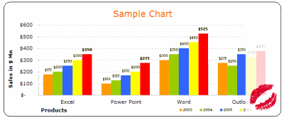
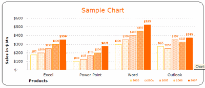
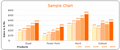
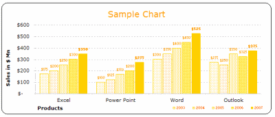
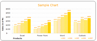
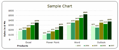
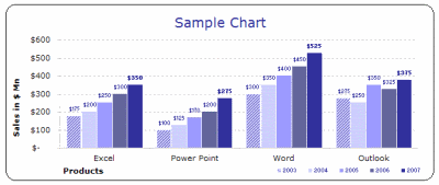
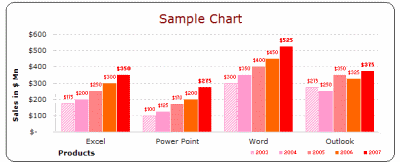
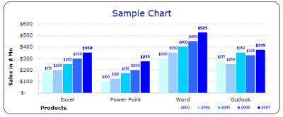
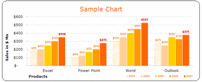
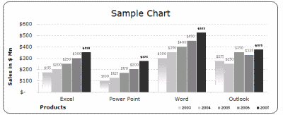
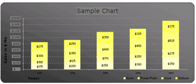
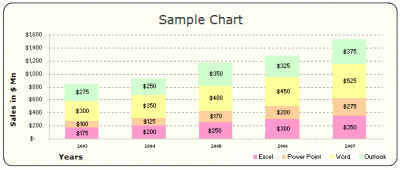
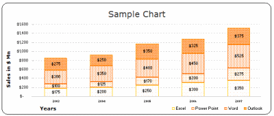
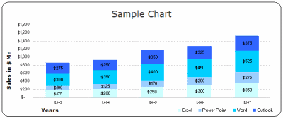
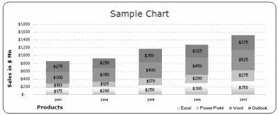
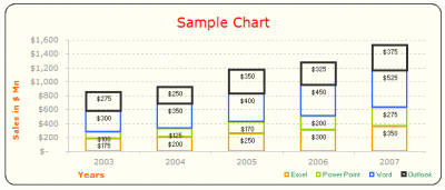
1. Bar / Column Chart Templates:
(29 of them)
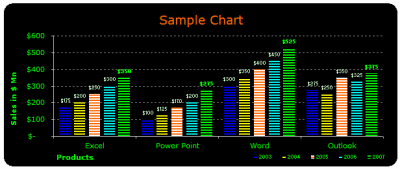
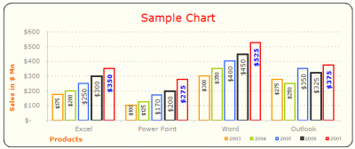
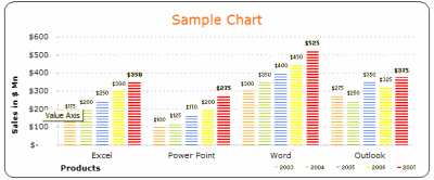
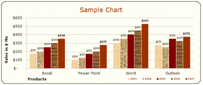
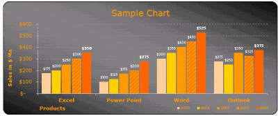
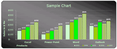
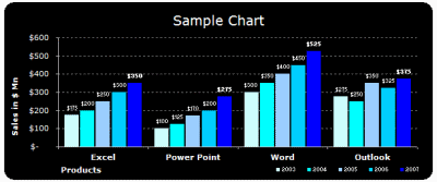
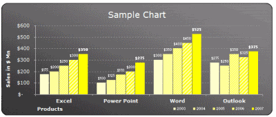
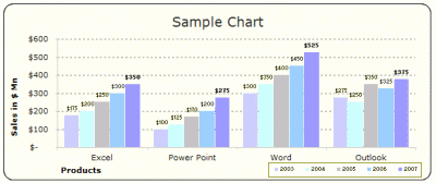
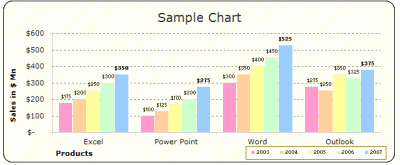
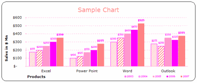
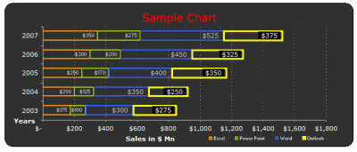
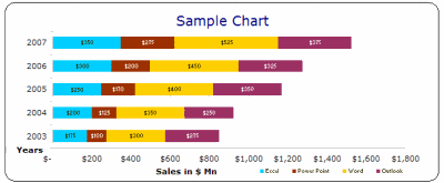
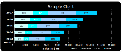
2. Stacked Bar / Column Chart Templates:
(22 of them)
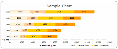
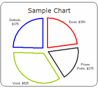
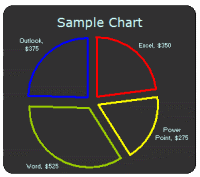
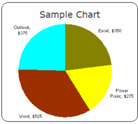
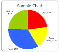
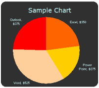
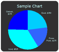
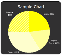
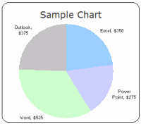
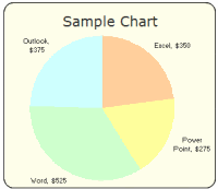
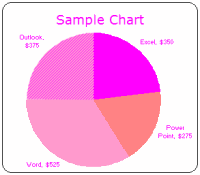
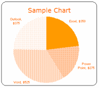
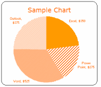
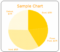
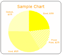
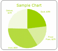
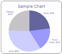
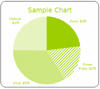
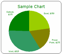
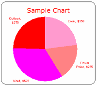
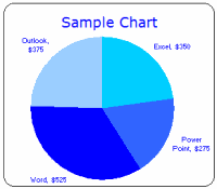
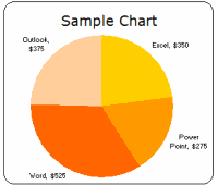
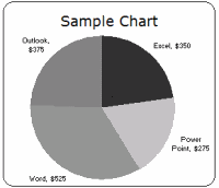
3. Pie Chart Templates:
(22 of them)
Even though I seldom use pie-charts (since they hide more than they show and all that) I know a lot of people do use them and hence here they are,
How to use these templates?
Learn more about using chart templates in excel
- Method 1 – Easy and Quick:
- Download the chart templates (download links at top and bottom of this post)
- Copy both the chart you wanted and the “data used” portion
- Paste in your workbook
- Change the values, remove columns (or add them if you wish)
- Modify formatting if needed
- Be careful now, as your boss may feel zealous for your charting skills
- Method 2: Slightly geeky but works like a charm!
- Download the chart templates (download links at top and bottom of this post)
- Select the chart you want, right click and select “Chart type” from the context menu
[note: for more detailed steps & how-to, look in the excel worksheets you have downloaded - In the dailog, go to “custom types” tab and select “User-defined” radio button (towards bottom left)
- Click on “Add…” button, and give your chart-template a name that you can remember
- When you are done, click ok, and the chart is now added to your user-defined-charts library
- In future, when you want to use the chart, simply click on charts icon on tool bar, and select the chart type as custom -> user defined ->your chart name
- Now, watch out as your charts start stealing eyeballs in the boardroom!
Finally we can say good bye to default chart formats and all the associated eyesore
Download the free MS Excel chart / graph templates
More Charting Resources
Excel Dashboards – Tutorials & Downloads
Free Excel Downloads
Charts and Graphs
Excel School – My Online Excel Classes
VBA Classes – My Online VBA Training Program


115 Responses
There’s nothing worse than the default MS chart formats. Thank you for working to rid the world of these eyesores.
Man, you sure do have a fetish for Excel.
What about line charts? These are great but not feeling the love for the lines. -C
Hi…These templates aint working
Message Received: Drawing conversion failed.
@Monte Bel – thank you for visiting PHD and commenting 🙂 Hope you liked the templates
@ Kapil : thanks 🙂
@Cristobal: Thanks for visiting PHD, btw, the line charts are there, just load the template and convert the chart type from bar chart to line chart, the colors would adjust automatically (they should 😛 ), let me know if this doesn’t work.
Really cool templates, many thanks, I downloaded them for future use. Bye
Excellent prepared
Hi, your chart templates are great. I did n’t understand how to create 1*1 pixel in paint brush with the colour of my choice.
@DRN … thanks, you can create the color of your choice in mspaint by,
1. go to start > all programs > accessories > paint and click on it
2. double click on any of the color buttons at the bottom
3. select “Define custom colors >>”
4. enter RGB values for your color choice
5. click on “Add to custom colors”
6. click OK
7. select paint bucket tool (tool tip says “fill with color”)
8. click on the image area
9. go to menu > image > image attributes (or press ctrl+E)
10. enter 1 as width and height
11. save as bmp or jpg or gif
cool, now you have a 1*1 pixel in color of your choice.
Let me know if this helps you… 🙂 welcome to PHD…
Thanks a lot…I got it 🙂
Chandoo, You are a Freaking Genius, you saved me atleast 2 days of work.
Thanks Man for this, great to see some value been added to the Internet.
Please do post some more sample, this will be really helpful to alot of us.
@Dhondu … welcome to PHD, thanks alot for your comments.. 🙂
thank you!!!
you made my day..too much helpful
Dear Chandoo,
Really you are great yar! I learned most of the Conditional Formatting by your tips. If you have any other tips and tricks in excell please send me a link.
Thank You
With regards.
Is it possible to display charts simply by selecting the data, and is it possible to change the chart by selecting another data.
Please reply.
Dear Excel Master,
Hi Chandoo I have changed your name …You are really great..I have download all cool templates for future use.
If you have any other tips and tricks in excel please send me a link.
Have nice Weekend Bue.
Thank you so much sir, Really cool templates, I downloaded them for mu day to day use. KEEP IT UP!
@Sadiq Ali: Hi sorry, I didnt notice your question till now “Is it possible to display charts simply by selecting the data, and is it possible to change the chart by selecting another data.”
well, its not possible to plot charts dynamically by selecting data unless you are willing to write some VBA. There are other techniques to make charts look dynamic, I will write about one such technique sometime soon.. keep watching this blog 🙂
@Nikhil – welcome to PHD blog, thanks for your comments. Sure, just subscribe to our mailing list or blog content feed to get fresh hot excel tips everyday.
@Shanker – Welcome to PHD blog. Thanks for your comments. Keep visiting this place to enjoy more tips 🙂
Hi Chandoo!
I’ve been reading through a lot of the site for hours and I got a question man, I’ve encountered recently some excel documents a co-worker downloaded which is sort of a quiz, basically a game quiz, it has an image of a movie and you had to guess the name in a box then, a box below gave you a correct with green bgcolor or wrong in red bgcolor. My question is what kind of formula or way, can I get to use this so I can do some quiz test for some students? it’s a very ingenius way to pop the brain a bit with excel. I appreciate the time you put into this site, keep up the work.
hi chandoo,
is my second time typing it seems my explorer sucks, I’ll make it short this time, I received an email with an excel document that does a quiz where they showed you an image of a movie and you had to answer which movie is it from, almost case sensitive capitals don’t matter, so i would like to know what is the formula or whatever it is so i can apply it on educative ways for classes. thanks for the time you put into this site.
@istreva … thankfully your first comment made to my server before crashing your browser. Welcome to PHD and thanks for the comments 🙂
You can create a quiz in excel by using protected cells and conditional formatting. I will write a tutorial on this may be in the next 2 weeks. Basically the way to do this is to have the answers in a range that is protected so that no one can view it, and then use conditional formatting on cell(s) to change color to red / green based the answer entered by quiz taker.
I think that would be awsome, I’ve been trying to figure that out but I’m not an excel guru, I studied some computer programing and done some javascript, so i thought there would be some “if” “then” involved, I think If you can point me in one direction with one sample I can manage to replicate the process and maybe even add on some more to it! Thanks man, 6 hours a day in the office can be very insighfull reading your site 🙂
Hi
I just found this site and am happy to find other people interested in Excel as much as I am!. I have a problem because my IE can’t find the link to download the charts. Are they still available??
Thanks
Joseph
@Joseph: Welcome to PHD and thanks for visiting us 🙂
You can download the files from http://cid-b663e096d6c08c74.skydrive.live.com/embedrow.aspx/Public/73%20Free%20Designer%20Quality%20Excel%20Chart%20Templates.zip it is a one zip file available for download from Live.com’s skydrive. Let me know if you have access issues, I can upload the file to my own server and give you another link.
Thanks,
Hi Chandoo, this site is really useful for my report. Everyone might admire me as of my interesting presentation. nice day!
Thaopham: Awesome… I am happy you found this useful 🙂
I am still not able to download these templets…….ti shows access denied…..sorry for being too demanding but if you could mail to my id azmat1979@rediffmail.com it would be highly appreceiated
hi Chandoo… this is of great help and saves a lot of time…
Thanks
Fantastic! I don’t use Excel much, but this is so cool, I had to download the templates 🙂
Thank you.
Great work!!! This is very useful!! Cheers – Deepak
perfect! thanks very much for your contribution.
Excellent charts!
Microsoft must buy your chart templates and use them in their next Office release.
May God bless you.
Hi Chandoo,
Thank you very much…I learned a lot conditional formatting &
Dashboard technique because of you.
If you can provide more dashborad examples clearly..then it will be
a great help.
Regards
Rajinikanth
thanks for your valuable chart templates. really they are very useful. keep up good job.
@Nick: Welcome to PHD and I am happy you liked these charts.
Hi Chandoo,
Its very good help for every one who wants to prepare the charts,
your templates are good and I utilised some of the templates with some modifications.
Great job!!!!!!thanks
@Rajinikanth: Welcome to PHD and thanks for your nice words. I am very happy you liked the templates and using them in your work.
good day, dear, This is very useful, thanks a lot,
keep is going,
I want to create a chart where the bars in the chart mirror the color in the cells used to create it. For example, if something is Red at 12% and Green at 85%, I want the columns in the chart to be Red at 12% and Green at 85%. Whenever I try to create the chart it colors each bar the same. Is what I want to do possible?
SHannon – one way you could do this is to add a different series to the chart for each colour that you will be using, then format those series the specific colours you want. The series would need to reference different columns, which would only contain the data specific to each colour.
For instance, if your original data was in a column starting from A2, then in the cell B2 (which will be where the green series of the graph points to) you would have a formula like =if(A2 > .80, A1, na()) which means that only data that meets your cut-off point for being green (80% in this example) gets copied there. Anything else gets entered as the error #N/A, which Excel doesn’t plot.
THis should do the trick.
Thanks for your work. It’s what I ever wanted in Excel, otherwise a good program.
Little question – the edges of the pie charts are uneven – is some anti-aliasing possible?
Dear Sir
Actually an looking for your help.
I have a folder which contain word and excel working on .However it me personal file but have to dispute in where a lots of person to get access with it .is it possible to put it with an easy way as read only just they can view it only.Thanking in advance for your help
@Martin… Try using Excel 2007, it makes the edges of charts look more smoother. More on the charting differences between 2007 and 2003 here: http://peltiertech.com/WordPress/why-i-dont-like-excel-2007-charts/
@Krishun… You can use the protect sheet options to protect ranges or whole worksheets from editing. Learn more here: http://chandoo.org/wp/2009/11/03/make-better-excel-sheets/
Excellent!! I’ve been looking for some nice looking charts!
You are an angel!!!! I have struggled with a pie chart, but not anymore!!
Thanks,
Wise Writers and Speakers
Hi Chandoo
When I try to download it does nt come as a normal zip folder and it asks which program to use? I tried excel and doesn’t work! any ideas 🙁
@Catherine… sometimes live.com adds an underscore “_” at the beginning and end of the file name. just select the file, press “F2” and remove the “_” from end. This should make the file work with winzip (or expand all option).
its great..
thank you
Thats Gr8:-)
Hi Chandoo,
I found these templates, and like the idea of using them. However, I must be missing something because when I follow the directions, the result I get is not what I expected. When I choose the range $N$9:$S$13 and select the user defined chart, I get a really strange result.
I found that I had to select only the data values ($O$10:$S$13), then when the used designed chart appears, manually re-enter the X Axis series ($N$10:$N$13), and the each references for each of the years ($O$9 etc.).
Any idea what I am doing wrong?
Regards David
Thank you! This looks great. The defaults look horrible. You’ve done a great job with these templates!
Great Work;
It is very useful in a real life and time saving as well.
Thank you
Saved me a lot of time and grief and gave me a much better quality of output than I would ever have achieved on my own
Much appreciated
Hi Chandoo – Have read your interview in msn. You are simply great and can stand as one of the roll model to the youngsters especially who scream by comparing themselves with others promortion or hike.
Best part is that you have realised what is your passion.
HEARY CONGRATS.
Rgds,
Gopinath
Do you have a simple Excell Add-On that gives Dashboard gauge results? My physicians need something easy to ready and the Gauge formot seems to be easy. Thanks
Dear Chandoo,
I just came across your site and I must say thank you very much for all the helpful tips. Saves all of us days of working so many things out ourselves!! I have a problem. I download the chart templates file from the link you gave but when I tried to open the Zip file using WinRar, I get an error message “The archive is either in unknown format or damaged”. I have used WinRar to open other zip files without any problems. Is there any way I can re-download and open in WinRar? Are the templates still available? Thanks very much
Hi Chandoo,
Pls ignore earlier request (not the comments though!) as I managed to download and extract. Thank you once again
UnniK
Hi Chandoo
I do not know how to put curved text in the doughnut shape which aligns well with the lines.
Any one any idea?
Vinod
Chandoo….you rock!!! Thanks a tonne, man!
Hi Chandoo,
Cant download the templates as the link is not available anymore. can you please provide an updated link?
Many thanks
@Ahmet
The download links take you to a Sky Drive page
Just select the file from there
There are several online tools available that can help you create comprehensively designed flowcharts and graphs within few mins. These could be flash animated charts that could go in to a ppt slide.. Read more here.. http://askwiki.blogspot.com/2011/09/best-of-online-graphs-and-charts.html
By learning Microsoft Excel Online it helps me to work more effectively and more precise with the help of examples files were we can download and learn in more advanced terms in MS Excel. I appreciate the work of this online training programme to higher extent because it help lot of people who is willing and interested to work in Excel like me. I Love MS Excel to the higher extent. And I request you to please upload more example files so that the people like me can be benifited from Excel training.
Thank you.
N.Vishwanath.
I appreciate for all your help to make us learn Microsoft Excel in a more advanced terms. I request you to please update more exercise files, so that the people like me who are interested can be benifitted from learning MS Excel. I Like MS Excel to the higher extent.
i cash teachung
This looks great! I would really like to take a look at these. Is there another, more direct link to download the templates? The Sky Drive link doesn’t work for me.
Nice templates! Thanks!
Biju
http://www.lenvica.com
Wonderfully creative and comprehensive. Bubble charts play an increasingly important role in my work. Any idea why Pie Charts can have leader lines to show the Label, but I cannot do that [easily or at all?] for bubble charts. As you know, bubbles can overlap or completely cover each other, so use of leaders can make them understandable. Thanks for any recommendations
Hi, I have a question regarding templates. Basically I have a series of data, theyre like 10 numbers. I calculated the summary statistics for it already and now I want to create a bell curve and have that bell curve automated where if I put in any number, it will plot it on my bell curve and I can see if its an outlier or how many standard deviations its away from the mean. Thanks
PS: Im using Excel 2007 and already have the Data Analysis Took Pak added.
Chandoo,
I have tried few times but can’t use these charts. When I use the 1st method – nothing happes when I change the data??
more clear
Chandoo,
I want to build a 3-D charts for Item 1, 2, 3 and their sales for 2011 and 2012. Do you have a template for that?
Simon
@Simon
Setup your data like:
2011 2012Item A 17 20
Item B 15 13
Item C 12 16
2011 is above column with no. 17
2012 is above column with no. 20
Select the whole area including Items, Years and data
Goto Insert, Chart, select the 3D chart type you want to use
I think I need to clarify the data set a bit.
2011-01 2011-02 2011-03 2012-01 2012-02 2012-03Item A 17 20 23 34 32 32Item B 15 13 34 32 33 65Item C 12 16 34 32 44 99
I want the Items to stack in 1 bar per month, and show it in one list of bar for each year
Simon
@Simon,
Can you email file to me?
(Click on Hui above and look at bottom of the page for email address)
Hi Chandoo,
I like the look of the pseudo incell chart, how did you achieve such an effect? I’ve downloaded the templates, but there is no fill for any data series.
Thanks!
JY
i got to know abt chandoo.org recently, n since two days completely diggin out the site 😛 i just love working with excel n powerpoint n graphs etc.. this site is really “awesome”. 😀
Do you have any cool templates for line graphs?
HI CHANDOO,
PLEASE LET ME KNOW HOW TO CREATE THAT SMALL BOX AS U HAVE CREATED IN A New Year Resolutions Template that Kicks Ass , IN WHICH WE HAVE TO TICK OR UNTICK………
Does ANYONE know if its possible to make a CLOCK graph to depict overlapping work schedules for a crew at any particular job location? if so, where can I get it and/or how do I make it. Thanks for ANY feedback David.
update please…
Really cool templates, many thanks, I downloaded them for future use. Bye
Seeing the stuff in your website I feel astonished that how a man can be so brainy doing so many things single handed. Kudos to you.
Hi Chandoo excellent charts for free, but i ma trying to find out how you created your pie of pie of pie chart re water use. how can i create the same thing using my data
I am very interested to see if someone has used these dashboards as shared workbooks to give multiple users (5-10) access to update the dashboards concurrently. Lots of our clients use spreadsheets very inefficiently with no concurrent update of data made possible due to their reliance on old school “you-add-your-data-and-I-will-add-mine when-you-are-done” approach with no account for version control etc. I don’t want to use VBA because once you step out of the team they keep phoning you to make the slightest changes to the code. I want to keep it as simple as possible and was hoping their would be people out there who have used these dashboards in a smart collaborative manner.
The option of saving the chart templates is not available in Excel 2010 as i m currently using the Office 2010. Pls guide how to get the oprion of Chart Type > User Defined
I downloaded the excel template, but with I copy the chart to workbook, how do I copy the data put. its not working for me please advise.
I have the latest version of Excel. Method 1 and 2 do not work! I cannot edit any of the templates. Can someone Help me please???
Hi Chandoo,
How to convert pie chart into bar diagram. It is like converting earth to flat map but do know the process.
Help will be appreciable.
Will people that don’t have these templates see them the same way when they open the spreadsheet on their computer?
@Julie
All versions of Excel after 2003 render colors and lines slightly differently to versions before 2007
But yes you will mostly see the same on your PC
Hi!
I am looking for a “Variance Matrix” Graph for differences in Quality scores. Basically, we score quality from 1 – 5 and then an auditor will score the same call 1 – 5. I want a graph that has 1 – 5 vertically and then 1 – 5 horizontal at the top, then put counts in the middle for how many calls match up in each box EG, If I scored it a 1 and then they scores it a 3 it would show up at 1 vertically(my score) and 3 along vertically (Auditors score) is this possible on excel?
Hi Sir,
I want to create a Graph any type. I have data in below format:
Company Name Emp Name Number
ABC Aditya 555
ABC Mukesh 777
ABC JHA 999
XYZ Aditya 666
XYZ Mukesh 444
XYZ JHA 888
Please guide me to plot this graph on above data but I want Company Name, Emp Name, Max of No, Min of No and Avg of No.
Waiting for your response…
@Aditya
Can you please pose the question at the Chandoo.org Forums
http://forum.chandoo.org
Add a sample file to simplify the task
Thumbs up for the templates…you rock man!
Thanks so much.
this is one what m i looking for