Excel Charts, Graphs and Templates
Tutorials, Examples and explanations on Excel charting. You can learn how to create almost any chart type in this section. Also learn how to create effective charts, make them interactive and add automation thru VBA
CP029: Impress your boss with Excel charts – 6 step road map for you |
|

|
Podcast: Play in new window | Download Subscribe: Apple Podcasts | Spotify | RSS In the 29th session of Chandoo.org podcast, let’s impress the boss with Excel charts. What is in this session?Many Excel charts live a short life. They spawn in an ambitious analyst’s spreadsheet. They go to boss with literally flying colors. The boss frowns, they disappear in to recycle bin. Don’t curse your Excel charts with short life span. Here is a 6 step road map to help you create awesome Excel charts, everytime. That is our topic for this podcast session. In this podcast, you will learn
|
Doing Cost Benefit Analysis in Excel – a case study |
|

|
Imagine you are the in-charge of finance department at Hogwarts. So one fine day, while you are practicing the spells, Dumbledore walks in to your office and says, “Our electricity bills are way too high. As the muggles don’t accept wizard money, we have to find a way to reduce our power consumption.” So you summoned the previous 12 month utility bills to examine energy consumption patterns, and pretty soon you realized that most of the electricity consumption is due to the light bulbs. You suddenly have a brilliant idea. Why not replace the light bulbs with a variety that consumes low power? A light bulb moment indeed. Your next step is to figure out what varieties of light bulbs are out there. Fortunately this is easier than catching a snitch in a game of quidditch. A quick search revealed that there are 3 types of light bulbs:
Now your job is to do a cost benefit analysis of these options and pick one. |
Creating In-cell charts with markers for average (or target) values |
|
|
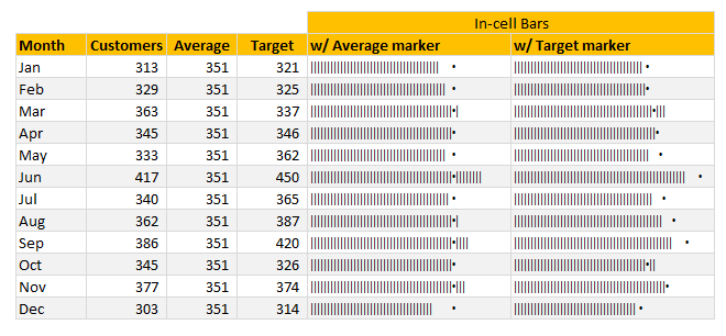
Today, lets talk about an interesting extension to the idea of in-cell charts. Adding average or target markers to the chart. Adding a marker (like average or target or last year value) can enhance your charts greatly and provide more context. Lets understand how to add marker symbols to in-cell charts. |
Download today – Introducing Excel Dashboard Templates from Chandoo.org |
|
|
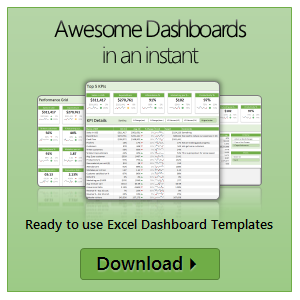
Friends and readers of Chandoo.org, my newest download, Excel Dashboard Templates are available for your consideration. Click here if you are ready to get them. Read on to know more. What are Excel Dashboard Templates?As the name suggests, these are ready to use Excel templates for creating awesome, informative, easy to understand & quick dashboards with your data. You just enter your data, set up few calculation options, decide how your dashboard should look & bingo, a beautiful & insightful dashboard will be created for you. These dashboards are optimized to look great, convey key information & prompt correct action. Who should buy these templates?Analysts, managers, reporting professionals, business owners & executives. These templates are designed to help anyone preparing Excel based dashboards, scorecards or KPI reports. Benefits for you
|
Ready to use Excel Dashboard Templates – Official Trailer |
|
|
Hello folks, Its almost ready. Our ready to use Excel dashboard templates are coming to a spreadsheet near you on November 13th. Here is a teaser preview of the dashboards. Our own official trailer, rated A for awesome. Watch it below: http://youtu.be/2-TvjpEKf-o (see it on our YouTube Channel, alternative link) Excel Dashboard Templates – What are they?As the name suggests, these a set of workbooks where you can key in your data, set up how you want the looks & bam, a beautiful, insightful, fun, easy to use dashboard pops right out. All in few minutes. Here is how these templates can help you:
|
A better chart to visualize “Best places to live” – Top 100 cities comparison Excel chart |
|

|
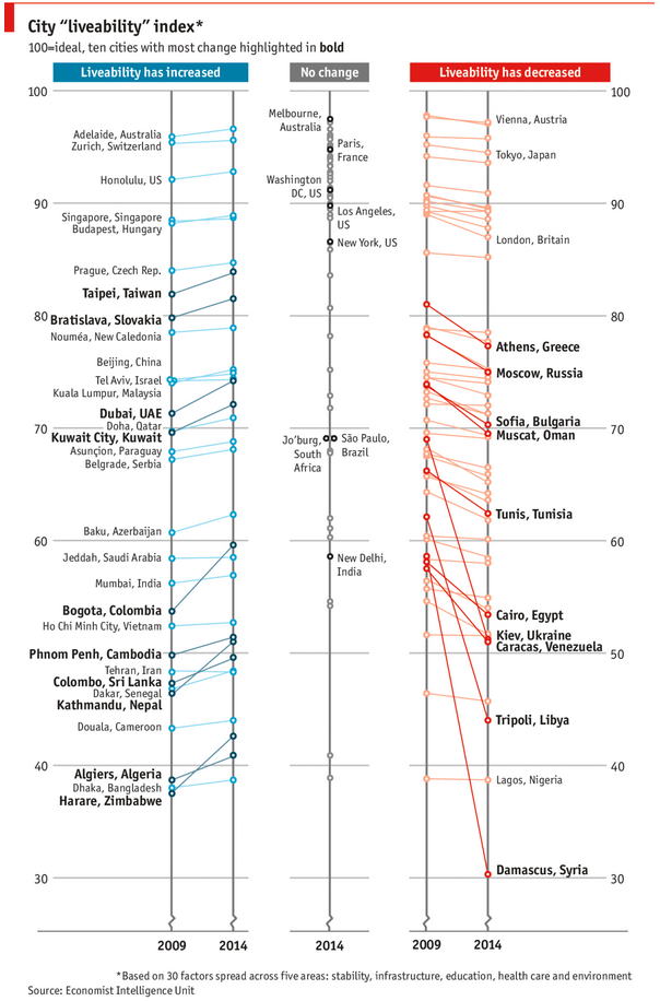
Recently, I saw this chart on Economist website. It is trying to depict how various cities rank on livability index and how they compare to previous ranking (2014 vs 2009).
As you can see, this chart is not the best way to visualize “Best places to live”. Few reasons why,
After examining the chart long & hard, I got thinking. Its no fun criticizing someones work. Creating a better chart from this data, now thats awesome. |
ABC Inventory Analysis using Excel |
|
|
|
ABC analysis is a popular technique to understand and categorize inventories. Imagine you are handling inventory at a plant that manufactures high-end super expensive cars. Each car requires several parts (4,693 to be exact) to assemble. Some of these parts are very costly (say few thousand dollars per part), while others are cheap (50 cents per part). So how do you make sure that your inventory tracking efforts are optimized so that you waste less time on 50 cent parts & spend more time on costly ones? This is where ABC analysis helps. We group the parts in to 3 classes.
Given a list of items (part numbers, unit costs & number of units needed for assembly), how do we automatically figure which class each item belongs to? And how do we generate above ABC analysis chart from it? |
Mapping relationships between people using interactive network chart |
|

|
Today, lets learn how to create an interesting chart. This, called as network chart helps us visualize relationships between various people. Demo of interactive network chart in Excel First take a look at what we are trying to build. Looks interesting? Then read on to learn how to create this. |
A dashboard to visualize this FIFA worldcup [guest post] |
|
![A dashboard to visualize this FIFA worldcup [guest post]](https://cache.chandoo.org/images/c/excel-charting-example-v1.png)
|
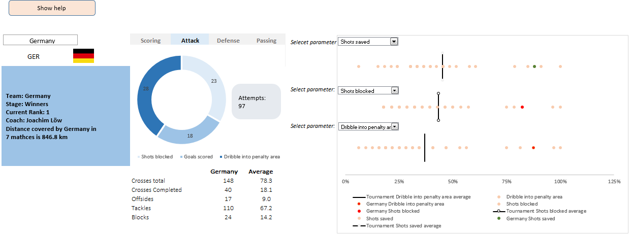
This is a guest post by Krishna, a football lover & one of our readers. The wait for lifting the most valued priced in football for Germans was finally over. For a football fan, world cup is best time that is scheduled every four years and that if your favorite team lifting the trophy is like your crush is going on a date with you. 🙂 A sneak-peek at the final dashboard Here is the final dashboard (it has more functionality than depicted). Click on it to enlarge. |
Story of my first ever 200KM bike ride (plus an Excel dashboard with ride stats) |
|

|
Ok people. Let me tell you that this post is almost not about Excel. It is about how one Excel blogger’s (yours truly) dream of long distance cycling came true. So sit back, grab your favorite drink and read between sips. So what is this all about? Last Sunday (27th July) & Monday (28th), I finished my first ever 200KM bicycle ride. I rode for a little more than 12 hours, burned 5,179 calories & rode 206 kilometers. It is definitely one of the most memorable, tiresome & uplifting experiences in my life. So naturally, I want to share the story with you. |
How fireworks animated chart is made [video tutorial] |
|
![How fireworks animated chart is made [video tutorial]](https://cache.chandoo.org/images/c/excel-charting-example-v1.png)
|
On July 4th this year, I published an animated fireworks chart for you. Many of you liked it. Quite a few wanted to know how its made. So here is a video explaining the construction of fireworks. (You can see this video on our YouTube Channel too) |
CP014: How to create awesome dashboards – 10 step process for you |
|
|
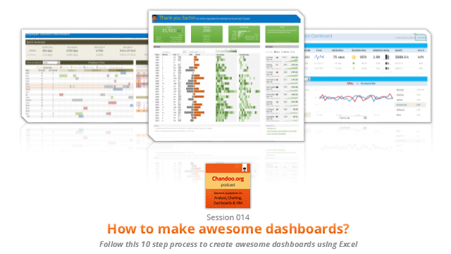
Podcast: Play in new window | Download Subscribe: Apple Podcasts | Spotify | RSS In the 14th session of Chandoo.org podcast, lets figure out how to make awesome dashboards. What is in this session?Excel based dashboards are much in demand these days, thanks to advancements in Excel & growing pressure on costs. Now a days, analysts & managers are expected to quickly put together a dashboard using Excel. But how do you make a dashboard? What process you should follow? These are the questions we address in this podcast. In this podcast, you will learn,
|
Winners of state migration dashboard contest |
|
|
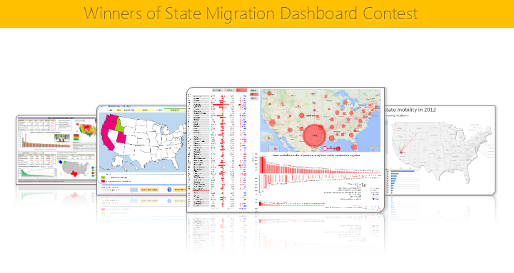
Finally the wait is over. Here are the winners of our 2014 dashboard contest. Check them out. |
4th of July Fireworks – an Excel animation for you |
|

|
To all our readers & friends from USA, I wish you a happy, fun & safe 4th of July. For the last 4th of July (2013), we (Jo, kids & I) were in USA. We went to Washington DC to meet up a few friends for that weekend. And we had one of the most memorable evenings of our lives when we went to national mall area in the evening to watch beautifully choreographed fireworks. Kids really loved the amazing display of fire-crackers and enthusiasm. While we all are back in India this time, it doesn’t mean we cant celebrate 4th of July. So I made some fireworks. In Excel of course. Here is a little Excel animation I made for all of us. 4th of July Fireworks – Excel animationFirst watch this quick demo (<15 secs) |
CP013: Is this a FIFA worldcup of late goals, lets ask Excel [How to analyze data to answer questions like these…] |
|
![CP013: Is this a FIFA worldcup of late goals, lets ask Excel [How to analyze data to answer questions like these…]](https://img.chandoo.org/podcast/session-013.png)
|
Podcast: Play in new window | Download Subscribe: Apple Podcasts | Spotify | RSS In the 13th session of Chandoo.org podcast, lets turn our attention to on-going FIFA worldcup and ask an important question. What is in this session? |
A quick Excel tip for you while on a long bike trip…, |
|

|
Hi friends, I have a surprise for you. Between the late night world-cup matches & my reinvigorated thirst for biking, I have difficulty finding time to write a long & detailed article for you. So I thought why not say hello to you and share an Excel tip while I am on a biking trip. Go ahead and check it out. Its just 4 minutes. Watch it below or on our YouTube channel. |
Is this a FIFA worldcup of late goals? Lets ask Excel |
|
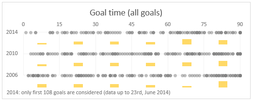
|
Just like millions of viewers around the world, I too have been spending hours watching FIFA world cup football matches on TV. I don’t like spending hours watching TV. But when its FIFA world-cup time (which is once every 4 years), I am glued to the idiot box. Blame it on PaWaRa, my school teacher in 8th grade who instilled this passion. So while watching the match day before yesterday (it was Holland vs. Chile), the commentator said, “This has been a world-cup of late goals” as both teams maintained 0-0 until 77 minute mark when Leroy Fer scored a goal for Holland. That got me thinking, Is this really a world-cup of late goals? But I quickly brushed away the thought to focus on the match. Later yesterday, I went looking and downloaded all the goal data for 2006, 2010 & 2014 FIFA world-cup matches (2014 data for first 36 matches). Lets examine the hypothesis “2014 has been a world-cup of late goals”. |
Top 10 things we struggle to do in Excel & awesome remedies for them |
|

|
Recently we asked you, what do you struggle doing in Excel? 170 people responded to this survey and shared their struggles. In this post, lets examine the top 10 struggles according to you and awesome remedies for them. |
Excel Dashboards – 49 dashboards to visualize US State to State migration trends |
|

|
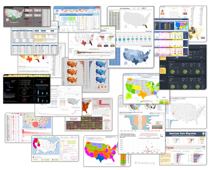
Hello everyone. Stop reading further and go fetch your helmet. Because what lies ahead is mind-blowingly awesome. About a month and half ago, we held our annual dashboard contest. This time the theme is to visualize state to state migration in USA. You can find the contest data-set & details here. We received 49 outstanding entries for this. Most of the entries are truly inspiring. They are loaded with powerful analysis, stunning visualizations, amazing display of Excel skill and design finesse. It took me almost 2 weeks to process the results and present them here. Click on the image to see the entries. |
Create a line chart with bands [tutorial] |
|
![Create a line chart with bands [tutorial]](https://img.chandoo.org/c/line-chart-with-bands-to-depict-kpi-or-goals.png)
|
Here is an interesting scenario. Imagine you are responsible for customer satisfaction at ACME Inc. Every month you track customer satisfaction rate for the 3 products you sell which are conveniently named Product A, B & C. You also have bands for the satisfaction rating.
At the end of the year, you want to visualize the ratings for last 12 months for 3 products along with bands. Something like above. Unfortunately, there is no “Insert Banded line chart” button in Excel. So what to do? That is what we will learn today. Ready? |

