Excel Charts, Graphs and Templates
Tutorials, Examples and explanations on Excel charting. You can learn how to create almost any chart type in this section. Also learn how to create effective charts, make them interactive and add automation thru VBA
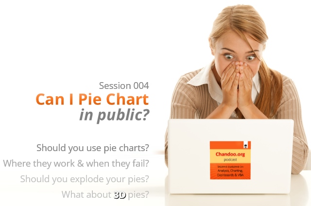
CP004: Can I Pie Chart in Public? Discussion about Pie charts, their merits and drawbacks, when to use & when to avoid them |
|
|
Podcast: Play in new window | Download Subscribe: Apple Podcasts | Spotify | RSS In the 4th session of Chandoo.org podcast, lets talk about Pie charts. Pie charts evoke strong opinions among analysts & managers. Some people love them and can’t have enough of them in reports. Others despise them and go to any lengths to avoid them. And that is why we are going to talk about them in this session. You will learn,
|
I won’t eat donut with a thread inside, but lets make one anyway! |
|
|
Today lets take a stroll outside what Excel can do and make something fancy, fun and may be useful. Nowadays, many newspapers, websites and magazines are featuring info-graphics. An info-graphic is a collection of shiny, colorful & data-full charts (or often pieces of text.) In many of these info-graphics, you can see threaded-donut charts. Not sure what that is..? It is not same as the blasphemy of spoiling a soft, sweet, supple donut with a piece of string. No one should be excused for an offense like that. What I am talking about is shown above |
Quick and easy Gantt chart using Excel [templates] |
|
![Quick and easy Gantt chart using Excel [templates]](https://img.chandoo.org/pm/quick-gantt-chart-template-excel.png)
|
Gantt charts are a very popular way to visually depict project plans. Today, let us learn how to use Excel to make quick & easy Project Plan Gantt Chart. This is what we will be creating. |
Learn how to create these 11 amazing dashboards |
|
|
Today lets talk about how to build world-class dashboards. What is a dashboard?Dashboard reports allow managers to get high-level overview of the business and help them make quick decisions. A dashboard is usually a one page report that contains critical information for decision support. How to make dashboards?Excel is an excellent tool to make powerful dashboards that can provide analysis, insight and alert managers in timely manner. But creating a dashboard takes a lot of skill & practice. That is where a resource like Chandoo.org comes handy. In this site you can find more than 200 different dashboard examples, tutorials, samples and downloads – all designed to make you awesome. Read on to learn more… |
Combine pie and xy scatter charts – World Polls chart revisited |
|

|
Few days ago, we learned how to create a pie+donut combination chart to visualize polls around the world in 2014. It generated quite a bit of interesting discussion (47 comments so far). One of the comments was from Roberto, who along with Kris & Gábor runs The FrankensTeam an online library of advanced Excel tricks, charts and other mind-boggling spreadsheet wizardry. I really liked Roberto’s comments on the original post and a charting solution he presented. So I asked him if he can do a guest post explaining the technique to our audience. He obliged and here we go. Over to FrankensTeam. |
Did Jeff just chart? |
|

|
How do you segment customers by revenue easily in Excel, so that you can see which customer groups to focus on. Find out, and download this handy template. In this charting example, Jeff, our guest author, occasional charter and Excel wizard shows us how to segment customers based on revenue and depict the result using Excel charts. |
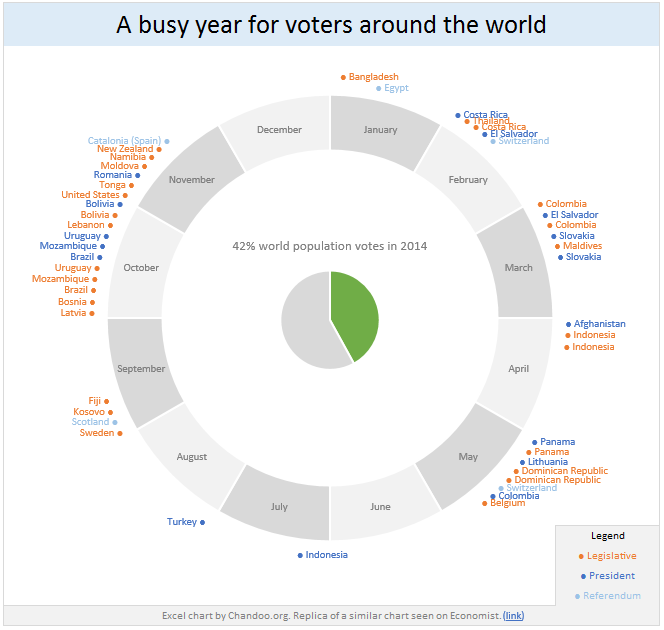
42% of the world goes to polls around a pie chart – Like it or hate it? |
|
|
Today lets have a poll. Lets debate if this pie chart about world elections in 2014 is good or bad. First lets take a look at the chartThis chart, published by The Economist talks about how 42% of the world population is going to vote this year. Take a look and read on to learn how you can re-create this in Excel. |
Bar chart with lower & upper bounds [tutorial] |
|
![Bar chart with lower & upper bounds [tutorial]](https://img.chandoo.org/c/bar-chart-with-lower-and-upper-bounds.png)
|
Bar & Column charts are very useful for comparison. Here is a little trick that can enhance them even more. Lets say you are looking at sales of various products in a column chart. And you want to know how sales of a given product compare with a lower bound (last year sales) and an upper bound (competition benchmark). By adding these boundary markers, your chart instantly becomes even more meaningful. Lets learn how to create a column chart with lower & upper bounds in this tutorial. |
Top 10 things I learned using Excel for a decade |
|

|
Sometime during the 2nd half of 2013, I finished 10 years of Excel usage. In the last 10 years, I completed my studies, got my first job, married, had kids, visited 15 different countries, quit my job to start a business, bought first car, first house, made dozens of new friends, read 100s of books, wrote a book and learned 1000s of new things. And all along, Excel stayed a true companion. Right from MBA entrance exam preparation in 2003 to making my summer internship project reports in 2005 to planning my wedding expenses in 2007 to getting a promotion in 2009 to planning my kids feeding schedule in 2010 to running a successful business in 2014, Excel helped me in every step. So today, I want to tell you the top 10 things I learned using Excel in last decade. Grab a hot cup of coffee, buckle your belts and get ready for time travel. |
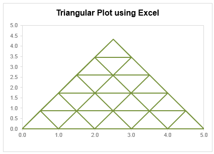
Creating Triangular Plots using Excel |
|
|
Triangular plot…! What is it? Recently, a Chandoo.org forum member asked this, ‘I want to be able to make a graph that, in some aspects, looks like below, but I have no idea how to do it at all.’ After seeing it, I said to myself in Barney Stinson’s tone, ‘Challenge Accepted!‘ The final plot looks like above. Read on to learn how this is made. |
Thank you Sachin [a small tribute] |
|
![Thank you Sachin [a small tribute]](https://cache.chandoo.org/images/c/excel-charting-example-v1.png)
|
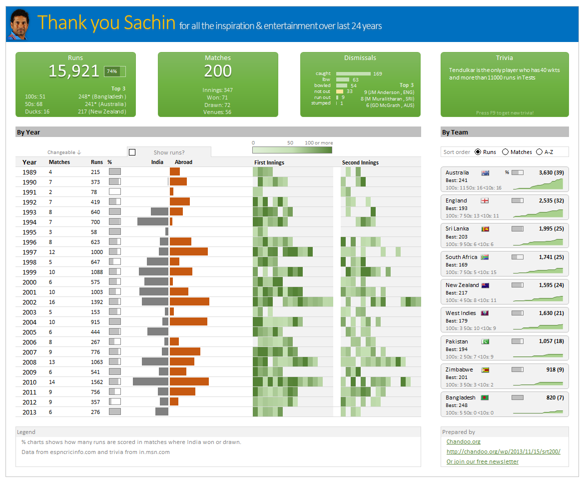
Lets talk about people who inspire us. People who show us that anything is possible. People who prove that commitment, hard work and perseverance are true ingredients of a genius. I am talking about Sachin Tendulkar. Those of you who never heard his name, he is the most prolific cricketer in the world. He is the leading scorer in both tests (15,921 runs) and one day matches (18,426 runs). Read more about him here. Tendulkar has been an inspiration for me (and millions of others around the world) since I was a kid. The amount of dedication & excellence he has shown constantly motivates me. It is a pity that the great man is retiring from test cricket. He is playing his last test match (200th, most by any person) as I am writing this. So as a small tribute, I have decided do something for him. Of course, I have never been a cricketer in my life. Once in college I was reluctantly asked to be a stand-by player in a game with seniors. I did not get a chance to pad up though. That is the closest I have been to a cricketer. So I did what I do best. Create an Excel workbook celebrating Sachin’s test career. Thank you Sachin – his test career in a dashboardHere is a dashboard I made visualizing his test cricket statistics. It is dynamic, fun & awesome (just like Sachin). (click on the image to enlarge)
|
Closing gaps in this Gender Equality Gap chart… |
|
|
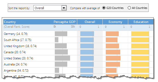
Today lets close some gaps. Recently I saw this interesting chart on Economist Daily Charts page. This chart is based on World Economic Forum’s survey on how women compare to men in terms of various development parameters. First take a look at the chart prepared by Economist team. So what are the gaps in this chart?This chart fails to communicate because,
But criticizing someone’s work is not awesome. Fixing it and making an even better chart, that has awesome written all over it. So that is what we are going to do. You can see the improved chart above. Click on it to learn how you can create it. |
How to create a Then vs. Now interactive chart in Excel? |
|
|
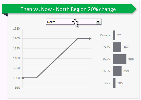
You have been there before. Trying to compare last year numbers with this year, or last quarter with this quarter. Today, let us learn how to create an interactive to chart to understand then vs. now. Demo of Then vs. Now interactive chart First, take a look the completed chart below. This is what you will be creating. |
Never use simple numbers in your dashboards (bonus tip: how to fix default conditional formatting) |
|
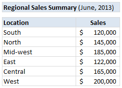
|
Pop quiz: What is wrong with above report? At first glance, it looks alright. But if you observe closely, you realize that it is not telling the entire story. Just looking at regional sales numbers, you have not much clue what is going on with them. So how to improve it? |
Are you ready for 2,000 miles, 15 days & 10 Excel tips road trip? |
|
|
Finally my Excel classes in USA are over. It was a lot of fun traveling to new cities, teaching Excel & dashboards to enthusiastic crowds and making new friends. As if that is not fun enough, we (Jo, kids & I) are going on a 2,000 mile, 2 week road trip starting today. Although I am enjoying all this, I also feel bad for not taking enough time to share new tricks, ideas & techniques with you here. So, I have a wacky, wild & awesome plan for you. Join us on our road trip. That is right. You can join me on our road trip and see what I see, learn some pretty cool Excel tricks, all while sipping coffee and stretching legs in the comfort of your office cubicle. |
How to create a column chart with background image in Excel ? |
|
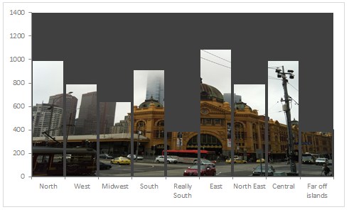
|
Tony sends this chart and asks if it can be done in Excel. It sounded like a good challenge for a lazy Sunday morning. So here we go. (Posting it on Monday). Now I could not get an oil rig photo or that data. So I made up few numbers and used a photo of Flinders street station I took when I was in Melbourne last year. |
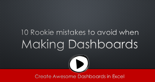
10 Rookie mistakes to avoid when making dashboards [video] |
|
|
|
Are you making these 10 rookie mistakes when creating dashboards? Watch below to video to understand what these mistakes and how to avoid them. 10 Rookie mistakes to avoid when making dashboards [23 mins]
|
How to create an Interactive Chart in Excel? [Tutorial] |
|
![How to create an Interactive Chart in Excel? [Tutorial]](https://cache2.chandoo.org/images/c/interactive-chart-in-excel-demo.gif)
|
Imagine you have a worksheet with lots of charts. And you want to make it look awesome & clean. Solution? Simple, create an interactive chart so that your users can pick one of many charts and see them. Today let us understand how to create an interactive chart using Excel. |
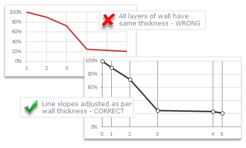
Chart for wall hygrometric physic (or how to create a chart with custom x axis intervals?) |
|
|
Livio, one of our readers from Italy sent me this interesting problem in email.
|
Learn Top 10 Excel Features |
|
|
Last week, we had a lovely poll on what are your favorite features of Excel? More than 120 people responded to it with various answers. So I did what any data analyst worth his salt would do, I analyzed the data and here are the top 10 features in Excel according to you. Read on to learn more. |

