
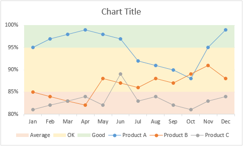
Here is an interesting scenario.
Imagine you are responsible for customer satisfaction at ACME Inc. Every month you track customer satisfaction rate for the 3 products you sell which are conveniently named Product A, B & C.
You also have bands for the satisfaction rating.
- Rating of 85% or below is Average
- Rating between 85% & 95% is OK
- Rating above 95% is good
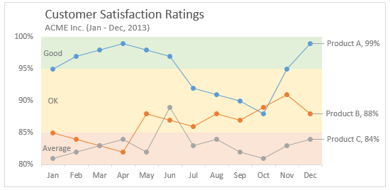
At the end of the year, you want to visualize the ratings for last 12 months for 3 products along with bands.
Something like this:
Unfortunately, there is no “Insert Banded line chart” button in Excel. So what to do?
That is what we will learn today. Ready?
Create a line chart with KPI bands
The process of creating a line chart with background bands is simple. Follow these steps.
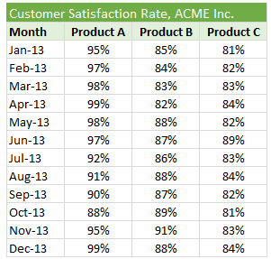
Step 1: Arrange your data
Lets say your data looks like this:
Now, add the band information to it and make it look like this:
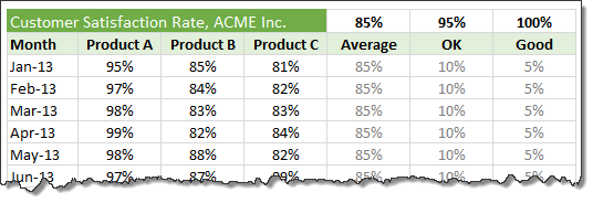
Use simple formulas to generate OK & Good columns from the bands.
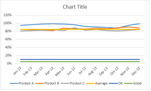
Step 2: Create a line chart with all data
Select all 6 columns of data and insert a line chart.
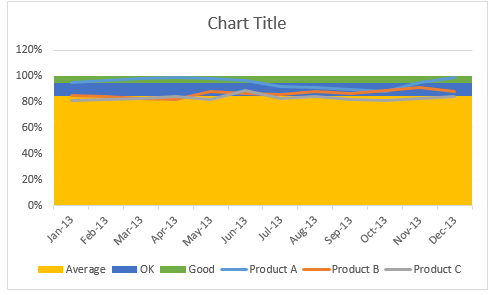
This is how it looks.
Step 3: Convert Average, OK & Good lines to columns
This step changes depending on the version of Excel you are running.
In Excel 2013:
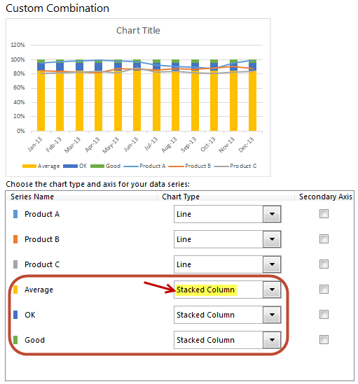
- Right click on any line and choose “Change series chart type”.
- Now, set up “Stacked Column” as chart type for Average, OK & Good series. (As shown in above picture)
- Done!
In earlier versions of Excel:
- Right click on Average line and choose “Change series chart type”.
- Change it to “Stacked Column Chart”
- Repeat the steps 1 & 2 for OK & Good lines too
- Done.
Step 4: Make columns wider by setting gap width to 0%
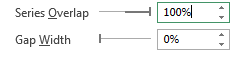 Right click on any of the columns and choose format.
Change the gap width to 0%.
Step 5: Adjust axis settings & column colors
Since our focus is to show variation in customer satisfaction ratings between the band of 80% to 100%, adjust axis min to 80%, axis max to 100% and major unit to 5%.
Also, fill columns with dull & subtle colors. This way, user’s attention shifts to the lines.
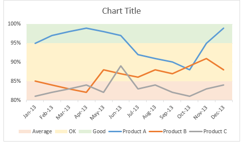
Step 6: Format the lines & axis labels
Now let’s make those lines stand out. You can add markers, adjust line thickness. While at it, fix the orientation of axis labels and remove year (as it is not needed).
Step 7: Add a title, apply labels to important points and annotate bands
This is the last step. Lets add a descriptive title to the chart.
Also, apply data labels (only to the last data point). To do this:
- Click on the line. All points will be selected.
- Click on the last point alone.
- Now only last point will be selected.
- Right click & add data label.
- Click on data label.
- Click on it again (this will select only that label, not the entire series)
- Format it by adding series name.
Annotate bands by either adding data labels or text boxes.
Our chart is ready.
Download line chart with bands template
Click here to download the chart template. It has detailed images of all the steps. Examine the chart settings to understand this better.
Do you make banded line charts?
Although I make very few banded charts, I think they are great for several scenarios.
What about you? Do you make banded line charts to report this kind of data? What techniques you rely on? Please share your tips & ideas using comments.
More charts like this:
If you like banded line charts, you will surely enjoy these other charts too:
- Bar chart with lower & upper bounds
- Shading above or below a line chart to depict boundaries
- Indexed charts to depict change from point in time
- Thermo-meter chart with last year value
- World education rankings visualization – a case study
Your journey to Excel awesomeness – a banded line chart
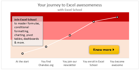
Why stop at banded line charts? You want to learn how to create different types of charts, reports, dashboards & analytical models to supercharge your career. And this is where my Excel School program can help you most. It is an online course with more than 50 lessons on various aspects of Excel, right from basics to advanced concepts.
You can login and access the lessons from anywhere at anytime. You can learn at your own pace and become awesome in Excel.
Please click here to learn about Excel School program & join us.


24 Responses
save time: skip step 4 by using stacked area instead of stacked columns.
Hi Chandoo & Others,
Please help me in creating line chart with bands (number range). Unlike percentage, my data is numbers and count. Following is my data.
Function Number of days – projects closed Days
100 200 300
0 – 100 101 -200 201 – 300 Good OK Bad
Comme 5 5 2 100 100 100
Customer 8 51 1 100 100 100
F&A 7 28 3 100 100 100
OP Support 4 38 1 100 100 100
Support 3 24 5 100 100 100
@Maniratnam
Can you please ask the question in the Chandoo.org Forums
http://forum.chandoo.org/
Please attache a sample file to simplify a solution
Hi Chandoo,
Your example on http://chandoo.org/wp/2014/05/05/line-chart-with-bands-excel-tutorial/ looks very much the same as a chart, published by Hessel de Walle, somewhere half of april: http://hesseldewalle.blogspot.nl/2014/04/excel-chart-with-background-indicating.html
I made a kind of copy on my own site: http://www.fhvzelm.com/files/DiversenGrafiekenAanvulling.xlsm, sheet LijnWaardenBovenOnder.
Is this a coincidence, a copy or inspiration? Or is it a commonly known old trick? It was new to me.
By the way: your charts and other Excel info look good!
Mvg, Frans
Hi Frans…
Thanks for the comments. It is not a copy. Just a coincidence.
I have not heard about Hessel’s website until today. As you can see from my reply to him below, I got inspiration for this from a reader’s email.
Remarkable, I published this exact same idea on April 22, 2014, using exactly the same method. Two souls one thought.
You can find it in my blog http://hesseldewalle.blogspot.nl/2014/04/excel-chart-with-background-indicating.html
@Hessel,
Thanks for your comments. My post is a mere coincidence. I did not even know about your website until I saw your comment. But as you can imagine, chart with background bands is a common request by many people working in service / manufacturing areas where such monitoring is required. I got an email from a reader last week with similar request (but a little more complicated) and I used that as an inspiration for this post.
Btw, very good blog you have. I am adding to my reading list.
How can we add bands based on the Average and 1; 2 and 3 Standard Deviation?
The idea is to have one green band, 2 yellow bands and 2 red bands
@Carlos
Have a look at: http://chandoo.org/wp/wp-content/uploads/2014/05/line-chart-with-bands-IH.xlsx
Great, but I still have problems
If I have numbers instead of percentages, and values close to zero, I do not get what I expected
Try this numbers instead with only one product, the result is not, O tryed but the lower limit does not draw correctly
1,35
1,28
1,13
0,99
0,94
0,89
0,89
0,88
0,88
0,82
0,82
0,76
0,75
0,71
0,71
0,65
0,64
0,63
0,63
0,62
0,61
0,60
0,59
0,57
0,57
0,56
0,56
0,54
0,49
0,47
0,46
0,44
0,44
0,33
0,30
0,28
I image you could use this same methodology to create a four quadrant colored analysis chart as well. Would just need another stacked bar graph series for the additional two colors 🙂
@Chandoo That is what I thought; once you get the question asked, the idea is there and the solution is not too difficult when you know what to do with charts in Excel.
@Nir, indeed, with an area chart it is even easier
@Chris, that is actually what I used to create my Gantler Magic Quadrant: http://hesseldewalle.blogspot.nl/2014/04/excel-gartner-magic-quadrant-made-easy.html
That’s a nice looking chart right there!
Excellent file by Hessel (I follow his blog already) and good explanation by Chandoo (as always) …
I found now from here:
http://www.prodomosua.eu/ppage05.html#contributi a file by Fernando Cinquegrani was the 9 December 2003 … http://www.prodomosua.eu/zips/bands.xls
of course, as you, he is a great expert in Excel chart too
@Roberto,
Nice site of this Fernando Cinquegrani . It is a pity that Excel sites in Italian are hard to find.
I had created something similar last year and it was cool. X Axis was time Y axis was value. I created vertical tiles which showed BEFORE and AFTER. I wanted to highlight change in trend in terms of BEFORE vs AFTER. Of course I used Bar Chart instead of Column Chart as suggested here) and it worked quite pretty well 🙂
I found using gradient fill in the plot area works reasonably well.
You simply have to define your stops. No extra columns required. 🙂
Your tutorial is awesome creating line chart with bands.
Thanks for sharing.
Nice looking line chart tutorial
Thanks
Beautiful work. How did you get the lines from last data point to data label? Are these just inserted shapes?
Excellent! Thanks for sharing!
Very cool, I’m going to be making a lot of use of this!
If it helps; you can save on having to calculate the numbers for the different bands by not using a stacked chart:
Set the numbers in the last three columns to the actual numbers (85%, 95% and so on) and change the column order so the highest number is first and the lowest is last.
Instead of using a stacked column use a clustered column, set the spacing to zero as shown but set the Series Overlap to 100%.
This has the same effect but you don’t need a risky formula to find the right values for the bands. You could even have your banding columns point at a table of fixed values, so if your measures change all you need to do is update three lines in another table!
This blog was… how do I say it? Relevant!! Finally I’ve found something which helped me.
Thanks a lot!
Hi, Chandoo
I follow your blog since 6 moths ago, & I want to thank you for your website, because it helps me in all the things that i need to do.
Your website is awesome, when I grow up in excel, I want to be like you.
Greetings form Mexico.