
Ladies & gentleman, put on your helmets. This is going to be mind-blowingly awesome.
About a month ago, we announced our brand new contest – Visualize Excel Salary survey data here.
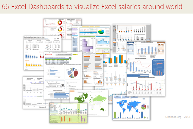
We received 66 outstanding entries for this. More than 40 entries are truly world-class with innovative visualizations, interactive graphs & kick-ass number crunching. It took me quite a while to organize all these entries, collect screenshots and review them.
So how do we make sense of all these?
Since doing justice all this variety and creativity in one post is difficult, I am splitting this in to 4 entries.
- All 66 Dashboard entries & my comments [this post]
- How to create Box plots?
- How to make your dashboards interactive?
- Voting for contest winner
How to read this post?
This is a fairly large post. If you are reading this in email or news-reader, it may not look properly. Click here to read it on chandoo.org.
- Each entry is shown in a box with the contestant’s name on top. Entries are shown in alphabetical order of contestant’s name.
- You can see a snapshot of the entry and more thumbnails below.
- The thumb-nails are click-able. So that you can enlarge and see the details.
- You can download the contest entry workbook, see & play with the files.
- You can read my comments at the bottom. If I liked a particular entry, I have put a small “Chandoo’s pick” icon too.
- At the very bottom of this page, I have put a list of resources to help you learn most of the techniques used by our participants.
Thank you
Thank you very much for all the participants in this contest. I have thoroughly enjoyed exploring your work & learned a lot from them. I am sure you had fun creating these too.
So go ahead and enjoy the entries.
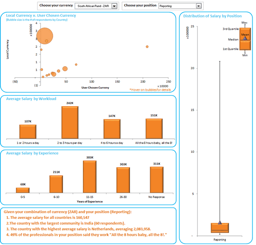
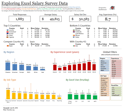
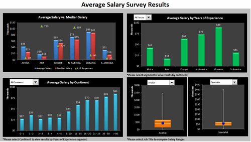
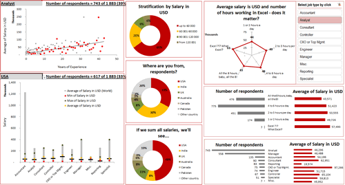
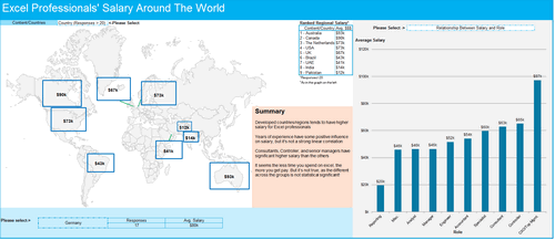
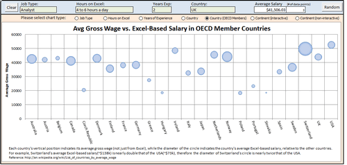
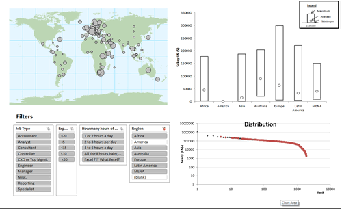
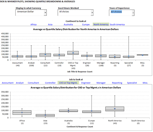
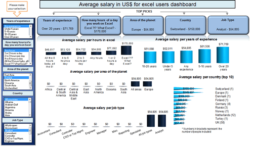
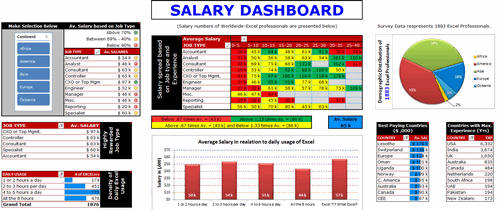
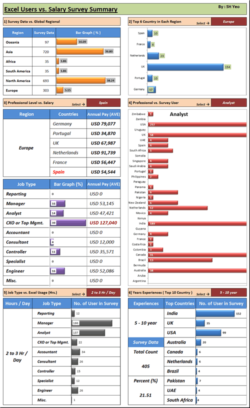
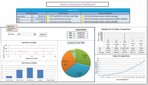
Interactive Dashboard by Aaditya Nanduri


Download workbook:
- Ability to view results in any currency
- Summaries of selected sub-set at bottom
- Box plots
- Dynamic charts

![]()
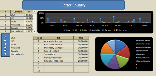
Interactive Dashboard by Akash Khandelwal


Download workbook:
- Dynamic charts (with filter)
- 5 types of analysis
Interactive Dashboard by Aldo Mencaraglia


Download workbook:
- Dynamic charts
- Indexed salary analysis by country & position
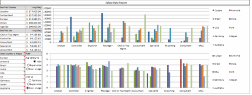
Dashboard by Allred Ben
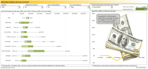


Download workbook:
- Box plots
- Interesting colors & chart construction
- Multiple filters to select a sub-set of data
- Analysis of salary increase by years of experience (to see % hike with every year added)
- Comparison of survey data with Bureau of labor statistics data
Dashboard by Anchalee Phutest
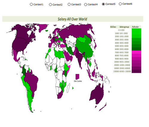


Download workbook:
- Ability to select any of 6 analysis charts and view
- Word cloud from wordle.net
- World map with colors based on salary made
- Box plots
Dashboard by Andrew Plaut
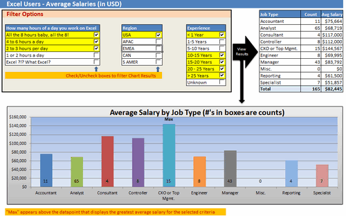


Download workbook:
- Ability to select any sub-set of data based o region, hours worked etc.
- View results in numbers & charts
Interactive Dashboard by Anup Agarwal
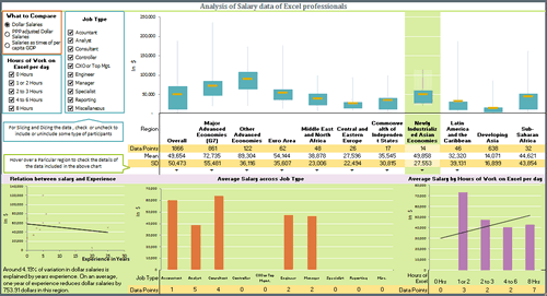


Download workbook:
- Box plots
- Grouping of countries by G7, Developing, Developed etc.
- Multiple filters to select a sub-set of data
- Dynamic hyperlinks to show analysis on hover
- Regression analysis of salary vs. experience
- PPP indexing of salary possible or salary as a % per-capita GDP
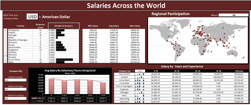
Dashboard by Ben Jones


Download workbook:
- Very good colors and bright design
- Text observations & analysis
- Top / bottom 5 country names along with flags
- Slicers
- Interesting chart design with error bars to show standard deviation
![]()
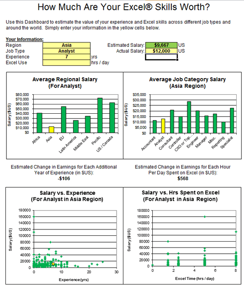
Dashboard by Braisted, Matthew


Download workbook:
- Analysis of “How much are your excel skills worth?”
- Simple bar & XY charts to analyze spread of salary
- Estimated Change in Earnings for Each Additional Year of Experience (in $US)
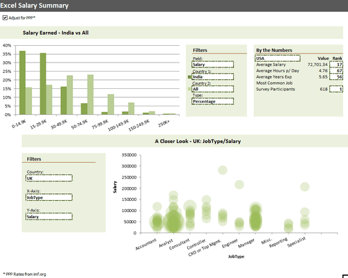
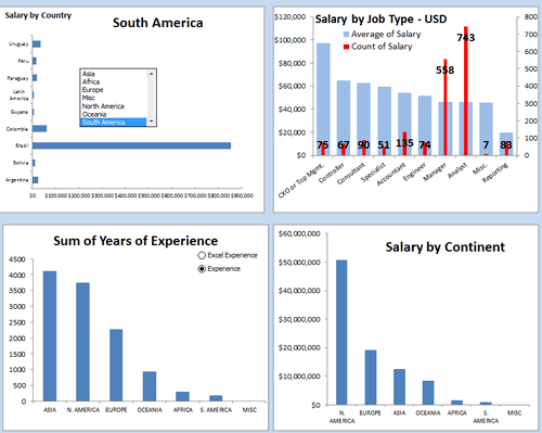
Dashboard by Brant Spear


Download workbook:
- Interesting colors & chart construction
- Option to adjust salary by PPP
- Multiple filters to select type of analysis you want and which data to compare. (For example salary in India vs. All or Experience in Brazil vs. France)
- Closer look at any country, Job-type and salary combinations.
Learn how to make Excel Dashboards & Reports

- Learn how to create interactive dashboards & reports using Excel
- Analyze data like a pro
- 32 hours of video training
- Learn at your own pace
- Click here to know more
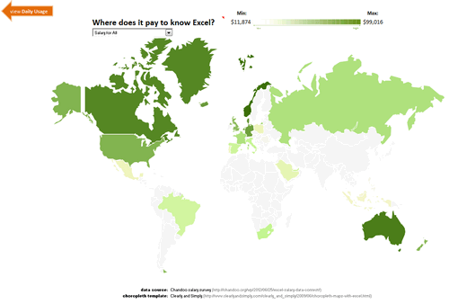
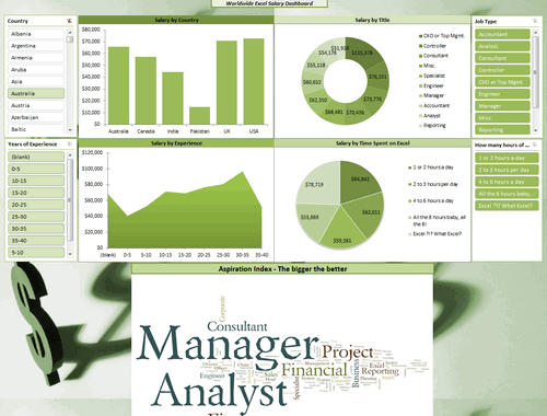
Dashboard by Bryan Munch


Download workbook:
- Choropleth of salaries in all countries
- Salary by job type analysis
- Interesting layout
Interactive Dashboard by Bryan Waller


Download workbook:
- Dynamic charts
- Average vs. median salaries by region
- Box plots to compare any 2 roles
Dashboard by Cesarino Rua


Download workbook:
- Interactive browsing of data & filtering using Excel’s filters
- Summary of filtered data shown on top along with simple charts
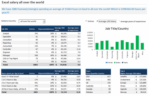
Dashboard by Daniel Rosenberg


Download workbook:
- Interesting layout
- World-map with bubble chart
- Comprehensive analysis
- Interesting analysis on “Potential Salary” – salary possible with 8 hours of Excel work, given current number of hours as input.
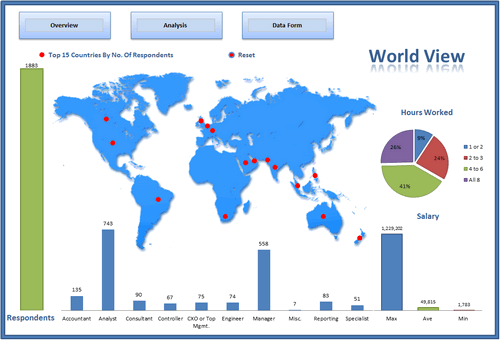
Interactive Dashboard by Dustin Corbin


Download workbook:
- Dynamic charts
- Good colors and layout
- Ability to compare any country / job type with world-wide averages
Interactive Dashboard by Ekaterina Batranets


Download workbook:
- Comprehensive analysis
- Dynamic charts
- Trend analysis of salary vs. experience
- Good chart for country analysis
- Slicers based selection
- Interesting layout
![]()
Interactive Dashboard by Ganesh Madhyastha


Download workbook:
- Dynamic chart
- Comprehensive analysis
- Text + charts
- Good use of form controls (scroll bar, combo box)
![]()
Dashboard by Guillermo Barreda


Download workbook:
- Slicers
- 3D Charts
Interactive Dashboard by Hariharan T S
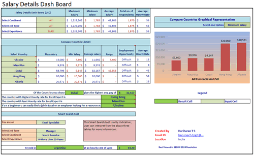


Download workbook:
- Smart search tool to find you best paying countries & hourly rates
- Select up to 5 countries to compare
- Dynamic charts
Interactive Dashboard by Hilary Lomotey
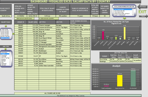


Download workbook:
- Interesting layout and navigation sheet
- Dynamic charts & data filtering
- Multiple analysis sheets
Interactive Dashboard by Iva Kožar


Download workbook:
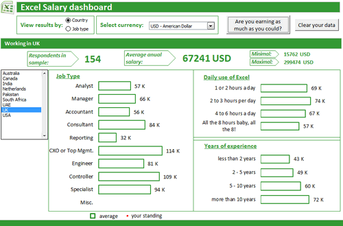
- Interesting layout & colors
- Dynamic charts & multiple filters
- Ability to view results in any currency
- Are you earning as much as you could – launches user form to get your details and compare it with data.
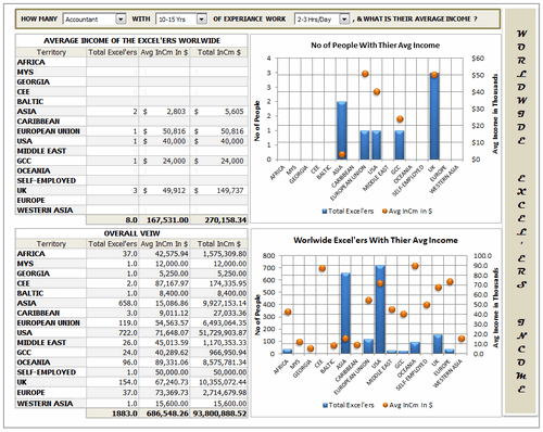
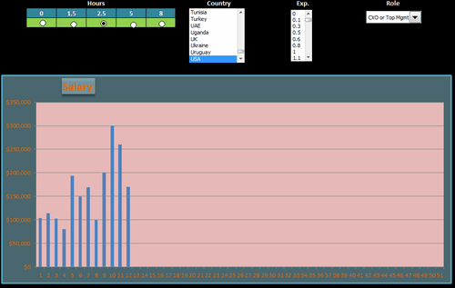
Dashboard by Jairaj Guhilot


Download workbook:
- Multiple selection and analysis
- In-cell charts
Dashboard by Jeanmarc Voyer
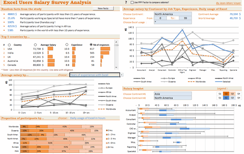

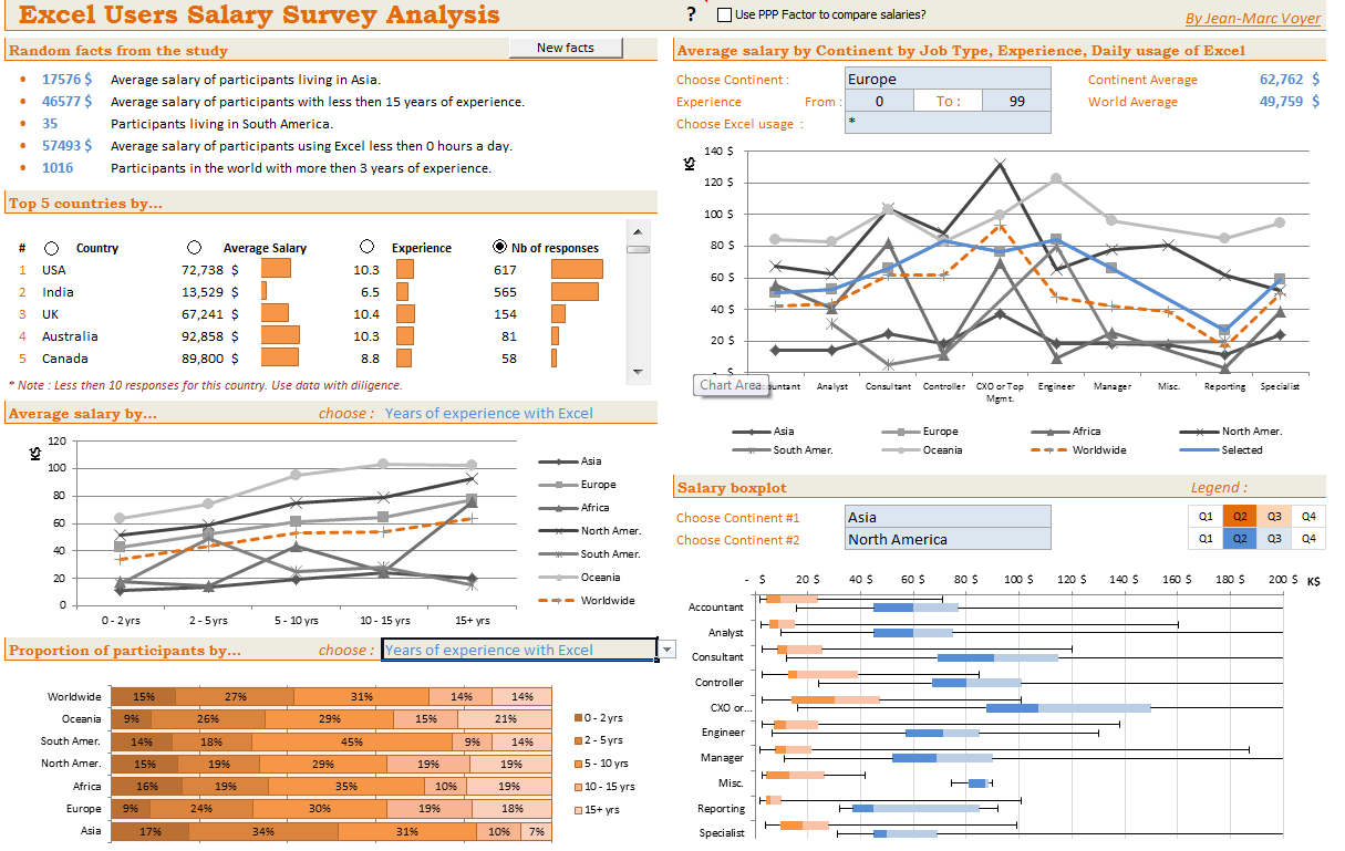

Download workbook:
- Good layout and colors
- Box plots
- Random facts from data (with ability to refresh)
- Top 5 countries by…
- Many selections to analyze data in several ways
- Comprehensive analysis
- Ability to scale salaries by PPP
- Compare one continent with another
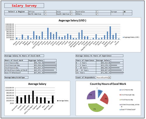
Dashboard by Jingyi Wei


Download workbook:
- World-map with average salary data
- Select analysis type to see the chart
Dashboard by Joerg Decker


Download workbook:
- Interesting layout & colors
- Salary per hour analysis
- Slicers
- Interesting chart construction to show top 5 salary per hour per experience level.
- Box plots
![]()
Learn how to make Excel Dashboards & Reports
- Learn how to create interactive dashboards & reports using Excel
- Analyze data like a pro
- 32 hours of video training
- Learn at your own pace
- Click here to know more
Interactive Dashboard by Joey Cherdarchuk


Download workbook:
- Excellent design & colors
- Dynamic charts (clickable cells with VBA)
- Analysis by continent
- Text + charts
- Clear layout
![]()
Dashboard by John Michaloudis


Download workbook:
- Interactive hyperlinks
- World-map with bubble chart
- Slicers
- Top & Bottom salary analysis
- Sparklines
![]()
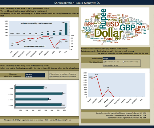
Dashboard by Jonathan Ong


Download workbook:
- Multiple analysis
- Interactive world-map to show regional summaries
- Comparison of Excel salaries with average salary by country for all jobs
- See the results by random sub-set of data or search on your own
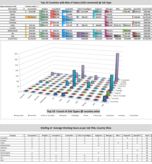
Interactive Dashboard by Jose Eduardo Chamon – Claro Matriz –


Download workbook:
- Analysis by country and top 10 positions
- Dynamic charts
- 3D charts
Interactive Dashboard by Juwin

Download workbook:
- Dynamic charts
- Compare multiple countries with one another
- Analysis by many criteria (Sal vs. Jobs, Jobs vs. Experience etc.)
Dashboard by Karine Gouveia Dibai – Mediphacos


Download workbook:
- Good layout and colors
- Clean design with lots of text, numbers and simple charts
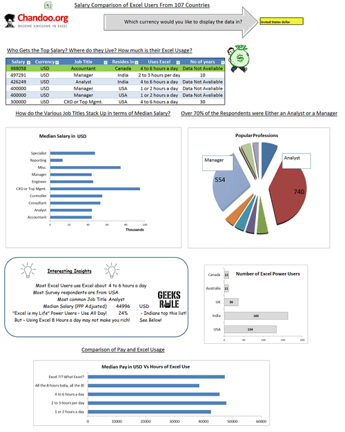
Dashboard by Kostas


Download workbook:
- World-map with bubble chart
- Slicers
- Box plots
- Distribution of salaries (all vs. selected data thru slicers)
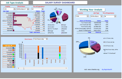
Dashboard by Krishnan A

Download workbook:
- Analysis in any currency
- Interesting insights from data
- Salaries indexed by PPP
Dashboard by Krishnaraj Alevoor


Download workbook:
- Supports both left & right hand users
- Interactive world-map to select a region
- Country vs. region analysis
Interactive Dashboard by Krishnasamy Mohan


Download workbook:
- Dynamic hyperlinks to show charts
- 3D Charts
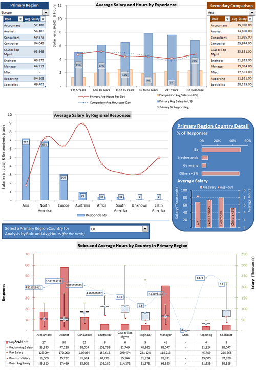
Dashboard by Lubos Pribula
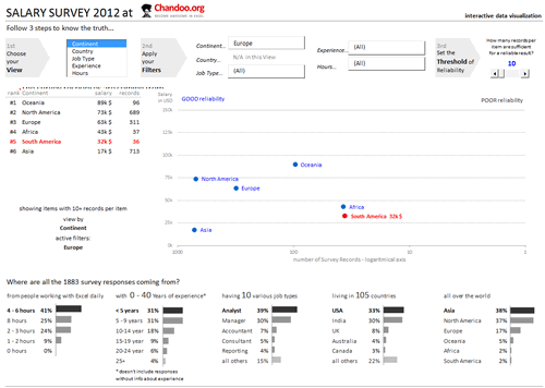


Download workbook:
- Very good colors and design
- Multiple selection options to analyze any sub-set of data
- Marking of data by “good reliability” so that you can make sense.
- Select role using clickable cells
- Good mix of numbers, text and charts
Dashboard by Luis E. Hernandez Nicasio
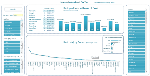


Download workbook:
- Slicers
- Analysis in any currency
- Good colors and layout
- Best paid jobs & countries
![]()
Interactive Dashboard by Luke Morris


Download workbook:
- Comparison of one continent with another
- Interesting & comprehensive charts
- Dynamic charts
Become Awesome in Excel & VBA – Create dashboards like these…
- Learn how to create interactive dashboards & reports using Excel
- Develop your own macros & VBA code
- 50+ hours of video training
- Learn at your own pace
- Click here to know more
Dashboard by Luke Moraga


Download workbook:
- Box plots
- Dynamic charts
- Analysis in any currency
- Updation of charts with dynamic hyper-links
- Analysis by continent or position
Dashboard by Lynn Mar


Download workbook:
- Slicers
- Pivot charts
- Comprehensive analysis
Dashboard by Marko Markovic


Download workbook:
- Pivot charts
- Interesting colors & chart construction
- What-if kind of analysis
Dashboard by Michael Yager


Download workbook:
- Box plots
- Compare one country with another
- Interesting layout and colors
- Headline & text summary
- Analyze top 15 countries (by responses) or all
Interactive Dashboard by Mohd Mustafa
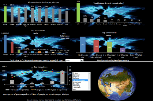


Download workbook:
- Analysis of total numbers (total salary by position etc.)
- Dynamic charts
- Usage of form controls
Dashboard by Nathan Gehman

Download workbook:
- Very good colors
- Box plots
- Salary vs. years of experience (with quartile spread to get a sense)
Dashboard by Neculae Valeriu

Download workbook:
- 3D charts
- Conditional formatting with pivots
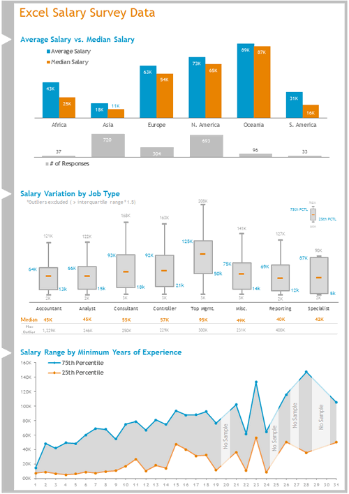
Interactive Dashboard by Nicholas R. Moné
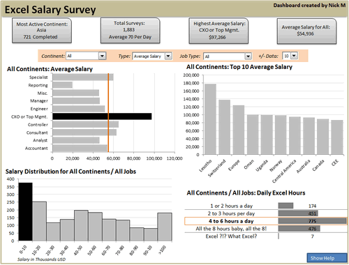


Download workbook:
- Dynamic charts
- Good colors and layout
- Key observations in text on top
- Ability to show top 10, top 5 or top n values
- Built in help (interactive)
![]()
Interactive Dashboard by Nitin Bindal


Download workbook:
- Interactive pivoting of data
- Dynamic display of chart based on clicked cell
- Key observations in text
- Interesting design
Interactive Dashboard by Oscar T


Download workbook:
- Comprehensive analysis
- Dynamic charts
- Multiple selection of filters
- Key messages on top
- 3D charts
Dashboard by Peter Damian


Download workbook:
- User forms and notes
- Scenario analysis (set conditions to see how people are paid)
- Clickable world-map with interactive analysis of Top 15 countries
- Data form to browse and query data
![]()
Interactive Dashboard by Peter Van Klinken
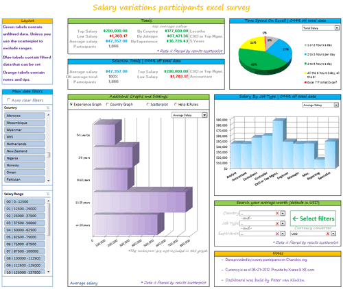


Download workbook:
- Slicers & form controls for dynamic selection
- Comprehensive analysis
- Good colors and layout
- Good mix of text, data and charts
- Clickable world-map
- Search your average worth
- Built-in help
Dashboard by Philippe Brillault
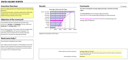


Download workbook:
- Select a business question to see the charts
- Lots of analysis (like cost of living index derived from survey data)
- Analysis & commentary based on selected chart
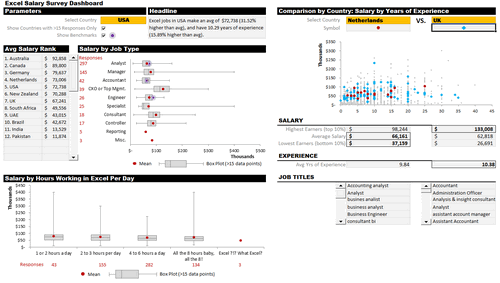
Dashboard by Prakash Singh Gusain


Download workbook:
- Pivot tables + conditional formatting
- Colorful design
- Slicers
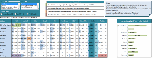
Interactive Dashboard by Rajendra Joshi


Download workbook:
- Dynamic charts
- Text observations & analysis
- Pie chart
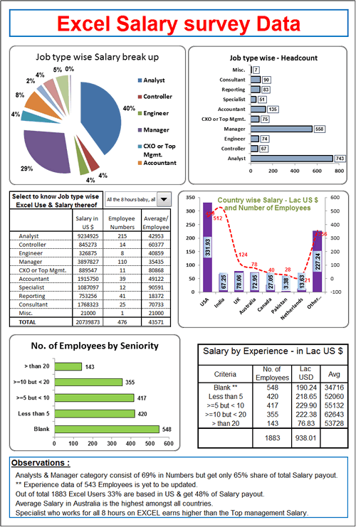
Dashboard by Rajinikanth


Download workbook:
- Dynamic display of selected country’s map
- Dynamic charts & multiple filters
- Charts & numbers
- 3D charts
Interactive Dashboard by Ramzan Shaikh


Download workbook:
- Dynamic charts
- Ability to compare one country with another
- Ability to view any data point
Interactive Dashboard by Richard Stebles

Download workbook:
- Form controls to enable dynamic selection of data
- Number of big-macs you can buy with the salary
- Ability to compare countries in any region and see how they fit in with world-wide numbers
- Good colors and layout
![]()
Interactive Dashboard by Saurabh Sharma

Download workbook:
- Dynamic charts thru pivot tables
- 3D Charts
Dashboard by Sergey


Download workbook:
- Slicers for selection
- Box plots
- Good colors and layout
- Ability to zoom in to any chart
- Good documentation of the workbook & techniques used
- Comprehensive analysis
Interactive Dashboard by Shyeo


Download workbook:
- Dynamic charts
- Comprehensive analysis
Dashboard by Stilwill, Kelly


Download workbook:
- Ability to analyze by any currency
- Multiple selection options to analyze anything.
- World map with XY chart
- Sparklines
Interactive Dashboard by Susan Christine Mcmanus

Download workbook:
- Dynamic charts
- Pivot charts
Dashboard by Umang Merwana


Download workbook:
- PPP adjusted salary analysis
- Slicers
- Word cloud of job titles
- Good simple colors
Interactive Dashboard by Vishwanath M.C


Download workbook:
- Dynamic charts
- Key messages on top
- Box plots
Interactive Dashboard by Yogesh Gupta


Download workbook:
- Dynamic charts and multiple selections
- Clickable cells (with VBA)
- Ability to view results in any currency
Interactive Dashboard by Prince Goyal


Download workbook:
- Dynamic charts
- A view of all data that meets given condition
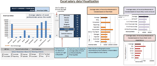
Interactive Dashboard by Vinita Varier


Download workbook:
- Dynamic charts
- Word cloud from wordle.net
- Average vs. total salary earned by all people in a country
Become Awesome in Excel & VBA – Create dashboards like these…
- Learn how to create interactive dashboards & reports using Excel
- Develop your own macros & VBA code
- 50+ hours of video training
- Learn at your own pace
- Click here to know more
Tutorials & Examples to Make Excel Dashboards
- Excel Dashboards – Resources, Tutorials and Downloads
- KPI Dashboards using Excel – 6 part tutorial
- Using Picture Links in Excel
- Adding interactivity using Hyperlinks
- Adding interactivity using click-able cells
- Showing one chart analysis from many – Analytical charts in Excel
- Using Check-boxes to show – hide data in charts
- Using Slicers to make dynamic dashboards
- How to create Box plots?
- How to make your dashboards interactive?
- More on interactive charts and dashboards
How do you like these dashboards?
I found quite a few of these really impressive. But I want to hear from you.
What entries you liked most? Go ahead and share your views.


66 Responses to “Budget vs. Actual Charts – 14 Charting Ideas You can Use”
[...] Update: Check out the results at Budget vs. Actual Charts [...]
Hi there:
I'm interested in understanding exactly how contestants #'s 1, 8 got their surplus or shortfall to show up at the top of the bar (is this overlapped or stacked somehow) and change colour? I hope this makes sense. I've tried to find samples and I can see contestant 8 (cuboo) may have used something called graphomate but I can't use this.
I need to create a bar chart that shows budget, and actual variance whether it be a surplus or a shortfall and I would like make it look like option 1 or 8 above but haven't a clear idea how to do it...any help would be greatly appreciated!
Regards..Linwe
[...] heute können alle Beiträge auf “Pointy Haired Dilbert” gesichtet und bis zum 12.04. bewertet werden. Falls mein Vorschlag - Nr. 8 - gefällt, freue ich [...]
Danken Sie Excel friend!
#6 is the best here. Simple, no extraneous visual effects.
I was all set to vote for #9...until I noticed its lack of y-axis labels. So I have to go with #6 also.
I think #6,#9 is enough .
#9 is my favorite
Nice data/ink ratio 😉
I agree with Jon - #6 for me.
8 & 14
I go for # 9 (simple) and #14 (complete)
I go for cuboo #8
cheers
#6 for overview at a glance / top management
#8 for deeper analysis / those who need more detailed information
#14 although I think you only need the bottom panel and I then would stack the Center charts vertically to make Center comparisons easier.
#10 gets my vote.
If there is a second place, then #14
denise
Hi, if I was not wrong, Samples 3,4 and 5 were created using Tableau software and not Excel. For more information on Tableau you might want to visit http://www.tableausoftware.com/. It was initially designed by Prof. Pat Hanrahan and his PhD students. I am not their salesperson but I thought someone might want to know more about this particular technology.
Hi Tin Seong Kam:
Thanks - I have looked at Tableau before. I have also found the means to reproduce something similar to chart 8 without using graphomate, and also chart 7. I proposed chart 9 as well but the overlap is confusing to some.
I am really not too concerned about showing actual budget figures but the variance in $ and % is important for my particular use. That is why I gravitate to the charts that seem to easily tell us that we have a surplus or a shortfall.
Thanks!
Linwe
11, 6, 9 (presque pareil)
7 pour la clarté
cuboo #8 ist my favorite
best regards...
8
8 is fantastic
I prefer N#8 - N# 1,7 & 8 use the settings of Rolf Hichert...
6 : The GURU (read "Jon Peltier ") has spoken,
SOO easy on eyes!
Hi Chandoo,
I liked Cuboo's submission. So #8 gets my vote.
Regards,
Sumit
Number 8 by far. Even though it's not part of the data display, the comments feature sells me. Variance explanations are as important as the actual variances.
I visually prefer #8, but #3 is really easier to understand, even if it lacks a lot of information (inverting budget/actual), legend, etc...
[...] All in all there are several great entries suggesting a good variety to present budget vs. actual performance. Go check them out. [...]
[...] reshape, zoo by learnr A reader of a Pointy Haired Dilbert blog enquired about best ways to visualise budget vs. actual performance. In response PHD challenged his blog readers to contribute their visualisations made using Excel or [...]
anyone willing to post their xls for these? Some really excellent exmaples.
To avoid the summary execution of the person presenting these to an executive team these charts must handle overspending as well as underspending, be comprehensible in 5 seconds and show the key fact clearly. The key fact isn't budget or actual - it's the magnitude of the gap!
Therefore:
#14 for nailing the key fact and being able to handle overspending. The winner therefore.
#6 for nailing speed-reading and being able to handle overspending, but somewhat obscuring the key fact. Second place.
#8 for nailing information depth and aesthetics. Third place.
I really wanted #8 to win, but that's the technician's view not the end-user's.
[...] Todas as contribuições podem ser vistas no seguinte endereço: Budget vs. Actual Charts – 14 Options You can Use Posted on April 5th, 2009 http://chandoo.org/wp/2009/04/05/budget-vs-actual-charts/ [...]
Social comments and analytics for this post...
This post was mentioned on Twitter by NancyJHess: I like to explore fav tweets of those I follow. Here is one from DutchDriver http://twurl.nl/17eiap Creative visual charts: Budget vs Actual...
number 8
clean, full of info, qualitative as well as quantitative
Hi,
I Like 4 chart in above as per the following ratings:-
no 1# -> 14***
no 2# -> 7***
no 3 # -> 8**
no 4# -> 1.3**
I will be greateful if someone can send me the process of making all above 4 charts.
Virender
[...] Budget vs. Actual Values in Charts – 14 more options [...]
[...] Budget vs. Actual – 14 charting options [...]
Does anyone know what type of chart #6 is (chart name?)? Also, how do I create this is Excel 2007?
@Shazbot
I'd call it a Column and Bar chart, but don't get hungup on names
To make it try this:
Setup the chart as a Clustered Column Chart
Change the Series so there is 100% overlap, ie: One column is in front of the other
Change the Budget series to a line chart
Set the line color to none
Set the marker style to a Flat Line
Change the marker width to make it the same width as the bar
Change colors and other chart properties to suit
Does anyone have an idea on how to create chart #1?
Thanks
Caroline, please see the german page: http://www.hichert.com/de/software/exceldiagramme/55
there you can find the original example for nr1.
best regards,
stefan
Caroline
This is a Clustered Stacked Column Chart
Which has the column under the Shortfall/Excess colored the same as the Budget
Have a look here
http://chandoo.org/forums/topic/question-about-budget-v-actual
&
http://peltiertech.com/WordPress/clustered-stacked-column-charts/
Hi,
Is it possible to get the source files like the other visualisation challenge (on sales).
Thanks,
Vijay
Dear Chandoo,
I discovered your site by pure chance and I am really thrilled about it and I am learning a lot.
Is it possible to post the source file for this visualisation challenge?
Thanks,
Vijay
[...] Budget vs. Actual Charts in Excel [...]
Dear Chandoo,
How do I create Chart #10 (comparing Budget vs Actual Performaces) by cost center by quarter without the cumulative performance. Do you have an actual example that I could use?
Thanks,
Greg
HI
Does anyone can help me to a to create chart #7? I'm beginer in excel , I started to work two weeks ago and my boss ask me to follow the budget/actual until the end of the year.
SO I really need your help.
Thanks in advance
p.s Sorry for my english ( i'm french)
@OKI, Greg
I have made a mockup of #7 and #10
It is available at:
http://chandoo.org/wp/wp-content/uploads/2009/04/Bud-Act-visualizaion-challenge-7+10..xlsx
#10 is a straight, Pivot Chart/Table but the data has been rearranged to get it into the pivot table
#7 is 2 charts, being a simple Bar Chart and a Scatter Chart with 100% Error Bars
I have used Named Formulas for the two charts.
HELLO Hui
Thanks you very much for your hepl , i really appreciate
Have I nice week
Hi,
I was wondering how can you replicated chart 1.3? The bars looked like there overlapped on two different axis?
Tony
I think 1 & 3 are good.
Hi Chandoo,
Please can you provide a link of the excel sheet for 1. Chart "3 colors and everything is clear"
I would like to drill into the spreadsheet and learn the secrets as how the chart was made.
Many thanks,
Sawan
@Sawan
It is probably 12 seperate charts, I will assume snapped to the underlying cells to ensure they are the same size
The left 3 Charts have a vertical Axis
The bottom 4 Charts have a horizontal Axis
The remainder have no axis
The remaining text maynot be part of the charts but is probably cell content
Saludos,
Como puedo descargar estos maravillosos ejemplos para estudiarlos y analizarlos deseo aprender a realizar este tipo de graficas en Excel.
Gracias,
Dear Chandoo and Hui,
Please would you help me (step by step if possible) to create Chart #8?
Many thanks in advance!
Dear Chandoo,
I think chart #8 is really great. Would really appreciate if you can show basic step to create it.
Thanks 🙂
Hi all,
Is there any step by step tutorial to recreate the the chart #1 please?
Would really appreciate if someone could show me how it done.
Regards
Sawan
Can someone tell me how do you create chart number 2? Thanks!
Am I the only one that can not display any of the images? Would love to take a look at these. This is the ONLY page on the whole website I have had this issue with. 🙁
Dear All,
how can i create chart # 7? is there any link where i can subscribe to your website by paying a certain amount. i want to learn some good excel techniques.
please let me know.
Cant see the images 🙁
Where can I find the link to download some of the above charts?? these are extremely usefull chart and would like to utilize the same.
Waiting for the reply.
Thanks..
I am interested for # 1,6,7,8,9,10,11 its very exciting for me .
Hi,
Just wanted to check, is there any possibility that pivot table or drop down work in power point?
Regards
Satyapal
@Satyapal... you can only use static images or slide animations in Power Point. Not features like pivot tables or drop downs. However, you can embed the entire workbook (or sheet) in a presentation. When clicked this will just open Excel so your users can play with the data.
Is there any instalment kind of facility available for joining the online course of Rs.12000/-.
Regards
Ramesh N
Hi,
I badly want to replicate #10. Can someone help me.. I've checked google to help but I can't figure out how to add the total 🙁
Regards,
Tim