All articles with 'box plots' Tag
{ 22 Comments }
How to make Box plots in Excel [Dashboard Essentials]
Published on Jul 31, 2012 in Charts and Graphs
![How to make Box plots in Excel [Dashboard Essentials]](https://img.chandoo.org/dashboards/bp/box-plot-in-excel-how-to.png)
Whenever we deal with large amounts of data, one of the goals for analysis is, How is this data distributed?
This is where a Box plot can help. According to Wikipedia, a box plot is a convenient way of graphically depicting groups of numerical data through their five-number summaries: the smallest observation (sample minimum), lower quartile (Q1), median (Q2), upper quartile (Q3), and largest observation (sample maximum)
Today, let us learn how to create a box plot using MS Excel. You can also download the example workbook to play with static & interactive versions of box plots.
Continue »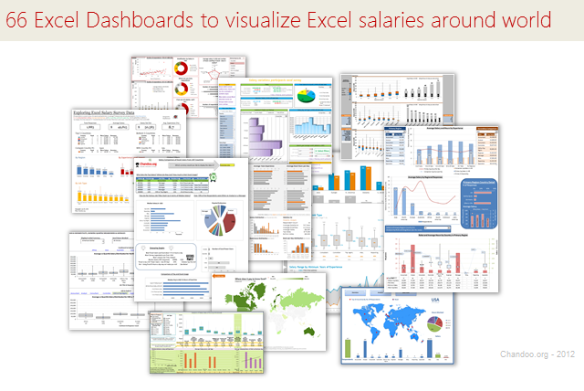
Ladies & gentleman, put on your helmets. This is going to be mind-blowingly awesome.
See how many different ways are there to analyze Excel salary data. Look at these 66 fantastic, beautifully crafted dashboards and learn how to one up your dashboard awesomeness quotient.
Continue »
One of the most dreaded courses during my under-graduation is Probability, Statistics & Queuing Theory. We called it PSQT. I struggled to understand the significance and concept of this course as I could barely concentrate in the class. We had a professor, who is probably a genius, but the moment he started the class, I would magically fall in to one of my after-noon naps. When I woke up, we are either in the middle of an elaborate t-test or going thru intricacies of a Markovian queue.
This was all 11 years ago. Later in life, I have embraced the world of probability & statistics. I still fear queues. May be I will get there one day. 😉
A good understanding of statistics & probability theory is necessary if you want to model complex real-life problems using Excel or similar tools. Naturally, Excel has several functions, features & supported add-ins to help you in this area.
Today, I want to share some of this with you. This article is broken down in to 3 parts.
- Learning Statistics & Probability using Excel
- Downloadable Excel Workbooks to understand
- Full blown models & simulations in Excel
{ 11 Comments }
Excel Teens are out to get you & Other findings from our Survey
Published on Feb 25, 2011 in Charts and Graphs
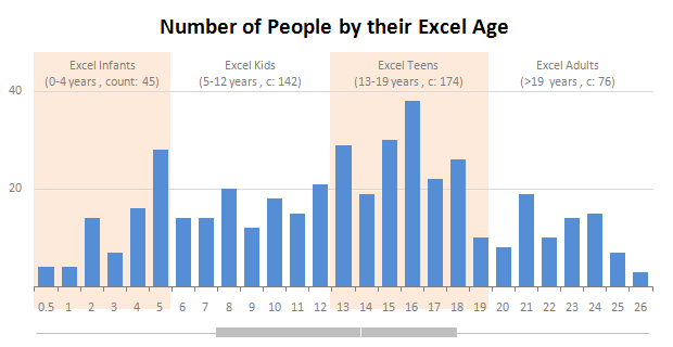
Our of curiosity and fun I asked you “how long have you been using Excel?”. I was overwhelmed by the response we got to this simple question. More than 437 people responded with their comments, stories and enthusiastic responses. Thank you so much.
It would taken me more time to make the charts and understand the data. But thanks to Hui, who volunteered to tabulate all the survey data in a simple CSV.
Shown above is a chart I came up with based on the data. Read the rest of the post to understand the survey results and view more charts. Also, you can download the excel workbooks and original data set to play.
Continue »{ 14 Comments }
90% of you can see up to cell M26 & other findings [visualization]
Published on Nov 12, 2010 in Charts and Graphs, Learn Excel
![90% of you can see up to cell M26 & other findings [visualization]](https://chandoo.org/img/vp/last-visible-cell-in-excel-visualization-thumb.png)
Two weeks back I ran a poll asking you to tell me what is the last visible cell in your excel window. It was a casual poll. So I didn’t expect a lot of responses. But, boy I was wrong! 295 of you have responded at last count. This is so much more than what I expected.
As I said, the purpose of this poll is to make a visualization out of the poll responses. In this post you can see the chart(s) I made from this data & learn more.
Continue »{ 13 Comments }
Gantt Box Chart Tutorial & Template – Download and Try today
Published on Jul 12, 2010 in Charts and Graphs, Learn Excel
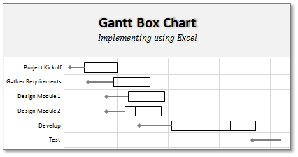
On Firday, we proposed a new chart for showing project plans. I chose an ugly name for it and called it Gantt Box Chart. Essentially, a gantt box chart is what you get when a gantt chart and box plot go to a bar, get drunk and decide to make out. It shows the project […]
Continue »{ 15 Comments }
A Gantt Chart Alternative – Gantt Box Chart
Published on Jul 9, 2010 in Charts and Graphs
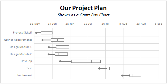
Traditional project plans use Gantt Charts to depict the plan. While gantt charts work great and provide instant picture of overall plan, they fail to communicate the uncertainty in the plan. In most real world projects, the plans always change. Most of the management energy is spent on controlling and communicating about this plan uncertainty. This is where a project plan like gantt box chart can help. This chart (as shown above) clearly shows the variance in end dates of project tasks thus giving a clear picture of uncertainty in the plan. Read more to find out how this chart can be used in project management.
Continue »{ 33 Comments }
What new chart types you want to see in Excel? [poll]
Published on Jun 18, 2010 in Charts and Graphs
![What new chart types you want to see in Excel? [poll]](https://chandoo.org/img/polls/what-new-chart-in-excel.png)
Hui, one of our in-house excel ninjas at Chandoo.org Forums, has asked an interesting question. Microsoft is already planning the next version of Excel and is looking for our feedback into what extra chart types it should offer/include. [more] It is an interesting question, so lets have a poll. What new chart types you prefer […]
Continue »{ 12 Comments }
Bonavista Chart Tamer Kicks ass.
Published on May 4, 2009 in Charts and Graphs, excel apps

Over the last few days I have been using Bonavista Chart Tamer tool and I found it pretty neat. Read my review of this wonderful tool.
Continue »![Adding Box Plots to Show Data Distribution in Dashboards [Part 6 of 6]](https://chandoo.org/wp/wp-content/uploads/2008/10/box-plot-excel-dashboard-visualization-thumb.png)
This is a Guest Post by Robert on Visualization Techniques for Excel KPI Dashboards. This 6 Part Tutorial on Management Dashboards Teaches YOU: Creating a Scrollable List View in Dashboard Add Ability to Sort on Any KPI to the Dashboard Highlight KPIs Based on Percentile Add Microcharts to KPI Dashboards Compare 2 KPIs in the […]
Continue »
