Excel Dashboards – 49 dashboards to visualize US State to State migration trends
Hello everyone. Stop reading further and go fetch your helmet. Because what lies ahead is mind-blowingly awesome.
About a month and half ago, we held our annual dashboard contest. This time the theme is to visualize state to state migration in USA. You can find the contest data-set & details here.
We received 49 outstanding entries for this. Most of the entries are truly inspiring. They are loaded with powerful analysis, stunning visualizations, amazing display of Excel skill and design finesse. It took me almost 2 weeks to process the results and present them here.
![]()
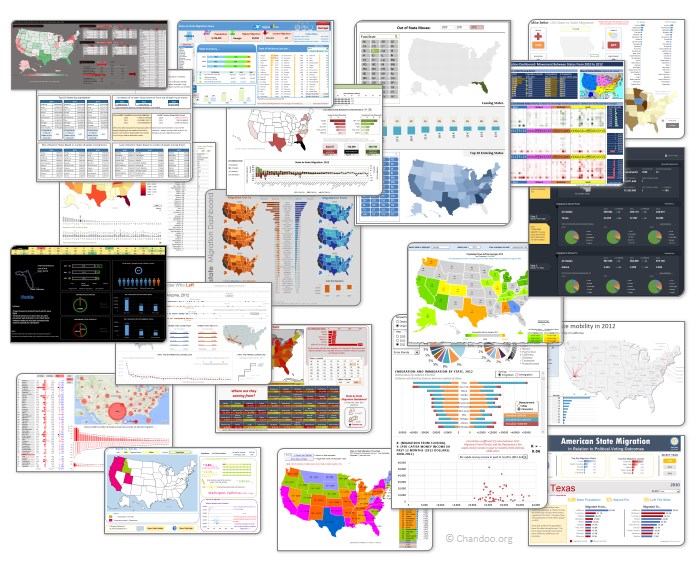
Click on the image to see the entries.
Visualize Excel salaries around world with these 66 Dashboards
Ladies & gentleman, put on your helmets. This is going to be mind-blowingly awesome.
See how many different ways are there to analyze Excel salary data. Look at these 66 fantastic, beautifully crafted dashboards and learn how to one up your dashboard awesomeness quotient.
We cant Cure Cancer, But we can Cure this Medicare Chart [Chart Busters]
In this installment of Chartbusters, we take a look at a poorly constructed choropleth of medicare reimbursements in US and suggest cure for it. The post is from our Guest Buster – Jeff.