All articles with 'dashboards' Tag
How to create SVG DAX Measures in Power BI (Easy, step-by-step Tutorial with Sample File)

SVG (Scalable Vector Graphics) is a great way to add a bit of flavor and pizzazz to your boring Power BI reports. I have been using them for a while and really love how easy and fun they are to work with. So today, let me share the technique and provide sample measure code that […]
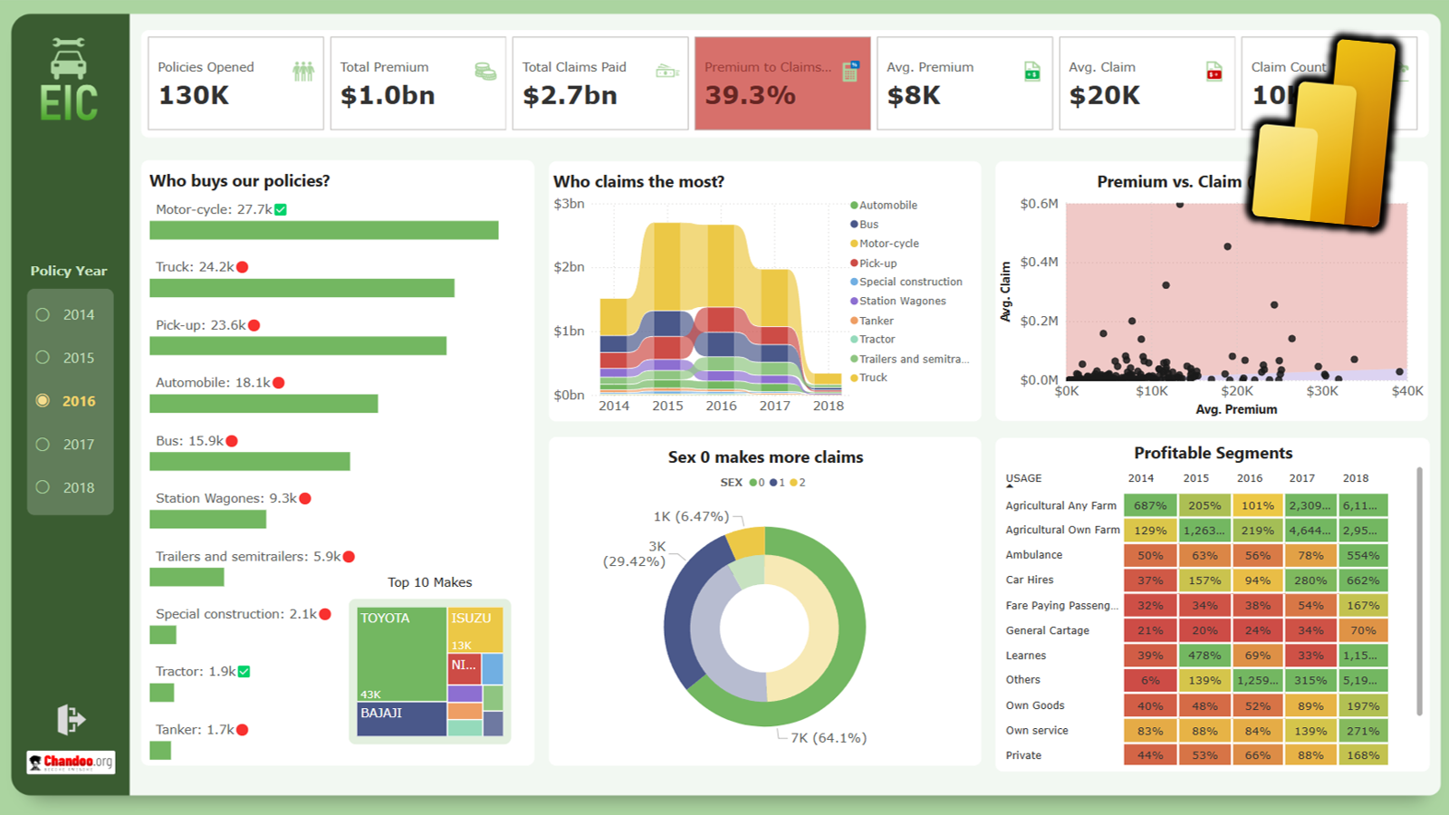
Continue »How to Create a Power BI Dashboard for Insurance Analytics (With Examples)

1. Introduction Insurance is a perfect industry for data analysis. There is plenty of data – right from lead generation to to underwriting to policy issuance to administration to claims processing. With a careful and well thought data strategy insurance companies can become profitable. Power BI makes data analysis in insurance space a breeze. Whether […]
Continue »Sales Analysis Dashboards with Power BI – 30+ Alternatives

Do you need inspiration for your upcoming Power BI sales dashboard? Well, I got you covered. In this page, let me present 33 alternatives for Sales Analytics Dashboards with Power BI.
Continue »Announcing Power BI Dashboard Contest (win $500 prizes!)

Hey there, I have a SUPER exciting announcement! April is about to get a whole lot sweeter with our Power BI Dashboard Contest! Your mission, should you choose to accept it: Craft the most EPIC dashboard for the Awesome Chocolates CEO with sales & financial insights! Winners stand a chance to score up to $500 in Amazon Gift Cards, plus some serious bragging rights!
Continue »
Do you manage projects? You are going to LOVE ? this one. In this in-depth tutorial, learn how to create a fully interactive & dynamic Excel Project Management dashboard. Sample files & video instructions are also provided.
Continue »
A stream graph or stream plot is an area chart that looks like a stream. In this post, let me show you how to create an interactive stream graph using Excel area charts. The original design for this graph is inspired from Cedric Scherer.
Continue »
Do you run an e-commerce website? You are going to love this simple, clear and easy website metrics dashboard. You can track 15 metrics (KPIs) and visualize their performance. The best part, it takes no more than 15 minutes to setup and use. Here is a preview of the dashboard.
Click to download the template.
Continue »Advanced Pivot Table Tricks for you

Excel Pivot tables make data analysis and visualization easy. With the help of these advanced pivot table skills, you can create powerful data analytics and reports. New to Pivot Tables? If you are new to Pivot Tables, check out this excellent introduction to Pivot Tables page. × Dismiss alert Table of Contents #1 – One Slicer, Two […]
Continue »Introduction to Power BI – What is it, how to get it, how to create reports with Power BI and how to publish them?

Power BI is a data analytics & visualization software. It is one of the most popular and powerful way to work with complex business data. In this page, you will find a comprehensive guide to start your Power BI journey.
Continue »Create impressive dashboard tiles in Excel

If you want to tell the story of how your business / project / charity / thing is going on, then making a dashboard is the best way to go about it. Dashboards can combine heaps of data, insights and messages in to one concise format that fits on to a desktop or table or mobile screen.
But let’s be honest. Creating them in Excel is a lot of work. Even after spending hours on them, they might still look meh. So, let me share a trick to make your dashboards look snazzy (without compromising on insights per inch).
Create dashboard tiles, something like above.
Continue »Power BI Webinar, Amsterdam & Australia tours [update time]
![Power BI Webinar, Amsterdam & Australia tours [update time]](https://chandoo.org/wp/wp-content/uploads/2019/03/powerbi-webinar-Apr2019.png)
Hiya folks… just a quick update on whats keeping me busy this year, with a bonus Excel tip at the end. Take a sip of your favorite brew and read on.
Continue »
Work in HR and use Power BI? You are going to love this extensive, powerful and useful Employee Turnover Dashboard. In this detailed article, learn how to create your own attrition dashboard system with Power BI. Full example workbook, video and sample data included.
Continue »
Commonwealth games 2018 have ended in the weekend. Let’s take a look at the games data thru Power BI to understand how various countries performed.
Here is my viz online or you can see a snapshot above.
Looks good, isn’t it? Well, read on to know how it is put together.
Continue »![Designing awesome financial metrics dashboard [tutorial]](https://img.chandoo.org/contests/mv2016/rs/09-chandeep-c.png)
In this amazing guest post, the winner of our 2016 dashboard contest – Chandeep – Explains how he constructed the jaw dropping beauty (shown above) using Excel, creativity, love and sweat. Grab a full cup of coffee (or whatever liquid fancies you) and read on. Take lots of notes and play with the ideas in Excel while reading to maximize your learning.
Thanks Chandeep.
Continue »Visualizing Financial Metrics – 30 Alternatives

Around 2 months back, I asked you to visualize multiple variable data for 4 companies using Excel. 30 of you responded to the challenge with several interesting and awesome charts, dashboards and reports to visualize the financial metric data. Today, let’s take a look at the contest entries and learn from them.
First a quick note:
I am really sorry for the delay in compiling the results for this contest. Originally I planned to announce them during last week of July. But my move to New Zealand disrupted the workflow. I know the contestants have poured in a lot of time & effort in creating these fabulous workbook and it is unfair on my part. I am sorry and I will manage future contests better.
Continue »

