
Ladies & gentleman, put on your helmets. This is going to be mind-blowingly awesome.
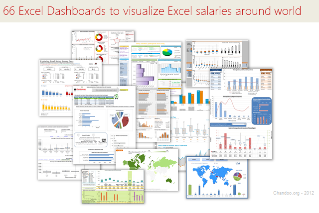
About a month ago, we announced our brand new contest – Visualize Excel Salary survey data here.
We received 66 outstanding entries for this. More than 40 entries are truly world-class with innovative visualizations, interactive graphs & kick-ass number crunching. It took me quite a while to organize all these entries, collect screenshots and review them.
So how do we make sense of all these?
Since doing justice all this variety and creativity in one post is difficult, I am splitting this in to 4 entries.
- All 66 Dashboard entries & my comments [this post]
- How to create Box plots?
- How to make your dashboards interactive?
- Voting for contest winner
How to read this post?
This is a fairly large post. If you are reading this in email or news-reader, it may not look properly. Click here to read it on chandoo.org.
- Each entry is shown in a box with the contestant’s name on top. Entries are shown in alphabetical order of contestant’s name.
- You can see a snapshot of the entry and more thumbnails below.
- The thumb-nails are click-able. So that you can enlarge and see the details.
- You can download the contest entry workbook, see & play with the files.
- You can read my comments at the bottom. If I liked a particular entry, I have put a small “Chandoo’s pick” icon too.
- At the very bottom of this page, I have put a list of resources to help you learn most of the techniques used by our participants.
Thank you
Thank you very much for all the participants in this contest. I have thoroughly enjoyed exploring your work & learned a lot from them. I am sure you had fun creating these too.
So go ahead and enjoy the entries.
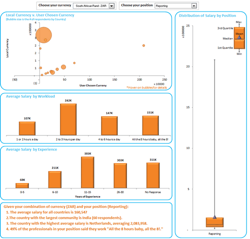
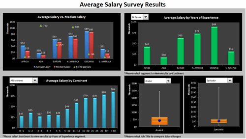
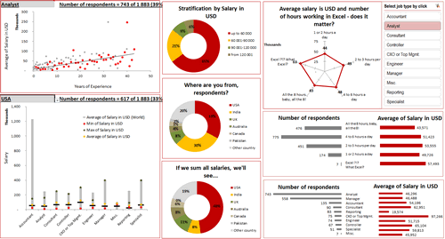
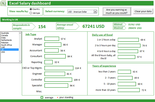
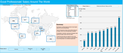
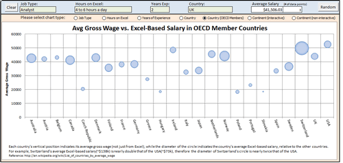
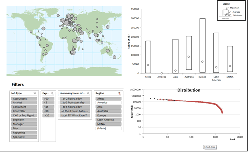
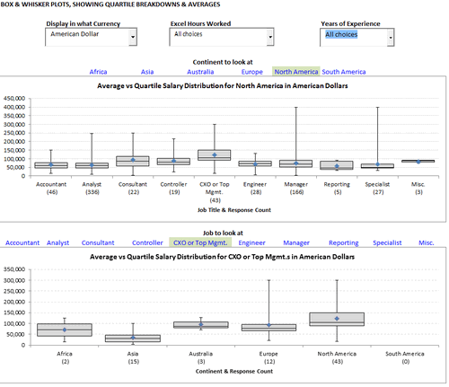
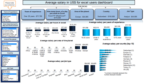
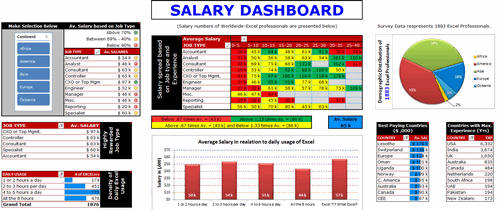
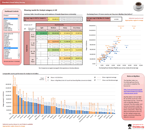
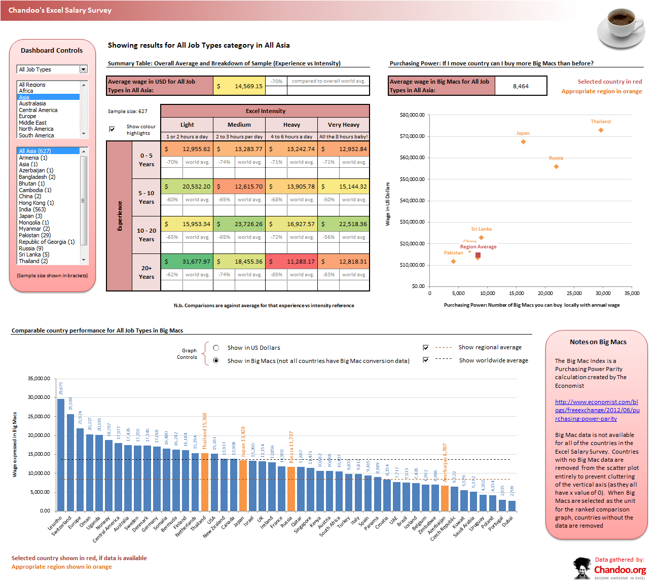
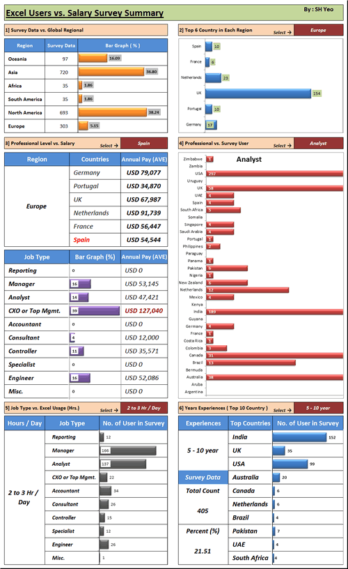
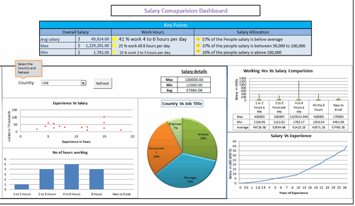
Interactive Dashboard by Aaditya Nanduri


Download workbook:
- Ability to view results in any currency
- Summaries of selected sub-set at bottom
- Box plots
- Dynamic charts

![]()
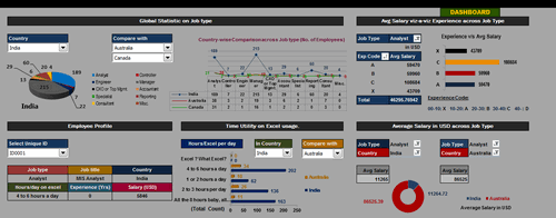
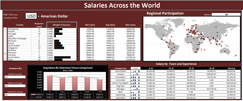
Interactive Dashboard by Akash Khandelwal


Download workbook:
- Dynamic charts (with filter)
- 5 types of analysis
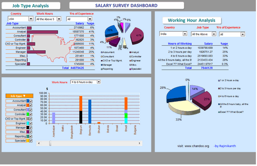
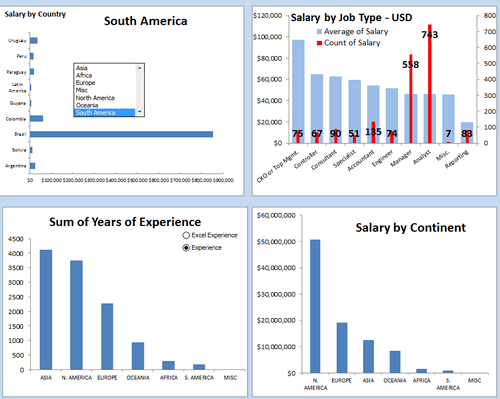
Interactive Dashboard by Aldo Mencaraglia
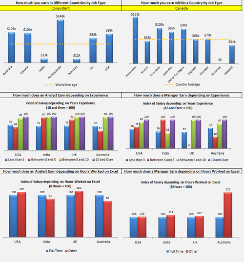


Download workbook:
- Dynamic charts
- Indexed salary analysis by country & position
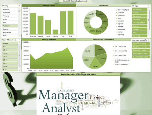
Dashboard by Allred Ben
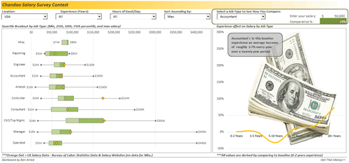


Download workbook:
- Box plots
- Interesting colors & chart construction
- Multiple filters to select a sub-set of data
- Analysis of salary increase by years of experience (to see % hike with every year added)
- Comparison of survey data with Bureau of labor statistics data
Dashboard by Anchalee Phutest


Download workbook:
- Ability to select any of 6 analysis charts and view
- Word cloud from wordle.net
- World map with colors based on salary made
- Box plots
Dashboard by Andrew Plaut


Download workbook:
- Ability to select any sub-set of data based o region, hours worked etc.
- View results in numbers & charts
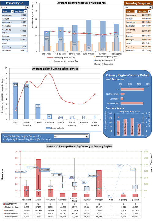
Interactive Dashboard by Anup Agarwal
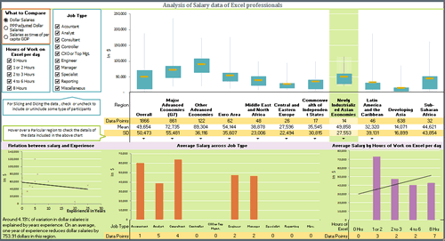


Download workbook:
- Box plots
- Grouping of countries by G7, Developing, Developed etc.
- Multiple filters to select a sub-set of data
- Dynamic hyperlinks to show analysis on hover
- Regression analysis of salary vs. experience
- PPP indexing of salary possible or salary as a % per-capita GDP
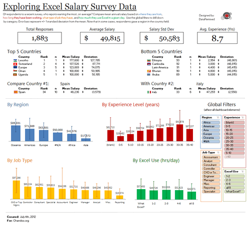
Dashboard by Ben Jones


Download workbook:
- Very good colors and bright design
- Text observations & analysis
- Top / bottom 5 country names along with flags
- Slicers
- Interesting chart design with error bars to show standard deviation
![]()
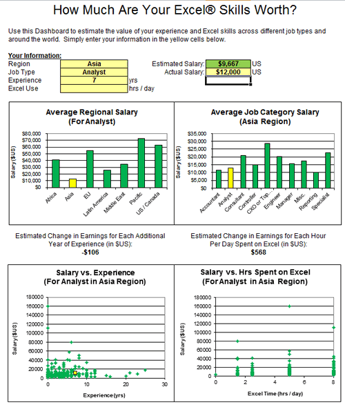
Dashboard by Braisted, Matthew


Download workbook:
- Analysis of “How much are your excel skills worth?”
- Simple bar & XY charts to analyze spread of salary
- Estimated Change in Earnings for Each Additional Year of Experience (in $US)
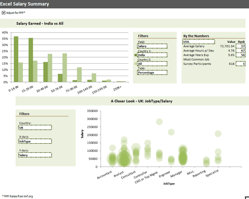
Dashboard by Brant Spear


Download workbook:
- Interesting colors & chart construction
- Option to adjust salary by PPP
- Multiple filters to select type of analysis you want and which data to compare. (For example salary in India vs. All or Experience in Brazil vs. France)
- Closer look at any country, Job-type and salary combinations.
Learn how to make Excel Dashboards & Reports

- Learn how to create interactive dashboards & reports using Excel
- Analyze data like a pro
- 32 hours of video training
- Learn at your own pace
- Click here to know more
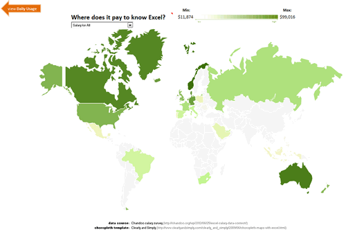
Dashboard by Bryan Munch


Download workbook:
- Choropleth of salaries in all countries
- Salary by job type analysis
- Interesting layout
Interactive Dashboard by Bryan Waller


Download workbook:
- Dynamic charts
- Average vs. median salaries by region
- Box plots to compare any 2 roles
Dashboard by Cesarino Rua


Download workbook:
- Interactive browsing of data & filtering using Excel’s filters
- Summary of filtered data shown on top along with simple charts
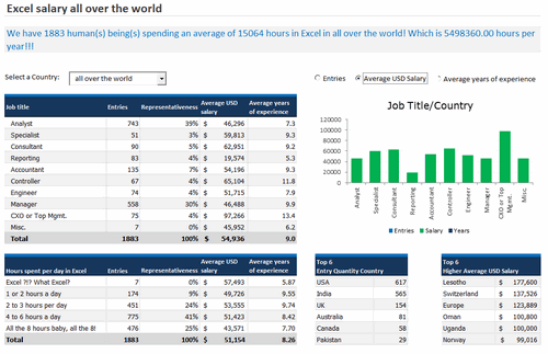
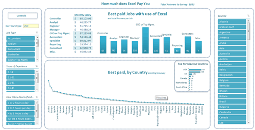
Dashboard by Daniel Rosenberg


Download workbook:
- Interesting layout
- World-map with bubble chart
- Comprehensive analysis
- Interesting analysis on “Potential Salary” – salary possible with 8 hours of Excel work, given current number of hours as input.
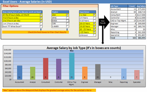
Interactive Dashboard by Dustin Corbin


Download workbook:
- Dynamic charts
- Good colors and layout
- Ability to compare any country / job type with world-wide averages
Interactive Dashboard by Ekaterina Batranets


Download workbook:
- Comprehensive analysis
- Dynamic charts
- Trend analysis of salary vs. experience
- Good chart for country analysis
- Slicers based selection
- Interesting layout
![]()
Interactive Dashboard by Ganesh Madhyastha


Download workbook:
- Dynamic chart
- Comprehensive analysis
- Text + charts
- Good use of form controls (scroll bar, combo box)
![]()
Dashboard by Guillermo Barreda


Download workbook:
- Slicers
- 3D Charts
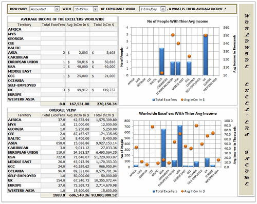
Interactive Dashboard by Hariharan T S
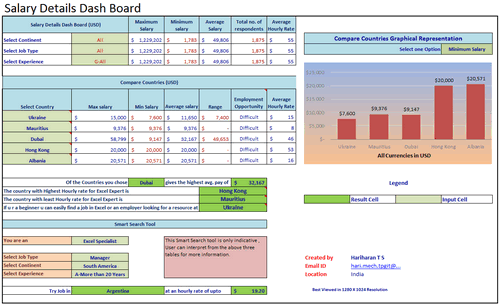


Download workbook:
- Smart search tool to find you best paying countries & hourly rates
- Select up to 5 countries to compare
- Dynamic charts
Interactive Dashboard by Hilary Lomotey
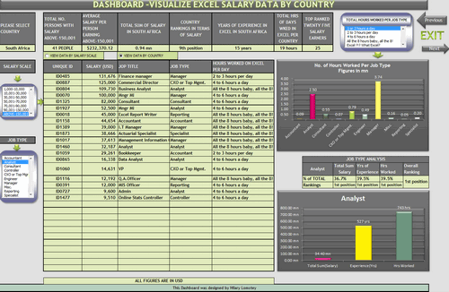


Download workbook:
- Interesting layout and navigation sheet
- Dynamic charts & data filtering
- Multiple analysis sheets
Interactive Dashboard by Iva Kožar


Download workbook:
- Interesting layout & colors
- Dynamic charts & multiple filters
- Ability to view results in any currency
- Are you earning as much as you could – launches user form to get your details and compare it with data.
Dashboard by Jairaj Guhilot


Download workbook:
- Multiple selection and analysis
- In-cell charts
Dashboard by Jeanmarc Voyer
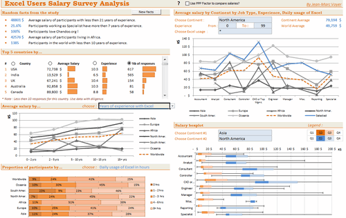

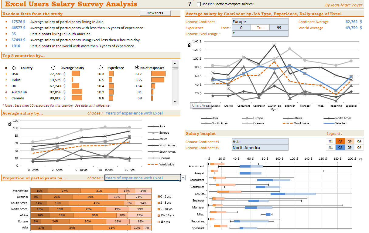

Download workbook:
- Good layout and colors
- Box plots
- Random facts from data (with ability to refresh)
- Top 5 countries by…
- Many selections to analyze data in several ways
- Comprehensive analysis
- Ability to scale salaries by PPP
- Compare one continent with another
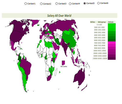
Dashboard by Jingyi Wei


Download workbook:
- World-map with average salary data
- Select analysis type to see the chart
Dashboard by Joerg Decker


Download workbook:
- Interesting layout & colors
- Salary per hour analysis
- Slicers
- Interesting chart construction to show top 5 salary per hour per experience level.
- Box plots
![]()
Learn how to make Excel Dashboards & Reports
- Learn how to create interactive dashboards & reports using Excel
- Analyze data like a pro
- 32 hours of video training
- Learn at your own pace
- Click here to know more
Interactive Dashboard by Joey Cherdarchuk


Download workbook:
- Excellent design & colors
- Dynamic charts (clickable cells with VBA)
- Analysis by continent
- Text + charts
- Clear layout
![]()
Dashboard by John Michaloudis


Download workbook:
- Interactive hyperlinks
- World-map with bubble chart
- Slicers
- Top & Bottom salary analysis
- Sparklines
![]()
Dashboard by Jonathan Ong


Download workbook:
- Multiple analysis
- Interactive world-map to show regional summaries
- Comparison of Excel salaries with average salary by country for all jobs
- See the results by random sub-set of data or search on your own
Interactive Dashboard by Jose Eduardo Chamon – Claro Matriz –


Download workbook:
- Analysis by country and top 10 positions
- Dynamic charts
- 3D charts
Interactive Dashboard by Juwin

Download workbook:
- Dynamic charts
- Compare multiple countries with one another
- Analysis by many criteria (Sal vs. Jobs, Jobs vs. Experience etc.)
Dashboard by Karine Gouveia Dibai – Mediphacos


Download workbook:
- Good layout and colors
- Clean design with lots of text, numbers and simple charts
Dashboard by Kostas


Download workbook:
- World-map with bubble chart
- Slicers
- Box plots
- Distribution of salaries (all vs. selected data thru slicers)
Dashboard by Krishnan A

Download workbook:
- Analysis in any currency
- Interesting insights from data
- Salaries indexed by PPP
Dashboard by Krishnaraj Alevoor


Download workbook:
- Supports both left & right hand users
- Interactive world-map to select a region
- Country vs. region analysis
Interactive Dashboard by Krishnasamy Mohan


Download workbook:
- Dynamic hyperlinks to show charts
- 3D Charts
Dashboard by Lubos Pribula
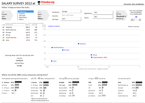


Download workbook:
- Very good colors and design
- Multiple selection options to analyze any sub-set of data
- Marking of data by “good reliability” so that you can make sense.
- Select role using clickable cells
- Good mix of numbers, text and charts
Dashboard by Luis E. Hernandez Nicasio


Download workbook:
- Slicers
- Analysis in any currency
- Good colors and layout
- Best paid jobs & countries
![]()
Interactive Dashboard by Luke Morris


Download workbook:
- Comparison of one continent with another
- Interesting & comprehensive charts
- Dynamic charts
Become Awesome in Excel & VBA – Create dashboards like these…
- Learn how to create interactive dashboards & reports using Excel
- Develop your own macros & VBA code
- 50+ hours of video training
- Learn at your own pace
- Click here to know more
Dashboard by Luke Moraga


Download workbook:
- Box plots
- Dynamic charts
- Analysis in any currency
- Updation of charts with dynamic hyper-links
- Analysis by continent or position
Dashboard by Lynn Mar


Download workbook:
- Slicers
- Pivot charts
- Comprehensive analysis
Dashboard by Marko Markovic


Download workbook:
- Pivot charts
- Interesting colors & chart construction
- What-if kind of analysis
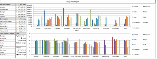
Dashboard by Michael Yager


Download workbook:
- Box plots
- Compare one country with another
- Interesting layout and colors
- Headline & text summary
- Analyze top 15 countries (by responses) or all
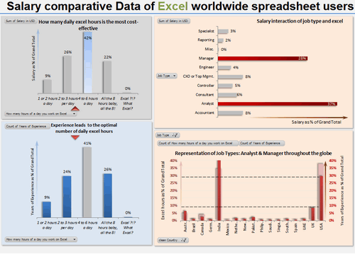
Interactive Dashboard by Mohd Mustafa


Download workbook:
- Analysis of total numbers (total salary by position etc.)
- Dynamic charts
- Usage of form controls
Dashboard by Nathan Gehman

Download workbook:
- Very good colors
- Box plots
- Salary vs. years of experience (with quartile spread to get a sense)
Dashboard by Neculae Valeriu

Download workbook:
- 3D charts
- Conditional formatting with pivots
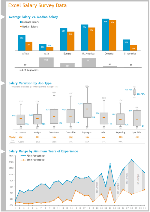
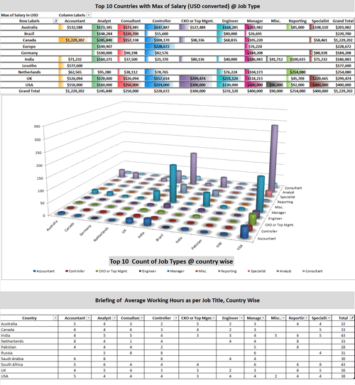
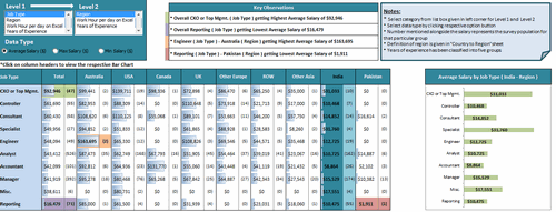
Interactive Dashboard by Nicholas R. Moné
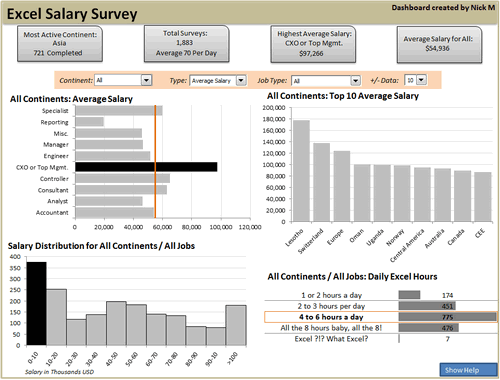


Download workbook:
- Dynamic charts
- Good colors and layout
- Key observations in text on top
- Ability to show top 10, top 5 or top n values
- Built in help (interactive)
![]()
Interactive Dashboard by Nitin Bindal


Download workbook:
- Interactive pivoting of data
- Dynamic display of chart based on clicked cell
- Key observations in text
- Interesting design
Interactive Dashboard by Oscar T


Download workbook:
- Comprehensive analysis
- Dynamic charts
- Multiple selection of filters
- Key messages on top
- 3D charts
Dashboard by Peter Damian
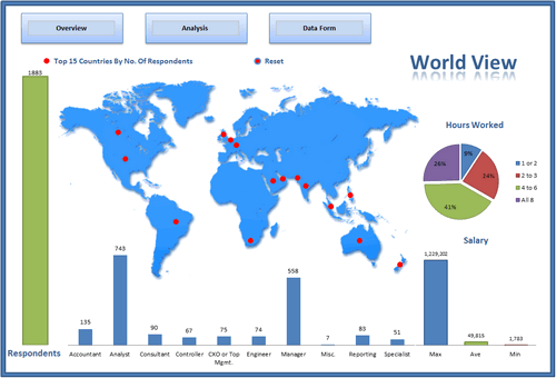


Download workbook:
- User forms and notes
- Scenario analysis (set conditions to see how people are paid)
- Clickable world-map with interactive analysis of Top 15 countries
- Data form to browse and query data
![]()
Interactive Dashboard by Peter Van Klinken
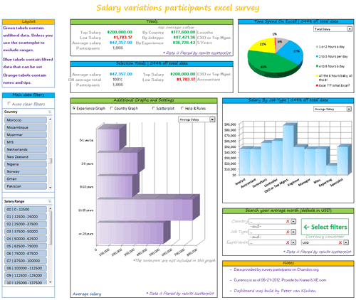


Download workbook:
- Slicers & form controls for dynamic selection
- Comprehensive analysis
- Good colors and layout
- Good mix of text, data and charts
- Clickable world-map
- Search your average worth
- Built-in help
Dashboard by Philippe Brillault
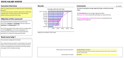


Download workbook:
- Select a business question to see the charts
- Lots of analysis (like cost of living index derived from survey data)
- Analysis & commentary based on selected chart
Dashboard by Prakash Singh Gusain


Download workbook:
- Pivot tables + conditional formatting
- Colorful design
- Slicers
Interactive Dashboard by Rajendra Joshi


Download workbook:
- Dynamic charts
- Text observations & analysis
- Pie chart
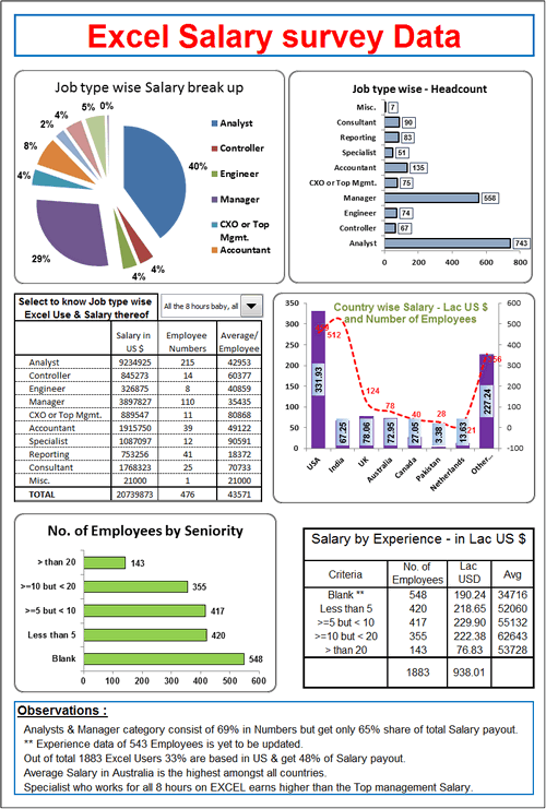
Dashboard by Rajinikanth


Download workbook:
- Dynamic display of selected country’s map
- Dynamic charts & multiple filters
- Charts & numbers
- 3D charts
Interactive Dashboard by Ramzan Shaikh


Download workbook:
- Dynamic charts
- Ability to compare one country with another
- Ability to view any data point
Interactive Dashboard by Richard Stebles

Download workbook:
- Form controls to enable dynamic selection of data
- Number of big-macs you can buy with the salary
- Ability to compare countries in any region and see how they fit in with world-wide numbers
- Good colors and layout
![]()
Interactive Dashboard by Saurabh Sharma

Download workbook:
- Dynamic charts thru pivot tables
- 3D Charts
Dashboard by Sergey


Download workbook:
- Slicers for selection
- Box plots
- Good colors and layout
- Ability to zoom in to any chart
- Good documentation of the workbook & techniques used
- Comprehensive analysis
Interactive Dashboard by Shyeo


Download workbook:
- Dynamic charts
- Comprehensive analysis
Dashboard by Stilwill, Kelly


Download workbook:
- Ability to analyze by any currency
- Multiple selection options to analyze anything.
- World map with XY chart
- Sparklines
Interactive Dashboard by Susan Christine Mcmanus

Download workbook:
- Dynamic charts
- Pivot charts
Dashboard by Umang Merwana


Download workbook:
- PPP adjusted salary analysis
- Slicers
- Word cloud of job titles
- Good simple colors
Interactive Dashboard by Vishwanath M.C


Download workbook:
- Dynamic charts
- Key messages on top
- Box plots
Interactive Dashboard by Yogesh Gupta


Download workbook:
- Dynamic charts and multiple selections
- Clickable cells (with VBA)
- Ability to view results in any currency
Interactive Dashboard by Prince Goyal


Download workbook:
- Dynamic charts
- A view of all data that meets given condition
Interactive Dashboard by Vinita Varier


Download workbook:
- Dynamic charts
- Word cloud from wordle.net
- Average vs. total salary earned by all people in a country
Become Awesome in Excel & VBA – Create dashboards like these…
- Learn how to create interactive dashboards & reports using Excel
- Develop your own macros & VBA code
- 50+ hours of video training
- Learn at your own pace
- Click here to know more
Tutorials & Examples to Make Excel Dashboards
- Excel Dashboards – Resources, Tutorials and Downloads
- KPI Dashboards using Excel – 6 part tutorial
- Using Picture Links in Excel
- Adding interactivity using Hyperlinks
- Adding interactivity using click-able cells
- Showing one chart analysis from many – Analytical charts in Excel
- Using Check-boxes to show – hide data in charts
- Using Slicers to make dynamic dashboards
- How to create Box plots?
- How to make your dashboards interactive?
- More on interactive charts and dashboards
How do you like these dashboards?
I found quite a few of these really impressive. But I want to hear from you.
What entries you liked most? Go ahead and share your views.


86 Responses
Absolutely fantastic effort by everyone here! This is probably the best contest / response/ learning that I’ve ever seen!
Can’t wait to learn some of the excel-lently employed techniques!
I’m in Excel heaven :-)))
There is so many good ideas…
can’t wait to go through many great files.
Congratulations to all participants 🙂
Really looking forward to seeing the detail behind these, all are good but some are frankly amazing, lots of potential inspiration here, especially for people like me who are good with tech aspects but useless at design!
Nice solutions. And so much difference in using the same numbers.
Peter
Chandoo,
Amazing entries. It is noticeable the increase in number of entries and the bubbling enthusiasm. I can see a clear use of lot of tips and tricks that you have discussed in various postings in the website. That shows that the followers of your website have taken you really seriously. Kudos to each of the participants, you and your team.
Continue the good work. I can’t wait for your customary analyses and the winning entries.
Subbaraman
Really is quite amazing how the same data can be transformed into so many different dashboards. Plenty of things here that I can learn from, like getting the world map to change color based on user selections. Tried for a couple hours one day and just couldnt get it. Glad to see it’s at least possible.
so much in one post….unbelievably useful..thanks a lot
66 is a good show 😀 Well done all!
Some really good ones here, although mine is clearly the best 😉
It must have taken AGES to go through each one. I can see a lot of these have some very clever tricks going on, I can only imagine how long it took to unpick them all.
Thanks to Chandoo for running such a good contest
Richard
Well done to all participants and appreciate all the brains behind this amazing experiance, many of them have presented in a professsional manner and i am sure it will inspire many more people who want to be awesome in dashboards!
Once again congratuations to all and thanks to Chandoo for your wonderful effort!
This is simply amazing. So much I could learn from all the 66 dashboards.
All I can say is “wow”. Both to the creativity and cool tips submitted by the readers, and to Chandoo for taking the time to look at everything.
@Chandoo,
I would request that you edit the name of mine to just show my user name, rather than my whole email address. Not sure if that was a VLOOKUP gone awry, or what. Thanks.
Oops, it was a human error. Fixed it. Sorry for that.
All the entries are amazing..So many ideas in one place..just cant wait to analyze each of the entries to learn a ton.
Also waiting for the winning entry…but for me its a learning treasure 🙂
WOW, really was a big time invested on this post, Chandoo. Amazing… I wish I could win. But I’m already happy to be chandoo’s pick!
The first place I would give for Lubos or Bryan. Second for Nathan. I think mine could be the 3th! >)
I’m learning a lot with the xlsm files. Thanks for the initiative Chandoo!
Cheers from Brazil.
Karine
I never add comments to these things…….but here’s an exception – I am blown away by the work here – I do this for a living and believe myself to be very good at it however some of these examples are exceptional and I felt I had to congratulate those that put in the effort here.
well done.
I feel like a kid in a candy store: everything look so impressive.
I’m always amaze that the same data could be displayed so differently.
Congradulation to all participants, you’re work is a true inspiration for the rest of us. Now that I look most of them the next step is to look at the mechanic.
Awesome entries!!!
This is what I like most in Chandoo.org. Primarily, it is here where we can find a lot of excel experts around the world unselfishly sharing their talents and ideas.
Mabuhay!
Wow Mind blowing technics
Hi All
Firstly it was great to see so many entries in the competition.
The variety of analysis, range of layouts and use of different Excel skills is amazing.
I must say that I was both surprised and delighted that so many entries used World Maps to highlight/display data
Well Done to Everyone who entered !
Chandoo has asked me to assist in the Judging of the contest.
So to do this I set myself some criteria.
The dashboard had to:
1. Tell a story
2. Be clear and easy to follow through the logic of the presentation
3. Be able to be understood without a PHD
4. Be able to be presented
Then I thought about what I would want to see if looking for information on Salaries.
I would want to see
1. What my salary range by profession was in my country
2. Variance across the world
3. What is the variation in my profession
I was also looking for analysis that I hadn’t thought of but that were also useful.
Using the above sets of criteria I constructed a Hui’s Top 10 (although the astute will notice I picked 11) and gave each post a Gold Star.
For those who didn’t enter, these dashboards provide a huge library of various Excel techniques, which you can pull apart and examine how they work so you can use the same techniques in your own dashboards.
Peter Damian made a amazing job!
congratulations to all participates.
Awesome Techniques……….
Thanks.
Very nice contest with awesome participants. Can’t wait to see the details how it those dashboards was made.
Wow! Never imagined the variety that can be seen here! For ‘excel-simpletons’ like me it’s like a walk in a high-tech store -aspirational! Congrats to Chandoo.org for an awesome contest.
Just wondering has anyone downloaded all 66 dashboards and placed them in one zip file? Might save time instead of downloading them 1 by 1.
I did 😉
Get them all from here: http://img.chandoo.org/contests/ssc/files/all.zip
thanks for the zip file Chandoo!
Thanks Chandoo!!
I’m amaze with all of these file and spent my entire day reviewing these and learn really interesting things and i never knew excel can be utilize like this !!!
Wondered if i can made anything like this???
and it’s hard to chose one… chandoo you must be in dilemma 🙂
Awesome, WOWWWWWWWW………………………
Kudos to all participants. Even a simple bar chart tells a story. Would love to learn each and every dashboard.
This website is so lively which is what it makes it so interesting.
The moment one asked for the Zip file of all excel listed, Chandoo made it available in the link.
Quite Amazing.
Would love to learn and join you, Chandoo.
I agree – a truly staggering response rate and congratulations to each and every participant. It’s all testimony to the standing of Chandoo in the international Excel community.
Does anybody know how many of the participants are Chandoo dashboard alumni?
One impression of mine was that in several cases the participants’ dataviz skills were not as advanced as their technical skills. There are some dashboard basics which were quite often not followed in the submissions:
– think very very carefully before using 3D
– choose units and number formats appropriately
– think before using pie-charts
– go for quiet colours
– keep the data-ink ratio to a maximum
– get the dashboard to fit on a standard computer screen (moving target I know)
Another question I asked myself (with hindsight, of course!) was whether the questionnaire could have been structured better. For example, at least three of the job descriptions apply to what I do. And say I work on Excel two hours a day: in my case this doesn’t mean I could increase my income fourfold because I spend the rest of my working time doing different things.
Best, Juanito
Awesome set of dashboards – thanks!
And thanks for the pointer to wordle.net – I hadn’t come across that site before.
They are all excellent, but I have to say I like Brant Spears the best. Sorry I just had to put it out there…
Saying that I am a complete novice, and might not be looking at it in the way an expert would. These have inspired my to sign up onto your course, as Juanito asked, it would be interesting to know if any of these entries are from the course.
I quickly checked to see how many entries are from my students. – 8 entries.
John Michaloudis, Lubos Pribula, Mohd Mustafa, Nathan Gehman, Nicholas R. Moné, Oscar T, Richard Stebles, Umang Merwana are our students. There may be more, but since we use different payment systems and course websites, it is difficult to track.
What an amazing source of inspiration… !!
Congratulation to all participants.
Thanks again Chandoo + Hui for driving this survey.
You rock !
I am Wowed…..Chandoo,You have created a platform where anyone can expect the resolution of their worries…. Just give a hit on link to downlode all in one.
Such zeal of sharing is very rare….Salute
Just one off track observation, We know you live in Vizag but time stamp on comment is not IST. where are these servers running 🙂
This is great chandoo. I’d like to replicate some of these from scratch – any idea on how to start. I think it would be a great learning method.
Really awesome, congratulations to all partipants.
Thanks a lot Chandoo for driving and share this survey, there is a lot to learn of all solutions.
All – some very, very good work here, and so much we all can learn from each other’s submissions. I downloaded the zip and will be using (read: stealing) as much as I can!
I wrote a brief “how-to” post on my “flags & slicers” entry here: http://dataremixed.com/2012/07/exploring-survey-data-with-excel/
Chandoo, Hui – thanks for taking time to evaluate all 66 of these entries! Looking forward to seeing the final conclusion of the contest – good luck to all!
Ben @DataRemixed
https://twitter.com/DataRemixed
What a great response to this contest! There are some amazing Dashboards and I think that everyone is a WINNER here!
My Excel experience spans over 10 years but it wasnt until we installed Excel 2007 at work a couple of years ago (yeah I know, they are way behind!!) that I really started to take interest in Excel. Maybe it was the fact that Excel 2007 was a huge leap from previous versions and more user friendly that I realized that it is a tool to be reckoned with!
I wanted to distinguish myself from my peers at work and Excel was the key. I realised that everyone was using Excel at work but wasnt really good at it or wasnt using Excel to its full potential. So I decided to become AWESOME in Excel!!!. These are the steps I took:
1. I decided to join Chandoo´s classes over a year ago.
2. Look at Dashboards from previous contests, dissect them and apply them in to my current job. This was fun because I was using real life work situations. It took time to dissect and understand some Dashboard formulas but once I got over that hurdle my understanding of new Excel techniques and formulas got much quicker.
3. Spend as much free time using Chandoo´s website as a resource guide for formulas and problem solving for my work templates that I was asked to come up with.
4. Ignore my wife when she´s telling me that I have to go to sleep when I am learning new excel techniques J
During the last 12 months I have evolved from a “beginner/intermediate” level to an “awesomeness” level. I still have to master Macros so there is a huge upside. Now at work people are taking note of my work and are calling me an “Excel Expert”. I let them think that even though I am not in the expert/Chandoo/Hui level just yet.
Most bosses have no clue about excel so if you can stand out in the crowd then you will be promoted very very quickly.
PS. Chandoo didn’t pay me to write this J
John Michaloudis
Wow John. What a great testimonial and inspirational story. I am thrilled to hear about your success. I pray that you ascend many more peaks in your work and personal life continuing with this attitude.
Thanks for sharing it here and making my day.
Participation is unbelievable 🙂 Thanks.
Great stuff! Thanks for posting and thanks to everyone who contributed. Hopefully there will be more of these competitions in the future.
OK, How many years did it take to pull this off? Kudos!!!, I’m so happy for you all I think I will just go outside and start running as fast as I can until this excitment wears off. Bye :o)
Thanks for the zip file
Thanks for having this great site and all your hard work
Thanks for all the dashboard entries and the people that share on here
It is appreciated
Michael Yager’s dashboard looks the best. Very useful and logical.
Hi Chandoo
You have done fantastic work and mind blowing inspire.
Do create like this kindly of Monthly contest and or some making points for us to win
What a bumper crop this time around!
Overall every salary dashboard is nice and thier own speciality , but i was looking for the something ealse
Every quarter manager should to put some comment on thier chart , so every dash board should have comment box wich is changing according to qurter ,month or year .
I hope someone should put that kind of interactive dashboard
Excellent work by everyone. Exceptional dashboard creations. very informative and I learnt a lot.
I would like to vote for Bryan Munch’s dashboard.
Thanks.
Awesome Job done by each individual…Kudos to everyone….Special thanks to Chandoo for the platform..Kudos..cheers
Dear Chandoo
All the dashboards are really out standing.Hats off to you to orgnise sucg contest .I must apperetiate your effort to share excel knowledge.
Congratulations to all participants. and winners too
Dear Chandoo,
Was delighted to take part in the contest and it was my first attempt at it. I have learnt so much from your site and glad to know that the dashboards are out there for any one to rip open and learn more great stuff……Congratulations to the winners and all who took part….hope we can have more contests like this…..and learn more and become more awesome…
Thanks Chandoo and Hui…..
Mohammed Mustafa
It is very much interesting and amazing … this I feel is the creativity at its best in Excel. I wish you continue to come up with more such things.. Thanks a lot … 🙂
Congratulations to All…just great and amazing :). A lot of interesting idea..thank you to all for sharing it!
ABSOLUTELY FANTASTIC….
Wishes to each of you for bringing out the best… For those who did win… CONGRATULATIONS…. and for those who did not, CONGRATULATIONS….
Seeing all these, it feels, i know nothing, but i look it the other way that i got Lots to learn… (from you guys)
I have learnt many a technique from this site and have used it in my real life work situations – the thermometer chart, the sterring wheel… but still tyring to get into the INTERACTIVE CHARTS… this is one area which if i succeed, will put me in faster mode….
VERY BEST TO ALL OF YOU AND THANKS CHANDOO & HUI… YOU GUYS ROCK…!!
Thanks CHOONDO.
Congratulation!
and thunk a lot for these helpful files.
Excel Dashboard fan from CONGO Brazzaville
So much of amazing stuff.. and everything is shared.. awesome
guys.. u r all great..
Chandoo it is a great thing u r doing
Pretty good.
I’ll study them and learn a lot.
Thank you very much
To God Be The Glory for all these things. Thanks Chandoo.
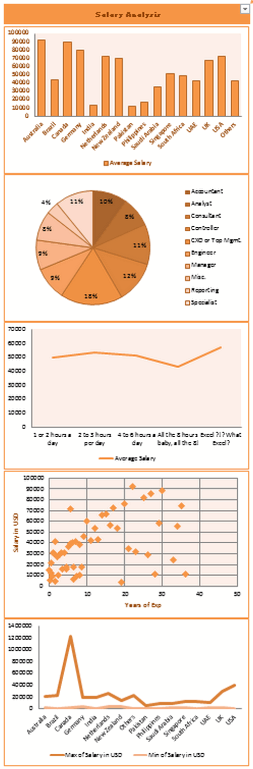
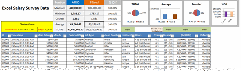
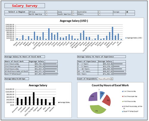
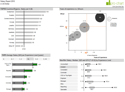
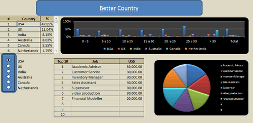
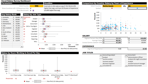
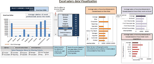
I am trying to find the original tables for this chart.- 3rd from the top. Where would I find it.
Interactive Dashboard by Aldo Mencaraglia
@Kirt
Just below Aldo’s post on the right side is a “Download workbook:” with a large red button just below it
But here is the link anyway: http://img.chandoo.org/contests/ssc/files/salary-survey-entry-01-admin.xlsx
All the submissions come from the same data set.
All these dashboards templates are very precious for all the students and Excel Analysts. Mr Chandoo is very great. Thank you sir.
It’s enough to make my jaw drop…. I’m very inpired by all of work.
Thanks all.
Wow………………
Thanks for your excellent work about these templates.
Very useful and helpful.
Thanks a lot.
Cheers!
Thank you all participants and Chandoo who allows everybody to share outstanding ideas! Very well done, hats off!! 🙂
Thanks… There is so much to learn here… Seems learning curve is going to shoot from here..
These are very helpful.
Thanks Again
Regards
Salil
So much templates. That is great source. Thanks
A great Job, congratulations.
Thanks!
Hi ,
It would be very kind , if someone helps me to make a dash board. Details are as under :
Data consists of @ 50K to 2.5L rows with unique customer ID’s , i.e. Field Service carried out over 1 to 5 months
Month wise MIS needed , Average calls of perticular product , Area Manager Wise , Franchisee wise .
Trend / AVG / etc.
if any one ready to help out please let me know will give details in depth. Thanks in advance.
…Santosh K
Thanks a lot to Chandoo , For the Great Work done by you and has been very helpful, though i am just a beginner 😉
this is a great learning sourse for me, but how can I get that? who can help me?
@Carol
You can ask questions right here:
http://forum.chandoo.org/
thanks, great job!
Nice to learn Excel and financial improvement in this website
Very well done analysis.