All articles with 'screencasts' Tag
CP031: Invisibility Tricks – How to make things disappear in Excel?

Podcast: Play in new window | Download
Subscribe: Apple Podcasts | Spotify | RSS
In the 31st session of Chandoo.org podcast, let’s disappear.
What is in this session?
Spreadsheets are complex things. They have outputs, calculation tabs, inputs, VBA code, from controls, charts, pivot tables and occasional picture of hello kitty. But when it comes to making a workbook production ready, you may want to hide away few things so it looks tidy.
That is our topic for this podcast session.
In this podcast, you will learn
- Quick announcements first anniversary of our podcast etc.
- Hiding cells, rows, columns & sheets
- Hiding chart data points
- On/off effect with form controls, conditional formatting
- Making objects, charts, pictures disappear
- Disabling grid-lines, formula bar & headings
- Hiding things in print

Imagine you are the in-charge of finance department at Hogwarts. So one fine day, while you are practicing the spells, Dumbledore walks in to your office and says, “Our electricity bills are way too high. As the muggles don’t accept wizard money, we have to find a way to reduce our power consumption.”
So you summoned the previous 12 month utility bills to examine energy consumption patterns, and pretty soon you realized that most of the electricity consumption is due to the light bulbs. You suddenly have a brilliant idea. Why not replace the light bulbs with a variety that consumes low power? A light bulb moment indeed.
Your next step is to figure out what varieties of light bulbs are out there. Fortunately this is easier than catching a snitch in a game of quidditch. A quick search revealed that there are 3 types of light bulbs:
- Regular incandescent bulbs (the kind Hogwarts currently uses)
- Compact Fluorescent Light bulbs (CFL)
- Light Emitting Diode bulbs (LED)
Now your job is to do a cost benefit analysis of these options and pick one.
Continue »Unleash the pattern power with Excel Fill [quick tip]
![Unleash the pattern power with Excel Fill [quick tip]](https://chandoo.org/wp/wp-content/uploads/2015/01/patterns-in-excel.png)
When you are a “work from home” dad, you can see a lot of patterns. Here is one.
My kids come home from school by noon (they are too young for full day school). Right after lunch they watch their favorite cartoon program, Team Umizoomi, in which few fictional characters go about solving problems in the Umi city using maths. Milli, one of the characters is an expert with patterns. She solves problems by identifying patterns and unleashing pattern power.
Team Umizoomi & Excel Fill – How do they link up?
Here is how they link up.
Imagine you have a workbook where you need to follow a pattern, like above.
You too can unleash the pattern power. What more… you needn’t break in to a song sequence every-time you unleash the power.
Continue »
Want to write formulas faster? Here is a quick tip.
Use Auto-correct!
That is right. Excel’s auto-correct feature can be setup to help you write formulas faster. See above demo. Read on for details.
Continue »Compare 2 sets of data by letter or word & highlight mismatches [vba]
![Compare 2 sets of data by letter or word & highlight mismatches [vba]](https://img.chandoo.org/vba/compare-2-texts-by-letter-word-demo.gif)
We analysts like to compare. If you ever want to keep an analyst busy, just give her 2-3 options. She won’t return to your desk until the cows come home. My wife uses this trick all the time. Picture this:
[In late 2013]
Me: I want to buy a new phone
She: Do you want Nexus 5 or Galaxy S5 or iPhone 5s?
Its late 2014 and I am not done comparing.
So today, let’s talk about an interesting comparison scenario.
Comparing by letter or word
See above demo to understand the concept. Read more to learn how to do this.
Continue »A better chart to visualize “Best places to live” – Top 100 cities comparison Excel chart
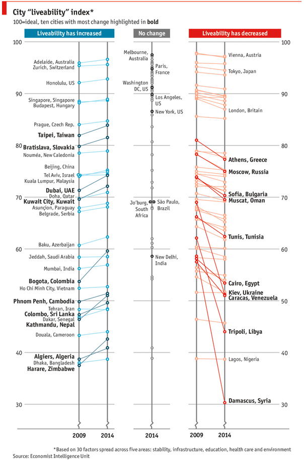
Recently, I saw this chart on Economist website.
It is trying to depict how various cities rank on livability index and how they compare to previous ranking (2014 vs 2009).

As you can see, this chart is not the best way to visualize “Best places to live”.
Few reasons why,
- The segregated views (blue, gray & red) make it hard to look for a specific city or region
- The zig-zag lines look good, but incredibly hard to understand % changes (or absolute changes)
- Labels are all over the place, thus making data interpretation hard.
- Some points have no labels (or ambiguous labels) leading to further confusion.
After examining the chart long & hard, I got thinking.
Its no fun criticizing someones work. Creating a better chart from this data, now thats awesome.
Continue »ABC Inventory Analysis using Excel
ABC analysis is a popular technique to understand and categorize inventories. Imagine you are handling inventory at a plant that manufactures high-end super expensive cars. Each car requires several parts (4,693 to be exact) to assemble. Some of these parts are very costly (say few thousand dollars per part), while others are cheap (50 cents per part). So how do you make sure that your inventory tracking efforts are optimized so that you waste less time on 50 cent parts & spend more time on costly ones?
This is where ABC analysis helps.
We group the parts in to 3 classes.
- Class A: High cost items. Very tight control & tracking.
- Class B: Medium cost items. Tight control & moderate tracking.
- Class C: Low cost items. No or little control & tracking.
Given a list of items (part numbers, unit costs & number of units needed for assembly), how do we automatically figure which class each item belongs to?
And how do we generate above ABC analysis chart from it?
Continue »Drag to multi-select slicer items [quick tip]
![Drag to multi-select slicer items [quick tip]](https://img.chandoo.org/q/drag-to-multiselect-slicer-items-demo.gif)
Hola folks…
My trip to Houston & Dallas was very successful, fun & awesome. I got back home on Friday and instantly I am in another fun, awesome & happy place with my kids, Jo (my wife), rest of the family & friends.
Today, I want to share a very simple yet super awesome trick with you. I learned this from Augie, one of the Houston Masterclass participants.
You can drag slicer items to multi-select them.
Selecting multiple items in a slicer quickly
We know that slicers are powerful, friendly and fun way to filter the pivot tables, pivot charts, power pivot tables and regular tables (only in 2013). They are visual filters that can be used to instantly filter the data (or report). But when it comes to selecting multiple items, slicers can be hard. We must hold CTRL key and tap multiple slicer items one at a time to select them. At least that is how I used to do it.
Do you know we can drag to multi-select?
See this demo:
Continue »Quickly convert numbers stored as text [tip]
![Quickly convert numbers stored as text [tip]](https://img.chandoo.org/q/convert-numbers-stored-as-text-error-options.png)
Here is a quick tip to start the week.
Often, we end up with a situation where a bunch of numbers are stored as text.
In such cases, Excel displays a warning indicator at the top-left corner of the cell. If you click on warning symbol next to the cell, Excel shows a menu offering choices to treat the error.
Continue »Mapping relationships between people using interactive network chart

Today, lets learn how to create an interesting chart. This, called as network chart helps us visualize relationships between various people.
Demo of interactive network chart in Excel
First take a look at what we are trying to build.
Looks interesting? Then read on to learn how to create this.
Continue »Building a simple timer using Excel VBA to track my Rubik’s cube solving speed [case study]
![Building a simple timer using Excel VBA to track my Rubik’s cube solving speed [case study]](https://img.chandoo.org/vba/excel-timer-demo.gif)
Today, lets learn how to make a simple timer app using Excel. First some background…,
Recently, I learned how to solve Rubik’s cube from my nephew. As a budding cuber, I wanted to track my progress. Initially I used the stopwatch in my iPhone. But it wont let me track previous times. So I thought, “Well, I can use Excel for this”.
So I made a small timer app using Excel. Its quite minimalistic. It has a single button. I press it and it tracks the start time (date & time stamp). If I press the button again, it records the duration.
This way, I can see my progress over next few weeks and may be plot the trend.
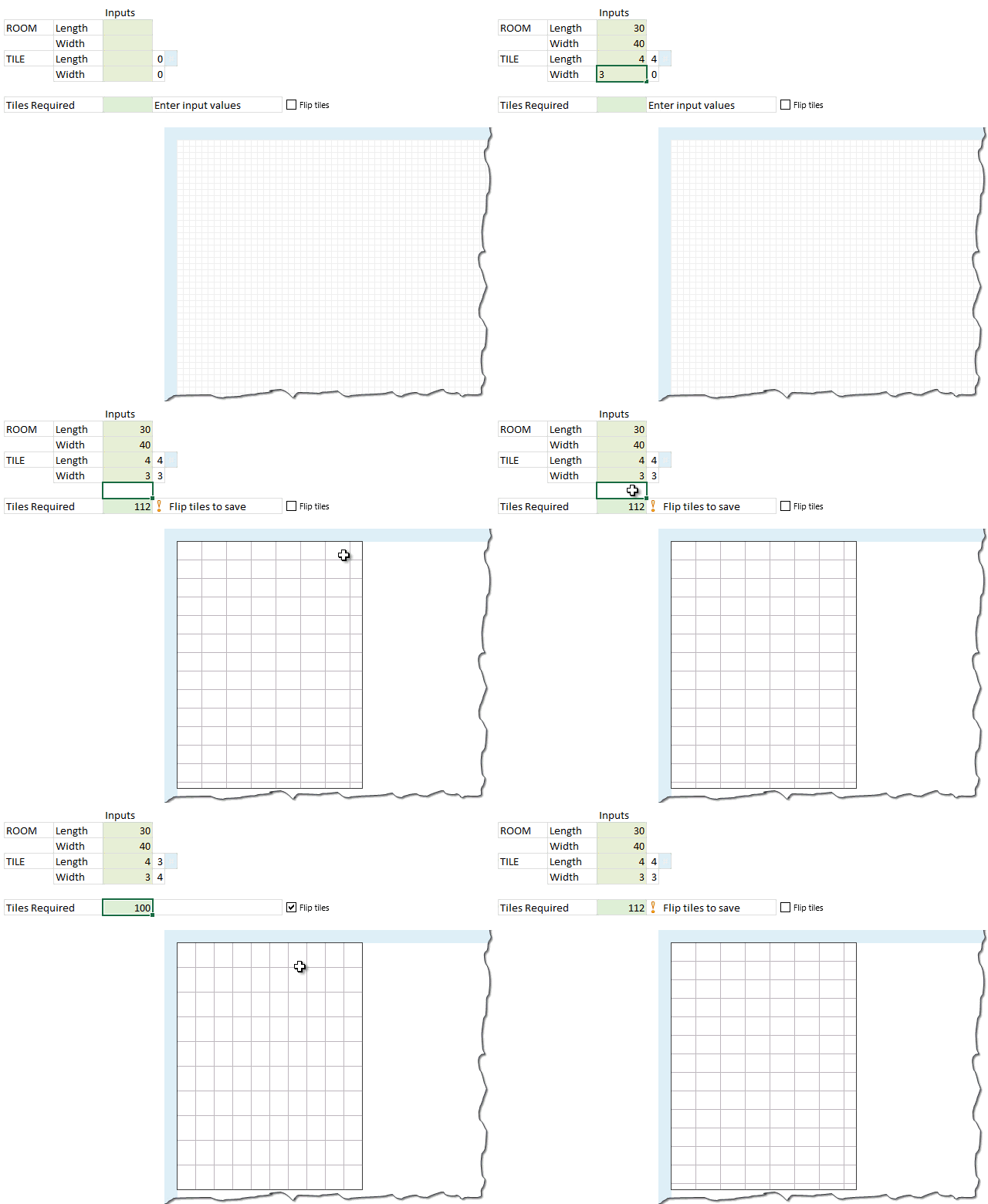
Continue »Modeling tiles in a room using Excel Conditional Formatting

Last week we learned how to answer questions like, “How many tiles in a room?” using Excel. We learned about CONVERT function and fraction number format settings in Excel.
But why stop at calculation? We can even model a room full of tiles, thanks to Excel’s grid nature.
So today, we will learn how to create a room layout as shown above, using Excel.
Continue »CP004: Can I Pie Chart in Public? Discussion about Pie charts, their merits and drawbacks, when to use & when to avoid them

Podcast: Play in new window | Download
Subscribe: Apple Podcasts | Spotify | RSS
In the 4th session of Chandoo.org podcast, lets talk about Pie charts.
Pie charts evoke strong opinions among analysts & managers. Some people love them and can’t have enough of them in reports. Others despise them and go to any lengths to avoid them. And that is why we are going to talk about them in this session.
You will learn,
- Special, secret transmission from guest stars
- What is a pie chart?
- Why they work? 2 reasons
- Why they don’t work ? 4 reasons
- Cousins & siblings of Pie charts
- Donut charts
- Gauge charts (speedometer)
- 3D pies
- Area charts
- Bubble charts
- 4 Situations when making a pie chart is ok
- Alternatives to Pie charts
- Mistakes you should avoid
- About the resources
- Conclusions
You can move formula help box with your mouse!!! [quick tip]
![You can move formula help box with your mouse!!! [quick tip]](https://chandoo.org/wp/wp-content/uploads/2014/03/move-formula-help-box-with-mouse.gif)
One of the most useful features of Excel is formula help box. You know the little yellow box that appears as soon as you start typing a formula in a cell. I use this all the time to understand what the syntax of a particular function is, what parameters to pass etc.
Although I love it, sometimes it does get in the way when writing formulas. Because the help box sits on top of my data, often I find it hard to know which cell to link to.
Solution?!?
Simple. Use your mouse to move away the help box wherever you want.
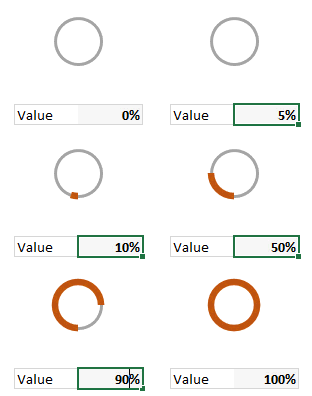
Continue »I won’t eat donut with a thread inside, but lets make one anyway!

Today lets take a stroll outside what Excel can do and make something fancy, fun and may be useful.
Nowadays, many newspapers, websites and magazines are featuring info-graphics. An info-graphic is a collection of shiny, colorful & data-full charts (or often pieces of text.) In many of these info-graphics, you can see threaded-donut charts. Not sure what that is..? It is not same as the blasphemy of spoiling a soft, sweet, supple donut with a piece of string. No one should be excused for an offense like that.
What I am talking about is shown above
Continue »

