All articles with 'list posts' Tag

On twitter I follow many charting and visualization related accounts. One of them is @Andy Kriebel, who runs Makeover Monday. The idea is simple. Every Monday they publish a data-set and ask the community to visualize. Last Monday (7th May, 2018), they have published about toughest sport by skill data. This categorizes 60 sports by 10 skill categories to find out which sport is the toughest. Over the weekend, Andy posted a summary of all toughest sport viz entries. Many of the entries are made in Tableau. I thought it would be a fun challenge to re-create some of these charts in Excel. The result is this post. 60 sports in 6 charts. Check out the charts and download workbook to learn more.
First four charts are re-creations of Tableau designs. Last two are mine.
Continue »Top 5 keyboard shortcuts for Excel Charts

We all know that learning a few keyboard shortcuts can speedup your Excel game. Most pro users rely on a handful shortcuts when working with large spreadsheets. But when it comes to charting, we automatically reach for mouse. But do you know that you can use few simple shortcuts to do most day to day chart related things?
Ready for top 5 keyboard shortcuts for Excel charts? Read on.
Continue »5 conditional formatting top tips – Excel basics
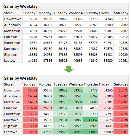
Time for another round of unconditional love. Today, let’s learn about conditional formatting top tips. It is one of the most useful and powerful features in Excel. With just a few clicks of conditional formatting you can add powerful insights to your data. Ready to learn the top tips? Read on.
Continue »18 ways to turn analysis projects into a nightmare

Every week, we read news about failed analysis projects. If you listen carefully, you can hear the grunts, screams and curses of thousands of analysts all over the world about their analysis nightmares.
At Chandoo.org, we talk a lot about best practices for data analytics. So today, let’s peek in to the dark side and understand the mistakes that can turn your analysis project into a nightmare.
There are 3 parts in any analysis project
To understand these worst practices in analysis world, first let’s break analysis projects in to 3 parts.
- Requirements
- Data Structure
- Tools & Construction
Let’s deep dive in to each area of the analysis projects to see what can go wrong.
Continue »Visualizing Financial Metrics – 30 Alternatives

Around 2 months back, I asked you to visualize multiple variable data for 4 companies using Excel. 30 of you responded to the challenge with several interesting and awesome charts, dashboards and reports to visualize the financial metric data. Today, let’s take a look at the contest entries and learn from them.
First a quick note:
I am really sorry for the delay in compiling the results for this contest. Originally I planned to announce them during last week of July. But my move to New Zealand disrupted the workflow. I know the contestants have poured in a lot of time & effort in creating these fabulous workbook and it is unfair on my part. I am sorry and I will manage future contests better.
Continue »CP054: Top 10 Pivot Table Tricks for YOU

Podcast: Play in new window | Download
Subscribe: Apple Podcasts | Spotify | RSS
In the 54th session of Chandoo.org podcast, let’s make you awesome in Pivot Tables.
What is in this session?
In this podcast,
- Quick updates
- Top 10 pivot table tricks
- Adding same value field twice
- Tabular layouts
- GETPIVOTDATA & 2 bonus tricks
- Relationships & data model
- One slicer to rule them all
- Show only top x values
- Relative performance
- Show unique count
- Spruce up with conditional formats
- Not so ugly pivot charts
- Resources & Show notes for you

2015 has been the busiest year since starting Chandoo.org.
Wow, that is 12 years of breaking previous records. Thank you.
In 2015, we published 124 posts (down 3% YoY), received 6,300+ comments (up 5%). Our forum too had busy year with 1000s of new members and 5,000+ new threads. Chandoo.org podcast continued to shine, we had 24 episodes this year and reached the 50 episode milestone. Our podcast episodes has been downloaded more than 900,000 so far since launch (in March 2014) with 600,000+ downloads this year alone!!!
Fun fact: People have spent 6.8 million minutes in 2015 listening to Chandoo.org podcast. (assuming only 50% of downloads materialized to listens)
We have trained more than 1,800 people thru my online classes – Excel School, VBA Classes & 50 ways to analyze data program.
Continue »CP050: Fifty Excel Tips to make you awesome

Podcast: Play in new window | Download
Subscribe: Apple Podcasts | Spotify | RSS
This is going to be epic!!! In the 50th session of Chandoo.org podcast, we have 50 Excel tips to make you awesome.
What is in this session?
In this podcast,
- Thank you message
- Fifty tips in 5 buckets
- Shortcuts & Productivity
- Formulas
- Managing Data
- Charts
- Using Excel better

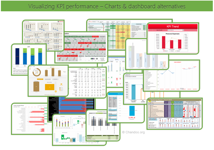
Hello all, prepare to be amazed! Here are 43 creative, fun & informative ways to visualize KPI data.
About a month ago, I asked you to visualize KPI data. We received 65 entries for this contest. After carefully reviewing the entries, our panel of judges have discarded 22 of them due to poor charting choices, errors or just plain data dumps. We are left with 43 amazing entries, each creatively analyzed the data and presented results in a powerful way.
How to read this post?
This is a fairly large post. If you are reading this in email or news-reader, it may not look properly. Click here to read it on chandoo.org.
- Each entry is shown in a box with the contestant’s name on top. Entries are shown in alphabetical order of contestant’s name.
- You can see a snapshot of the entry and more thumbnails below.
- The thumb-nails are click-able, so that you can enlarge and see the details.
- You can download the contest entry workbook, see & play with the files.
- You can read my comments at the bottom.
- At the bottom of this post, you can find a list of key charting & dashboard design techniques. Go thru them to learn how to create similar reports at work.
Thank you
Thank you very much for all the participants in this contest. I have thoroughly enjoyed exploring your work & learned a lot from them. I am sure you had fun creating these too.
So go ahead and enjoy the entries.
Continue »Are you an analyst? Use these 25 shortcuts & tricks to boost your productivity

Analyst’s life is busy. We have to gather data, clean it up, analyze it, dig the stories buried in it, present them, convince our bosses about the truth, gather more evidence, run tests, simulations or scenarios, share more insights, grab a cup of coffee and start all over again with a different problem.
So today let me share with you 25 shortcuts, productivity hacks and tricks to help you be even more awesome.
Continue »
Here is a situation all too familiar.
You are looking at a spreadsheet full of data. You need to analyze and tell a story about it. You have little time. You don’t know where to start.
Today let me share 15 quick, simple & very powerful ways to analyze business data. Ready? Let’s get started.
Continue »
A lot of analysts swear strong allegiance to keyboard shortcuts. But when it comes to formatting a spreadsheet, these shortcuts go for a toss as formatting is a mouse-heavy activity.
But we can use a few simple & effective shortcuts to zip through various day to day formatting tasks. Let me share my favorite formatting shortcuts.
Continue »8 Reasons you must get better at Excel in 2015

This is a guest post by Sohail Anwar.
Why do so many of us use Excel? Let’s trace it back to the ’80s when Microsoft hit gold by being the first out of the blocks with the widely available operating system that was somewhat dummy proof.
Suddenly everyone could aspire to launch ‘Nukes’ like a fresh faced Matthew Broderick in the film ‘War Games’.
By the early 90’s Windows had become even more established relative to other Operating Systems, so much so that PC manufacturers were developing components around Windows’ capabilities and suddenly PCs were Windows machines. As big business began accepting the significance of computing, Microsoft started winning huge licensing contracts with all the major corporations in all sectors, but the Finance sector in particular, where Excel would be king, was having an exponential boom at this time. For big organisations, once you spent a fortune buying licences for the Operating System it only made sense to purchase the seamlessly integrated and carefully developed/tested apps to run on them; enter Excel, Word, PowerPoint and eventually Outlook. Fast forward to 2015 and we are firmly in the age of second generation corporate professionals who have developed much of their productivity skill sets around those particular Windows tools. While all the excellent tools have their place, Excel stands out and here are 8 reasons why you need to up your Excel game more than ever this year.
Continue »Top 10 things we struggle to do in Excel & awesome remedies for them

Recently we asked you, what do you struggle doing in Excel? 170 people responded to this survey and shared their struggles. In this post, lets examine the top 10 struggles according to you and awesome remedies for them.
Continue »Learn how to create these 11 amazing dashboards

Today lets talk about how to build world-class dashboards.
What is a dashboard?
Dashboard reports allow managers to get high-level overview of the business and help them make quick decisions. A dashboard is usually a one page report that contains critical information for decision support.
How to make dashboards?
Excel is an excellent tool to make powerful dashboards that can provide analysis, insight and alert managers in timely manner. But creating a dashboard takes a lot of skill & practice. That is where a resource like Chandoo.org comes handy. In this site you can find more than 200 different dashboard examples, tutorials, samples and downloads – all designed to make you awesome.
Read on to learn more…
Continue »

