
Around 2 months back, I asked you to visualize multiple variable data for 4 companies using Excel. 30 of you responded to the challenge with several interesting and awesome charts, dashboards and reports to visualize the financial metric data. Today, let’s take a look at the contest entries and learn from them.
First a quick note:
I am really sorry for the delay in compiling the results for this contest. Originally I planned to announce them during last week of July. But my move to New Zealand disrupted the workflow. I know the contestants have poured in a lot of time & effort in creating these fabulous workbook and it is unfair on my part. I am sorry and I will manage future contests better.

How to read this post?
This is a fairly large post. If you are reading this in email or news-reader, it may not look properly. Click here to read it on chandoo.org.
- Each entry is shown in a box with the contestant’s name on top. Entries are shown in alphabetical order of contestant’s name.
- You can see a snapshot of the entry and more thumbnails below.
- The thumb-nails are click-able, so that you can enlarge and see the details.
- You can download the contest entry workbook, see & play with the files.
- You can read my comments & suggestions for improvements at the bottom.
- At the bottom of this post, you can find a list of key charting & dashboard design techniques. Go thru them to learn how to create similar reports at work.
Thank you
Thank you very much for all the participants in this contest. I have thoroughly enjoyed exploring your work & learned a lot from them. I am sure you had fun creating these too.
So go ahead and enjoy the entries.
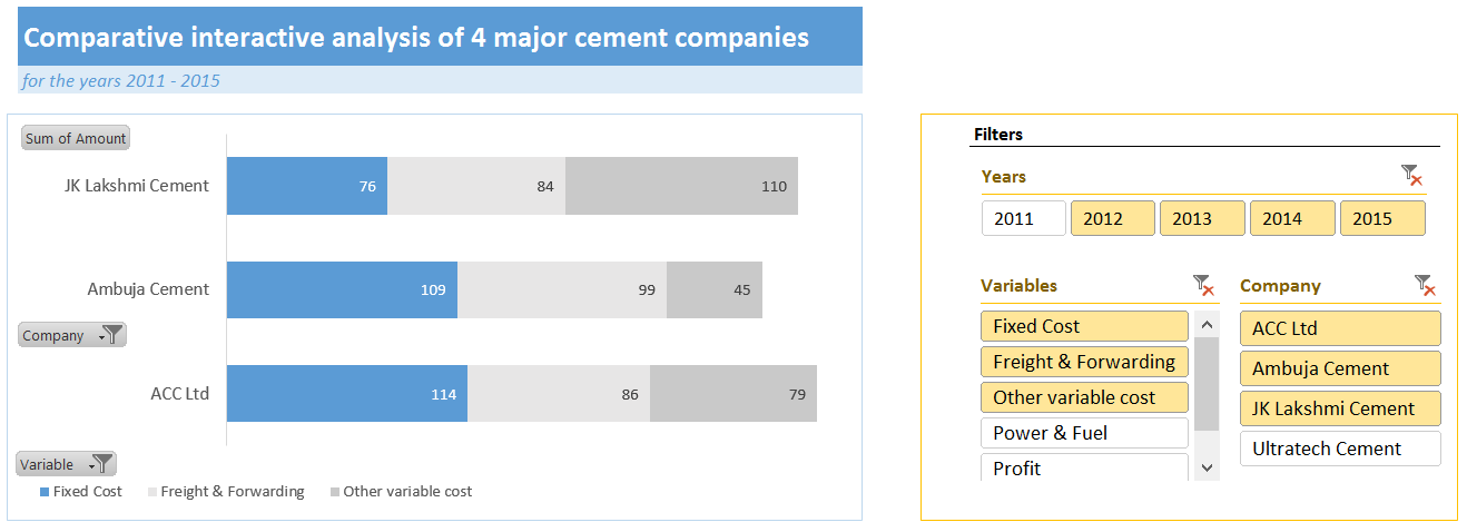
Dashboard by Abhay


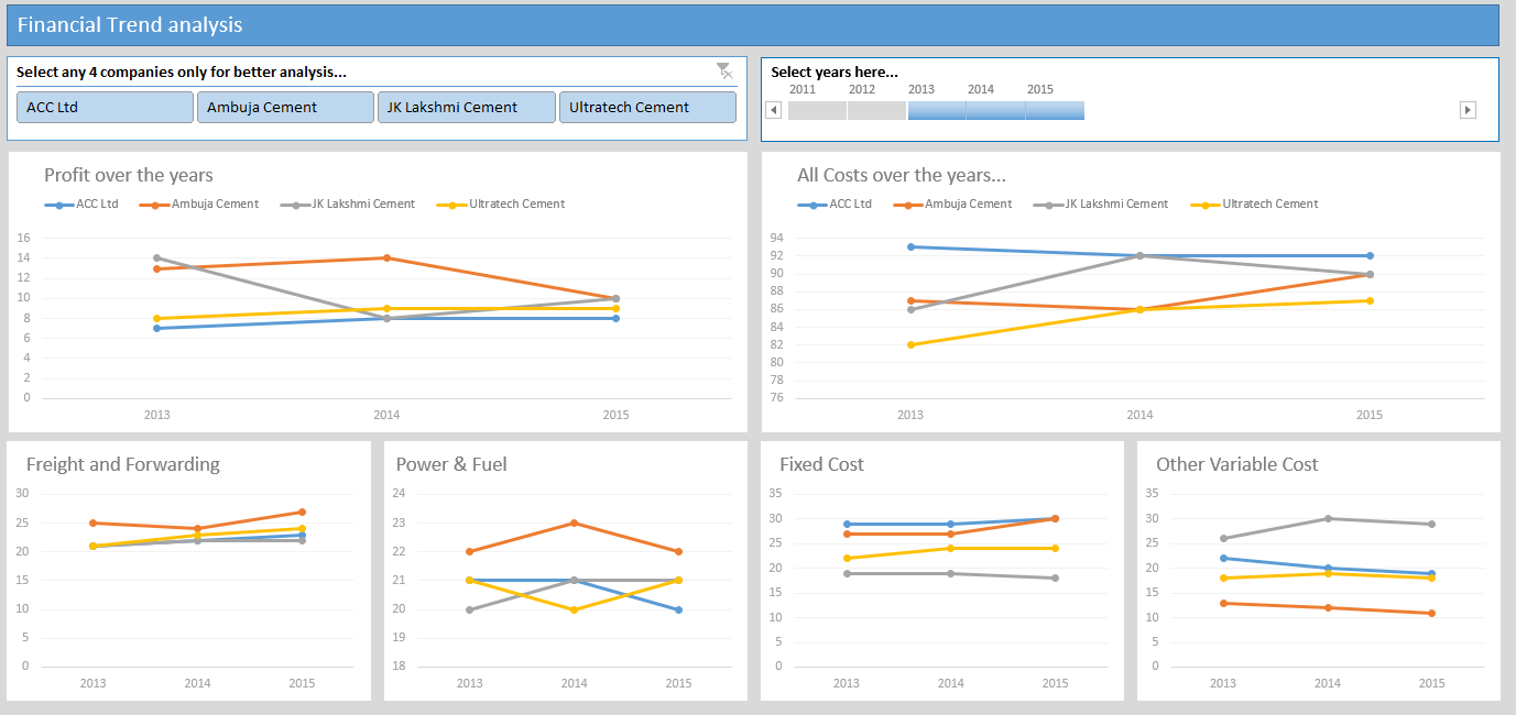
- Interactive dashboard
- Dynamic, can add years and companies. Built with Power Query.
- Simple and easy to read layout
- Can add % changes for top & bottom companies
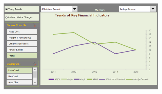
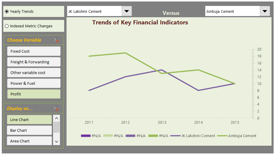
Interactive Chart by Akongnwi


- Dynamic pivot chart
- Could have used regular line chart. Smoothed chart creates wrong impression.
Interactive Chart by Alex

- Interesting layout and execution
- Allows various comparisons
- Can add labels to the bars.
Interactive Chart by Arnaud


- Interesting layout and story telling
- Allows various comparisons
- Can be a bit hard to understand as there are few labels
- Could have added another set of bubbles (or just labels) to compare previous year’s values
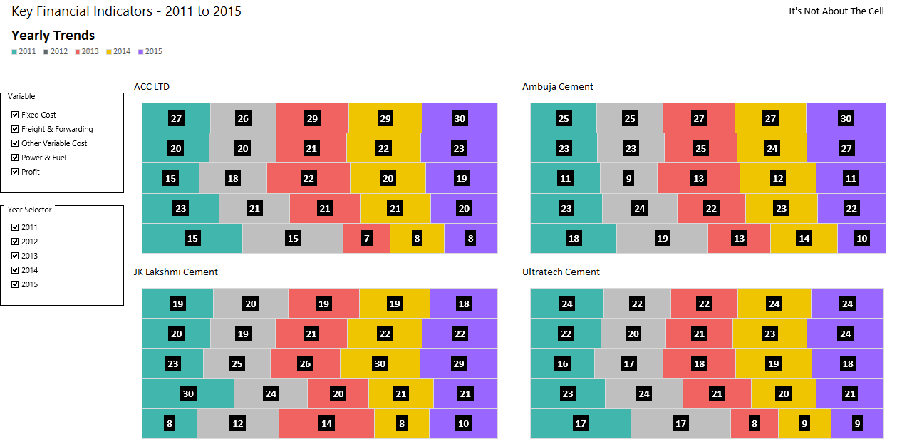
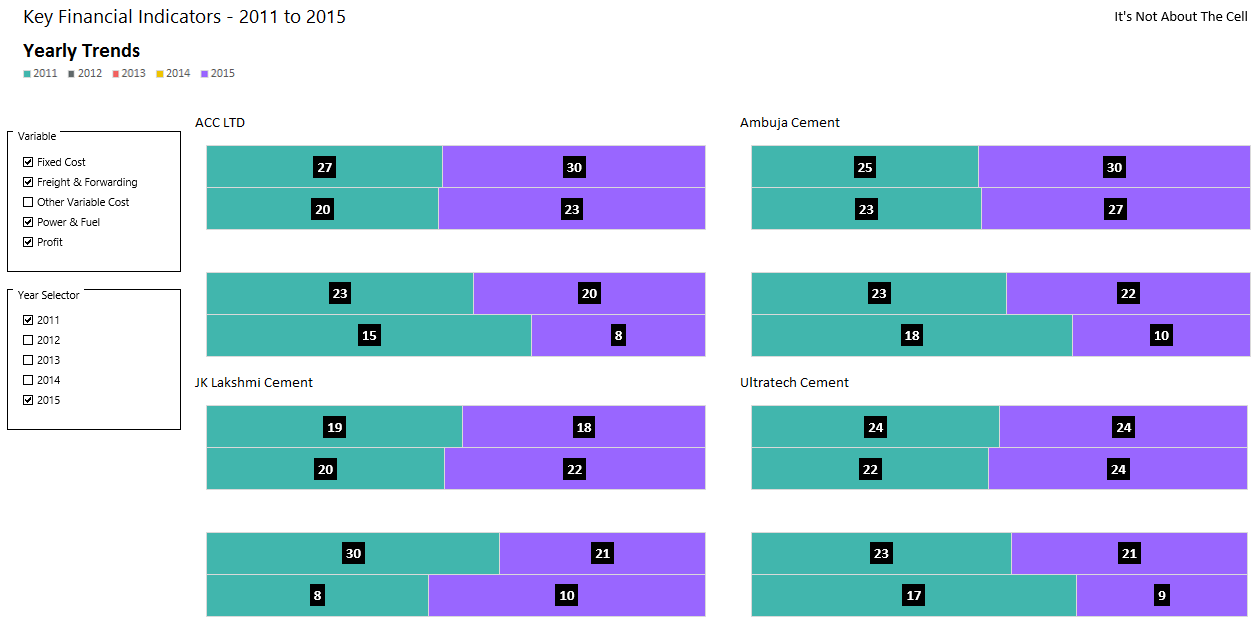
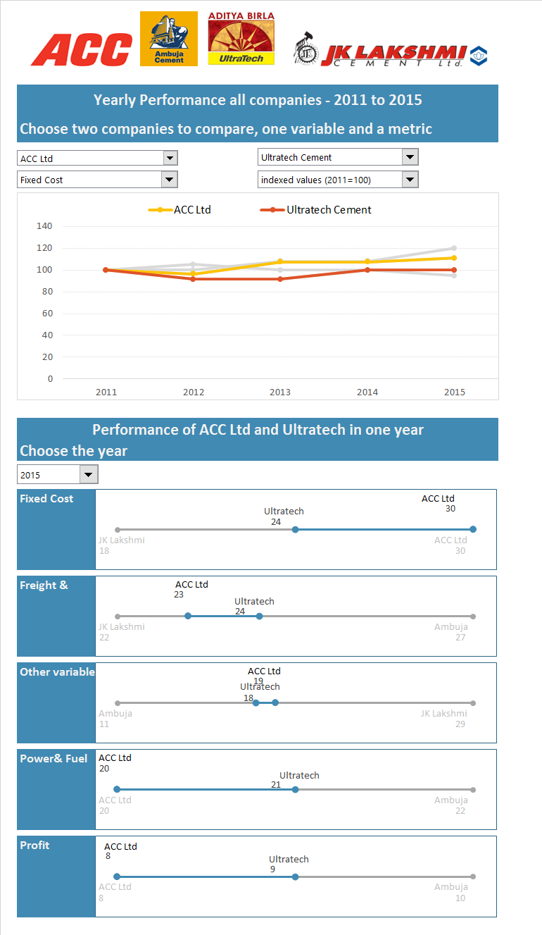
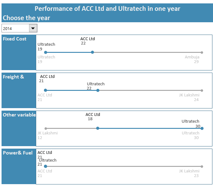
Dashboard by Chandeep
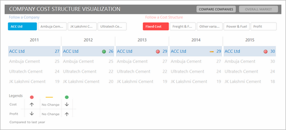

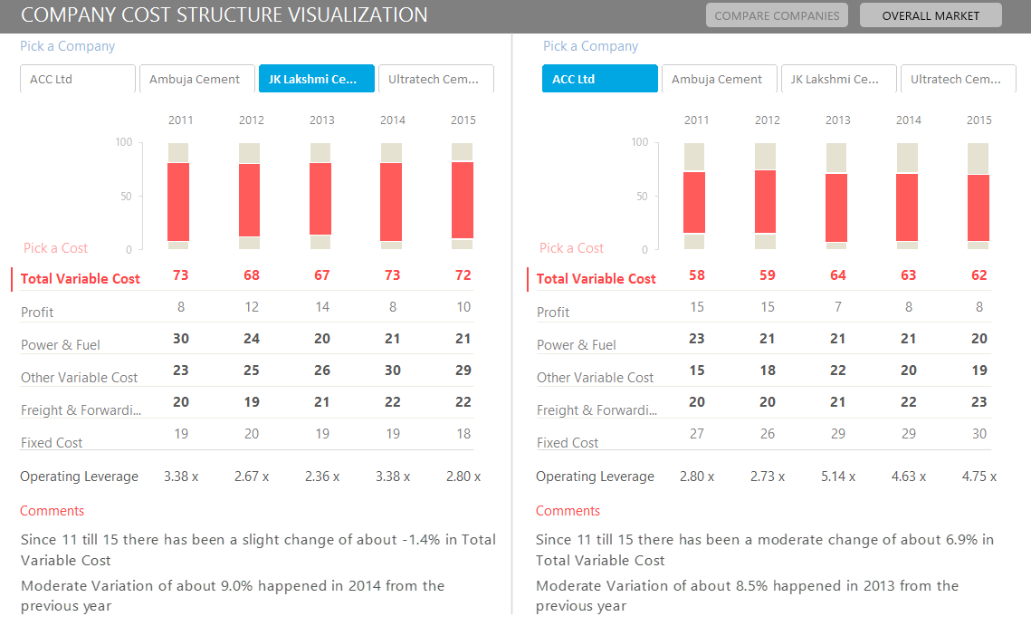


- Awesome design and analysis
- Offers additional metrics and comparisons
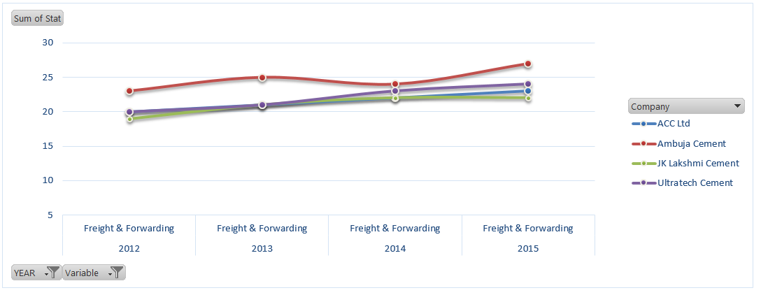
Interactive Chart by Chirayu


- Interactive chart to analyze financial performance YoY
- Simple and easy to read
Dashboard by Edouard

- Interactive dashboard with lots of comparison options
- Very cool line chart with relative performance
- Could have re-arranged to fit on one screen. Feels too long.
Chart by Edwin


- Very interesting normalized chart
- Can be hard to read. Could have added explanation.
Interactive Chart by Elchin


- Interactive charts
- Simple and easy to read
- Could have removed the filtering buttons from pivot chart
Chart by Emlyn


- Multiple charts to visualize various trends
- Simple and easy to read
- Can add some insights (% changes etc.)
Become Awesome in Excel & VBA – Create dashboards like these…

- Learn how to create interactive dashboards & reports using Excel
- Develop your own macros & VBA code
- 50+ hours of video training
- Learn at your own pace
- Click here to know more
Interactive Chart by Erik


- Interactive dashboard
- VBA driven, allows multiple selections & comparisons
- Few errors and alignment issues
- Can add commentary on what metrics / companies are important.
Chart by Gareth


- Simple and easy to read panel chart
- Could have highlighted trends that are important
Chart by Gerard

- An elegant presentation of profit vs expenses data
- Very good colors and easy to read
- Could have added ability to sort by latest figures for a selected metric. This can expose key trends easily.
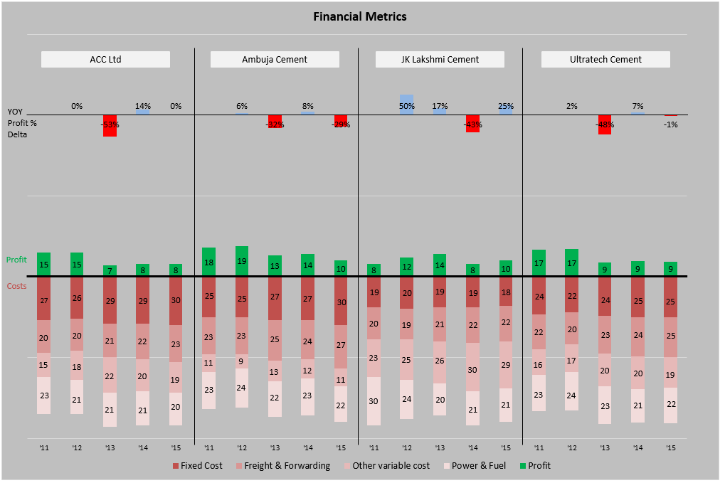
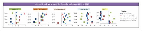
Chart by Marcel


- An interesting panel chart to analyze yearly trends and comparisons
- Somewhat hard to read, could have used left aligned bars.
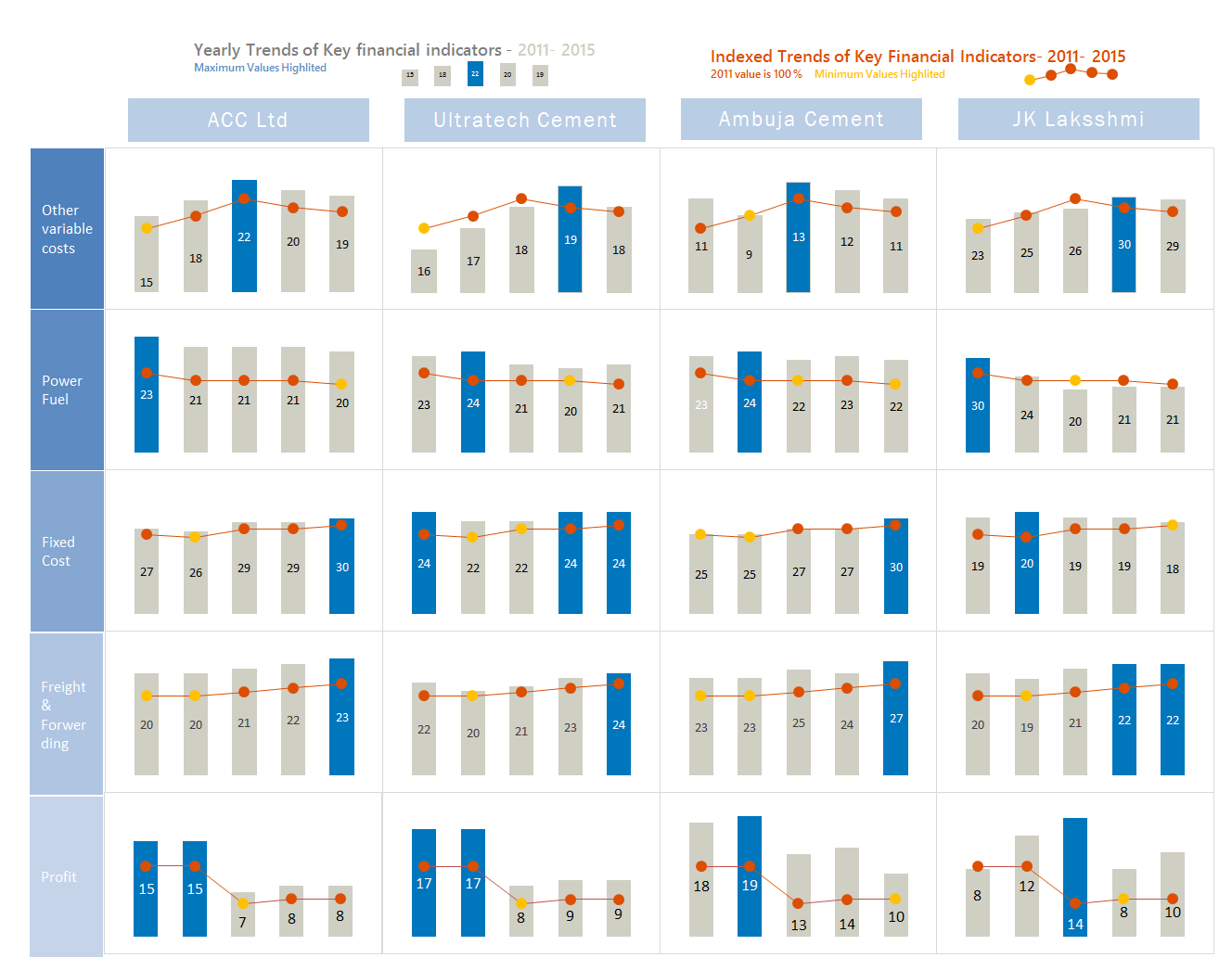
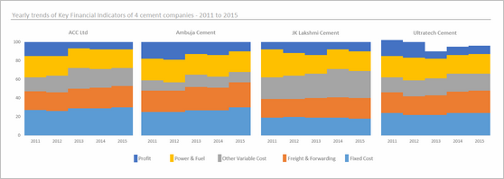
Chart by MF Wong

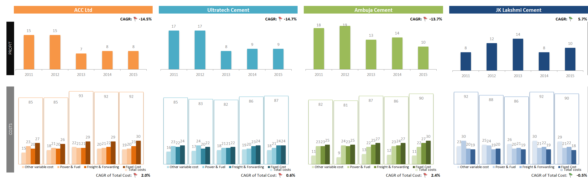
- Elegant panel chart with profit vs. costs view.
- Very interesting column chart (container chart?)
Interactive Chart by Michael


- Panel chart with YoY and company comparisons
- Slicers to mix and match values you want to analyze
- Could have used lines instead of columns, this way fewer colors can be used.
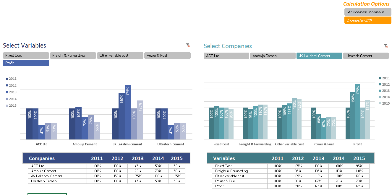
Chart by Miguel

- A panel / combination chart to see all trends in one place
- Could have used a form control to toggle between indexed vs. regular values. This will make the chart easier to read.
Interactive Chart by Nanna


- Dynamic dashboard with profit vs. costs view
- View by company or metric
- Time is shown on vertical axis. This makes comparisons / trend analysis hard.
Chart by Pawel
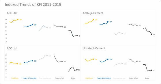

- A simple and elegant indexed panel chart to view all trends in one place
- Nice colors and design. We can call it sperm chart 😉
- Faint but visible vertical grid lines could make reading easier.
Interactive Chart by Peter

- A pivot chart with slicers to toggle measures and companies
- Could have added color legend and made the labels shorter
Become Awesome in Excel & VBA – Create dashboards like these…
- Learn how to create interactive dashboards & reports using Excel
- Develop your own macros & VBA code
- 50+ hours of video training
- Learn at your own pace
- Click here to know more
Infographic by Pinank
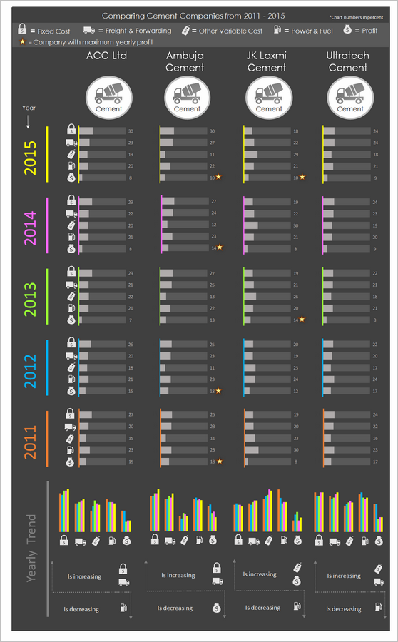

- Nice infographic style report in Excel.
- Interesting use of icons to represent costs
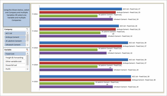
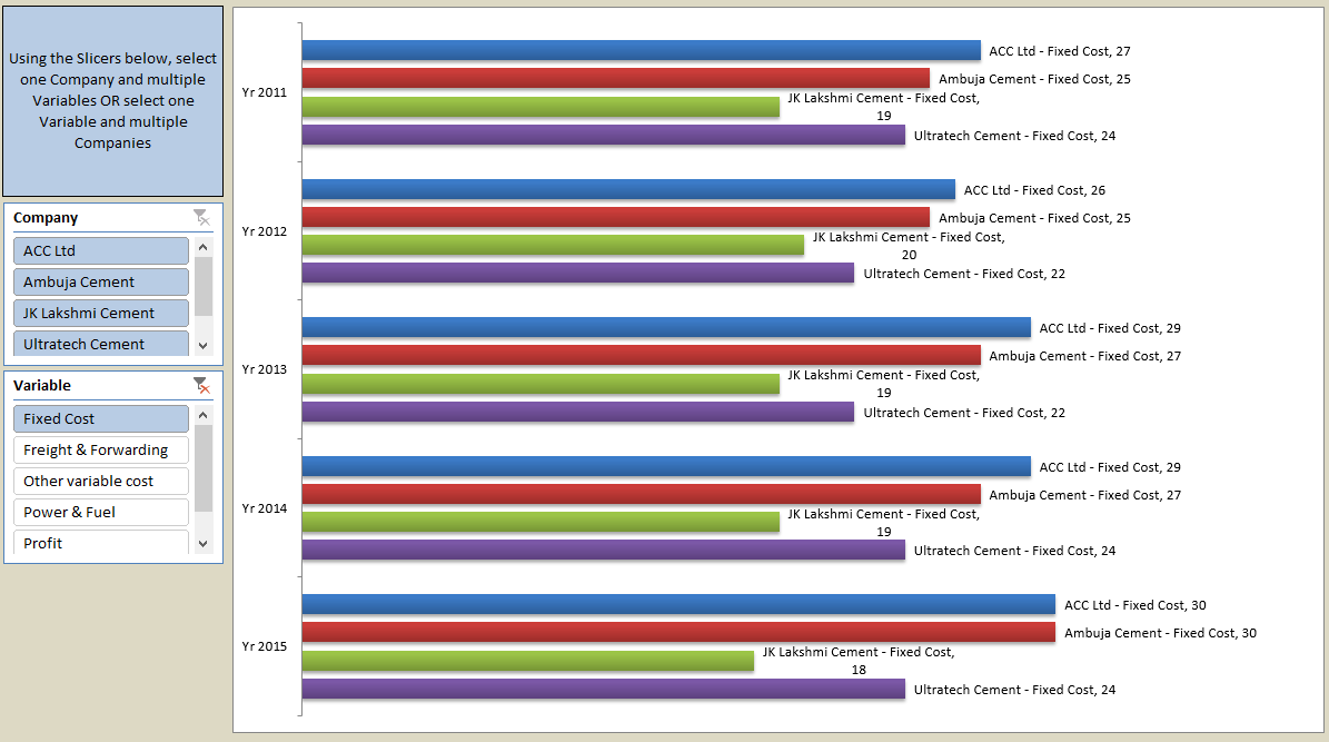
Interactive Chart by Ronny

- A pivot chart with slicers to pick measures
- Adding values across companies is not a good idea
Chart by Salim

- Charts made with Power View
- Can be filtered using PV filters
- Should have added views to see only one year value. Selecting year just highlights the values.
Chart by Shivraj
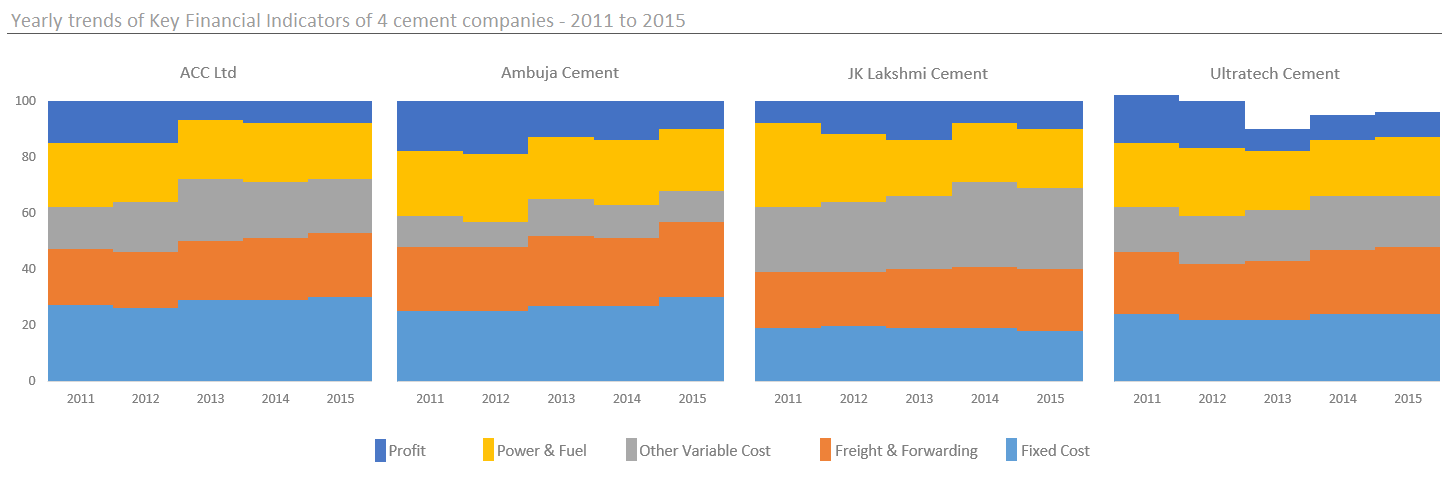
- An interesting panel chart with stacked columns to view yearly trends by all measures
- Simple colors and easy to read
- Since all the numbers add up 100 anyway, visualizing trends becomes hard. Should have used a slicer / form control to show one measure at a time.
Dashboard by Simayan
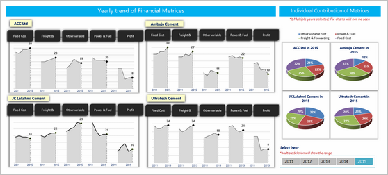
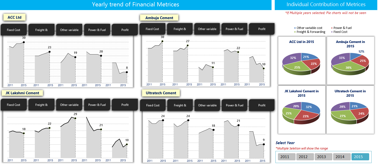
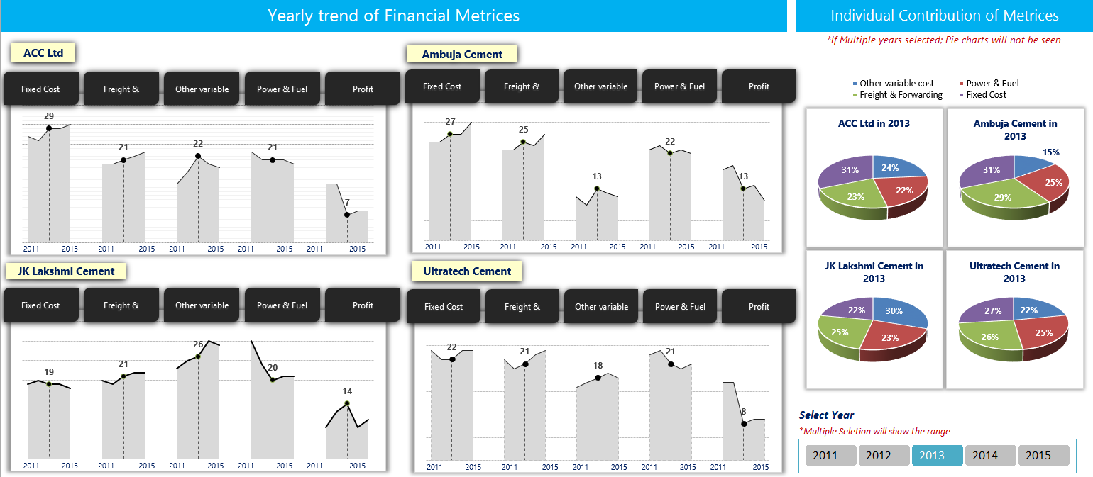
- A dashboard to understanding yearly trends
- Slicers to focus on any individual year.
- 3D pie charts are tricky to read. Should have used a stacked bar chart.
- Some of the labels are redundant.
Chart by Sudhir
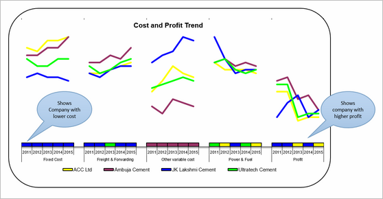
- A simple line chart to understand yearly trends
- The tiles to show low cost / high profit companies is interesting.
- Could have used standard chart colors in Excel 2010. They offer better contrast.
Interactive Chart by Thomas


- A set of dynamic charts, each offering trends or comparisons based on user input.
- Lots of comparisons and variations possible
- Years on vertical axis can be tricky to read. Should have used another type of chart.

Interactive Chart by William

- A dynamic chart with lots of comparisons and analysis.
- Feels a bit buggy. The picture links are not updating on slicer selection.
Chart by Yuhanna


- Simple XY charts with yearly trends and variance analysis
- A bit harder to read as lots of dots overlap. Should have added an option to highlight one company at a time.
Become Awesome in Excel & VBA – Create dashboards like these…
- Learn how to create interactive dashboards & reports using Excel
- Develop your own macros & VBA code
- 50+ hours of video training
- Learn at your own pace
- Click here to know more
Techniques used in these dashboards & charts
If you want to create these kind of charts & reports at work, I suggest reading up the Excel Dashboards & Excel Dynamic Charts pages. Also check out below links to know more about specific techniques.
Form Controls Data validation Pivot tables Slicers Clickable Cells (VBA)
VBA Formulas Sortable Tables Data bars (CF)
Conditional Formatting Scrollable Tables Picture links Sparklines
Indexed Charts Panel Charts
How do you like these charts & dashboards? Which are your top 3?
Quite a few of these entries are really impressive. You can learn a lot by deciphering the techniques in these workbooks. Many thanks to everyone who participated. I will publish the winner names in next few days. Meanwhile, share your comments and tell me what you think. Share your top 3 entries too. 🙂


36 Responses
Although I am one of the contestants, I must wholeheartedly admit that the Dashboard of Chandeep is the best of all. It’s design, colors, message-conveying is the greatest. My regards!
I would like to learn how Chandeep highlighted the graph when he made a selection on the slicer.
Any links to previous posts perhaps where this was covered by Chandoo?
Thank You
Ahmad
Dashboard from Abhay simply rocks. To the point and conveys the intended message even for a novice.
Infographic by Pinank – is looking good
I have also contributed to this contest. I am really inspired by various entries in above post. Based on following parameters i would like to rate these:
1. Explanatory – Whether dashboard will be used to explain certain thing or mention a story. This type of dashboard will be static.
2. Exploratory – Here user would like to interact more with the dashboard to extract the relevant story or meaning which is not apparent. Hence, this type dashboard needs to have more interactivity.
3. Scalability – If new or more data can be added to dashboard and still the functionality will work. If user wants to add more companies, years, etc. will it work.
Based on above criteria I would rate following entries as top ones:
1. Explanatory – by Pinank
2. Exploratory – by Chandeep
3. Scalability – In most of the entries additional work would be required to include more data except for mine. new years or companies can be easily added and analysed in chart by me.
These entries are really inspiring i will definitely use it to revise my dashboard.
Abhay’s dashboard is good however, if Chandeep can go with the trend analysis Abhay has done (line graphs), then maybe Chandeep’s dashboard can excel.
And now I’m angry that I haven’t noticed contest announcement earlier and I’ve sent what I’ve sent… Building a dashoboard was supposed to be my goal but lack of time forced me to sent sth simplier and now I can see how big mistake it was (when it comes to fighting a competition like this). Nice work guys! It’s realy inspiring! Even less advanced works are intresting because of different task approach. So wance again: thanks 🙂
If I had to choose the best ones (IMHO) I would go for William and Edouard as a second place (for both). Despite some weak sides (like label errors or “work place” next to a final chart) they meet my sense of clear data visualisation and contain intresting interactive elements.
The best entry is definitly Chandeep’s. Although there was some failing with automatical comenting feature (#arg! in my Excel’10) it’s full of advanced dashboarding tricks which makes it easy to read. Furthermore, as one of the few he finished(?) his project – it opens in a “secured mode”, with no place to mess anything, no data trash – just choose, point and read/print.
It all deserves to get the Grand Prize!
and BTW: when can we expect another contest? 🙂
Big round of applause to everyone who participated. I’m amazed at the creativity of our community. 🙂
My vote would be for Chandeep, MF Wong, and Miguel.
I have not contributed, but have read this post with a lot of interest. I would like to congratulate all participants for there work & inventiveness.
My #1 spot goes to Gerald for showing all the data in 1 graph & to have still kept it simple & readable.
I would give a prize for innovation to Pinank for the use of icons.
Great to see so much creativity.
I have not contributed also, but have wait his post for a long time (because I have the same kind of issue in my “daily life”).
My top 3 is the following :
– Pinank for the effeiciency and for the style
– Arnaud for the calculation behind the chart
– Miguel for the elegant business oriented dashboard
All the entries look very good. However I feel Pinanks entry seems the best as it is very explanatory with good innovative thoughts.
Hi all,
Some brilliant dashboard and interactive entries – really nice stuff and lots of clever tricks.
However, given that the initial question was “Need to quickly visualize 3 variables ( Company, years, Financials) in a single […] chart”, unfortunately I don’t think any dashboards – as cool as they are – really answer that question. The interactives also assume that this will be opened in Excel rather than seen in a printed hand-out, which essentially means you’d need multiple charts to show all the variables or be limited to a computer screen. Even Chandoo’s initial panel chart approach – which is static, and also very simple and clean – is not really a ‘single chart’. Furthermore, most of the interactives don’t actually show all variables at once but rather slice the data into more manageable chunks, which is not staying true to the original brief.
So, in light of the above, I’d vote for Gerald in first place, Edwin in second and finally my third chart option in third place (yes, I know, voting for yourself is poor form but unfortunately I think the original question disqualifies most of the entries).
Anyway, a fun competition and thanks for following up on this Chandoo.
I am once again in awe of the submittals to a Chandoo contest. The results are so impressive. I have been trying to build nice dashboards for years and take so many courses, but I don’t seem to have the eye for design. The color choices, fonts and chart choices are so important and I’m amazed at how some people really have a great talent for making the best selections.
It’s nice to have such quality inspiration!
I saw Chandeep’s entry on his website and I must say that I was very impressed by it. Simply loved it. Somewhat makes it difficult to keep an open mind towards the other entries.
My ranking:
1. Chandeep for its completeness as dashboard.
2. MF Wong/Miguel for “simple” but smart graphs.
3. Pinank’s entry looks like a page from a glossy magazine.
During scrolling I stopped at Chirayu’s entry: easy to the eye.
But honestly congrats too all for having the balls to participate and thank you for sharing your creativity!! Hat’s off to you.
Miguel, MF Wong, and Pinank.
Thanks to Chandoo and everyone who contributed for the great ideas.
Hi,
I personally liked the dashboard of:
1. Chandeep – His dashboard is clear, crisp and informative, his color combination and design is awesome, also he has shared few details like operating leverage plus he has added few comments. In totality, its a complete packaged dashboard.
2. Miguel – His dashboard is simple and all the information is visible in one shot.
It’s very interesting looking through these – you can definitely tell who’s done courses in dashboard design and with whom!
I particularly liked Pawels ‘sperm chart’ 😉 … squint your eyes – you’ll see what I mean). each of the charts or dashboards are put together well – but I agree with Elchin on this one – Chandeeps dashboard set ‘tells a story’ of the data. Student of Mr Few??
Without a doubt, Chandeep deserves #1. #2 goes to Abhay, and #3 to Pinhank, for the great presentation style if nothing else.
MF Wong
Do not apologize for any delay! Moving from one town to the next only 10 miles away is tough enough – let alone a family moving from one country to another!
THANK YOU for this excellent post!
As one of the participants, I have been looking forward to this post for long. But totally understood the reason of delay, so never mind! Hope all is well in NZ.
Thank you very much to those who like my chart! 🙂
Also thanks Chandoo for suggesting a name for it “Container Chart”, which I have never thought about.
Personally I like the infographic by Pinank. Very outstanding design and use of icons. My two-cent worth: Just the lower part of “Yearly Trend” is actually good enough to answer the question, isn’t it? 😉
Cheers,
What an outburst of creativity!
Vote for Chandeep and Pinank!
Agreed!
Awesome dashboards
Infographic by Pinank is awesome
Thank you so much for sharing!! i learn so much from these posts
Highly appreciated
Ahmad
South Africa
Fantastic responses from all the contestants. Some really great ideas. I’m inspired and will adapt some of these to my own dashboard work. Thanks for hosting such a great contest!!
Thank you for sharing this valuable resources !!!
I have only a couple of question that wasn’t able to solve regarding data-origin.
Nowadays I have the data coming from a “current” situation from a big database containing all kind purchase-orders information of many different projects. I can calculate the current status of each project investments, but I am not able to track automatically the progress of it month to month or week to week by freezing the calculated metrics on each date. This would let me calculate new graphs and the speed of investments execution.
My question would be, if it is possible to calculate something with an excel formula and automatically freeze this values in a new row or new column. I guess that right now, Basic is the only way, but I guess that there could be a function to copy-a-range, insert-range-as-value-only as a new row or a new column or display everything down or left.
This would preserve the excel formulas defined, and add new data, everytime that it is re-calculated.
Any idea?
Great post , loved all chart representation. Congratulations to all participants and winners.
I need updates to this article.
I didn’t even realize this got posted. Came across it today. Thanks
Fantastic post but I was wondering if you could write
a litte more on this subject? I’d be very thankful if you could elaborate a
little bit further. Thank you!
Hi Chandoo,
I comeback after a long time on your Blog. So I saw it lately. Its a brilliant idea.
I like all entries and these are amazing efforts from all participants.
Regards
The report presented by Pinanik is excellent and very innovative. Could be an interesting work for portfolio presentation