All articles with 'downloads' Tag
{ 44 Comments }
ABC Inventory Analysis using Excel
Published on Oct 1, 2014 in Charts and Graphs, Learn Excel
ABC analysis is a popular technique to understand and categorize inventories. Imagine you are handling inventory at a plant that manufactures high-end super expensive cars. Each car requires several parts (4,693 to be exact) to assemble. Some of these parts are very costly (say few thousand dollars per part), while others are cheap (50 cents per part). So how do you make sure that your inventory tracking efforts are optimized so that you waste less time on 50 cent parts & spend more time on costly ones?
This is where ABC analysis helps.
We group the parts in to 3 classes.
- Class A: High cost items. Very tight control & tracking.
- Class B: Medium cost items. Tight control & moderate tracking.
- Class C: Low cost items. No or little control & tracking.
Given a list of items (part numbers, unit costs & number of units needed for assembly), how do we automatically figure which class each item belongs to?
And how do we generate above ABC analysis chart from it?
Continue »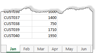
We all know about the MAX formula. But do you know about 3D Max?
Sounds intriguing? Read on.
Lets say you are the sales analyst at ACME Inc. Your job involves drinking copious amounts of coffee, creating awesome reports & helping ACME Inc. beat competition.
For one of the reports, you need to find out the maximum transactions by any customer across months.
But there is a twist in the story.
Your data is not in one sheet. It is in multiple sheets, one per month.
Continue »{ 10 Comments }
CP019: 6 Tips for Best Practice Modeling – Interview with Danielle from Plum Solutions
Published on Sep 4, 2014 in Chandoo.org Podcast Sessions

Podcast: Play in new window | Download
Subscribe: Apple Podcasts | Spotify | RSS
In the 19th session of Chandoo.org podcast, lets talk about modeling best practices.
What is in this session?
I am very happy to interview my good friend, blogger, author, excel trainer & business-women – Danielle Stein Fairhurst for this session. I first met Danielle when I went to Sydney, Australia in April 2012. Our friendship & collaboration grew a lot in the last 2.5 years. She is a great speaker & trainer. This episode is loaded with her trademark style commentary, explanation & tips for better modeling. I hope you will enjoy it.
In this podcast, you will learn,
- Introduction to Danielle & her work
- 6 Tips for Best Practice Modeling
- Write consistent formulas
- Avoid hard-coding
- Smart referencing
- Ditch the bad habits
- Document assumptions
- Format & label things
- Resources for learning more
{ 12 Comments }
What is the average speed of this road trip? [Solution & Discussion]
Published on Aug 18, 2014 in Excel Howtos, Formula Forensics
![What is the average speed of this road trip? [Solution & Discussion]](https://img.chandoo.org/hw/time-per-50-mile-laps.png)
Last week, we had an interesting homework problem – What is the average speed of this road trip?
We received more than 150 answers. But to my surprise, 57 of them are wrong. So today, lets learn how to calculate the average speed correct way.
Continue »{ 47 Comments }
Mapping relationships between people using interactive network chart
Published on Aug 13, 2014 in Charts and Graphs

Today, lets learn how to create an interesting chart. This, called as network chart helps us visualize relationships between various people.
Demo of interactive network chart in Excel
First take a look at what we are trying to build.
Looks interesting? Then read on to learn how to create this.
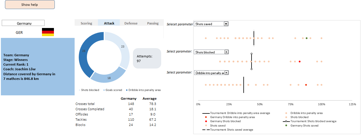
Continue »This is a guest post by Krishna, a football lover & one of our readers.
The wait for lifting the most valued priced in football for Germans was finally over. For a football fan, world cup is best time that is scheduled every four years and that if your favorite team lifting the trophy is like your crush is going on a date with you. 🙂
A sneak-peek at the final dashboard
Here is the final dashboard (it has more functionality than depicted). Click on it to enlarge.

Ok people. Let me tell you that this post is almost not about Excel. It is about how one Excel blogger’s (yours truly) dream of long distance cycling came true. So sit back, grab your favorite drink and read between sips.
So what is this all about?
Last Sunday (27th July) & Monday (28th), I finished my first ever 200KM bicycle ride. I rode for a little more than 12 hours, burned 5,179 calories & rode 206 kilometers.
It is definitely one of the most memorable, tiresome & uplifting experiences in my life. So naturally, I want to share the story with you.
Continue »{ 2 Comments }
How fireworks animated chart is made [video tutorial]
Published on Jul 17, 2014 in Charts and Graphs, VBA Macros
On July 4th this year, I published an animated fireworks chart for you. Many of you liked it. Quite a few wanted to know how its made.
So here is a video explaining the construction of fireworks.
(You can see this video on our YouTube Channel too)
Continue »{ 24 Comments }
CHOOSE() me, an introduction to Excel CHOOSE function
Published on Jul 16, 2014 in Learn Excel
Today lets learn about Excel CHOOSE() function.
CHOOSE eh? What does it do?
To understand CHOOSE() and appreciate its uses, lets invent an imaginary boos-subordinate pair.
Jasmine is the boss. She is, well, lets call her peculiar. She likes olives, Tuesdays & color Red. She hates potatoes.
Martin is the faithful butler of Jasmine. He is obedient, quirky and tall. He likes lotuses, Fridays & color blue. He hates potassium.
Enter Jasmine’s scarf problem:
Jasmine likes to wear a different colored scarf every weekday. She likes to wear Red colored scarf on Mondays & Tuesdays. She likes to put on the blue polka dot scarf on Wednesdays. On Thursdays, she wears her olive colored scarf. On Fridays & Saturdays, she prefers the lovely orange blue scarf. Sundays are no scarf days.
No wonder she is peculiar.
Continue »{ 29 Comments }
Winners of state migration dashboard contest
Published on Jul 7, 2014 in Charts and Graphs, Excel Challenges
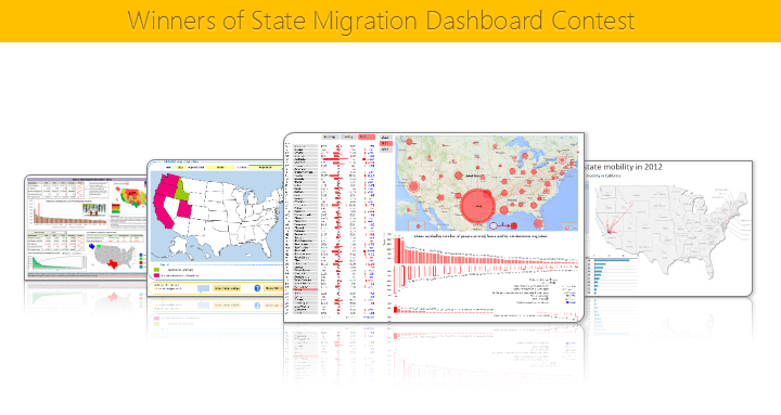
Finally the wait is over. Here are the winners of our 2014 dashboard contest. Check them out.
Continue »{ 39 Comments }
4th of July Fireworks – an Excel animation for you
Published on Jul 4, 2014 in Charts and Graphs, VBA Macros
To all our readers & friends from USA,
I wish you a happy, fun & safe 4th of July.
For the last 4th of July (2013), we (Jo, kids & I) were in USA. We went to Washington DC to meet up a few friends for that weekend. And we had one of the most memorable evenings of our lives when we went to national mall area in the evening to watch beautifully choreographed fireworks. Kids really loved the amazing display of fire-crackers and enthusiasm.
While we all are back in India this time, it doesn’t mean we cant celebrate 4th of July. So I made some fireworks. In Excel of course.
Here is a little Excel animation I made for all of us.
4th of July Fireworks – Excel animation
First watch this quick demo (<15 secs)
Continue »{ 10 Comments }
CP011: 5 Excel magic tricks to impress your boss
Published on Jun 19, 2014 in Chandoo.org Podcast Sessions

Podcast: Play in new window | Download
Subscribe: Apple Podcasts | Spotify | RSS
If you want to create magical effect with your Excel workbook (or report, dashboard, model), then hear no further. In this episode, we explore 5 very powerful magic tricks you can apply to get jaw dropping reactions from your bosses, clients & colleagues.
In this podcast, you will learn,
- Annoucements
- Why magic
- 5 Excel Magic Tricks
- 1: Conditional formatting
- 2: Form controls + Charts
- 3: Pivot tables + Slicers
- 4: Macros + Automation
- 5: Using right feature @ right time
- How to learn these magic tricks
- Conclusions
Hello everyone. Stop reading further and go fetch your helmet. Because what lies ahead is mind-blowingly awesome.
About a month and half ago, we held our annual dashboard contest. This time the theme is to visualize state to state migration in USA. You can find the contest data-set & details here.
We received 49 outstanding entries for this. Most of the entries are truly inspiring. They are loaded with powerful analysis, stunning visualizations, amazing display of Excel skill and design finesse. It took me almost 2 weeks to process the results and present them here.
![]()
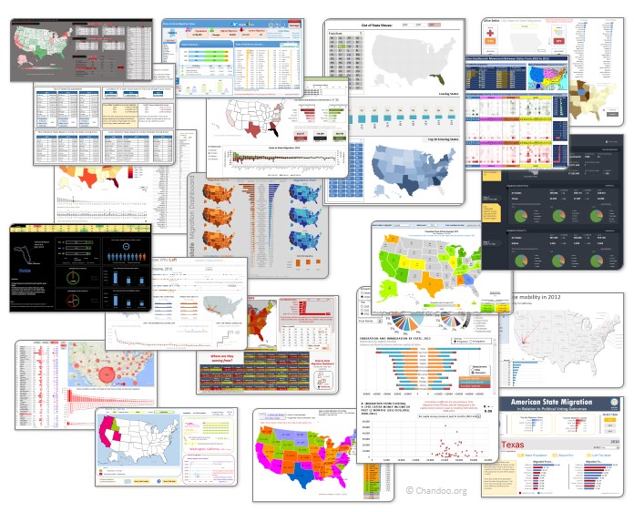
Click on the image to see the entries.
Continue »{ 5 Comments }
Matching transactions using pivot tables [video]
Published on Jun 10, 2014 in Pivot Tables & Charts
Last week, we learned how to use formulas to reconcile (match) transactions in Excel. Today, lets take a look at even faster and simpler way to do this:
Using Pivot Tables
Here is a short video explaining the technique and why it works. See it below
Continue »{ 45 Comments }
Matching transactions using formulas [Accounting]
Published on Jun 6, 2014 in Excel Howtos, Learn Excel
![Matching transactions using formulas [Accounting]](https://img.chandoo.org/f/example-of-matching-transactions.png)
Imagine you are the head of Accounts Receivable department at a large company. Drab, I know, But humor me and imagine.
Now, every month you get a transaction report.
And you want to know which numbers are matching up.
i.e, if your company gave Vendor-0002 $872.34 on 1st of April, 2014 and your received below payments from them subsequently,
- $427.77 on 1st April
- $152.88 on 2nd April
- $291.69 on 2nd April
Then you consider the account matched since the total received is same as total payable.(427.77 + 152.88 + 291.69 = 872.34).
Continue »
