Everyone likes to be in control. Even my 2 year old daughter jumps with joy when she lays her hands on TV remote. She pushes the buttons and assumes it is working. It is another story that we rarely watch TV at home.
By adding an element of control, we can make our dashboard reports fun. Interactive elements like form controls, slicers etc. invite users to play with your dashboard, get involved and understand data by asking questions. That is why I recommend making dashboards interactive.
Today lets understand how you can make dashboards interactive.
There are 2 aspects to interactivity:
- What users see (controls, slicers etc.)
- How it works in background (formulas, pivots, tables etc.)
Section 1: Adding interactivity to your dashboards
There are many techniques to add interactivity to your dashboards. Lets look at each of them closely.
Using Data Validation to add drop-downs to a cell
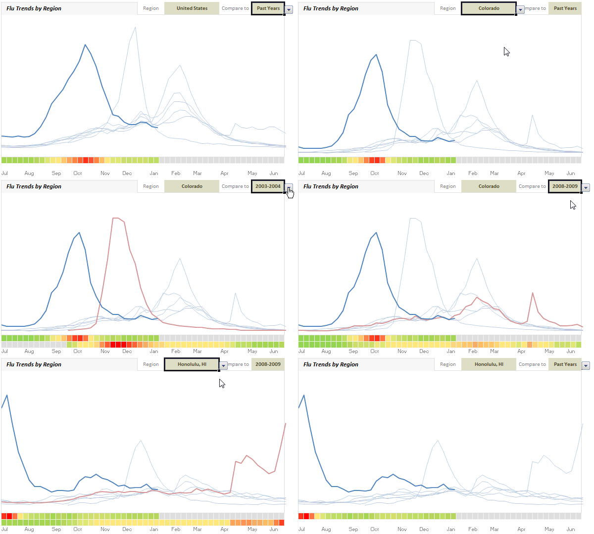
This is the easiest way to get started. Using data validation feature in Excel, we can restrict only a set of values in a cell. When you do this, Excel shows a small drop down box (combo-box) inside the cell so that you can pick one of the possible values. Like this:

Demo of what you can do:
An example report show casing flu trends in US, various states & cities between 2003 – 2009. For more, click here.
Learn how to use data validation drop-downs:
- Adding data validation drop downs in Excel – Introduction & Examples
- Cascading Drop downs – load values in 2nd list depending first list
- Making data validation list dynamic
Example Dashboards with data validation drop downs
- Flu trends dashboard in Excel
- Visualizing Survey Results using Panel Charts
- Sales Analysis charts in Excel – lots of examples
- Personal Expense Trackers
- Sales Dashboards – lots of examples
- Excel Salary Survey – Dashboards – lots or examples
Using Form Controls to add interactivity
Almost all computer users are familiar with form controls. We see them every day – scroll bars, check boxes, option buttons, buttons – pretty much all programs in your computer are ripe with form controls. But do you know you can add the same controls to your Excel worksheet?
You can use these controls on worksheets to help select data. For example, drop-down boxes, list boxes, spinners, and scroll bars are useful for selecting items from a list. Option Buttons and Check Boxes allow selection of various options. Buttons allow execution of VBA code.
By adding a control to a worksheet and linking it to a cell, you can return a numeric value for the current position of the control. You can use that numeric value in conjunction with the Offset, Index or other worksheet functions to return values from lists.

Demo of what you can do:
[Watch the demo on our YouTube channel]
Learn how to use form controls
- Introduction to various form controls & Examples
- Using check boxes with charts – example & tutorial
- Using scroll bar control – simple mortgage payment calculator in Excel
Example dashboards using form controls
- KPI Dashboards using Excel
- Customer Service Dashboard in Excel
- Excel Salary Survey Dashboards – lots of examples
- Sales Dashboards in Excel – lots of examples
Using Slicers to add interactivity
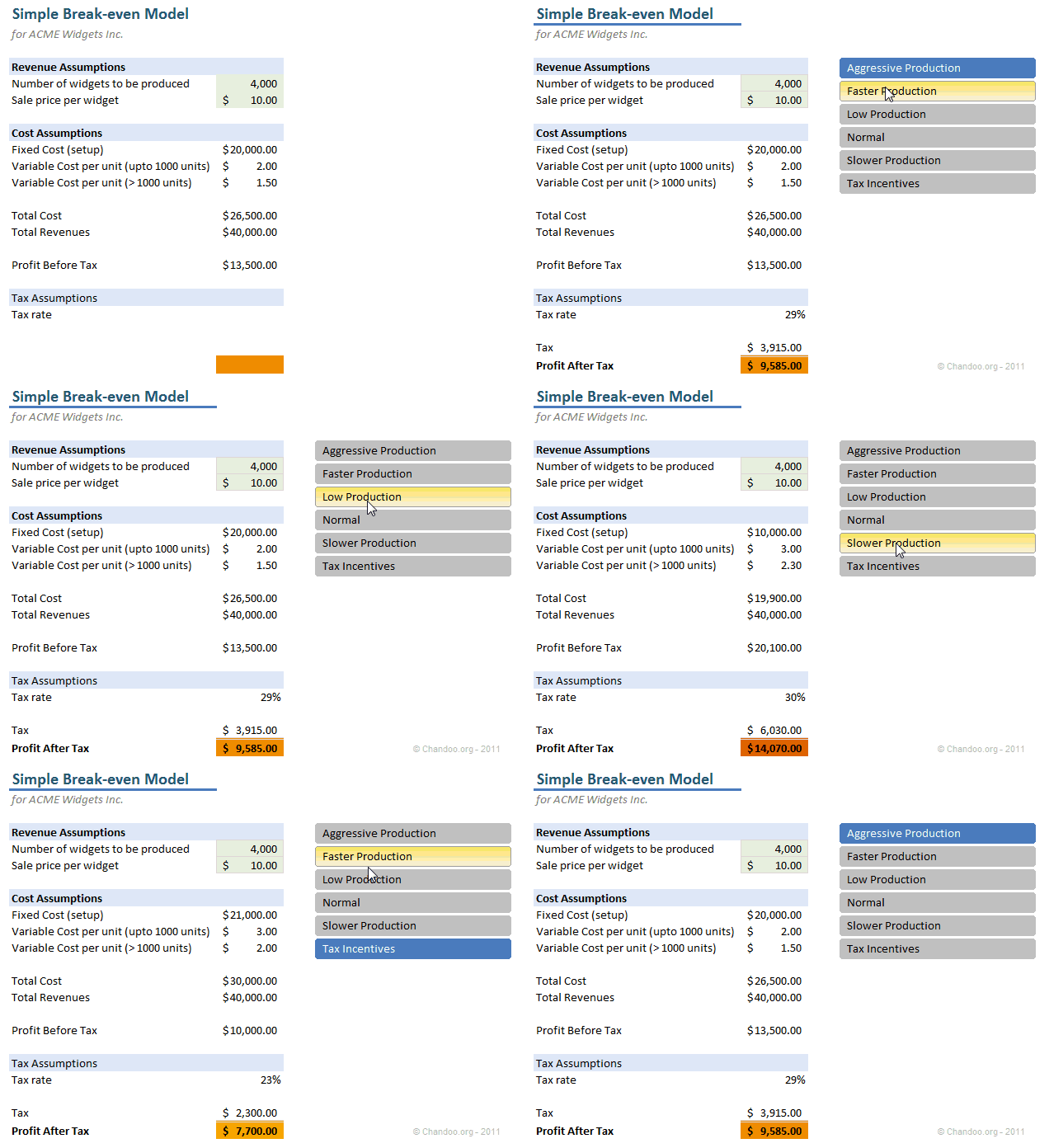
Slicers, a new feature added in Excel 2010 can be used to add interactivity to your dashboards & reports. Slicers are like visual filters. So you can see all available options as small boxes and you can click which option you want.
Demo of Slicers in action:
Learn how to use Slicers
- Using slicers to make a dynamic dashboard in Excel
- Overview of slicers & other new features in Excel 2010
- Using slicers to select one of many scenarios in your models
Example Dashboards using Slicers
Using Click-able cells as interactive elements
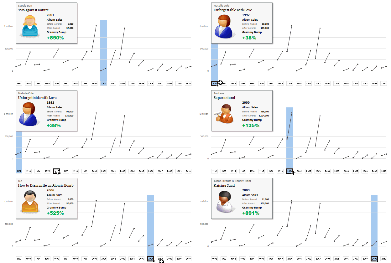
With a few lines of VBA code, you can turn every cell in Excel in to a potential input option. When user clicks on a particular cell, you can treat that as interaction and modify your dashboard (or chart). This is a very powerful and intuitive way to use in dashboards. See below example.
Demo of what you can do:
Learn how to use click-able cells
Example dashboards using click-able cells type of interactivity
- Interactive sales chart in Excel
- Displaying product reviews on demand
- Grammy bump chart in Excel
- Customer service dashboard in Excel
- Excel Salary Survey Dashboards – lots of examples
Using Hyperlinks to add interactivity
Many of you know that you can type any text in a cell and press CTRL+K to convert it to a hyperlink to another part in your workbook. But Hyperlinks can trigger macros upon mouse hover. This is a powerful technique first mentioned by Jordan at OptionExplicitVBA.
By using this behavior, we can create an interactive report that gets updated upon mouse hover. See this demo:
Demo of what you can do:
Learn how to set up dynamic hyperlinks
- Interactive dashboards using Excel Hyperlinks – tutorial & explanation
- Video tutorial on Interactive hyperlinks
- Excel hyperlinks – basics, syntax & more
Example dashboards using interactive hyperlinks
- Excel Salary Survey Dashboards – lots of examples
- Periodic table of elements in Excel [Option Explicit VBA]
Using VBA / Macros to add interactivity
Of course, you can add active x or VBA events to add interactivity to your dashboards. This gives you lot of control on what you want and enables you to do more. That said, using VBA to provide interactivity requires that your audience must enable macros when they view your work.
There are many ways to add interactivity thru VBA. Some popular methods are,
- Adding buttons or assigning macros to drawing shapes, images
- Overlapping buttons or shapes on maps, floor plans etc. and driving events on click
- Using worksheet or active-x controls and adding events (like mouseover, click etc.)
Note: Both click-able cells & interactive hyperlinks also require VBA to be enabled. But the amount of code they require is quite less.
Demo of what you can do
Learn how to use VBA & Macros to add interactivity
- Introduction to VBA, Excel Macros
- Using VBA Macros to make a picture calendar
- Dynamic Pivot Chart using VBA Macros
Example Dashboards using VBA Macro based interactivity
- MLB Pitching Statistics Dashboard
- India’s world cup cricket victory in a dashboard
- Interactive Sales chart using Excel
- Sales analysis charts in Excel – multiple examples
- Excel Salary Survey dashboards – multiple examples
- Visualizing Roger Federer’s Wimbledon victory – Excel VBA Dashboard
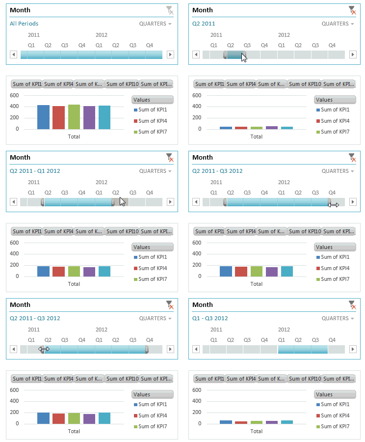
Using Timelines to add interactivity [Excel 2013]
Starting Excel 2013, Microsoft is introducing a new feature called as Time lines. Timelines allow you to interactively select a range of dates. I have not yet written any articles on this feature. But here is a short demo on how they work:

Section 2: Behind interactivity – What you need to know in Excel
Now that you know various techniques for interactivity, lets understand various building blocks that help you get there.
Use tables to hold your data
One of the premises of interactivity is that your data can change. When this is the case, I suggest you to set up all your data in tables. Tables allow you to keep data that can grow (or shrink) and write formulas referring to whole range.
Learn how to use tables [Excel 2007 and above only]
Use INDEX formula
INDEX formula helps you extract a portion (single cell, range) from a list of values that you want to use for further calculations or charting. The syntax is simple.
INDEX(range of values, row, column)
Example: INDEX(A1:A10,5) returns A5
Note: Index returns a reference to A5, not the value itself. So you can use INDEX where ranges are expected. For ex. INDEX(A1:A10,5) : INDEX(A1:A10,9) same as A5:A9
Fore more on INDEX formula:
PS: You can also use OFFSET formula in this situations. Please keep in mind that OFFSET is volatile and hence can slow down your workbooks if you use it alot.
Use lookup formulas
Interactive dashboards require formulas that dynamically lookup a set of values among heaps and return them to charts, summaries etc. This is where lookup formulas come handy. Check out our LOOKUP page for comprehensive information on this.
Use SUMIFS, SUMPRODUCT
SUMIFS & SUMPRODUCT formulas will become your best friends when it comes to extracting summaries from mountains of data based on user interaction. Once you master these, you can analyze & visualize any amount of data with ease.
- Introduction to SUMIFS formula, examples & explanation
- Introduction to SUMPRODUCT formula, examples & explanation
- Formula Forensics 007 – Sumproduct
- Advanced SUMPRODUCT examples
- More on SUMPRODUCT, SUMIFS, COUNTIFS, SUMIF, Array formulas
Use Picture links
Picture links are live snapshots of ranges of cells. If you create a picture link from cells A1:D5, then although it looks like a picture, it is a live image of the cells A1:D5. So when the cells change, the picture gets updated too, thus creating interactive effect.
For more on picture links:
- Introduction to picture links – examples, information & uses
- Picture links in practice – example dashboards & charts
Use Pivot tables
Pivot tables can process large volumes of data and give you desired summaries with in split seconds. They are by nature not dynamic (if data or criteria changes, you need to refresh them). Starting Excel 2010, you can use Slicers to interactively update pivot tables (hence pivot charts) . Even in earlier versions, you can use simple macros to automatically refresh pivot tables whenever users modify a form control or do something else. This allows for powerful dashboard reporting all the while keeping your calculation engine light weight.
For more on pivot tables:
Use conditional formatting
Conditional formatting plays an important role in interactive dashboards by highlighted changed portions of worksheet. This further improves the interactive feel and guides users attention.
More on conditional formatting:
Do you make your dashboards interactive?
I love keeping my workbooks, models & dashboards interactive. Simple features like form controls, slicers can add a lot of wow factor to your workbooks.
What about you? Do you make interactive dashboards & charts? What are your favorite techniques? Please share using comments.
Now, if you excuse me, I will go and resolve a fight between my daughter and son. They both want remote control the TV even though it is switched off.
More on Dashboards: Check out Excel Dashboards page & resources for making dashboards page.


13 Responses to “Gantt Box Chart Tutorial & Template – Download and Try today”
Hi Chandoo
As one of your students I have followed your detailed example through with great success. However, Excel is acting in an unexpected way and I wonder if you could take a look?
http://cid-95d070c79aef808e.office.live.com/self.aspx/.Public/Gantt%20Box%20Chart.xlsm
On my version, I have to type 40239 (Which equates to 2 Mar 2010) to get the chart to display 31 May 2010 (which should be 40329)!!??
Have I done something wrong or is Excel acting up?
Thx
Oli
PS Your example file in 2007 displays correctly.
Hi,
I like this idea a lot, but I agree the name is a little drab.
As an American I may just be seeing things, but to me the combination of lines and bars on your chart looks like a bunch of cricket bats.
Maybe you could work that into a catchier name. 🙂
Cheers!
Here is some code I use to keep the axis synched.
It may be useful to some of your readers
It is based on a comment I saw on Daily Dose of Excel.
Function SynchGanttAxis(Cname, lower, upper)
'Sets the X min and X max for Category axis
Application.Volatile
On Error Resume Next
'
'Top Horizontal Axis
With ActiveSheet.Shapes(Cname).Chart.Axes(xlCategory, 1)
.MinimumScale = lower
.MaximumScale = upper
End With
'Bottom Horizontal Axis
With ActiveSheet.Shapes(Cname).Chart.Axes(xlValue, 2)
.MinimumScale = lower
.MaximumScale = upper
End With
End Function
Function SynchVerticalAxis(Cname, lower, upper)
Application.Volatile
On Error Resume Next
' Excel 2007 only
'Right hand vertical axis
With ActiveSheet.Shapes(Cname).Chart.Axes(xlValue, 1)
.MinimumScale = 0
.MaximumScale = upper
End With
End Function
@Oli.. Can you check your file again.. I see 40329...
@Dave: Even I saw things.. the bars actually looked like lollipops. How about calling this lollipop chart - now that would be yummy and goes along the tradition of naming charts after eatables (bar, pie, donut...)
@Bob: Superb stuff... thanks for sharing 🙂
Hi Chandoo
This looks really good and I think it can also be applied to show project phases / milestones.
Question: Thinking further could this be amended to display a project lifecycle (Idea through to Implementation say 7 phases) on one bar / row? Just imagine 20 projects within a programme all on one chart one bar each showing their respective lifecycle stages i.e. on one page.
Idea: As the Gantt Box Chart this is quite intensive to set up re formatting etc how about the added extra of once you have completed this to "Save as template" i.e. saves the formatting and layout of the chart as a template so you can apply to future charts. Simple to do and will save the time formatting etc again and again and again.
Therefore tip: Click on your chart demo and then click on Save As template icon (2007) - edit file name and click on save. Ready to use / apply via Templates in Change Chart Type window.
Thanks and be very interested if the lifecycle question can be resolved
Mike
How embarrassing.
I was obviously suffering from numerical dyslexia. I was one of those days.
@Mike H: You can easily make this chart to work like a generic project lifecycle plan chart. All you have to do is,
1. in a separate sheet define the steps of lifecycle and various dates in a table (with 5 columns for each of the projects you have).
2. now use a control cell to input the project name you want to show in the chart
3. based on the input, use OFFSET Formulas to get the correct data
4. Rest is same as the tutorial above
For more info on the dynamic charting visit http://chandoo.org/wp/tag/dynamic-charts/ and http://chandoo.org/wp?s=OFFSET
Your solution is really smart but in the en Excel isn't meant to do stuff like this. I, as a former PM, always thought is was frustrating that you had to do stuff like this for something simple like a Gantt chart. So I built Tom's Planner. And would like to plug it here. I think it really solves the problem you are trying to solve in the most efficient way. Check out http://www.tomsplanner.com for a free account or play around with the demo.
Hi there,
Chandoo - this is really a very nice and helpfull chart - I adopted it, so I can report a forecast or the delay of a certain task (coming from my role as an auditor for projects).
One topic I´m currently struggeling with: I do have a project lasting for lets say 12 month. For a management reporting, I want to have kind of snapshot, lets say one month back and 2 month in the future. I tried with the offset formula, but failed. Any idea?
Thx
Lopi
[...] Ein viel geliebter Klassiker ist die Erstellung von GANTT-Diagrammen mit Excel. Wir hatten das Thema wiederholt schon hier. Chandoo.org hat sich mal wieder mit einer neuen Variante hervorgetan: Das GANTT-Box-Chart. [...]
[...] [...]
Hi Chandoo - fantastic xls. One thing I can't figure out how to do is adjust the alignment of the vertical axis. I would like to left align so that I could indent to represent sub tasks. Can that be done? Or is there a better way?
I've been trying to work out if there's a way to show weekends on the graph. The closest thing I've got is to add them on a secondary axis, but then I haven't been able to keep both axis lined up together! Any ideas?
Following on from this - is it possible to show things like holidays?