
Today we will learn a new and exciting excel formula – the all powerful SUMPRODUCT.
At the outset SUMPRODUCT formula may not seem like all that useful. But once you understand how excel works with lists (or arrays) of data, the SUMPRODUCT’s relevance becomes crystal clear.
SUMPRODUCT formula – syntax and usage
 The sum-product formula syntax is very simple. It takes 1 or more arrays of numbers and gets the sum of products of corresponding numbers.
The syntax is =SUMPRODUCT (list 1, list 2 ...)
 So, for ex: if you have data like {2,3,4} in one list and {5,10,20} in another list, and if you apply SUMPRODUCT, you will get 120 (because 2*5 + 3*10 + 4*20 is 120).
At this point it might seem like an almost useless function. But all that will change in the next 2 minutes, keep reading.
SUMPRODUCT and Arrays
Lets say you have a list of sales data with columns Name, Region, Product and Sales. Now, you want to know how many units the sales person named “Luke” sold. This is simple, you will write a SUMIF formula [examples] and use the Name column as “criteria range” and Sales column as “sum range”.
But, wait a second, you want to find how many units sales person “Luke” sold in the region “west”.
Hmm…. we have 2 options,
- Use an array formula
- Use a pivot table [what is a pivot table?]
Actually, there is a hidden third option, use SUMPRODUCT.
That is right, my friend, we can use SUMPRODUCT to do just this (and much more).
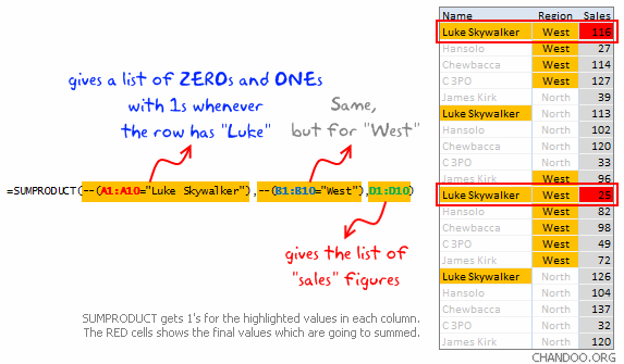
Using SUMPRODUCT as an array formula
Assuming, the data is in range A1:D10, with Name in column A, Region in B, Product in C and Sales in D, the SUMPRODUCT formula is,
=SUMPRODUCT(--(A1:A10="Luke Skywalker"),--(B1:B10="West"),D1:D10)
Okay, lets take a minute and try to understand WTF (what the formula) is doing.
- The portion
--(A1:A10="Luke Skywalker")is looking for Luke Skywalker across planetary systems in all universes 😉 It is going to give us a bunch of ONEs and ZEROs, one if the cell has Luke, Zero if the cell has something else. - The portion
--(B1:B10="West")is doing the same, but gets 1s when the value is “West”. - The portion
D1:D10is just returning all the sales figures. - When you put everything together and multiply, it just works. Why? That is your home work to figure out.
Share your SUMPRODUCT formula Tips & Tricks
SUMPRODUCT formula can do much more once you understand how it works. This post is meant to open the door for you. Go ahead and explore the possibilities, then come back and share your tips with us.
Recommended Reading
I suggest reading the excel array formula examples, sumif with multiple conditions and other excel formula tutorials.
This post is part of our spreadcheats series


254 Responses
Nice explanation Chandoo, I love it. It’s “almost” crystal clear for me.
Can you explain the use of — before the test ?
Hi Chandoo!
Your posts are really helpful, I have a querry, mentioned below.
Wanted to know whether sumproduct function can work with filters.
I have tried, however, the sumproduct values do not change as per list visible post filtering the column.
Thanks
Ahmed
In order to have filters affect SUMPRODUCT you must use SUBTOTAL function within SUMPRODUCT, it would go like =SUMPRODUCT(SUBTOTAL(3,A1:A10)*(A1:A10=”Luke Skywalker”)*(B1:B10=”West”)*(D1:D10))
Subtotal with option 3 here will return array of 1s and 0s (1 for unfiltered row, 0 when filtered out)
i have a table in the post where can i extract it with url?
is there any function in excel that I can extract table like power BI in excel https://hindi.4eno.in/rajasthan-gk-in-hindi/
@Cyril .. good point. the double hyphen is converting a list of boolean (true, false) values to ZEROs and ONEs. Each hyphen acts as a negation. When you negate something, excel converts the underlying values to numbers and then reverses the SIGN. So TRUEs become -1s and FALSEs become 0s. The second negation reverses this and leaves just numbers thus allowing sumproduct to actually multiply instead of throwing an error.
Another alternative for this example is to use SUMIFS function, but it is available only in excel 2007 & 2010
This is more easier and logical than using sumproduct with double hyphen.
Nice post Chandoo!!
Is there any limit to the number of arguments we can use with SUMPRODUCT function?
Chandoo – good explanation. I’m still learning about sumproduct, arrays, and the function of — .
I’d read elsewhere about using — to “coerce” some values – I know what coerce means but I didn’t really understand it in this context. I do understand your explanation though – basically it’s multiplying the results by -1. I tried using – instead of –, and it appears to work just the same, as long as you have an even number of arrays to multiply, as you do in your Luke Skywalker, West example.
Hi all,
I’ve seen the double hyphen (–) in all SUMPRODUCT tips, but haven´t used and so far my formulas seem to work fine (no errors)… any idea when it should really be used?.
It converts the arrays’ TRUE/FALSE arguments into boolean operators, i.e. 1/0.
Ones and Zeroes are much easier for programming purposes. If you click on the tick next to your formula in Excel, and you’ve got the same query/expression twice (once with and once without the double hyphen), you’ll see if present something like this:
Without “–” – “{FALSE,FALSE,TRUE,FALSE,TRUE,TRUE,TRUE,FALSE,FALSE,FALSE,FALSE,TRUE}”
With “–” – “{0,0,1,0,1,1,1,0,0,0,0,1}”
It’s a very handy action to use when counting cells. In SUMPRODUCT, it’s a fantastic substitute for running COUNTA alternatives, when running across multiple spreadsheets.
Why can’t i use 1 instead of “–“. I think that is more easy to understand?
@Sanjot
I use 1* as it is easier to understand
You can also use 0+ or any other function that doesn’t impact the output
Kaliman – for me, Chandoo’s Luke Skywalker / West example doesn’t work unless I use the double hyphen – –
I’ve just noticed in my earlier post, I had typed 2 hyphens and it came out looking just the same as 1. Apologies if anyone was confused by that 🙂
It should have read “…I tried using – instead of – – …”
The double-negative on the TRUE/FALSE result is likely my favorite formula trick, and has always allowed me to stay away from arrays (which I find cumbersome and error-prone).
Chandoo/Excel Gurus, do you believe the SumProduct usage is inherently faster than an array of SumIFs? I’ve read Excel forum threads that assert that the SumProduct performance difference is negligible because Excel was performing array activities behind the scenes, but those threads were a bit old (circa 2002/2003), and I never really bought into it. What has your experience been on the performance question?
Great post. The array part of this post will come in extremely handy at work.
sumproduct() is my favourite multiple condition summing formula. but double”-” before the argument was a new thing for me as I usually used syntax like this =sumproduct((array1=”luke”)*(array2=”west”)*array3)
however, sumproduct has one drawback – the array you want to sum must consist only from numericals. even if actual selections wont include cell like “n.a.” (might happen in datasets), sumproduct() will result in an error. find/replace helps just fine 😉
Seconding the use of SUMIFS if you have 2007 or higher. I personally find it much more intuitive.
Hi Brian, Hi Shandoo,
for more details and considerations …
here from an Excel Guru :
http://www.xldynamic.com/source/xld.SUMPRODUCT.html
;o)))
Great explanation Cahndoo,
I have seen the — used often in the SUMPRODUCT formula but not the N() fucntion, is there a reason not to use the N() function?
Excel has trouble doing math with text values. It needs to turn them into numbers first.
Type ‘0 into a cell (mind the quote). This makes a text zero.
Type =A1=0 into another cell, and you will get FALSE as the result.
Type =A1-1 into another cell, and you will get -1
But wait, if it’s not a number, why can it do math?!
Well, Excel forces things to be numbers when you do math on them.
So if you use math in sumproduct, you don’t need the double-minus:
=SUMPRODUCT((A1:A10=”Luke Skywalker”)*B1:B10=”West”)*D1:D10)
When it does the math for this, it will multiply all the zeroes and 1’s and values together, and will always come out with a number.
If you don’t put them in:
=SUMPRODUCT((A1:A10=”Luke Skywalker”),(B1:B10=”West”),D1:D10)
You get 0 instead.
So we need to turn them into numbers first. We can do that a lot of ways. For instance:
=SUMPRODUCT((A1:A10=”Luke Skywalker”)+0,(B1:B10=”West”)+0,D1:D10)
=SUMPRODUCT((A1:A10=”Luke Skywalker”)*1,(B1:B10=”West”)*1,D1:D10)
=SUMPRODUCT(N(A1:A10=”Luke Skywalker”),N(B1:B10=”West”),D1:D10)
But when it comes down to it, the people who are really smart at Excel figured out that Excel is fastest when it uses the unary operator (the ‘-‘ sign) twice.
So now people write:
=SUMPRODUCT(–(A1:A10=”Luke Skywalker”),–(B1:B10=”West”),D1:D10)
Feel free, if you have trouble, to use the *1 or +0 or N() if you’d prefer. They will work too.
So, to conclude.
If you use SUMPRODUCT with commas, you need to turn true/false values into numbers first by doing math or by using the N() function.
If you use SUMPRODUCT with multiplication, you’re already doing math so you don’t need it.
Most of the time it’s personal preference (I’m sure that there is a difference in speed in the long run, but most of us will probably never ever know about it).
Thank you Sal Paradise, Good Post
well explained, thank you Sal 🙂
Really Superb Explanation. Very easy to understand. Thanks Sal Paradise.
Hello Chandoo
— makes formula confusing for many users and it can be avoided if you replace , with * . The revised formula will be as under
=SUMPRODUCT((A1:A10=”Luke Skywalker”)*(B1:B10=”West”)*(D1:D10))
This formula is giving multiconditional sum and we have used only two conditions. However you can add as many conditions as you like provided the hight of each range is same.
If you remove the last entry with does not have condition attached to it, the formula will do the multiconditional count.
Formula for multiconditional count will be
=SUMPRODUCT((A1:A10=”Luke Skywalker”)*(B1:B10=”West”))
Thanks
Using the * will work for “and” criteria but you may not always want to use “and” in your formulas. To use “or” criteria you can use a + sign which is also doing math so you would not need to the the –.
Does this usage of SUMPRODUCT allow for multiple entries of the search criteria throughout a range?
i’ve always been fond of the SUMPRODUCT((range=criteria)*(range=criteria)) to search for multiple variables: Saves on pesky pivot tables.
@Moatasem & Brian & Andy
Yes, we can use SUMIFS in the same way. It is a better function, but not backward compatible with earlier versions of excel. That is why I wrote about this first. I will write about SUMIFS , AVERAGEIFS and COUNTIFS in an upcoming article.
@Rakesh…
You are welcome. Yes, There are limitations on SUMPRODUCT – It takes up to 255 arrays. It also slows down considerably once you have too many rows in the arrays (lists). I suggest using pivot tables or manual calculation mode if that happens.
In general, SUMPRODUCTs hold up well even for fairly large data (like few hundreds of rows or even thousands).
@Gerald
it is better to use double hyphen (minus sign) before every array as it lets you add / remove arrays with out worrying about the even-ness of the number of attributes.
@Brian S
“Chandoo/Excel Gurus, do you believe the SumProduct usage is inherently faster than an array of SumIFs? …”
I have not benchmarked SUMPRODUCT against other similar formulas like VLOOKUP, MATCH or Array SUM() formulas. But I have experienced considerable slow down when I have few thousand rows of data, no matter what formula is used. If I am writing the code behind these formulas, I would have used similar logic for all. So I dont see a reason why one formula should be faster / better than other. But I am as intelligent as a cabbage when I am talking about these things.. so…
Here is a request to all.. “if you have benchmarked these formulas, please let us know the results thru comments”
@Modeste … Thanks for the excellent link.
@Kanti Chiba
You can use N() in the same way. N() formula converts the input to number.
@Sal .. awesome explanation. Donut for you.
@Yogesh .. Again, super trick. I agree with * approach. Donut for you as well.
@Simon
You can use Array concepts like + operator to check for multiple conditions. For eg. ((A1:A10=”Luke Skywalker”)+(A1:A10=”Hansolo”)) should check for both Luke and Hansolo in the range A1:A10.
If you use a + sign then it reads as “or”. So what you are really saying is sum values for Luke Skywalker OR Hansolo. This is an important distinction! Using a * is read as “AND”.
Chandoo my man. I had to multiply some arrays today, and was momentarily scratching my head trying to remember how to do this with array formulas. I took a break, checked out your RSS feed, and whoa…you’ve taken my question right out of my mind and answered it.
I owe you a donut for this, which cancels out the one I earnt the other day. Don’t you just love this weightless, low calorie economy?
@Jeff, in the donut economy things never cancel out. They just get added up, because donuts are absolute(ly delicious).
I seriously wonder how many people-hours you saved with this one post alone Chandoo.
I guess it leaves more time for virtual donuts. 🙂
@Eric.. that is so sweet (and not in the heart killing donut sweet way). Thank you 🙂
I have a sumproduct question!
In my workbook i am working with 2 worksheets: “Hours” & “Variance”.
I am essential developing a variance tool on the variance tab.
I have a list of employees on the hours tab and the rests of the actual hours that they have worked by dated column.
I am trying to write a formula that totals all of the hours for a single employee based on a given date. See example at the end.
These formulas work as a stand alones:
=ADDRESS(MATCH(A10,Hours!$M$621:$M$725,0)+ROWS(Hours!$L$1:$L$620),MATCH($C$2,Hours!$620:$620),4,1,”Hours”)
=SUMPRODUCT(–(Hours!M621:M725=A10)*Hours!$N$621:$BZ$725)
BUT, when I try to combine the two to get the date variability like I want, Excel says my formula contains an error. Here is what the formula looks like:
=SUMPRODUCT(–(Hours!M621:M725=A10)*Hours!$N$621:ADDRESS(MATCH(A10,Hours!$M$621:$M$725,0)+ROWS(Hours!$L$1:$L$620),MATCH($C$2,Hours!$620:$620),4,1,”Hours”))
Doughnuts all around for anyone who can help me on this one! I suspect that I have a syntax issue in my formula but not sure.
Example:
Variance Tab
As of: 11/28/2009
Resource Total hours worked Answer should be
Billy 130
Bob Formula 50
Joe goes 80
An here 90
Jill 160
Hours Tab
Resource 11/14/2009 11/28/2009 12/12/2009
Billy 40 90 30
Bob 30 20 80
Joe 50 30 80
An 80 10 40
Jill 80 80 50
bummer, example data formatted ugly….imagine rows and columns, rows and columns
@Jadam… I think this is happening because you cannot define a range like a1:Address(xxx), it has to complete range or complete indirect. Why dont you use INDIRECT(“Hours!$N$621:”&ADDRESS(…)) in the sumproduct.
Also make sure the INDIRECT is wrapped in ()s to avoid any confusion.
Hi Chandoo, Hi Jadam
;o))) there is no use of SUMPRODUCT ….
just you have to name some ranges
ResDat =Hours!$B$1:$A$Z1 ( ie for 52 dates)
ResNam =Hours !$A$2:$A$1000 ( ie for 1000 names)
in Variance!B2 put this formula
=SUMIF(WBK1!resDat,”<="&$A$10,INDIRECT("hours!"&ADDRESS(1+MATCH(A2,WBK1!resNam,0),2)&":"&ADDRESS(1+MATCH(A2,WBK1!resNam,0),52)))
and pull it down as many time as ressource names
beware :
dateref of calculation is absolute $A$10
current ressource name is relative : A2
WBK1 is actual Workbook.name
HTH
;o)))
Supposedly — is slightly faster than any other way of converting the logicals to numbers.
My preference is to use =SUMPRODUCT(1*(A1:A10… instead of =SUMPRODUCT(–(A1:A10=
As it is easier to read, especially for those not so familiar with formulas.
I like your idea.
Just fallen on this site – already hooked.
Sumproduct is great. I used to struggle to add multipple criteria up in my spreadsheets, and then someone from UtterAccess.com taught me about Sumproduct. I can’t thank that person enough.
Anyway…many articles to catch up on. Keep up the outstanding work.
Chandoo:
The SUMPRODUCT function is the most versatile in Excel.
It can be used to do multicolumn sorts by array (with no human intervention or VBA required).
It can determine if a number is prime.
It can coerce bitwise operations in integers (i.e. bitwise logical AND, OR, XOR, IMP, EQ, and NOT).
It can be used to supercharge lookup tables with bitmasks.
It can find the dot product of two vectors.
It can do the database calculations you addressed in this post and has the massive advantage over SUMIF and COUNTIF (and the Excel 2007 SUMIFS and COUTNIFS) that it can handle OR clauses in the criteria.
It can replace most any Array-Entered Formula that uses SUM, and is usually about 10% faster.
This list could go on for pages…
I have a very detailed post on my blog:
http://www.excelhero.com/blog/2010/01/the-venerable-sumproduct.html
Regards,
Daniel Ferry
excelhero.com/blog
In support of @Eric and a HUGE thank you Chandoo! I was tasked with preparing a report with thousands and rows of data and compiling based on three variables and I had no idea how I was going to make it happen without half a dozen pivot tables and hours of time, but with this tutorial I got it done in about 2 hours and only one pivot table for check totals. My boss is beyond impressed. Thank you so very much for sharing this knowledge with us! Now I have plenty of time to go in search of these virtual donuts I read of… 😛
@Teresa… Wow.. I am so very proud of you. More success to you.
Btw, I would love to know how you have arm twisted such massive amount of data in no time. If you have sometime, can you write a guest post on Chandoo.org explaining the problem and solution ?
Hi Chandoo,
I have a comment for Brian…
I have heard about the performance issues of SUMPRODUCT.
I made a test on a 1 million rows table using SUMIFS and SUMPRODUCT side by side and didn’t notice any significant differences in calculation time.
In my lists there are a lot of =NA() Values. Therefore Sumproduct returns NA aswell, is there any workaround besides converting to empty cells?
@Chris.. you can use SUM () formula with arrays, like this:
=SUM(IF(ISNA(F14:F20),””,F14:F20)) to check for NAs and replace them with empty spaces or zeros. You must ctrl+shift+enter that formula to get it work.
Thx Chandoo!
Hi Chandoo,
Came across your site when looking for help on sumproduct.
Firstly, what does the “–” do in this formula?
secondly, can I use Named Range in replace of “D1:D10”; giving your formula to change from:-
“=SUMPRODUCT(–(A1:A10=”Luke Skywalker”),–(B1:B10=”West”),D1:D10)”
to
“=SUMPRODUCT(–(A1:A10=”Luke Skywalker”),–(B1:B10=”West”),SALES)”
Thanks in advance.
Cheers,
CL
@CL
The two – – ‘s or double nagatives and aren’t required in your case, although it is good practice to use them all the time just in case.
Sumproduct takes each set of (Range=something ) and converts each element in that range to a True/False.
In your case you have 2 sets of (Range=something) and so when they are multiplied the result is converted True = 1 & False =0.
If you only have 1 set of (Range=something) then you need to do some maths to that to convert the True/Falses to values for evaluation. Hence the use of – -.
I prefer to use 1* as I think it reads easier and other do 0+, but all do the same thing they convert the True/False values in the array to 1’s and 0’s for subsequent use.
It s good practice to use a – – or 1* as if someone else comes along and removes one set of (Range=something) then the remaining equartion without a – – wont work.
Absolutely use Named Ranges, They will make your formulas so much easier to read and understand in 6 months when your trying to work out “What did I do here ?”
Have a look at http://chandoo.org/wp/2009/11/10/excel-sumproduct-formula/
It works fine but I think it is prone to very popular mistake – spaces. Name “Luke Skywalker” can be written as “Luke Skywalker ” – this is very common mistake I deal with. Often people that are filling such sell-results-datasheets use copy-paste method (and copy too much). In the spreadsheet it looks the same:
Luke Skywalker
Luke Skywalker
If the the table is large – few hundreds of records, it will be very difficult to find that there is mistake (e.g. one record with sales = 36, and total sum of Luke S. = 12 340, the potential accountant will not notice that – 36 too small comparing with 12 340, and he assumes that is OK).
So I propose to slightly modify the formula. Instead of:
=SUMPRODUCT((A2:A21=”Luke Skywalker”)*(B2:B21=”West”),C2:C21)
use:
=SUMPRODUCT((TRIM(A2:A21)=”Luke Skywalker”)*(TRIM(B2:B21)=”West”),C2:C21)
There is also “Trim” with the region (West), just in case :). Of course it is possible to use some data validation when filling the spreadsheet, and then there will be no need for Trim.
pfabi: use TRIM(). It removes all unnecessary spaces (eg anything except for one space between words).
sumproduct is awesome. you can use for condition sum and count and everything most things that deals with array. For example you can combine this with the functions row(), max() to get last item (row) of data. excel Help document underestimate sumproduct’s power.
Thank you v much!! your website has been a godsend for me. I just started work and have to use excel extensively. Your website gave me simple ways to learn the tricks to make life easier. Thanks!
Nope i dont get it.
Large coffee and try again tommorow
Hello Mr. Chandoooo.com,
Thankx a ton!!!!
The formula works and it completes my work in secs…..
Thankx a lot one again
You’re a real teach. Amazing easy explanation!!!
I spend a week reading forums and I didn’t get it.
Today I decided to give it another try, found your site
and in less that five minutes I understood it.
THANKS SOOOOOO MUCH!!!!
GOOD JOB!!!!!
Hiya – am not getting the sumproduct formula to work in Excel 2007 – worked like a charm previously – so not sure what now?
I urgently have to get a value total for all rows that qualify on two criteria, and your formula is giving me a #value error – I have tried with – – and without, replacing the commas with the asterisk – and no luck. Would be awesome if I could get it sorted as a potential deal depends on it : (
Thanks for any help in advance
LornaB
@LornaB
Check that all your Ranges are the same size (length and width)
Ok – So all the ranges are the same length. Still no go. So what would happen if there are blank fields?
@Lorna… Are there some errors in the data range itself? If possible, can post your formula as is along with some sample data in the comment?
=SUMPRODUCT((Data!$D$2:$D$500=A2)*(Data!$AE$2:$AE$500=”PROGRESS”)*(Data!$AD$2:$AD$500))
Data Tab
Column D =
Status
Firm Quoted
Firm Quoted
Firm Quoted
Firm Quoted
Firm Quoted
Firm Quoted
Firm Quoted
Firm Quoted
Firm Quoted
Firm Quoted
Column AE
Item PayType
PROGRESS
SUBSCRIPTION
SUBSCRIPTION
PROGRESS
SUBSCRIPTION
PROGRESS
SUBSCRIPTION
Column AD
Item Total
8,000.00
4,000.00
1,000.00
2,000.00
20,000.00
400
10,000.00
1,000.00
On Main tab (where formula sits A2 = Firm Quoted
I am thinking that the blank spaces or the actual format of the values (ColumnAD) are what is causing the grief……
If you are wanting more data let me know and I will email the spreadsheet…..
Thanks SO much for the help guys!
Hey Chandoo,
The data is not coming through properly here – as the blank rows are not being put in…. There are a couple of blank rows through out the columns – could that be causing the issue?
@Lorna.. I tried with some dummy data and it seems to work fine. Are you sure the numbers are numbers and not text looking like numbers?
I ask this because you have some numbers with thousands separator & 2 decimal points and some without them (the 400 in middle).
@Chandoo
I think that may be exactly it, my problem is that the data comes off a webquery – which needs to be refreshed from a database and the values need to be calculated etc etc, so changing the format each time defeats the purpose.
Absolutely any idea how I can circumvent this?
: (
@Lorna
Multiply all your data by 1 using paste Special Multiply
That will fix it.
@Hui,
Thanks for the info – my problem is that the data comes through a webquery – so any changes are lost with a refresh – so I need to find a solution in the actual formula : (
Dunno if there is anything that can help?
I would be more than happy to sent the spreadsheet to anyone that is interested……….
Hi Lorna,
I use data that is exported from a webpage and find that some data does not work with sumproduct until I clean it by running the Trimall macro from http://dmcritchie.mvps.org/excel/join.htm#trimall. Not sure if it will help but worth a try 🙂
If your data is formatted as text and looks like a number you can use VALUE(). eg VALUE(“1,000.00”) will return the number 1000
What is the need for hte “–” in the sumproduct formula?
Also, having trouble getting an answer..I am getting an error. Please help.
@Ash… the the – (minus symbol) forces boolean values (TRUE, FALSE) to be converted to numbers. But since it is minus, it will negate them. So we use one more – sign (thus double minus) to convert TRUE to 1 and FALSE to 0.
What error are you getting?
@chandoo
can u give example work sheet of above example
@chandoo and hui
i have criteria in E coloum and have value data in H and S column
problem is whenever i m using sumproduct formula to get H column data it shows true result
but when i apply it for S column data it show the #VALUE error
i have checked it from all side but cant get sucess
nd if i apply sumif formula then there is no issue
@Rahul
Check the following
1. The range length in Columns E, H and S must be the same, eg: E2:E20, H2:H20 and S2:S20
2. In Columns H & S check that the cells don’t contain a leading or trailing space
3. If Column S is numbers, but not as a Formula, type 1 in a blank cell, copy it and Paste Special Multiply over the range in Column S, this will convert text that looks like numbers to numbers.
If the above doesn’t help, can you post the two formulas and some data to show us what you have
@hui
thanx alot
in my situation S column contained formula and after applying your third suggestion its working perfectly
but there is any formula which can show result of contained of formula column
i have try text formula as follows but showing errror
=SUMPRODUCT((E2:E20=”tikka”)*(TEXT(H2:H20,”0″)))
i am asking this because my data expand every hour and have to see result all time but doing this “copy paste and multiply always” is not convenient
@Rahul
Try:
=SUMPRODUCT(1*(E2:E20=”tikka”),(H2:H20))
or
=SUMPRODUCT(1*(E2:E20=”tikka”),(S2:S20))
@hui
above formula
is showing same error #VALUE
When you copy the above , retype the ” characters manually
Hi!! Hui!!
What’s the formula if sumproduct return text?
@Ramki
Sumproduct is a Numerical Function that can return a number or True/False
Can you explain your application?
due to my long conditions excel has already prompted me that I have a long formula… is there anyway I can get around? I only have one condition left
Can you please help me out with changing this formula to =SUMPRODUCT?
I currently have this formula;
=SUMIF([Test.xlsx]Sheet1!$C$2:$C$101792,A14,[Test.xlsx]Sheet1!$F$2:$F$101792)
I have tried using this;
=SUMPRODUCT(–([Test.xlsx]Sheet1!$C$2:$C$101792=A11),[Test.xlsx]Sheet1!$F$2:$F$101792) but it returns an a value of ‘0’.
Can you help me by telling me where my formula is wrong?
@Greg
Try:
=SUMPRODUCT(([Test.xlsx]Sheet1!$C$2:$C$101792=A11)*[Test.xlsx]Sheet1!$F$2:$F$101792)Can someone help me with the following calculation? what is the formula? Example. Cell A1 (250) is greater then Cell A2 (150), the result in cell A3 will be 100, but if the Cell A1 is not greater then Cell A2, so the result must be in Cell A3 0 (zero). This is the point. Please help me. email: zafar_fafa@yahoo.co.uk
Zafar:
=IF(A1 > A2,100,0)
or you could do this:
=(A1>A2)*100
…because the (A1>A2) bit returns 1 if true, or zero if false, which you then multiply by 100. So if true, 1 * 100 = 100. If not true, 0 * 100 = 0
I was looking for a work around for SUMIFS function to work on gDocs SpreadSheets.
Unfortunately, SUMIFS is not available in gDocs, so I used the sumProduct function instead.
In my example, I had ranges to work with
Column A was minimum value of a range
Column B was maximum value of range
Column C was number of occurrences within the given Min and Max
i wanted to summarize the data with new and more meaningful ranges.
So, in column E, I defined the new Minimum Range
in Column F i defined the new corresponding Maximum Range
in Column G, i applied the following formula
=SUMPRODUCT((COLUMN1>=E2)*(COLUMN2<=F2)*(COLUMN3))
It does not take full advantage of SUMPRODUCT, but it is a handy workaround for SUMIFS in gDocs and older versions of Excel which dont support SUMIFS.
A very thorough explanation of SUMPRODUCT that I have found to be extremely helpful is at
http://www.xldynamic.com/source/xld.SUMPRODUCT.html
I first discovered the xldynamic website when researching SUMPRODUCT on various MVP websites … there is a link on this page
http://blog.contextures.com/archives/2009/06/17/excel-for-underdogs/
HTH!
Hi clif
in fact the above link was already here for a long time :
http://chandoo.org/wp/2009/11/10/excel-sumproduct-formula/#comment-84704
;o)))
So I have two problems with this.
First I have data which is telling me whether or not a delivery was made on the correct delivery day (returning a Y or N), what month it was delivered in (Returning Jan, Feb, Mar) and the rate that was charged. The sumproduct is happily counting how many were not delivered on the right day in each month:
=SUMPRODUCT((a:a=”n”)*(b:b=”jan”))
However when I try to expand to total the rates for the month I get an value error.
=SUMPRODUCT((a:a=”n”)*(b:b=”jan”)*(C1:C300))
Any ideas?
My next issue is that I need to do the same sums but for week numbers. I am assuming that my problem here is that you can’t have text and a number in the same formula.
ie =SUMPRODUCT((a:a=”n”)*(b:b=”1″))
I’ve tried using the – – to turn the text into 1’s like you say, but it is not having any of it…..
Help??
for your problem 1:
=SUMIFS(C:C,A:A,”n”,B:B,”jan”)
this will calculate the sum of all values in column C where
Column A contains “n”
and Column B contains “jan”
for problem 2, i would suggest you create another column for week number
if that does not work, do drop in some more details of what the data looks like
Hi FSJ,
Thanks for the swift response.
Alas I am having the same issue as a lot of you, in that I did SUMIFS, sent to a colleague who was still running 2003, hence the need for something else! While sending her just the values answers her questions, I would like to master SUMPRODUCT as this is the first opportunity I have had to use it!
My bad, the week numbers are in a different column. Sorry I didn’t make that clear. It is difficult to explain these type of problems clearly….
Does that help? Thanks
=SUMPRODUCT((A:A=”n”)*(B:B=”jan”),C:C)
this would return the same result as SUMIFS formula
regarding the week grouping, say
column A contains Y/n
column B contains Month
Column C contains the amounts
Column D contains the week number
=SUMPRODUCT((A:A=”y”)*(B:B=”jan”)*(D:D=1),C:C)
this would extend the formula to cater for the week number given in column D.
i usually use the sumproduct formula in the following way
=sumproduct( (contidion 1) * (condition 2) * … * (condition n) , (result array) )
i.e., the conditions are multiplied and the comma comes before the resultant column(s)
in your case, the revenue/amount column was the resultant
month name, week number, delivery state (y/n) were your conditions
but sumproduct is a lot more powerful than just the above stated usage
Hi FSJ,
I appreciate youR time on this. I know how powerful excel is and have already learned loads just from visiting this site!
I have fixed the first problem. I had to change the rate column format to “general” then it picked it up.
But the second problem still confuses me as it is not even counting up :O(
So, to clarify:
Column C contains (Y/N)
Column E contains Week Number (1,2,3)
Column P Rates
Cells all currently formatted to “General”
=SUMPRODUCT((Data!$C:$C=”N”)*(Data!$E:$E=”1″)) is coming back with a 0. That’s before I even try to expand to the rates column?
Try removing the quotation marks around the 1
=SUMPRODUCT((Data!$C:$C=”N”)*(Data!$E:$E=1))
that should be a start
also, i am assuming that you want to sum the Ns and not the Ys in column C
Hi FSJ,
I couldn’t reply to your reply.
Just to say that cracked it, thank you for putting up with me. I owe you a coffee!
Thanks a million for the clear ordinary language explanation of sumproduct.
Yesterday I was stumped trying to match four criteria and return a number.
This morning I thought, “sumproduct should work. I need to find a sumproduct tutorial.”
I created the formula and then solved my own question on excelforum.com.
I am pleased! 😀
Catherine
@Catherine
You may also want to have a look at:
http://chandoo.org/wp/2011/12/21/formula-forensics-no-007/
http://chandoo.org/wp/2011/05/26/advanced-sumproduct-queries/
and
http://www.excelhero.com/blog/2010/01/the-venerable-sumproduct.html
Hui,
Thanks a million. This is terrific information. I”m heading towards being an expert Excel user. Who knew?
😀
Catherine
Is it possible for sumproduct to return text? Using the sample data that began this thread I used the following array formula…
=SUMPRODUCT(($C$2:$C$21=$I$1),–($B$2:$B$21=$H$1),–$A$2:$A$21)
Unfortunately, this formula continues to give me a #value! error.
To be more clear with my formula (the previous one contained references) here is the revised formula…
=SUMPRODUCT(($C$2:$C$21=116),–($B$2:$B$21=”West”),–$A$2:$A$21)
Me again!
Trying to use this on a new report and it keeps returning a #NUM or #N/A error. What am I doing wrong? I just want to count how many BA’s have got a N for example.
Column AL has list of depot codes ie BA, BG, BL…
Column AP has Y/N responses in it.
=SUMPRODUCT((‘Orders Extract Data’!$AL$3:$AL$21384=”BA”)*(‘Orders Extract Data’!$AP$3:$AP$3519=”N”))
Any Ideas?
K
@K
Your ranges need to be the same length
eg:
=SUMPRODUCT(('Orders Extract Data'!$AL$3:$AL$21384="BA")*('Orders Extract Data'!$AP$3:$AP$21384="N"))or
=SUMPRODUCT(('Orders Extract Data'!$AL$3:$AL$3519="BA")*('Orders Extract Data'!$AP$3:$AP$3519="N"))The answer to my question may lie in the 100+ replies to this post- I printed them out and will read through them as I await your response – but my particular question is whether SUMIF and SUMPRODUCT can be use d in the same formula. I want to be able to do a SUMPRODUCT only if certain criteria are met in another column (or columns) within the spreadsheet. Is that possible? I’m trying to avoid adding columns to do an intermediate calculation as it would be an extremely tedious task at this point. THANKS!
You can ignore this post – figured it out after reading through that SUMPRODUCT “does it all”. Not sure I understand the need for the double minus sign, however – seems to work fine without it.
Handy info here, Thanks a lot to all for sharing their expertise.
I am stuck getting a sum of values based upon certain month. i.e.
Column A got Expense dates (e.g., 20-May-12, 01-Jun-12, 04-Jun-012 etc)
Column B got nature of expense (e.g., Business, Personal, etc)
Column C got amount.
I wanted to put all expenses under business head which occurs in the month of Jun in a particular cell. I am using following formula but without any luck. Any suggestion what i am doing wrong.
SUMPRODUCT(–(MONTH(E_Date)=6),–(Charged_To=”Company”),Amount)
or
SUMPRODUCT(–(MONTH(A1:A10)=6),–(B1:B10=”Company”),C1:C10)
Thanks
you can try the following formula
Column A contains dates
Column B contains nature of expense
Column C contains amounts
SUMPRODUCT((MONTH($A$2:$A$76)=6)*($B$2:$B$76=”Business”)*($C$2:$C$76))
i have limited the data to 76 rows… you can change that value or try any other range (as long as all the ranges are the same)
Thanks FSJ,
It didn’t help, giving error “#Name?”.
SUMPRODUCT((MONTH($A$2:$A$76)=D2)*($B$2:$B$76=D5)*($C$2:$C$76))
D2 = 6
D5 = Business
if this does not help, try putting in
arrayformula(SUMPRODUCT((MONTH($A$2:$A$76)=D2)*($B$2:$B$76=D5)*($C$2:$C$76)) )
Thanks a Lot FSJ, Was out of town for some time, so couldn’t check it earlier.
Got it working now. However still unable to understand why we need to multiply each criteria. Shouldn’t sum product be doing this automatically?
Very neatly explained.
Thanks!
Once again I reference this page and learn more.
Hopefully one day I will be able to contribute and earn a donut!
Thanks, folks.
Sub test_2()
Status = Cells(3, 5).Value
MsgBox Status
Worksheets(“Sheet1”).Cells(4, 5).Value = _
[SUMPRODUCT(–(Sheet1!$G:$G=E3,–(Sheet1!$J:$J=1))]
End Sub
In place of “E3” i want to use “Status”
Worksheets(“Sheet1”).Cells(4, 5).Value = _
[SUMPRODUCT(–(Sheet1!$G:$G=Status,–(Sheet1!$J:$J=1))]
I am getting the result as ” #NAME?”
Can someone help me with this
@Srinivas
Can you post a file showing this?
Refer: http://chandoo.org/forums/topic/posting-a-sample-workbook
Can you please help me in deleting my second post where my intention was to provide details w.r.t my query but format was wrong
I have uploaded the images of two sheets .
URL:
http://tinypic.com/r/2mm5r7k/6
http://tinypic.com/r/2q03ihf/6
Sub test_2()
Status = Cells(3, 5).Value
MsgBox Status
Worksheets(“Sheet1?).Cells(4, 5).Value = _
[SUMPRODUCT(–(Sheet2!$G:$G=E3,–(Sheet2!$J:$J=1))]
End Sub
In place of “E3? i want to use “Status(variable)”
Worksheets(“Sheet1?).Cells(4, 5).Value = _
[SUMPRODUCT(–(Sheet2!$G:$G=Status,–(Sheet2!$J:$J=1))]
I am getting the result as ” #NAME?”
Here’s one for you all… I have the following formula, already working in Excel 2010; BUT I need to ‘downgrade’ it to be compatible in 2003 (yes, s/w nine years old! hey-ho).
=AVERAGEIFS(Data!S:S,Data!L:L,”Atherstone”,Data!T:T,”Service”,Data!C:C,”>=”&K3,Data!C:C,”<=”&K4)
K3 is the start of a date range and K4 is the end.
I’ve been told that SUMPRODUCT is the answer to all my woes, but I can’t for the life of me work it out. I know this a bit of a “do my homework for me?” question, but this is one of only 140 cells I need to convert (upgrading is off the table), so if someone fixes this for me, they can have my first-born (no, really – she’s a menace!).
Think of it as a ‘challenge’, if that helps. Me, I’m on my third Martini already…
@KevinA
Try:
=SUMPRODUCT(Data!S:S* (Data!L:L="Atherstone")* (Data!T:T="Service")* (Data!C:C>=K3)* (Data!C:C<=K4)) / SUMPRODUCT((Data!L:L="Atherstone")* (Data!T:T="Service")* (Data!C:C>=K3)* (Data!C:C<=K4))=AVERAGEIFS(B1:B14,A1:A14,C1)
=SUMPRODUCT( (A1:A14=C1)*B1:B14)/COUNTIF(A1:A14,C1)
same result
see if you can extend it to fit your needs.
I don’t get the syntax of the double “–” in this formula..
(--(A1:A10="Luke Skywalker"),--(B1:B10="West")What are the "--"'s in front of (A1:A10) and (B1:B10) needed for?@Mike together double unwary serves to convert the arrays of True/False to an array of 1/0’s
it could have been done as
((A1:A10="Luke Skywalker")*(B1:B10="West")Noting that multiplying the array by each other does the same thing
Is it possible to alternately multiply and add in a single column.
i.e I want to know the formula of =(A1*A2)+(A3*A4)+(A5*A6)+……(A101+A102)
@Sadhana: Welcome to Chandoo.org and thanks for your question.
You can do it using a SUMPRODUCT and MOD formulas like this:
=SUMPRODUCT(A1:A101, A2:A102, MOD(ROW(A1:A101),2))
Thanks, the — trick works great!!
Thanks for enlighting us!!!!
Dear List,
I do need urgent help about SUMPRODUCT formula. My excel table has 2 numeric rows and 1 text row showing criteria. I want to multiply these numeric rows, according to the criteria row. The following formula didn’t work:
=SUMPRODUCT((D1:BX1=”SCI”)*(D2:BX2)*(D4:BX4))
I tried with comma instead of *
May I request your help please.
Thank you very much.
Zeynep
Zeynep
Your formula should work ok
So maybe check that your data doesn’t have any text values in the Numeric Rows or error messages in any of the rows
Also check that calculation is set to Automatic
If this doesn’t help, can you copy/paste say A1:J3 here so we can see some data
Hui
I checked, there is no text in the cells except criteria row. My sample data,
A B C D E F G H I J K L….. CA CB
1 SCI SCI CONF OTH SCI SCI CONF CONF OTH OTH Weighted
2 0,2 0,1 0,3 1,1 1,3 0,5 0,0 1,2 0,4 1,9 SCI CONF
3 —— activity heading row ——– TOTALS
4 name-1 1 1 2 1 1 1 ….. formula
5 name-2 8 2 1 1 3 1 2 ……formula
…. name-n 1 3 2 1 5 ……formula
(Col.A idle)
I try to calculate : for each name, weighted activity by SCI, CONF and OTH on this data matrix which has ~100 names and ~80 activities.
Thanks again
Hui,
Problem is solved when I read the examples definedin the previous messages.
The double hyper completed the formula, the last view :
=SUMPRODUCT(–($C4:$BX4*$C$2:$BX$2);–($C$1:$BX$1=”SCI”)) for SCI case.
Thanks a lot
I have tried using your formula in different forms but it doesn’t seem to be working, can anyone help me out?
I have this in my cell:
=SUMPRODUCT(–(Sheet1!$F$3:$F$19=Sheet2!B11),Sheet1!$I$3:$I$19)
the first list is an array of months in the exact same format as Sheet2!B11, I’ve even done a cell to cell check to make sure it comes back as 1 which it does. The second list is numbers which need to be added.
Want to add up total expenses for each month, but for some reason it just keeps coming back $0 when it should be $525. Any help would be much appreciated. Thx.
Nevermind. got it! Needed to put the MONTH in there to compare apples to apples. Final equation is this:
=SUMPRODUCT(–(MONTH(Sheet1!$F$3:$F$19)=MONTH(Sheet2!B11)),Sheet1!$I$3:$I$19)
Thanks again
As my best practice, I always segregate each array with closed parenthesis () and put a space between each array to avoid confusion and better readability.
=SUMPRODUCT( (MONTH(Sheet1!$F$3:$F$19)=MONTH(Sheet2!B11)) * (Sheet1!$I$3:$I$19) )
Likewise, I find the use of named array very helpful especially for variable source. So if you create a named variable range as below:
Date = OFFSET(Sheet1!$I$3,0,0,COUNTA(Sheet1!F:F)-1,1)
Amount = OFFSET(Sheet1!$F$3,0,0,COUNTA(Sheet1!F:F)-1,1)
Note that I use COUNTA(Sheet1!F:F)-1 for both so that height are equal for all array in the sumproduct formula.
Below will arrive at same result as above.
=SUMPRODUCT( (MONTH(Date)=MONTH(Sheet2!B11)) * (Amount) )
Try adding records after Sheet1!F19
Hi, I need help.
I have a table of data. On the left side is Site and cost centre name then we have actual cost by month, budget by month for each of this cost centre by site.
Esample ( In here showing only two months but in reality I have twelve months data for actual and for budget)
Site cost centre Oct12Act Nov12Act Oct12budget Nov12Budget
Auckland Sales $100 $200 $150 $150
Auckland Marketing $200 $250 $500 $500
Hamilton Sales $50 $75 $100 $100
On another worksheet I have a dashboard report. When user select the month of Oct12, I want to be able to bring the ttal Actual for Auckland site (total sales & Marketing together) in the Actual column of te dasboard. SImilary, the budget column in the dasboard should be populated by the total budget for Oct for Auckland (total sales & Marketing).
I am managed to bring the result of Oct act and Oct budget if only I want total for Auckland Sales. But I cannot do total Auckland sales & Marketing.
Would appreciate any help.
=IF(G$2<>”X”,””,IF(SUMPRODUCT((ListFiles_Step30!$A17:$A10016=G$3)*((ListFiles_Step30!$B17:$B10016=ETL_FLB_Instances!$B22))*((ListFiles_Step30!$J17:$J10016<>”Error_Format”)))=G$1,”OK”,”KO”))
i need to know functionality of this formula plz explain
=IF(G$2<>”X”,””,IF(SUMPRODUCT((ListFiles_Step30!$A17:$A10016=G$3)*((ListFiles_Step30!$B17:$B10016=ETL_FLB_Instances!$B22))*((ListFiles_Step30!$J17:$J10016<>”Error_Format”)))=G$1,”OK”,”KO”))
how it is working in array ? please explain me
This formula was a godsend, thank you! after two days of googling and trying multiple formulas, this one worked a charm. Only one problem now though – every time I make any change at all the file takes 5 minutes to save, as it recalculates all the formulas. I would prefer not to hard number the formluas as I want to maintain the lookup function so any underlying data changes are captured in my result. Any ideas how I can speed things up?
Hi NickE,
One of the main reasons for slow response on sum-product (in my case) and performance issues of excel itself is when i set the entire column as data rather than just the required range.
something like A1:A155 rather that A:A *might* be the solution. it worked for me.
Thanks FSJ, that worked! This forum is reallllly cool Chandoo B)
I came looking for some help, and you gave me “homework” instead of an answer?
Screw you.
Thank you! This is SO much better than the official Microsoft description of SUMPRODUCT — which is virtually useless.
Great article.
Chandoo, It’s a big help. Have been figuring out how to use sumproduct till I saw this site. Thanks a lot!
Dear Sirs,
I would like to get a multiplication value as per the following
c1 having value (10) in sheet1 * c1 (20) in sheet2, if a1(“pet”) in sheet1 matches with a1(“Pet”) in sheet2 and give the result in d1 in sheet1.
Kindly help me with the formula.
Vincent
@Vincent
I think this is what you said:
Sheet2!C1 = 20
Sheet1!C1 = 10*Sheet2!C1 = 200
Sheet1!A1 = Pet
Sheet2!A1 = x
Sheet1!D1 = You want an answer here
You haven’t told us:
1. What the relationship between C1 (on either sheeet) or how that relates to A1 (also on either sheet)
2. What do you want in Sheet1!D1 when something happens ?
Dear Chandoo
Very useful tip.
We cam also use the DSUM formula i guess. to find out the lookup of sevral conditions and sum based on conditions, the formula is helpful for ddesigning dashboards
Ok maybe this is well known but I’ve decided to leave it here as I use it in a daily basis.
The sumproduct + responsive named ranges is one the most powerful tools in Excel.
The sumproduct is really well explained by Chandoo here so I will just talk about the responsive named ranges.
For example you want to build a resume table form a constantly growing set of data (both horizontally and vertically), where the first column has repeating identifiers that you use for your calculations and the first row has all the attributes you have from those identifiers set these 3 named ranges:
identifiers
=OFFSET(Sheet1!$A$2,0,0,COUNTA(Sheet1!$A$2:$A$900000))
attributes
=OFFSET(Sheet1!$B$1,0,0,1,COUNTA(Sheet1!$B$1:$ZZ$1))
data
=OFFSET(Sheet1!$B$2,0,0,COUNTA(Sheet1!$B$2:$B$900000),COUNTA(Sheet1!$B$2:$ZZ$2))
Then simple sumproduct it to fill your resume table with (considering column A has the identifiers and row 1 the attributes you want to pull)
=sumproduct((identifiers=$a2)*(attributes=b$1),data)
Then just copy it on all the cells you want filled.
Hope it helps
Thank you for this tutorial! I am so excited to have it up my sleeve now, it is EXACTLY what I was looking for! 😀
I have written a nice working SUMPRODUCT formula – =SUMPRODUCT(–([DLP1.xlsx]InvRegister!$B$4:$B$99=”Architect”),–([DLP1.xlsx]InvRegister!$J$4:$J$99=G$2),–([DLP1.xlsx]InvRegister!$K$4:$K$99=G$3),–([DLP1.xlsx]InvRegister!$L$4:$L$99=$A6),([DLP1.xlsx]InvRegister!$N$4:$N$99))
I’d like to replace “Architect” in first part of formula with a cell reference (A1) so I can change the role in A1 and have formula change accordingly.
When I put A1 in place of “Architect” then I get no values returned by formula…
Brainwave, solved it myself replaced Architect in A1 with =”Architect” and it works, is there a way to just have Architect in A1 or is my workaround the solution?
Usually if I use (array1=value1) in my formula it counts as an array formula, but this example works just by pressing enter. Why is that?
Thank you. This works
Hi Chandu, thanks for the explanation above. It proved very beneficial.
Further, i have a query in the example explained above:
Can i use the sumproduct formula if i have two conditions in the SAME COLUMN. Like:
to calculate the total sales for Luke and Hansolo both inclusive, in the region WEST..
I am using this formula but not getting 0 as the answer:
SUMPRODUCT((A1:A10=”Luke”)*(A1:A10=”Hansolo”)*(B1:B10=”West”)*C1:C10)
@Umang
Yes you can use multiple Conditions
But you can’t do it as you suggested
=SUMPRODUCT((A1:A10=”Luke”)*(A1:A10=”Hansolo”)*(B1:B10=”West”)*(C1:C10))
This is because the the * between each range is acting like an “And”
So A1:A10 can be = to Luke but it can’t also be equal to Hansolo at the same time
You can try something like:
=SUMPRODUCT((A1:A10=”Luke”)*(B1:B10=”West”)*(C1:C10))+SUMPRODUCT((A1:A10=”Hansolo”)*(B1:B10=”West”)*(C1:C10))
You can also do 2D lookup/sums
You can read about those here:
http://chandoo.org/wp/2011/05/26/advanced-sumproduct-queries/
@Hui
Thanks for explaining where I was going wrong. Ideally what I was doing should throw an error because that is not a viable condition. Neway I understood the alternative u suggested. Thank you 🙂
Hey Chandoo. This is great. I have a slightly different issue I am currently dealing with.
My current formula is this:
=SUMPRODUCT(($AK$1:$DS$1=$A23)*($AB$2:$AB$4066=C$1)*$AK$2:$DS$4066)
and that works perfectly. The formula works to find the values in Columns B, D and F as they are named uniquely (in the formula they are referred to in A23, A24 and A25).
However, I also need to return the values for column C, E and G which are all named identically. Is there way to offset the above formula? Or to look at the column next to where the condition is met?
Thanks.
Hi Chandoo,
I was looking for a formula where you can find the value of a cell based on two criterias – one in a row and the other in a column (i.e. the intersection of the row and column).
Region ABC XYZ PQR MNO EFG
West 15000 17000 20000 150 9800
East 11650 14500 56900 8640 8940
South 5200 8960 23560 96230 36450
North 7450 23000 9770 74500 78940
Mid 6900 1740 6630 2560 25630
Region ABC EFG MNO PQR XYZ
West ??
East ??
South
North
Mid
Like the one stated above. I think it can be done using Index and Match function but I am finding it confusing. Can’t do it manually since the data on which I am working is huge. Can you help me?
=VLOOKUP(G2,A2:E5,MATCH(H1,B1:E1,0)+COLUMN(B1)-(COLUMN(B1)-1),FALSE)
where
G2 contains required row header (north)
A2 to E5 is your complete data set with row headings (exclusive of column headers, i.e. ABC, EFG,…)
H1 contains the column head required (i.e. PQR)
B1 to E1 has the actual column heads (i.e. ABC, EFG,..)
B1 is the first column heading cell
Hi Chandoo,
Thanks for the prompt reply. It does work but can you elaborate on how the formula works? Also how would you use the above formula to auto fill the other cells in the example (i.e. we drag or copy the formula to other cell to give the result for the modified criteria automatically)
Hi Pushpa,
You can do this using index(match(),match())
=INDEX($C$3:$G$7,MATCH($B12,$B$3:$B$7,0),MATCH(C$11,$C$2:$G$2,0))
Where your top table starts at B2 & your bottom table starts at B11 the above formula goes in C12.
This can be copied to other cells in the target table.
Have a read of
http://chandoo.org/wp/2011/05/26/advanced-sumproduct-queries/
Those techniques may be applicable to you
I see a huge potential with my work to use this formula especially when you replace “Luke Skywalker” with a reference cell, essentially using this as a Vlookup with multiple arguments.
I’ve tried it twice now and just can’t get to work. The test VLOOKUPS I tried to make sure that there wasn’t some sort of formatting error making it a reference error. but I keep getting the same #REF.
Let me Explain Further
I have Sheet Data
Column A is Branch
Column B is Product Class
Column C is SKU
Columnc D is QTY Billed
Sheet Report
Column A is Branch
Column B is Product Class
So my formula (in Sheet Report) looks like
=SUMPRODUCT(–(Data!A$2:A$1000=A2), –(Data!B$2:B$1000=B2), Data!D$2:D$1000)
A Vlookup calling A2 in the same range works and so does B2, but get #REF when I use this.
Hello,
I have been attempting to get this figured out and I can not seem to figure it out it’s not doing what I want it to 🙁
I am grabbing data from one tab to display on another tab:
I am needing if a range of cells =”Jane Doe” and another range of Cells =”January” to also grab to points from another range adding them up so the end tells me Jane Doe in the month of January had a total of 600 points received…
Any help is greatly appreciated
@Hmm
Can you post a sample file ?
there a few limitations when doing this.
1. the selected data in column 1 (names), column 2 (months) and column 3 (points) should be the same number of rows.
2. assuming that the data is such that Sheet1 has 3 columns:
A: names of people
B: names of months
C: points earned
in sheet 2, we can write
=SUMPRODUCT ( (Sheet1!A2:A26=Sheet2!A2) * (Sheet1!B2:B26=Sheet2!B2) * Sheet1!C2:C26 )
Given that in Sheet 2, cell A2 contains the name of the person you want the data for (for example Frank Doe) and B2 contains the month for which you want the data (for example March).
you can also do
=SUMPRODUCT((Sheet1!A2:A26=”Frank Doe”)*(Sheet1!B2:B26=”March”)*Sheet1!C2:C26)
I am attempting the following:
=SUMPRODUCT(–($D$2:$D$15=J$3),–($E$2:$E$15=K$2),$F$2:$F$15)
But i am getting 0 returned
Is it possible to reference a cell rather than a string like:
=SUMPRODUCT(($D$2:$D$15=”FR”)*($E$2:$E$15=”Pierre”)*($F$2:$F$15))
Which does return data?
When I try:
=SUMPRODUCT(($D$2:$D$15=”FR”)*($E$2:$E$15=”Pierre”)*($F$2:$F$15))
I get a result but when I change the strings to a cell reference it returns a 0.
Any idea what I am doing wrong?
@Lee
I’d try:
=SUMPRODUCT(($D$2:$D$15=”FR”)*($E$2:$E$15=”Pierre”),($F$2:$F$15))
Copy and paste this
Then edit the formula and manually retype the ” characters
Also check the Data in Column D & E doesn’t have spaces or other non-printing characters in the cells
Check that Column F has numbers and that they aren’t text
Select two cells in Column F, the lower right Status Bar of the Excel screen should show the total if they are numbers and the count if they are text
Can you post a sample file for more specific help ?
1. make sure that you are using the same text case (upper case and lower case)
2. make sure there are no spaces in the reference cells (at the start or at the end of the text)
3. try CTRL+SHIFT+ENTER (entering an array formula)
can you share the data is possible?
1. make sure that you are using the same text case (upper case and lower case)
2. make sure there are no spaces in the reference cells (at the start or at the end of the text)
3. try CTRL+SHIFT+ENTER (entering an array formula)
can you share the data if possible?
I was just testing SUMPRODUCT as it is a formula I’ve never used before and was running into a few issues – a Network reboot has left me without data so let me try the suggestions above and will report back
Hi,
i’ve tried using this to return a time value for the total logged on time of call centre agents, but it is returning a zero. I have checked it against the number of calls and that works fine, but for some reason with a time value it is returning zero – any ideas?
thanks
Mike
@Mike
Is the cell formatted to display time?
Thanks..That was really helpful
nice one, very use full
Hello,
This sumproduct formula is not working with me in excel 2010. I tried the same way as it has been taught above, but however the value or the answer returned is always zero. If you can please help me out.
Thanx
@Ali
Can you post a copy of your formula as well as a copy of some data
Hi Chandoo and Team,
I am learning this Sumproduct with one of your sample data (vlookup-on-multiple-conditions.xl).
SUMPRODUCT(lstNetSales,–(lstSalesman=”Joseph”),–(lstRegion=”North”),–(lstProduct=”FastCar”), –(lstMonth=valMonth)) returns 1592
whereas with the same formula when I replace ONLY the valMonth with the actual date format (1/1/2007) it returns 0
SUMPRODUCT(lstNetSales,–(lstSalesman=”Joseph”),–(lstRegion=”North”),–(lstProduct=”FastCar”), –(lstMonth=”1/1/2007″)).
Also when I use the table reference
SUMPRODUCT(tblSales[Net Sales],–(tblSales[Salesman]=”Joseph”),–(tblSales[Region]=”North”), –(tblSales[Product]=”FastCar”), –(tblSales[Month]=valMonth)) returns 1592
SUMPRODUCT(tblSales[Net Sales],–(tblSales[Salesman]=”Joseph”)*–(tblSales[Region]=”North”)*–(tblSales[Product]=”FastCar”)*–(tblSales[Month]=-valMonth)) returns 0.
Please let me know how this calculates.
Appreciate your help.
Thanks
Mush
Any help on the previous queries I posted with using the variable and the actual values with SumProduct ?
You saved my evening!
Fantastic, i suppose to be an advanced user of Excel, but I never experienced this formula, wao!
Thank you so much
Hi Chandoo,
I’m still waiting for an answer to my previous question, please can you reply ASAP.
Rgds
Shazia
Hi Shazia,
Thanks for your comments & question. We never reply ASAP. I suggest waiting until someone can answer.
can you repeat your question?
cant find it here in the thread
@Shazia
I’d suggest posting more urgent questions in the Forums as I am pretty sure that only Chandoo and I read the Comments from the main website daily
http://chandoo.org/forum/
When posting at the forum supply a sample file for a quicker response
Hi Chandoo,
Great site here – much appreciated. Wonder if you can help me with some syntax I am clearly getting wrong.
==========================================
I have Excel 2010 and using SUMPRODUCT FUNCTION – I am unable to do date comparison
==========================================
I run a small share investment club and of course use Excel to keep track of our activities. On one worksheet (Asset worksheet) I am trying (for each company we hold) to add up the dividends received for the past year (today-365) from values contained in another worksheet (Cash Account worksheet).
I am using Excel 2010 and an example of my Formula is:
=SUMPRODUCT((‘Cash Account’!$C$7:$C$350=A4)*(TEXT(‘Cash Account’!$A$7:$A$350,”ddmmyyyy”)>$T$1)*’Cash Account’!$G$7:$G$350)
WHAT I AM TRYING TO DO:
A4 contains Name of company (let’s call it ACME).
$T$1 contains TODAY()-365.
Cash Account column A has Dates.
Cash Account column C has Company Name.
Cash Account column G has Amounts to be added up.
Therefore I am trying to look up all instances of ACME in the past year and adding up corresponding values.
THE PROBLEM
I cannot get the date compare element to work (it might as well as not be there). I get a value returned that adds up all available values in column G (for ACME) even those from more than 1 year ago.
Therefore as more rows get added to the Cash Account sheet, the only way to get this calculation to work is by manually (every month) amending the formula to only look at specific sets of rows (i.e. change the 7:350 range) to only include the rows covering Today-365.
I have tried all sorts of ways to amend this element of the formula.
I have tried SUMIF and SUMIFS !!
I have tried formatting all the cells that contain the dates.
SO – ALL HELP AND IDEAS APPRECIATED – MANY THANKS
@Raj
Can you post the question to the Chandoo.org Forums
http://chandoo.org/forum/
Please include a sample file as it makes analysing problems so much easier
Hui…
Thank you!
This site is awesome!
At first i was reading the Sumproduct explanation and was like,
“why is he using “- -” ?” But a quick scroll down to the comment section showed me that i was not the only one questioning that:)
Still lots to learn for me but this site will get me trough it.
Keep up the good work! Thanks again.
I love this formula (and the rest of your site as well) – it has saved me countless hours of work. I’m wondering if there is a way to apply this formula to multiple sheets in a book. I have one summary sheet and I need values to be pulled from 5 additional sheets. All sheet are formatted the same so essentially I need to say go to all sheets, return values in BK2:BK30 if X,Y,& Z criteria are met.
Thanks!
Thanks for your comments Shely.
Try the logic from here: http://chandoo.org/wp/2014/09/09/3d-max-formula-for-excel/
It may not work exactly, but you can improvise it to get what you want.
@Shely
=sumproduct((Sheet1!Range=X)*(Sheet2!Range=Y)*(Sheet3!Range=Z),BK2:BK30)
The ranges must all be the same height as BK2:BK30
It’s OK to use just one “-” instead of “–“, right? Because the product of two negatives is a positive.
@Peter
You use a single – to define a negative number
The use of two -‘s is to multiply the range/array by a negative and then another negative, which is effectively the same as 1* or 0+
In this case it is forcing Excel to evaluate the Array of True/False values and convert them to values of 1 & 0 respectively
People use two -‘s as it is the most efficient in terms of calculation speed
Hi Chandoo,
I’m having a lot of trouble writing a formula. Or should I say everything I’ve written comes back wrong.
so this is what I’m trying to do;
Column B has Names
Column C is just telling me if they still work for out company
Column D has the tier level in it (T1,T2,T3)
Column E has equipment #
Column F has Die #
Column G has hours need to run the job before they can test out
Column H has total hours running that job
Column I has date
Column J has points
Column K as date
Column L has points
All other columns go date then points
So what I’m trying do is;
Look for a name
then look for a tier level
then add the points in j, l, n, p and so on.
When I use sumproduct for just looking up the name and level and 1 points column it works great but then I try to add the other columns and I get a N/A or Name
Here is the last one I wrote tried many ways but still not doing what I need.
=sumproduct(–B:B=K2),–(D:D=K3),(J:J,L:L))
Please help
thanks
@Baby734
Try:
=sumproduct((B:B=K2)*(D:D=K3)*(J:J)*(L:L))
I’d also recomend limiting the column sizes
so: =sumproduct((B1:B1000=K2)*(D1:D10000=K3)*(J1:J1000)*(L1:L1000))
is 1/1000th the size of the whole columns and will be correspondingly faster
If that doesn’t work
Can you post a question and a sample file to the Chandoo.org Forums
http://chandoo.org/forum/
@Hui- Re: limiting column sizes: Isn’t Excel / SUMPRODUCT smart enough to know when it reaches the last used row in the spreadsheet? Seems to me if the formula is written to limit the number of rows there must be some mechanism to keep it from breaking as the amount of data increases.
@Clif
Unfortunately not, The user must make those assumptions or allowances at all times.
A simple test in a blank/new worksheet
=COUNTA(–(A:A)*(B:B)) Ctrl+Shift+Enter
=1048576
Yet there isn’t a piece of data in site
Hi,
I have two columns of data column H is due date and column I is completed date. I am trying to use the sumproduct function to count the number of cells in Column H that are overdue that don’t have an associated completed date in column I.
I have tried the following but it doesn’t seem to work:
=SUMPRODUCT(–(I2:I138=””),–(H2:H138=”<"&TODAY()))
If I change the second array to look for text (ie "TBD") it works and gives me to correct answer so it appears to be something to do with looking for dates. Any help would be appreciated.
Alex
Hi,
As you took name “luke skywalker” in above example,say we want to calculate the sales of “west”region for “luke skywalker””luke moonwalker”,” luke starwalker” and other similar names as well.
How could we calculate the total sales of all names in “west” region ?
Please assist.
Sumif() sounds just about right for your query
thanx a ton. Now i got the answer!
hi… mera naam kailash hai.. mai eak sannsthan main kaam karta hoon haal hi mai mujhe jo kaam saupa gaya mai apke sath share karna chahta ho taki aapki madad se mai excel mai kam karna sikh loon
Monthly Expense Items ke liye mai aapko apni problem eak example ke dwara batana chahta hoon
FOR EXAMPLE
koi dukan mai 200 items hai…
example ke liye 1 item – PEN ko hi le lete
Pen har din bikti har lekin hum monthly Item Record banate….
Mana ki dukan mai kul 2000 Pen Hain … April 2015 mail 1200 Pen bik gayi… toh kul bachi…800…fir agle mahine….500 Pen bikti toh..May 2015..ke bad balance 300 hoga….Ye excel ke formula mai kese kar ke hoga
i mean ki aap
hi kailash,
its very simple .
suppose aapka opening balance hai 2000
then sale 1200
Apr opening – Apr sale- Apr closing – may sale – may closing .
2000. 1200. =a2-b2(800). 500. c2-d2
sales Ka formula h-
opening+primary – sale= closing current /opening next month
Chan,
Where is the excel spreadsheet so I can follow along and do the example?
It’s hard to understand by chance reading. Thanks.
I feel SUMIFS formula is more easy rather than sumproducts.
Thanks
Name Region Sale
Rahul north 3008
Sandeep West 2619
Saman East 2610
Rahul north 2157
Sandeep West 2878
Saman East 2949
Rahul north 2196
Sandeep West 2936
Saman East 2727
Rahul north 2267
Sandeep West 2942
Saman East 2721
Rahul north 2516
Sandeep West 3104
=SUMPRODUCT(–(A2:A10=”Rahul”),–(B2:B10=”north”),C2:C10)
i am working on this date as col A, B, C
but giving answer Zero
please help
Regards
Shoaib
https://onedrive.live.com/redir?resid=855110EB65C6D980!926&authkey=!ABrJJyDPAAu-Ads&ithint=file%2cxlsx
works for me.
perhaps there are leading spaces or special characters in your text.
if you could share your sample file, it would be great.
@Mohammed
Your formula goes from Row 2 to 10
But there are 14 rows of data?
I’d suggest using:
=SUMPRODUCT((A2:A15=”Rahul”)*(B2:B15=”north”)*(C2:C15))
You can see an example using your data here:
https://www.dropbox.com/s/4raatm2x6o6wjfv/Sumproduct%20Q.xlsx?dl=0
If that doesn’t help, Can you post the question at the Chandoo.org Forums
http://forum.chandoo.org/
Please attach a file and you will get a more targeted response
Hi Team,
can you pls explain where we can use sumproduct.
Thanks,
Anoop
@Anoop
You can use Sumproduct anywhere you want to:
1. Sum the results of multiple ranges multiplied together
2. Sum the results of multiple ranges multiplied together subject to criteria
3. Do simple to very complex conditional Counts of ranges, ie: Count the number of cells in a range where a number of fields are equal or not equal to values
4. Do simple to very complex conditional Sums of ranges, ie: Sum the cells in a range where a number of fields are equal or not equal to values
A lot of the functionality of point 2 is now available by using Sumif/Sumifs or Countif/Countifs, but even these have limitations that Sumproduct doesn’t
You should also have a read of:
http://chandoo.org/wp/2011/12/21/formula-forensics-no-007/
http://chandoo.org/wp/2011/05/26/advanced-sumproduct-queries/
I have two date columns and need to add 20 years to first column to get updated date in second column, is there a formula for this? Example:
04/21/2006 4/21/2027
11/27/2006 11/27/2027
03/11/2004 3/11/2025
try
=A1+DATE(20,0,0)
if the date format is not recognized, then you can try
=DATE ( MID(A1,7,4), MID(A1,1,2), MID(A1,4,2) )+ DATE(20,0,0)
Why use — this sing in sumproduct………. What is the meaning — of this sing
Hello,
I done reading SUMPRODUCT explaination until the end, good explaination.
But i dont know whether it is the right function to work with my array formula.
Would u comment my array formula which is not working as expected
=IFERROR(IF(AND($D$8=”HIGH”;$E$8>=1);MAX(I8;INDEX(($B$8:$B$2222)+($E$8:$E$2222);(SMALL(IF(($C$8:$C$2222=$H$8)*($E$8:$E$2222>=1)*($D$8:$D$2222=”HIGH”);ROW($D$8:$D$2222)-ROW($B$7);””);J7))));IF(AND($D$8=”AKUM”;$E$8>=1);I8+INDEX($E$8:$E$2222;(SMALL(IF(($C$8:$C$2222=$H$8)*($E$8:$E$2222>=1)*($D$8:$D$2222=”AKUM”);ROW($D$8:$D$2222)-ROW($B$7);””);J7)));””));””)
My formula will only work as expected when D column only fill with 1 system, and meet failure when it’s forced to calculate within random system.
I asked a post over another forum site with the picture, so i will just attach the link here https://i.stack.imgur.com/tRidO.png
Kindly hope your excel insight how to simulate from daily journal into ledger in much improved way.
Regards
Tiong
Suppose that I have a bunch of names that all start with Luke, but different last names.
How do I use this to find all of the Lukes (regardless of their last name) for all “West” regions and return the sales?
Your help would be greatly appreciated.
Thank you.
column B has all the names
column C has regions
Column D has sales amount
—-
in column D, apply this formula: =IFERROR(IF(SEARCH(“luke”,B3)=1,1,0),0)
it will help you find if the first name given in column B is Luke… it will
once you get all the lukes, go with this:
=SUMPRODUCT((C3:C11=”East”)*(E3:E11=1)*(D3:D11))
example
https://1drv.ms/x/s!AoDZxmXrEFGFh26JqwYvV2qUQwSn
Well I really liked studying it. This post offered by you is very effective for proper planning.
How are you, nice internet site you’ve going here.|
I did not understand it. I think you need to elaborate it more
I could not understand why you used SumProduct to calculate Luke sales in west, if you can same result using sumifs functions. Kindly elaborate.
@Muhammad
2 reasons:
1. Because Sumif/s Countif/s are new functions and only have been available since Excel 2007/10
Sumproduct has been doing the heavy lifting since Excel was introduced
2. You also cannot perform math on ranges in Sumif/s, where you can in Sumproduct
How I sum 2 or more values with selecting 2 or more criteria in one column and same in 2 or more criteria in next column
How I average 2 or more values with selecting 2 or more criteria in one column and same in 2 or more criteria in next column
I have two work books with each work book have one work sheet
I am using workbook two to gather information from workbook 1 rows B5:B100 and rows C5:C100 Row B has job titles and row C has level of education. I am trying to come up with a formula that both statements have to be true for the formula to count.
So if row B has Student/ professor/ accountant/ student/ student/ accountant
Row C has High school/ college/ high school/ college/ college/high school
If I want to know how many student have a high school education it would come back with 1 even though student is listed three times only student and high school show up one.
this is the formula I have:
=SUMPRODUCT((‘k:\managers\2018 TCWA MAPPING\[2018 02 staffing plan with notes.xlsx]02 Staffing Report’!$H$1:$H$86=”student (02)”)*SUMPRODUCT(‘k:\managers\2018 TCWA MAPPING\[2018 02 staffing plan with notes.xlsx]02 Staffing Report’!$H$2:$H$86=”MAPPING\[2018 02 staffing plan with notes.xlsx]02 Staffing Report’!$J$1:$J$86=””high school”))
what am I doing wrong
Thanks for your comments and welcome to Chandoo.org Barb.
Try this:
=SUMPRODUCT((‘k:\managers\2018 TCWA MAPPING\[2018 02 staffing plan with notes.xlsx]02 Staffing Report’!$H$1:$H$86=”student (02)”)*(‘k:\managers\2018 TCWA MAPPING\[2018 02 staffing plan with notes.xlsx]02 Staffing Report’!$I$1:$I$86=”high school”))
If that doesn’t work, feel free post sample data (upload and link here or post the problem on forum.chandoo.org) so one of us can look at your files and help.
Thank you Sir. I use Sumproduct about once a year and every time I do, I come back here to remember how to use it. Best explanation ever!
Dear Chandoo,
I pay through paypal for the . The money has been withholded from my bank account. But when I paid I did not redirected to the page where I can watch my video.
Can you help me please?