
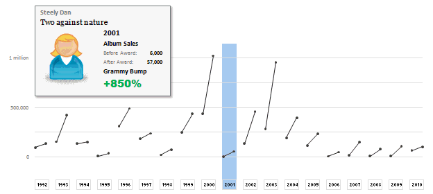
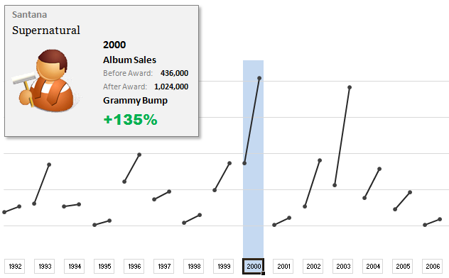
The folks at Washington Post made an interesting chart to understand whether winning a Grammy award makes any difference to album sales. Go ahead and browse it if you have not already seen it. Go, I will wait.
Are you impressed?
I really liked this chart. This is what I liked about the chart,
- It tells a story. [why charts should tell a story]
- It is an ego chart. We would all instantly search for our favorite artists and learn about how Grammy award changed their album sales.
- It is a simple chart. No clutter, no gaudy colors, just a bunch of lines and the story is out there.
- It lets you play. You can hover your most over an artist to see their sales before and after the award, and how much % bump they got.
In fact, I liked the chart so much that I wanted to make it in Excel.
Here is what I came up with:
How does the chart work?
1. Data for the chart: The Washington Post guys did not give any details about the source of data. So I manually typed the data myself by looking at their chart. It took a few minutes. But totally worth it. I put the data in 5 columns – Year, Artist, Album, Before and After sales.
2. The chart: The chart is an XY Scatter plot. I took numbers from 0 to 37 (there is a total of 19 years of data – from 1992 to 2010. Each year has 2 data points – before and after). For even numbers I used the before sales and odd numbers I used the after sales. For this I wrote simple INDEX formula with a bit of MOD(). Again, nothing too fancy.
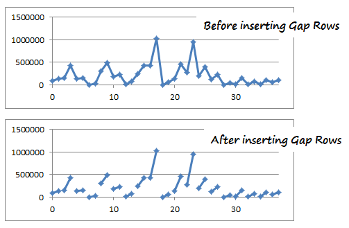
3. Getting the gaps in the chart:
This is the tricky part. By default, if you have 4 points (0,98000),(1,135000), (2,155000), (3, 427000) in the XY Scatter plot, Excel will draw a line connecting all 4. But we want to have a gap between first 2 points and second 2 points. How?!?
Thankfully, there is a simple workaround. You can insert blank rows between 2nd and 3rd row of your data and instantly you will see a gap in the chart. Repeat the same for remaining 18 points.
4. Year Selection & Highlighting
This is done using conditional formatting & Worksheet_SelectionChange Event Macro. First, I wrote a simple macro that would change the named range valSelectedYear to the selected year. The code is very simple. You can examine it in the download file.
Then, I used the valSelectedYear to drive the conditional formatting that would fill blue color across the column. As you can guess, the chart is transparent (ie no fill color for both chart area and plot area). So whatever color the cells beneath the chart have, they will show up in the chart too.
5. Creating the Dynamic Legend:
Here I have used picture links to fetch the artist image dynamically. (well, I was too lazy to download the actual images of Nora Jones and U2 etc. So I just used clip art).
Then, I used text boxes to make the dynamic legend, same as the technique demonstrated in smart chart legends & excel product catalog articles.
6. Formatting and aligning everything:
Once the basic setup is ready, I just moved and re-arranged the chart, legend box etc. so that everything looks right.
Download the Chart Workbook:
Click here to download the workbook in Excel 2007 format.
(click here to download the file in Excel 2003 format. I have not tested this, but it should work alright)
Mirror location for the files.
Please note that you must enable macros to select years.
Recommended Reading to make charts like these
- Picture Links – What are they and how to use them in Excel?
- Dynamic Chart Legends in Excel
- INDEX Formula – Examples, Tips & Tricks
- Conditional Formatting – Examples, Tutorials, Tips
- Further Examples,
How would you have made this chart?
I liked the original chart design and interactivity provided by Washington Post people. So I closely mimicked the same my Excel chart. But you may want to visualize the same data in a different way. So go ahead and download the workbook. It has data (hidden in columns A thru G). Play with it and make your own chart. Post them in comments.
I would love to see how you would have visualized the same information. Especially this type of data has a lot of relevance in business situations, so it would be fun to see your views and learn from each other. Go ahead and chip in.
Thanks to Washington post for the chart. Hat tip to Flowing Data for the link.


28 Responses
Good day Chandoo,
Can we create something similar in Power BI? if yes please advise, looking forward for your response.
Thanks
Cool chart idea – never seen anything like it. Thanks for sharing!
Tom
thats really eloborated work, thanks..
I downloaded the 2007 file but didn’t see a excel worksheet only .xml file. How can I view the xml workbook. Also, this site and contributors are awesome.
Two problems I see with the conclusions about the bump
1. We don’t see any information for people who were nominated but did not receive the award, or who were rising stars but were not nominated.
2. We don’t see the trajectory of their album sales beforehand. Maybe the growth in the previous year was similar to the growth in the year following the grammy (which is one reason they were nominated).
It is fun and also a nice chart, but there isn’t enough information to draw a valid conclusion about the impact of the award. It can tell a story but can also be a very misleading story that helps market the grammy.
🙁
cant download the file
Hi chandoo….. Nice post! In this days i am creating a tool for converting numeric figures into words. I had faced some problem. So i applied @ ur forum succesfully but yet not get password. So plz help me. Really love this blog……
Hey Chandoo,
Excellent work. Do you know if it is possible to to have pictures as X axis label in this graph? I am trying to build a similar graph comparing countries… Thanks!
Having just completed Edward Tufte’s book on quantitative visualization, here’s my attempt to present the grammy data using his principles. You can download it here, http://www.mediocreidea.com/Tufte.xlsm. I made it in Excel 2007, so only in that version will I vouch for its safety.
Rather than show the direct changes in sales after a “Grammy-Bump,” I instead plotted the percentage change against time. I figured that these percentage-increases are more appropriate to advance the argument that a Grammy win contributes to an increase in sales shortly thereafter. MY plot appears to show some increase in percentage with respect to time, but since lower pre-grammy-night sales bias toward higher percentage increases, probably more analysis is required to draw any conclusion. In retrospect, I maybe should have plotted raw sales.
Anyway, let me know if my spreadsheet works for you.
Thanks, J
Great Chart, but just a query, why did you use such a lengthy formula in cells E24 to F28 when an easy look up without the helper cell F23 would suffice? Is there something I am missing here?
@All… thank you so much for the comments. I am happy you liked it.
@nutathis: You need to just open the .xlsm file in Excel 2007. If you double click, you might see the XML file. Instead, just open Excel 2007 and drag and drop the file inside.
@Claie: Of course, the conclusions could be wrong. In fact, without knowing the trend of sales prior to and after the award (and seasonal fluctuations, additional press coverage etc. etc.), it would be foolish to conclude that the bump is due to grammy awards alone. But, I was more fascinated by the way this chart is executed. The technique can be applied to any business chart where we compare before with after values. For eg. budgets with actual consumption.
@Sabrina: Can you try again and let us know if you still cant get the file.
@Istiyak… Forums are having some issue with emails. Please give us a few days to recover.
@Val.. Yes, we can have pictures. It would be prudent to put the pictures on spreadsheet, resize them and align rather than having them on axis. This approach is lot easier and works well with macros.
@Jordan: Very good chart indeed. You have kept the formatting to bare minimum. I would advice to add a little more color as the chart does not demand any attention. You can consider adding x axis and using markers at the actual points.
@Chrisham: nope, you are right. I used the transpose, index formula just for experimentation 😀 I like to see alternative ways to get same result.
@Chandoo: Thanks for the feedback. Tufte argues that an aesthetically pleasing chart is inherently data driven; although in practice I’ve found that some folks are confused by the lack of formatting. This might be because they are demanding an overly complicated chart to their detriment; but for some cases, Tufte’s methods are almost too driven toward minimalism and away from application.
However, I wonder about the Post’s grammy-bump chart. That the chart is dynamic is very cool, but the mouseovers fragment the data such that you can only have full information at only one data point at a time. Sometimes I wonder if data like that might just have been better presented as a table. But the dynamic chart in excel is still very, very cool.
Thanks for sharing! A lot of cool tricks in the workbook I could re-use.
Hey All-
For some reason, I cannot get this to work. The link for reference (http://chandoo.org/wp/2010/10/19/how-to-use-picture-links/) only refers to copy a range of cells, not a picture.
So, I googled it and found this site:
http://excel.tips.net/Pages/T003128_Displaying_Images_based_on_a_Result.html
But I can’t seem to change the formula when I select the image.
Can someone help me figure out what I am doing wrong?
Bobby, here it is the excel.tips example:
http://cid-6b219f16da7128e3.office.live.com/self.aspx/.Public/MisFrutas.xls
When it is created the first time is necessary to close and open it to change the fruits.
I was inspired by your recent article about controls to take this Replication further.
Changes:
-Added in mouse over functionality using the mousemove event of the ActiveX image control.
-Downloaded the album art and added thumbnails of the art below the chart as in the original.
-Used dynamic picture link technique to allow the thumbnails to go from washed out to full color when selected.
-A few formatting changes to attempt to better match the original
Grammy Bump
Is there a way to get the selection to work withOUT using VBA or macros?
Thanks! Great chart
@3G
You could either use a Drop Down/Combo Box or Slider to select a Year
or
Data Validation and select a year
or
Put a True or other value below the year you wanted
.
All the above can be done without VBA
All the VBA code does is set the Named Range “valSelectedYear” (E23) to the Year Number
.
But there’s no way to do what Chandoo has with the mouse without VBA
Hi 🙂
What a fantastic feature!
Is it possible to show a new chart when you choose a year? Would really be helpfull for me.
Hi Chandoo,
Why do you use TRANSPOSE in cells E25, E26 and E27? I don’t quite undertand that. The formulae still work when I remove TRANSPOSE.
Thanks!
Frederick