
Last week, we had a lovely poll on what are your favorite features of Excel? More than 120 people responded to it with various answers. So I did what any data analyst worth his salt would do,
- I downloaded all the 120+ comments data
- I home brewed a large cup of coffee and started gulping it.
- I started analyzing the comments
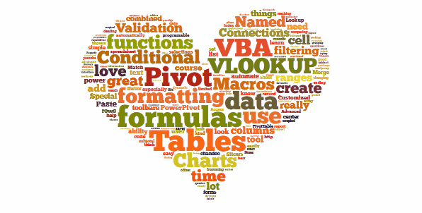
So here are the top 10 features in Excel according to you.
1. Excel Formulas
 63 people (50%) said Formulas are their favorite feature in Excel. Of course, you can say, Formulas & Functions are Excel!!! . They are what Excel is made of. But then again, a surprising fact is very few people actually know how to use formulas. Most people would Excel as a glorified notepad or ledger – just to type data. Once you understand the power of formulas, then you can be an irresistible analyst. Your boss & colleagues will be all over you for insights & information, much like the girls in Axe commercials.
Resources to learn Excel formulas:
- Introduction to Excel formulas – video
- Top 10 formulas for aspiring analysts
- 51 everyday Excel formulas – explained
2. VBA, Macros & automation
55 people said VBA is what makes them use Excel. VBA stands for Visual Basic for Applications, is a special language that Excel speaks. If you learn this language, you can make Excel do crazy things for you, like generate and email monthly reports automatically while you are busy reading this article.
Macros, little VBA programs are what you write to achieve this. Learning VBA can be quite fun, challenging & extremely rewarding experience. Once you learn VBA, suddenly your company will find you invaluable, thanks to all the time & effort you will be saving due to automation.
Resources to learn VBA:
3. Pivot Tables
 53 people said they love Pivot tables. They save you a ton of time, let you create complex reports, charts & calculations all with few clicks. No wonder so many people love them.
Pivot tables are ideal tools for managers & analysts who always have to answer questions like,
- What is the trend of sales in last 6 months?
- Who are our top 10 customers?
- Which button do I press for strong latte?
May be not the last one, but Pivot tables can answer almost any business question if you throw right data at them.
Resources to learn Pivot tables:
- Introduction to Pivot tables
- Top 5 Pivot table tricks & tips
- Pivot tables – detailed information, examples & tutorials
4. Lookup Formulas
25 people said lookup formulas (VLOOKUP, HLOOKUP, INDEX, MATCH etc.) are their favorite feature of Excel. Lookup formulas help you locate any information in your workbooks based on input criteria. By knowing how to write lookup formulas, you can build dashboards, make interactive charts, create effective models & feel pretty darn awesome.
Resources to learn lookup formulas:
- What is VLOOKUP formula, how to use it?
- Comprehensive guide to Excel lookup formulas
- VLOOKUP quiz – how well do you know it?
5. Excel Charts
Excel charts help you communicate insights & information with ease. By choosing your charts wisely and formatting them cleanly, you can convey a lot. I guess, most people hate Excel charts (hence it is at 5th position), because they are hard to work with. You can loose a whole afternoon formatting the wedges of a pie chart. But thanks to resources like Chandoo.org, you know better to make a column / bar chart and be done in 5 minutes.
Resources to learn Excel charts:
- How to select right type of charts for your data
- Creating combination charts
- More charting principles & charting tutorials
6. Sorting & Filtering data
If Microsoft ever needs few extra billions of cash, they just have to turn sorting & filtering features in Excel to pay-per-use. These ad-hoc analysis features are so powerful & simple that any aspiring analyst must be fully aware of them.
Resources to learn sorting & filtering features:
- Filter by selected cell’s value & other cool tips
- Sorting pivot tables in anyway you want
- SUBTOTAL formula and using it with filters
- Introduction to Advanced filters
- More sorting tips | filtering tips
7. Conditional formatting
Conditional formatting is a hidden feature in Excel that can make your workbooks sexy. Just add some CF to highlight your data and you will turn boring into interesting. With new features like data bars, color scales & icon sets, conditional formatting is even more powerful.
Resources to learn conditional formatting:
- Introduction to conditional formatting
- Conditional formatting basics – Video
- Conditional formatting – top 5 tips
- More tips & tutorials on conditional formatting
8. Drop down validation & form controls
 Right from my 3.5 years old daughter to CEO of a company, Everyone loves to be in control. So how can you make your workbooks interactive, so that end users can control the inputs ?
By using form controls & drop down lists of course.
Resources to learn dropdown lists, form controls:
- How to create an in-cell drop-down box for entering values?
- Introduction to Excel form controls
- Making your charts, workbooks & dashboards interactive – detailed guide
9. Excel Tables & Structural References
 Excel tables, a new feature added in Excel 2007 is a very powerful way to structure, maintain & use tabular data – the bread and butter of any data analysis situation. With tables, you can add or remove data, set up structural references, connect them to external sources (SQL server, ODBC etc.), add them to data models (Excel 2013 onwards), link them to PowerPivot (Excel 2010 onwards), format automatically, filter & sort with ease and still be out of office before lunch break. It is a pity Microsoft did not call them pixie dust or magic mix.
Resources to learn Excel tables:
- Introduction to Excel tables
- Using Excel tables – Introduction video
- Using structural references – video
- More tips & tutorials on Excel tables
10. PowerPivot, Data Explorer & Data Analysis features
 Although Excel in itself is quite powerful, it struggles to analyze certain types of data,
- Combining multiple tables and creating reports from them
- Processing data from difference sources and getting output to Excel
- What if analysis, scenarios & optimization
This is where add-ins like PowerPivot, Data Explorer and Analysis toolpak come in to picture. They let Excel do more, just like bat-mobile lets batman kick more ass.
Resources to learn more:
- Introduction to PowerPivot
- Introduction to DAX & PowerPivot measures
- Using Solver in Excel
- More on PowerPivot | data explorer
Learn all these features & more in one place
If you are looking to master all these top 10 features (and more) in one place, I highly recommend enrolling in my online classes. These training programs offer a step-by-step, in-depth, practical instruction on all areas of Excel, VBA, Dashboards & PowerPivot so that you can be awesome at your work. Click on below links to learn more.
- Excel, VBA & Dashboard training programs
- Excel & Dashboard training programs
- PowerPivot training program (next batch in July, 2013)
Or if you prefer face-to-face training & live in USA, you are in awesome luck. I am visiting USA this summer to conduct advanced excel & dashboards masterclasses in Chicago, New York, Washington DC & Columbus OH.
Click here for details & to book your spot.


65 Responses to “Make Dynamic Dashboards using Pivot Tables & Slicers [Video & Download]”
WOW, is all I can say.
I could not have imagined a dynamic dashboard without getting approved software budget and a team of people involved to create it. Given that I am a relative newbie to excel and actually got here by looking for pivit table help, I imagine that i would not be able to make anything myself. But armed with the demo excel sheet I will press buttons (and I will report back how that went;-)
Claudia
Good stuff Chandoo, thanks
The slicer buttons take up quite a bit of room on the dashboard
Is there a way to make the buttons smaller so we can have more room for charts, tables, and commentary?
Kind regards,
Winston
You can resize the slicers! When you click the slicers you can change the height and width of columns and slicers. You can also, under slicer style click "New slicer style" where you can define your own style, which enables you to change most things, including font size.
I hadn't seen the Group Option used as you did for the Duration PivotTable. And thanks for showing how to remove the Field Buttons on a PivotChart, I loathe them with all my heart.
Fantastic design and a great dashboard.
@Claudia.. I am glad you like it. Do let us know how your adventures go.
@Winston: You can resize slicers or increase the number of columns inside. Unfortunately, we can not readjust the font sizes in slicers. So when you resize, you will see partial text.
@Gregory: Thank you. I am happy you like it 🙂
Hi Chandoo, your dashboards are really professional and simple. I do have some question, if I have the following scenario, could you help to advise : -different data sources eg monthly
-calculations percentile
-%difference between financial year
Thank you so much!
Hi,
Thanks for your great information.It has helped me a lot.
Now,I can build my excel addin for Excel 2010 better with your tips.
Hi chandoo i am new reader for ur site.and really found good stuff and temp. But i suggest u 2 put a guidance step sheet in temp so anyone can understand easily.and also help me to become awesome as ur noume.
[...] [Related: Dynamic Dashboard using Pivot Tables & Slicers] [...]
Chandoo, Wow these are very powerful reports. I will be implementing them straight away. It will save me hours of work. Thankyou so much.
Hi Chandoo,
I love the Slicer, but how do I link a slicer for different data sheets e.g.: Client data on one tab and products on another tab, as I find that as long as you use pivot tables off the same data you can link the Pivot tables using Slicer connections.
Regards
Paul
I appreciate the work you have posted on your website - very informative and easy to understand. I just wanted to inform you that you can make selections within the slicer too by using Ctrl and selecting the fields you want to group and use as filter.
I had a question regarding the data used in pivot tables. Is there a way to update the data (eg. a new customer entry) and have the pivot tables and the linked charts in dashboard automatically update? I will search for the answer in other posts so ignore if you have covered it elsewhere.
Thanks again and keep up the good work.
-Vivek
Dear All,
Me too is a die hard fan of Slicer. it's requirement was arise when management is feeling it difficult to juggle with filters for sales of a particular location, Product Category in Pivot Table.
Got very positive response when introduced to tackle the above situation. furthermore in slicer setting there would be option to enable or disable deleted data is handy for particular scenario.
These are eye catching color themes would be like icing on the cake.
There is one more feature of excel 2010 which proves to be tool for great time saving is "Repeat Labels" in Pivot Tables.
This is fantastic!! Your steps were super to easy follow. I can't wait to show my new dashboard off to the boss. Thank you so much!
This might be a little unrelated but I'd like to know which software was used to record your on screen actions? I'd like to use it for tutorials on models that I build for my customers. Thanks!
@Van
Have a look here: http://chandoo.org/wp/about/what-we-use/
The slicers are coming in a sorted order... How can i get it in the way it appears in my original data.... The settings show to sort them A to Z or the other way round but they are option boxes and can not be unchecked... What are my options????
[...] Using slicers to make a dynamic dashboard in Excel [...]
I watched the video and then worked through an example of my own, also telephone costs by coincidence. It took me about 30 minutes to do everything. Once you've understood the basics of pivot tables and slicers, all that limits you is your imagination!
The only thing missing from the video is now to change the number of columns in a slicer: Right click a slicer then Size and Properties, Position and Layout, Layout, Number of Columns ...
Good page and video.
Duncan
How do you insert 'Year' in the Pivot Table Field List if it doesnt exist in the Master table???
Thanks
Hi,
Can I disable the multi-selection of the slicer to only allow one selection at a time?
Thanks in Advance
@Manu.. as of Excel 2013, this is not supported yet. But you can remove slicer heading, clear filter button and style it so that it looks like a single selection. You can also use Macros to ignore previous selection upon multiple selection, but I would not recommend it.
For an example on styling see - Interactive Pivot Calendar
Awesome guide! The dashboard I made blew people away. I do have one question. I want the chart title to match what I have selected. How can I do this without writing macros?
@Devin
Lets say what you have selected in in A1
Select the Chart then Select the Title
Click in the Formula Bar and type =A1
enter or click the small arrow to the left of the Formula Bar
Enjoy
Love the slicers and use them often in my dashboards. Question about the data (specifically the date) I see the "date of call" column but was wondering how were you able to filter on slicers by year and month when there is only a date of call entered into the data?
Thanks for your help!
Thanks for taking the time to create this interesting and very useful tutorial!
I was able to create a similar dashboard in a short time after watching your tutorial. The problem I am having now is how to update the pivot tables and dashboard graphs when a change is made in the raw data. I tried two methods; Change data Source and Refresh. When I used Change Data Source (Options-> Change data source) the values in the pivot tables didn't update. When I tried refresh the values in the pivot tables disappeared as well as the information in the graphs, since the data in the pivot tables no longer existed.
I have been searching for a solution for a while now but I have unfortunately not been able to solve this problem yet. Any help someone can provide is GREATLY appreciated.
All the best
Hi, looks great, but how valuable is power view when it comes to financial data? I've been having trouble trying to visualize how I would use power view to report of financial data.
Hi Chandoo, you are awesome! Thanks for the good work!
there is duplication for my slicer, probably cause i choose date, time as my options. i changed it to date but still theres a duplication of the same date
Just Great! Thank you for the time to put this together and teach us.
Alex Cardoso from Indaiatuba, Brazil.
First of all I would like to thank you guys for this post I used this amazing tool with the help of your tutorial to create a dashboard for one single account and my regional manager said "good job, it looks very profesional" she was so impresed that now she wants one daschboard with all the acounts and services she is going to replace her KPI reports with my report !! I smell a promotion!! My demand was a new laptop with MS 2010 and it was granted. now I have allot of work and many many questions to post .. kudos
Hi Chandoo
I want to say thanks first because i loved ur tutorials
i have a small doubt how to insert slicer from external connections
i searched every where could you please explain how to insert a slicer from external source
@Krishna Prasad
use external source data as pivot table then you will be able to use slicer.
Hello Chandoo,
How to get rid of the > items in Months slicer?
They are appearing when there is a grouping on the date field in pivot
Thanks
Hi Chandoo,
One problem always bothers me when i use slicer. I have no idea aobut how to change the number format in slicer. Want to display number in slicer as general format, but it always displays other number format such as date.
I check my source data and it doesn't effect the number format.
Look forward you or any EXPERTS to solve it. Thanks very much!
In the end, This website is awesome!!!
Hi Emma,
Were you able to resolve your query? I have a similar problem. I use Excel 2013 and the field I'm dropping into the slicer is a currency field ($1.00, $1.05, $1.10 etc.) representing the exchange rates that the user can choose from. The items in the slicer revert back to general format (1, 1.05, 1.1, etc.) although the source field is formatted as currency field. Is there a way to fix this?
@Sunil & Emma: You can create a new column in your raw data which has currency as text, using the TEXT formula like this =TEXT(currency_val, "$#,##.00"). Use this column to create the slicer.
Thanks for the response Chandoo. It works as you suggested. However, if the users were to pick more than one item in the window I'd like to know what is the max value and utilise that value in a DAX formula.
Also... there is no issue if I were to throw a slicer over a normal pivot. The trouble comes when I choose the 'Add this data to the Data Model' option which I need for the PowerPivot.
Hi Chandoo (Or others)
Is there a way to make the color change, when the value changing after the use of a slicer?
Lets say the value is 4,5, when i press the slicer, and the value change to 3,5 i would like the color to change. Can anyone help?
Thank you.
Hi Chandoo,
It was very useful video for me. Thanks.
But I have one question to ask.
How can I connect data which is growing in size (rows, records) by time (daily, monthly etc.) to this kind of dashboard?
Or it is only on select number of data?
Thank you.
Chandoo zindabad!
Hi Chandoo,
I have been able to create something similar quite easily. The problem that I am facing is that I want to keep the Top 10 filters permanently. If I select one option and then clear the filter, the chart removes the Top 10 filter; I want it to go back to Top 10 filter.
Is there a solution to this problem?
Regards
Thanks a lot for the tutorial and for the demo file!
I have the same problem of Angela: after clearing the filter applyed on P1, the filter on P1 shows all the customers without filtering top 10 (as it was before).
Thanks!
Federico
Go to your pivot table, right-click and choose "pivot table options." On the "Totals & Filters" tab check "Allow multiple filters per field."
Justin, thank you so much!
now after clearing the filter applyed on P1, the filter on P1 shows again top 10 customers.
[…] Slicers – how to use them – case study […]
Chandoo!
Just find out your website, I´ll follow your tutorials from now, very useful!
Great thanks from Brazil!!!
Very useful. Learned a new skill today. Thanks a ton!
Hi Chandoo,
This is fantastic! It's going to really help me with some operational reports I develop regularly. Two questions I'm hoping you can answer for me:
1. How can I use one slicer to manipulate two different pivot charts that came from two different pivot tables?
2. If I have a slicer in an excel and share that with someone who is on older versions of Excel - what will it look like to them?
thanks!
Hello Chandoo!
I love the dashboards and have been able to make quite a few, my puzzle is when I am connecting the pivot charts to the slicers, I have to do each individual one and check every single slicer (usually I have about 12, so I end up having to check the 12 check boxes 12 times to connect everything) am I missing something? Is there an easier way to do this?
Thanks!
elisa
Hello Chandoo,
You make my life easier, am in love withe the slicers!
I greatly appreciate
Thanx
Hama
[…] Slicers. Easy for me to do, but not as easy to explain how I did it. Fortunately, Chandoo has a Make Dynamic Dashboards using Pivot Tables & Slicers video and download that will do the job nicely. Suffice it to say it took me <3 minutes to put […]
thank you very much..... 🙂
You are a legend!! Thank you so much - very clear, very helpful indeed.
nice player...
i like to play like chandoo sir.
i learn somthing about slicer by watching posts.
it was too difficult to watch and easy to prepare..
thank you boss.
God Bless You
Hi,
I've built a dashboard on Excel 2010 using Pivot tables and slicers.
What I would like to do now is duplicate the dashboard on another tab, having it extract from another data source (format is identical to the 1st data source).
I'm extracting the same metrics, but each data sources measure different product lines.
Could anyone help me out?
Thanks in advance,
M
@M
Can you please post the question at the Chandoo.org Forums
http://forum.chandoo.org/
Please attach a sample file for a quicker more targeted response
Thank you so much. I learned so much about the slicer because of the video. Just got a quick question. Say I got 100+ Customer name bottons in one of the slicer, and it is time consuming to scroll up and down to find the one to select. Is there anyway I can set in the slicer setting that when I type "E", it automatically take the selectionto to where all the "E" starts? Thanks
Hi there,
This looks great - is there a way I can use it to compare vs budget, forecast? Is it just a case of renaming one of the field Comparison with the data being "Actual, Budget, Forecast"?
Thanks!
hello master!
please help me.
i am looking for many file example for Dashboard, but because my English is weak i couldnt fint it in hear.
please help me.
thankyou so much.
@An
Goto: http://chandoo.org/wp/welcome/
Have a look under dashboards http://chandoo.org/wp/excel-dashboards/
Also use the Search Box at the Top right of every page at Chandoo.org and search for Dashboard
thank you brother.
i love all of you!
Dear Excel Guru,
Hope everything is fine with you?
Can you please help in this Logic, it is a thought only to increase my knowledge SIR?
Please note that I have been working in Excel file contains two times of our teammates who claims overtime an each calendar month
My excel file as like this :-
ROW 1 Days of Month
ROW 2 Date of Month
Cell -1 [Time IN(06:00Hrs)], cell -2 [Time OUT(15:30Hrs)] no break in our factory and anything after Eight hours assume as overtime as standard in all across.
Appreciate if you could help me in providing the best an Exclusive Excel formula to calculate each day overtime excluding staff eight hours regular duty and Friday consider as full day overtime.
Kindly help me at the earliest convenience.
awaiting for your expertise.............
Best Regards / Ikram Siddiqui
Thank you for video , will you please provide pivot table with header and sub header like year main header and under that three sub header. How to make dashboard for that.
Dear Sir,
How to seperate amount, mention in remarks.