Excel Charts, Graphs and Templates
Tutorials, Examples and explanations on Excel charting. You can learn how to create almost any chart type in this section. Also learn how to create effective charts, make them interactive and add automation thru VBA
Make an Impressive Interactive Map Chart in Excel |
|
|
Today, let’s learn how to make an impressive map chart with Excel. Something like this. |
How to Create a Dynamic Excel Dashboard in Just 5 Steps |
|
|
|
A simple and clear 5 step process to create beautiful and useful dashboards. |
How to create a fully interactive Project Dashboard with Excel – Tutorial |
|
|
|
Do you manage projects? You are going to LOVE ? this one. In this in-depth tutorial, learn how to create a fully interactive & dynamic Excel Project Management dashboard. Sample files & video instructions are also provided. |
9 Box grid for talent mapping – HR for Excel – Template & Explanation |
|
|
|
9 box grid is a popular method for talent mapping. Download this free excel template for tracking and visualizing your employee performance & potential data. In this article, I explain about powerful excel features like FILTER(), SORT() and CONCATENATEX() to create a similar 9 box talent map grid for your data. |
6 Must Know Line Chart variations for Data Analysis |
|
|
|
Line charts in Excel are essential for trend analysis, spotting distribution and outliers. Use these 6 variations to get more out your line chart.
|
How to make stream graphs in Excel? |
|
|
|
A stream graph or stream plot is an area chart that looks like a stream. In this post, let me show you how to create an interactive stream graph using Excel area charts. The original design for this graph is inspired from Cedric Scherer. |
How to make an Interactive Chart Slider Thingy |
|
|
|
Ok, I will be honest. I have no idea what to call it. May be Chart Cover Flow? But Interactive Chart Slider Thingy sounds so better. So let’s go with it. Learn how to create this magical contraption in Excel. |
How to show positive / negative colors in area charts? [Quick tip] |
|
|
|
Ever wanted to make an area chart with up down colors, something like this? Then this tip is for you. |
6 Best charts to show % progress against goal |
|

|
Back when I was working as a project lead, everyday my project manager would ask me the same question. “Chandoo, whats the progress?” He was so punctual about it, even on days when our coffee machine wasn’t working. As you can see, tracking progress is an obsession we all have. At this very moment, if you pay close attention, you can hear mouse clicks of thousands of analysts and managers all over the world making project progress charts. So today, lets talk about best charts to show % progress against a goal. |
Easy Website Metrics Dashboard with Excel |
|
|
|
Do you run an e-commerce website? You are going to love this simple, clear and easy website metrics dashboard. You can track 15 metrics (KPIs) and visualize their performance. The best part, it takes no more than 15 minutes to setup and use. Here is a preview of the dashboard. Click to download the template. |
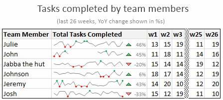
What are Excel Sparklines & How to use them? 5 Secret Tips |
|
|
Of all the charting features in Excel, Sparklines are my absolute favorite. These bite-sized graphs can fit in a cell and show powerful insights. Edward Tufte coined the term sparkline and defined it as, intense, simple, word-sized graphics Sparklines (often called as micro-charts) add rich visualization capability to tabular data without taking too much space. This page provides a complete tutorial on Excel sparklines. |
Add slope line to XY charts |
|
|
|
Slope line is very useful for spotting which values have changed from two sets. You can add a slope line to XY chart (scatter plot) using simple techniques. In this post, learn how to add them. |
Celebrate with spider web chart [Halloween Fun] |
|
![Celebrate with spider web chart [Halloween Fun]](https://chandoo.org/wp/wp-content/uploads/2016/10/spider-web-halloween-chart.png)
|
It’s Halloween time. As adults, we can’t go trick or treating. We can of course dress up in costumes and entertain others. But what about the poor spreadsheets. Don’t they deserve some of this fun too? Hell yeah! So I made a spider web generator in Excel. Just use it to make a spooky cob web pattern and add it to your report / dashboard / time sheet or whatever else. Surprise your colleagues. |
Impress with Tornado Charts in Excel |
|
|
|
It’s tornado season. Don’t freak out, I am talking about Excel tornado charts. Use them to visualize age and gender-wise KPIs. Here is a quick demo of interactive tornado chart made in Excel. Watch it and read on to learn how to make your own tornado in a spreadsheet. |
Zelda Stamina Wheel Chart |
|
|
|
I have been playing Zelda: Breath of the wild a lot these days and I LOVE the game. Considered one of the BEST video games all time, BOTW is beautifully designed and offers a lot of entertainment. Don’t freak out yet, Chandoo.org hasn’t suddenly branched into a video gaming blog. Instead, I am here to talk about Stamina Wheel Chart. |
Free Excel Risk Map Template |
|
|
|
Risk comes from not knowing what you are doing. Warren Buffet If you ever ask a project manager what they are up to, they will tell you “I have no idea“. So risks are quite common in project management. That is why I made this awesome free Excel risk map template to keep track and […] |
How-to highlight maximum value in Excel charts? [Quick tip] |
|
|
|
Ever wanted to highlight maximum value in charts? Then this tip is for you. |
Tour de France – Distance & Pace over time – Radial Charts |
|
|
|
This is an Excel replica of excellent Tableau visual on Tour de France winner data made by Marc Reid. Last week I saw a stunning visualization on Tour de France using radial charts. I wanted to replicate it in Excel. So here we go. |
Make info-graphics with shape fill technique [Charting Tip] |
|
|
|
This is a quick, fun and elegant way to make impressive charts. You can easily create info-graphic style charts in Excel using shape fill technique. Something like this: |
How to predict cricket scores [Excel + Machine Learning] |
|
|
|
Can we predict cricket match score in Excel? Using machine learning, ensemble modeling, multiple regression and Excel formulas we can. This tutorial explains how. |

