All articles with 'sorting' Tag
{ 20 Comments }
Speed up your Excel Formulas [10 Practical Tips]
Published on Apr 14, 2023 in Excel Howtos, Learn Excel
![Speed up your Excel Formulas [10 Practical Tips]](https://chandoo.org/wp/wp-content/uploads/2012/03/SNAG-2595.png)
Excel formulas acting slow? Today lets talk about optimizing & speeding up Excel formulas. Use these tips & ideas to super-charge your sluggish workbook. Use the best practices & formula guidelines described in this post to optimize your complex worksheet models & make them faster.
1. Use tables to hold the data
2. Use named ranges & named formulas
3. Use Dynamic Array formulas
4. Sort your data
5. Use manual calculation mode
… and more. Read on to learn these top 10 tips & ideas to improve performance of your excel formulas.
Continue »{ 29 Comments }
Sorting values in Olympic Medal Table style [Quick Tip]
Published on Aug 2, 2021 in Excel Howtos
![Sorting values in Olympic Medal Table style [Quick Tip]](https://chandoo.org/wp/wp-content/uploads/2021/08/sorting-excel-data-in-multiple-levels.jpg)
It is Olympic season. Everyone I know is tracking the games and checking their country’s performance. One thing that we notice when looking at medal tally is,
A single Gold medal is worth more than any number of Silver medals. Like wise, a single Silver medal is worth more than any number of Bronze medals.
So, when you look at the ranking of countries, you see countries with single Gold medal higher up than countries with lots of Silver and Bronze medals (but no Gold).
Continue »{ 2 Comments }
How to sort left to right in Excel (quick tip)
Published on Apr 26, 2019 in Learn Excel

Imagine you are in a life sustaining planet named Pearth, in another galaxy. One day you got to work, fired up Excel (hey, what else would you use? Excel is the best data software in any galaxy 🙂 ) and started working.
You came across a dataset that need sorting, but left to right – horizontally.
Now what? Do you turn your monitor sideways?
Continue »
Excel table is a series of rows and columns with related data that is managed independently. Excel tables, (known as lists in excel 2003) is a very powerful and supercool feature that you must learn if your work involves handling tables of data.
What is an excel table?
Table is your way of telling excel, “look, all this data from A1 to E25 is related. The row 1 has table headers. Right now we just have 24 rows of data. But I can add more later!”
Continue »{ 8 Comments }
Sorting to your Pivot table row labels in custom order [quick tip]
Published on Nov 29, 2016 in Pivot Tables & Charts
Pivot tables are lovely. But sometimes they are hard to work with. Let’s say you are analyzing some HR data and want to see number of weeks worked in each hour classification.
And you want this.

Except, there is a teeny tiny problem.
The sort order on the classification is all messed up.
Here is a quick fix to get custom sort order on your pivot table row labels.
Continue »{ 2 Comments }
Weighted Sorting in Excel [video]
Published on Oct 1, 2015 in Excel Howtos, Learn Excel
![Weighted Sorting in Excel [video]](https://chandoo.org/wp/wp-content/uploads/2015/10/weighted-sort-in-excel.png)
Imagine you are looking customer data like below and want to sort them by performance. If you sort the data by any one column, you will not get full picture of performance. To understand which customers rank low on performance, you need to defined a weighed sort, the kind of sort where you assign weights to each attribute (customer age, recent purchases and rate of returns) and come up with single score to sort them all.
Sounds interesting? Watch below video to understand how to do weighted sorting in Excel.
Continue »{ 12 Comments }
A better chart to visualize “Best places to live” – Top 100 cities comparison Excel chart
Published on Oct 8, 2014 in Charts and Graphs, Cool Infographics & Data Visualizations
Recently, I saw this chart on Economist website.
It is trying to depict how various cities rank on livability index and how they compare to previous ranking (2014 vs 2009).
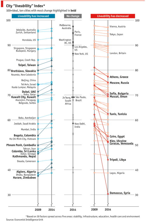
As you can see, this chart is not the best way to visualize “Best places to live”.
Few reasons why,
- The segregated views (blue, gray & red) make it hard to look for a specific city or region
- The zig-zag lines look good, but incredibly hard to understand % changes (or absolute changes)
- Labels are all over the place, thus making data interpretation hard.
- Some points have no labels (or ambiguous labels) leading to further confusion.
After examining the chart long & hard, I got thinking.
Its no fun criticizing someones work. Creating a better chart from this data, now thats awesome.
Continue »{ 8 Comments }
Closing gaps in this Gender Equality Gap chart…
Published on Nov 5, 2013 in Charts and Graphs
Today lets close some gaps.
Recently I saw this interesting chart on Economist Daily Charts page. This chart is based on World Economic Forum’s survey on how women compare to men in terms of various development parameters. First take a look at the chart prepared by Economist team.
So what are the gaps in this chart?
This chart fails to communicate because,
- All country charts look same, thus making it difficult to spot any deviations.
- We cannot quickly compare one country with another on any particular indicator.
- It does not provide a better context (for eg. how did these countries perform last year?)
But criticizing someone’s work is not awesome. Fixing it and making an even better chart, that has awesome written all over it. So that is what we are going to do. You can see the improved chart above. Click on it to learn how you can create it.
Continue »![Sort by Birthday [Quick tip]](https://img.chandoo.org/q/sorting-by-birthday.png)
Lets say you have a list of employees and their birthdays. Now you want to sort this list, based on their birthday, not age. How would you do it?
Continue »
Last week, we had a lovely poll on what are your favorite features of Excel? More than 120 people responded to it with various answers. So I did what any data analyst worth his salt would do,
I analyzed the data and here are the top 10 features in Excel according to you.
Read on to learn more.
Continue »{ 20 Comments }
Sort Pivot Tables the way you want [Quick tip]
Published on May 31, 2012 in Excel Howtos, Pivot Tables & Charts
![Sort Pivot Tables the way you want [Quick tip]](https://img.chandoo.org/pivot/custom-sorting-pivot-tables.gif)
Ever looked at a Pivot table & wondered how you can sort it differently?
“If only I could show this report of monthly sales such that our best months are on top!”
Well, there is a way to do it without sacrificing 2 goats or pleasing the office Excel god. Just use custom sorting options in Pivot tables.
Continue »{ 25 Comments }
Using Array Formulas to check if a list is sorted.
Published on Jan 7, 2011 in Excel Howtos
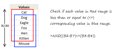
Today, we will learn an interesting array formula trick to test if a list is sorted or not. During last one week, I got 2 requests from different clients for some excel related work. Both of them had one thing in common. To test whether a list is sorted or not. So I got thinking, […]
Continue »{ 12 Comments }
Use Filter By Selected Cell’s Value to save time [Quick Tips]
Published on Dec 22, 2010 in Learn Excel
![Use Filter By Selected Cell’s Value to save time [Quick Tips]](https://img.chandoo.org/q/filter-by-selected-cells-value-excel-tip.png)
We are busy decorating the Christmas tree, making preparations for the holidays. But I have a very quick tip for you.
[Note: all these tips work in Excel 2007 or above]
Whenever you are working with huge lists of data, filtering & sorting is one simple way to analyze the data quickly.
You can quickly filter your data based on current cell’s value by right clicking and then selecting filter > filter by selected cell’s value.
Continue »{ 11 Comments }
Show Top 10 Values in Dashboards using Pivot Tables
Published on Dec 1, 2010 in Charts and Graphs, Pivot Tables & Charts
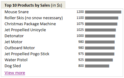
A good dashboard must show important information at a glance and provide option to drill down for details.
Showing Top 10 (or bottom 10) lists in a dashboard is a good way to achieve this (see aside). Today we will learn an interesting technique to do this in Excel.
Continue »{ 13 Comments }
Formula 1 Style Sorting of Times (Durations) in Excel
Published on Jul 15, 2009 in Excel Howtos

The other day I was watching Formula 1 on TV. I think it is the ideal game to follow for a lazy dude like me. It is on every other weekend. It takes .32 seconds to understand the game and 3.2 seconds to know the points and scoring mechanism. But I am not here to convince you to follow the game. While looking at score boards, it struck me,
“how about writing excel formulas for sorting a list of durations (or numbers) in the formula 1 order?”
Continue »
