
Recently I saw a big screaming ad that said “the chartbuster rules”. Of course, I know that chartbusters rule. Not just because I was one of them 🙂
So I got curious and read on. And I realized the ‘chartbuster’ is actually a car, not some cool, spreadsheet waving, goatee sporting dude like Jon Peltier. What a bummer!
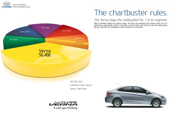
And then to my horror of horrors, I saw the exploding 3d pie chart, with reflection effects & glossy colors. And the sole purpose of the chart is to create an impression that Verna sells better than any car in India.
First take a look at the chart:
Now for criticism
Obviously there is no denying that Verna sells better. If you look at the number of units sold, Verna’s 56,486 is better than any other numbers.
But is that the impression the chart gives?
If you just look at slicers and colors (which is what you would do), you feel that Verna has 40-45% market share.
What is the reality? It is 31.4%
Why such a distortion in our perception?!?
This is because, the ad uses a mildly evil magic called 3d pie charts, to distort what you perceive.
Then the chart maker sprinkled this 3d pie chart with assorted poisonous sprouts called as ‘customized rotation of slices’ and ‘exploding the pie for Verna, to make it look big’.
Now, the chart means one thing, but says another. Its like my wife when she wants new shoes.
Can chart rotation impact your perception – here is the proof!
Now, you might be wondering, “Oh Chandoo, come on my man. Why would I be dumb enough to fall for this.”.
So I have made a proof. I made a similar 3d pie chart from these exact numbers. Then I rotated it from 0 to 360 degrees. And you can see how the slices of pie play with your eye.
So what is a better alternative for this chart?
In this case a column chart is better. It clearly shows the leadership position of Verna without resorting to sneaky tricks.
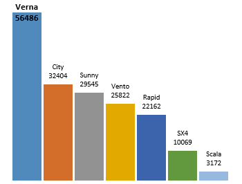
What more, you can format the column chart so that it has all the bling! (not that I recommend such over formatting)
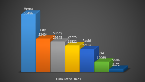
PS: A newer version of this ad features column chart, albeit with convoluted staircase representation.
What do you think about rotated, exploded 3d pie charts
The only time I want to rotate a pie is when it is too big and the portion I want to eat is on the other side.
What about you? do you make 3d pies? Are they tasty or sneaky (like the Verna pie)?
Share your thoughts using comments.
Take our 3d pie pledge
As a fun exercise, why don’t you take our 3d Pie pledge. Here it is.
I promise to never make a 3d pie chart. If I ever see one, I promise to not rotate or explode it. I also promise to create alternative charts (usually column, bar, line or scatter plots) so that my audience can see the truth better.
And oh yeah, I promise to bake & eat pies whenever possible. Apart from cakes, pastries, ice creams, biscuits and other assorted fun foods that is.
signed…
Go ahead and take the pledge
PS: Chartbuster series of articles & more charting principles.


25 Responses to “Display Alerts in Dashboards to Grab User Attention [Quick Tip]”
I prefer the red,grey,light grey,black icon set. I've also used in-cell pie charts from Fabrice's Sparklines for Excel as an alert which could also provide another piece of information.
I prefer the red,grey,light grey,black icon set. I've also used in-cell pie charts from Fabrice's Sparklines for Excel as an alert which can also provide another piece of information.
For Excel 2007, your formula should do the same as the Excel 2003 version, so that non-alert rows are blank - if they are 0, the unnecessary green icon will show
Hi Chandoo,
Nice Post !! just to add something for EXL 2003, we can also 4 Ifs and link to the alert data
For Ex: If we have alert data in Cell A2 and want to split in 4 orders namely <25%, 25-50%, 50-75% and 75%< then we can following formula and put fonts as you have suggested :
=IF(A2<0.25,CHAR(153),IF(A2<=0.5,CHAR(155),IF(A2=0.76,CHAR(152)))))
And then using Conditional Formating we can dashboard reflected on different COLOURS as per their respective alert.
Best Regards
Rohit1409
Hi Chandoo,
Nice Post !!! just to add something for EXL 2003, we can also 4 Ifs and link to the alert data
For Ex: If we have alert data in Cell A2 and want to split in 4 orders namely <25%, 25-50%, 50-75% and 75%< then we can following formula and put fonts as you have suggested :
=IF(A2<0.25,CHAR(153),IF(A2<=0.5,CHAR(155),IF(A2=0.76,CHAR(152)))))
And then using Conditional Formating we can dashboard reflected on different COLOURS as per their respective alert.
Best Regards
Rohit1409
The Complete formula [Don't Know how it got cut ]
=IF(A2<0.25,CHAR(153),IF(A2<=0.5,CHAR(155),IF(A2=0.76,CHAR(152)))))
PS : Use in single line [I have split it to avoid cuts 😉 ]
Hi Chandoo..
why it is not displaying the complete formula..
anyways here is the balance
"=IF(A2<0.25,CHAR(153), IF(A2<=0.5,CHAR(155), IF(A2=0.76,CHAR(152)))))"
@Rohit... your formulas are fine. Just that the width of comment area is fixed and hence my website is cropping it at 640pixels. I just edited your formula and added few white spaces so that it wraps nicely.
Very good idea btw.. kudos!
Hi,
Maybe just go for 'bold' ; 'underline' or 'italic' to draw the users attention? Those methods (if those can be called methods) are used cross media type (books, journals, blogs, billboards, ...) to guide the readers eye to valuable information.
Just a basic thought
@Tom.. good idea..
[...] has a very nice writeup on how to add such alerts to dashboard sheets. Possibly related posts: (automatically generated)Divide your data set into workbooksHow to enforce [...]
Hi Chandoo,
You certainly grabbed my attention! although I wasn't sure what my brother (Suresh) and cousin (Shyam) were doing right, and I was doing wrong? 😉
I love your blog btw - Many thanks for all your hard work in unravelling the secrets and mysteries of Excel!
Best regards
Ramesh
I thought I saw an advertisment for a book about learning excel called excel himalaya or something. It cost about 35.00 us money but seemed to have the things I need to have my admin assistant to start to use. I was hoping to start with this book and then send her to school if she shows some interest and aptitude. Any help on this would be appreciated. Thanks
Great web site and information!!!!
@Jeff... checkout http://chandoo.org/wp/2010/08/25/excel-everest-review/
thanks, your website is awesome!
[...] Alerts to highlight focus areas [...]
[...] There are lots of numbers in this dashboard. I would suggest adding few more visualizations like showing indicators or applying conditional formatting or replacing a table with a chart. This would reduce the [...]
[...] is the same technique as alert icons in dashboard. Just that I also showed green [...]
[...] is the same technique as alert icons in dashboard. Just that I also showed green [...]
Hi Chandoo
Firstly thanks for all the cool tips on how to use Excel better.
I am new to the site and have a question which you may be able to assist with but dont know if these comment boxes are the best way of asking ?
I am looking at assets and trying to calculate the depreciation total by taking a year (say 2010) adding the expected life of the asset (say 10 years) then comparing that to a future date (say 2015) using an IF statement. The calculation in normal is - IF((year in col B (2010) plus 10years)>year 2015, add a years depreciation, otherwise leave blank). The converted date value does not appear able to add 10 years in order to compare it to 2015. Am I missing something ?
I use the “IF” Statement in conjunction with Conditional Formatting in MS Excel to give verbiage to alert one of a required action, dependant on a review date. This makes a visual stimulus, plus it clues one as to what the conditional format is trying to warn you about and what follow-up actions are required.
Wow, I'm really impressed with dashboards. I had no idea this stuff was even possible with excel. I'd like to offer an interactive dashboard to my customers, showing analytics of their data. I have a .pdf file with the datapoints. I'd like them to enter the data on my website, and be able to see their data. Is something like that possible.
Hi Chandoo,
I've recently purchased the package for both templates.
In the portfolio dashboard,under the calculations worksheet, I'm attempting to change the date range in the gantt chart to show only the range of the project that starts in late 2013. How do I do this?
Thanks
Adam
[...] is the same technique as alert icons in dashboard. Just that I also showed green [...]
Hi Chandoo,
I'm new at Excel Dashboard and found your blog really useful and helpful! It's very nice of you that you dedicate your time to do this.
Could you please explain how can I use Alerts based on dates on a Dashboar?
For example, if a target date is coming closer to the actual date, the alert is yellow or red.
I'd really appreciate some help!
Thank you
Where can I download the file Excel of Averall Statistics ???
Thanks a lot.