Excel Charts, Graphs and Templates
Tutorials, Examples and explanations on Excel charting. You can learn how to create almost any chart type in this section. Also learn how to create effective charts, make them interactive and add automation thru VBA
KPI Dashboard – Revisited |
|
|
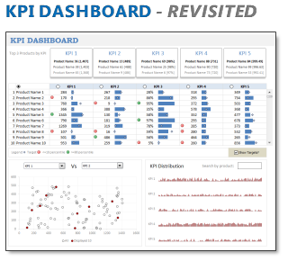
In 2008, I received an email from Robert Mundigl, which was the start of a life-long friendship. Robert asked me if he can teach us how to make KPI dashboards using Excel. I gladly said yes because I am always looking for new ways to use Excel. The original KPI dashboards using Excel article was so popular. They still help around 12,000 people around the globe every month. Many of our regular readers and members have once started their journey on Chandoo.org from these articles. In this article, we will revisit the dashboard and give it a fresh new spin using Excel 2007. |
Executive Review Dashboard in Excel [Dashboard Week] |
|
![Executive Review Dashboard in Excel [Dashboard Week]](https://chandoo.org/img/dashboards/dw/executive-review-dashboard-in-excel.png)
|
Purpose of the dashboard: This is a guest article written by John for our Excel Dashboard Week. This Dashboard was constructed for a number of reasons, one of which was to reduce the number of reports produced with the same data ( up to 6 separate files ). As we all know, when it comes to senior management and reports / files the more information they can get on one report / file the better for them. So, with this in mind I created the Dashboard to show the data they need to see “quickly” each week. |
Customer Service Dashboard using Excel [Dashword Week] |
|
![Customer Service Dashboard using Excel [Dashword Week]](https://img.chandoo.org/dashboards/dw/customer-service-dashboard-excel.png)
|
Early in Jan, I got this mail from Mara, a student in Excel School first batch. Hi Chandoo, I took your first Excel batch class and loved it. I created a dynamic and interactive dashboard for my work. My boss thinks it’s an excellent tool and I have you to thank for and also Francis Chin who shared his travel dynamic dashboard. I integrated things you taught so thanks so much! I felt very proud reading her email, so I asked her if she can share the dashboard with some dummy data so that we all can learn from her example. Being a lovely person Mara is, she gladly emailed me the workbook and I am thrilled to include it in Dashboard Week. |
Health-care Dashboard in Excel [Dashboard Week] |
|
![Health-care Dashboard in Excel [Dashboard Week]](https://img.chandoo.org/dashboards/dw/health-care-dashboard-small.png)
|
As part of Dashboard Week, in this post, we will take a look at Health-care Dashboard prepared and shared by Alberto. He put together an excellent dashboard to visualize hospital performance and understand what is going on. Read this post to understand how this dashboard is made, watch a tutorial video & download example workbook. Thank you Alberto for sharing the file & helping us learn. |
Announcing Dashboard Week – Submit your entries now! |
|

|
Hello there, I am glad to announce this week (21-25 March, 2011) as Dashboard Week on Chandoo.org |
Use Analytical Charts to Make your Boss Love You |
|
|
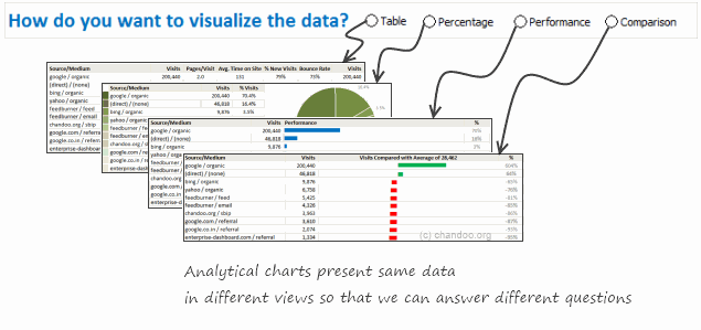
There are beautiful, powerful & awesome charting examples all around us. Today, I want to show you how we can harness the power of Excel to create Analytical Charts. Analytical What?!?To be frank, I do not know what to call these charts, so I choose the term Analytical Charts. But this is what I have in mind when I say Analytical charts: A chart is analytical chart, |
Excel Teens are out to get you & Other findings from our Survey |
|
|
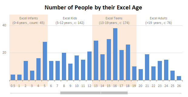
Our of curiosity and fun I asked you “how long have you been using Excel?”. I was overwhelmed by the response we got to this simple question. More than 437 people responded with their comments, stories and enthusiastic responses. Thank you so much. It would taken me more time to make the charts and understand the data. But thanks to Hui, who volunteered to tabulate all the survey data in a simple CSV. Shown above is a chart I came up with based on the data. Read the rest of the post to understand the survey results and view more charts. Also, you can download the excel workbooks and original data set to play. |
The Grammy Bump Chart in Excel |
|
|
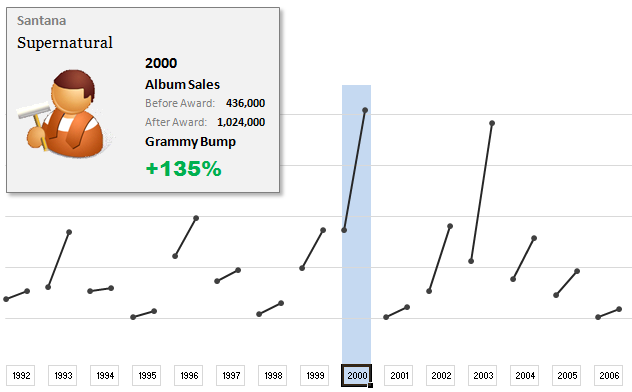
The folks at Washington Post made an interesting chart to understand whether winning a Grammy award makes any difference to album sales. Go ahead and browse it if you have not already seen it. Go, I will wait. Are you impressed? I really liked this chart. This is what I liked about the chart,
In fact, I liked the chart so much that I wanted to make it in Excel.. You can see a snapshot of what I came up with above. Read the rest of this article to learn more. |
A Huge Collection of Spreadsheets for Teachers [What Excel Can Do] |
|
![A Huge Collection of Spreadsheets for Teachers [What Excel Can Do]](https://img.chandoo.org/g/spreadsheets-for-teachers-what-can-you-do.png)
|
Way back in November, I received this email from Tom, a senior researcher at the Center for Learning Innovation in Australia.
I’ve been developing & have published spreadsheet applications for teachers for some time now. In particular, I have animations, adventure scenarios etc that can be used to create games for the classroom. I need to promote these so teachers eventually try these and use them. … Perhaps you could post some of these on your site. What a noble cause, I thought. So I wrote back to him and invited him to share his files along with a guest article. Tom acted quick and emailed me his article and Excel workbooks by Thanksgiving day. I was too lazy and got lost in the flow of things. But now, I am very very glad to feature his work. There are so many valuable tricks, ideas and powerful concepts buried in his workbook. I encourage everyone to play with his file (you need to enable macros) so that you can learn a thing or two. If you are a teacher, feel free to use the files to make your classroom teaching even more awesome. |
Are You Trendy ? (Part 3) |
|

|
In the final post of the Are You Trendy? series we will look at the use of Excel Charts and associated Trendlines for trend analysis and I will give you a free tool (Normally valued at $200, I wish) which will allow interactive assessment of a Charts Trendline Y value for any X value. |
Are You Trendy? (Part 2) |
|

|
Does your data hold hidden secrets? |
Are You Trendy ? |
|

|
Often you may have a set of data and need to know what an intermediate or future value of that data may be. |
220 Excel Tips, Tutorials, Templates & Resources for You [Celebrating 20k RSS Members] |
|
![220 Excel Tips, Tutorials, Templates & Resources for You [Celebrating 20k RSS Members]](https://img.chandoo.org/l/220-excel-tips-tricks-templates-resources.png)
|
I have an exciting news & massive post for you. Chandoo.org reaches 20,156 RSS Subscriber mark on Jan 19, 2011As of Jan 19, 2011, our little blog has registered our 20,000th RSS Subscriber. While this is not a huge achievement or anything, It certainly calls for celebration. I am so happy to see our mission to make people awesome in Excel is reaching out to more people everyday. Thank you. To celebrate this milestone, I am doing a massive post with 220 Excel tips, tricks, tutorials & templates. Formulas [52 tips] |
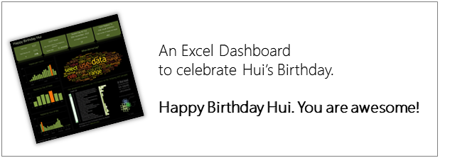
Happy Birthday Hui, An Excel Dashboard to prove you are awesome! |
|
|
Some of you know our guest author and Excel ninja Hui. Yesterday was his birthday. And I wanted to create nice birthday gift for him. So I took a database dump of our forums data and created a dashboard. Read rest of this post to see the dashboard & download workbook. |
How would you Visualize World Education Ranking Data [Homework + Video] |
|
![How would you Visualize World Education Ranking Data [Homework + Video]](https://chandoo.org/img/vp/world-education-scores-excel-chart.png)
|
Here is a charting challenge to begin your Christmas week. Recently Guardian’s Data Blog released World Education Rankings data and a sample visualization. Now your challenge is to make your chart visualizing World Education Rankings data. You can see the chart I have constructed above. Read the rest of the post to find out how I made this chart and download the workbook. Post your submissions using comments. |
Do you use (or make) Excel Dashboards? Tell us about yourself to win a free training kit |
|

|
(You can win my latest Excel Dashboard Training kit free, read this post to find out how.) Over at Jorge’s ExcelCharts blog, he started a very good discussion on Excel Dashboards: Who needs them anyway?. Jorge has very good experience designing, working on and teaching about dashboards. So he uses all that skill to gaze in to a crystal ball, to understand who needs excel dashboards and why. In this post, I build on his argument and ask you the big question – “If you make or use Excel Dashboards, who are you?” |
Make Dynamic Dashboards using Pivot Tables & Slicers [Video & Download] |
|
![Make Dynamic Dashboards using Pivot Tables & Slicers [Video & Download]](https://chandoo.org/img/dashboards/dynamic-excel-dashboard-using-pivot-slicers-demo.png)
|
Do you know that Excel 2010 makes creation of dynamic dashboards very simple? Yes, that is right. Using slicers feature, you can create dynamic excel dashboards from your data in very little time. Today we are going to learn a technique that will help you create a dashboard like below. Read rest of this post to find out how to construct a dynamic dashboard in Excel & download the example workbook. |
Show Top 10 Values in Dashboards using Pivot Tables |
|
|
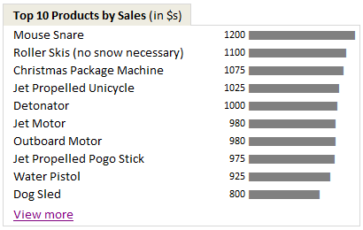
A good dashboard must show important information at a glance and provide option to drill down for details. Showing Top 10 (or bottom 10) lists in a dashboard is a good way to achieve this (see aside). Today we will learn an interesting technique to do this in Excel. |
Excel Animation without Macros! |
|
|
|
Today we will learn an interesting animation technique that ONLY uses, … wait for it …, Excel Formulas. That is right, we will use simple formulas to animate values in Excel. Intrigued? Confused? Interested? First see a short demo of excel animation achieved using this technique. Now read the rest of this post to learn more about this technique and download sample workbook. |
An Excel Dashboard to Visualize 10,007 Comments [Dashboard Tutorial] |
|
![An Excel Dashboard to Visualize 10,007 Comments [Dashboard Tutorial]](https://chandoo.org/img/vp/10007-comments-dashboard-thumb.png)
|
First some good news, On 21st November, 2010, our little blog received its 10,000th comment! Thank you so much for making this happen. Those of you reading chandoo.org for a while know my penchant for comments. I have learned a lot of excel tips & ideas just by reading the comments you posted on this blog. I think comments are one of the best parts of this blog. So, naturally, I wanted to celebrate this milestone, with something big & awesome. My intention was to download all the 10,000+ comments and play with the data to come up with something outstanding, like a dashboard. It took me 2 days to conceptualize and create this beauty. |


