All articles with 'INDEX()' Tag
A better chart to visualize “Best places to live” – Top 100 cities comparison Excel chart
Recently, I saw this chart on Economist website.
It is trying to depict how various cities rank on livability index and how they compare to previous ranking (2014 vs 2009).
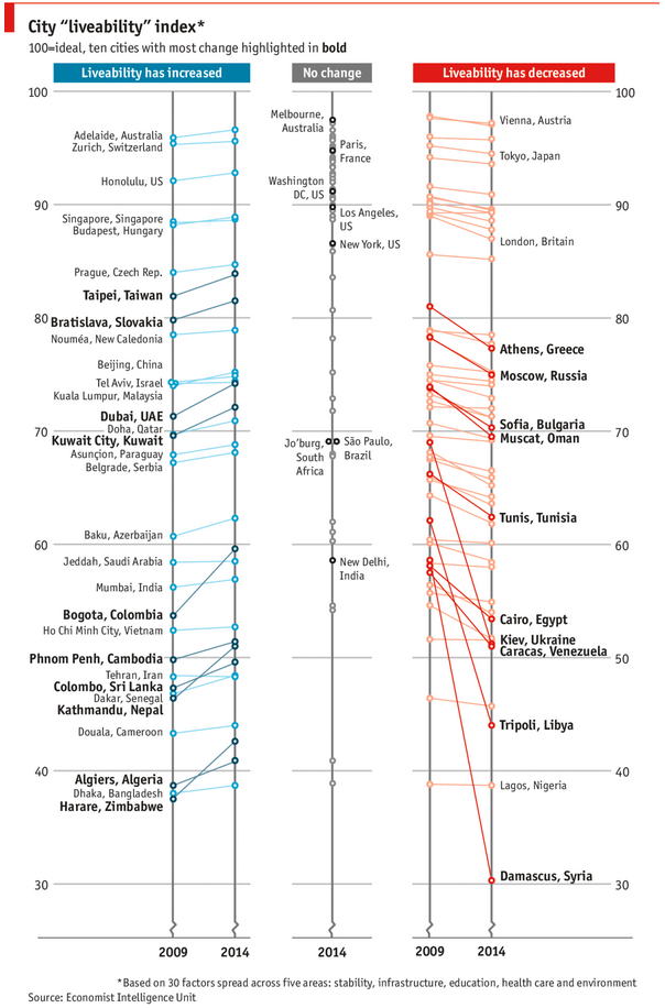
As you can see, this chart is not the best way to visualize “Best places to live”.
Few reasons why,
- The segregated views (blue, gray & red) make it hard to look for a specific city or region
- The zig-zag lines look good, but incredibly hard to understand % changes (or absolute changes)
- Labels are all over the place, thus making data interpretation hard.
- Some points have no labels (or ambiguous labels) leading to further confusion.
After examining the chart long & hard, I got thinking.
Its no fun criticizing someones work. Creating a better chart from this data, now thats awesome.
Continue »ABC Inventory Analysis using Excel
ABC analysis is a popular technique to understand and categorize inventories. Imagine you are handling inventory at a plant that manufactures high-end super expensive cars. Each car requires several parts (4,693 to be exact) to assemble. Some of these parts are very costly (say few thousand dollars per part), while others are cheap (50 cents per part). So how do you make sure that your inventory tracking efforts are optimized so that you waste less time on 50 cent parts & spend more time on costly ones?
This is where ABC analysis helps.
We group the parts in to 3 classes.
- Class A: High cost items. Very tight control & tracking.
- Class B: Medium cost items. Tight control & moderate tracking.
- Class C: Low cost items. No or little control & tracking.
Given a list of items (part numbers, unit costs & number of units needed for assembly), how do we automatically figure which class each item belongs to?
And how do we generate above ABC analysis chart from it?
Continue »Mapping relationships between people using interactive network chart

Today, lets learn how to create an interesting chart. This, called as network chart helps us visualize relationships between various people.
Demo of interactive network chart in Excel
First take a look at what we are trying to build.
Looks interesting? Then read on to learn how to create this.
Continue »This is a guest post by Krishna, a football lover & one of our readers.
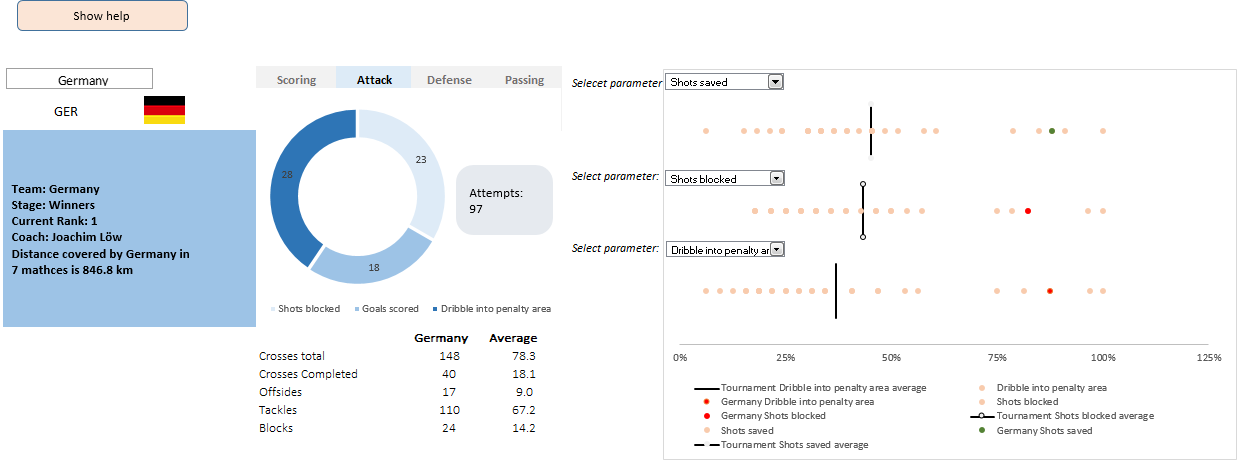
The wait for lifting the most valued priced in football for Germans was finally over. For a football fan, world cup is best time that is scheduled every four years and that if your favorite team lifting the trophy is like your crush is going on a date with you. 🙂
A sneak-peek at the final dashboard
Here is the final dashboard (it has more functionality than depicted). Click on it to enlarge.
Continue »
Ok people. Let me tell you that this post is almost not about Excel. It is about how one Excel blogger’s (yours truly) dream of long distance cycling came true. So sit back, grab your favorite drink and read between sips.
So what is this all about?
Last Sunday (27th July) & Monday (28th), I finished my first ever 200KM bicycle ride. I rode for a little more than 12 hours, burned 5,179 calories & rode 206 kilometers.
It is definitely one of the most memorable, tiresome & uplifting experiences in my life. So naturally, I want to share the story with you.
Continue »Calculating Maximum Change [solutions & discussion]
![Calculating Maximum Change [solutions & discussion]](https://img.chandoo.org/hw/maximum-change-problem-solutions-and-video.jpg)
Last Friday, we had a fun little Excel challenge – Calculate Maximum Change. More than 170 people commented and shared their solutions to this problem.
And the best part?
The best part is the variety of solutions & thinking displayed by our community. So if you are one of those 170, puff your chest & pat yourself on the back. Go ahead, I will wait.
Today, lets take a look at some of these awesome formulas and understand how they work. Read on and watch the video you below to gain few awesomeness pounds.
Continue »CP002: VTALKUP – 5 Excel lookup functions demystified + 4 Resources for you
Podcast: Play in new window | Download
Subscribe: Apple Podcasts | Spotify | RSS
In the second session of Chandoo.org Podcast, We will be learning how to use 5 Excel lookup functions.
What is in this session?
In this session, we tackle one of the most important areas of Excel. The lookup functions.
You will learn,
- Why lookup functions are necessary
- 5 Important lookup functions in Excel – VLOOKUP, HLOOKUP, LOOKUP, MATCH & INDEX
- When & how to use each of these 5 functions?
- Extreme scenarios:
- What happens when the value you are looking up is not there?
- What if too many items match the lookup value?
- What if you have too many conditions in the lookup criteria?
- Using IFERROR function
- Re-cap of the new powers you acquired
- 4 Resources for you to learn lookup functions better
Combine pie and xy scatter charts – World Polls chart revisited
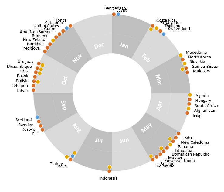
Few days ago, we learned how to create a pie+donut combination chart to visualize polls around the world in 2014. It generated quite a bit of interesting discussion (47 comments so far). One of the comments was from Roberto, who along with Kris & Gábor runs The FrankensTeam an online library of advanced Excel tricks, charts and other mind-boggling spreadsheet wizardry.
I really liked Roberto’s comments on the original post and a charting solution he presented. So I asked him if he can do a guest post explaining the technique to our audience. He obliged and here we go.
Over to FrankensTeam.
Continue »Find first non-blank item in a list with formulas

Blank cells are an invisible pain in the analysis. Dealing with them is frustrating, time consuming and often very complex. At chandoo.org, we are not big fans of blank cells. That is why we wrote:
- How to delete blank cells & rows?
- Dealing with blanks – case study
- Quickly filling blank cells in a table
- Extracting non-blank data from a list
Today, lets talk about one more scenario. Lets say you want to find out the first non-blank item in a list. How would you do it?
Continue »42% of the world goes to polls around a pie chart – Like it or hate it?
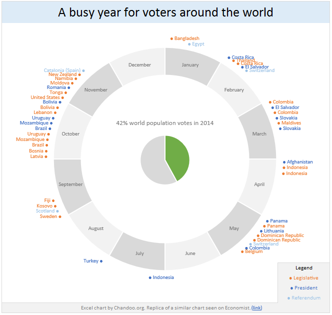
Today lets have a poll. Lets debate if this pie chart about world elections in 2014 is good or bad.
First lets take a look at the chart
This chart, published by The Economist talks about how 42% of the world population is going to vote this year. Take a look and read on to learn how you can re-create this in Excel.
Continue »Free 2014 Calendar, daily planner templates [download]
![Free 2014 Calendar, daily planner templates [download]](https://chandoo.org/wp/wp-content/uploads/2014/01/free-calendar-and-daily-planner-template-2014.png)
Here is a New year gift to all our readers – free 2014 Excel Calendar & daily planner Template.
This calender has,
- One page full calendar with notes, in 4 different color schemes
- Daily event planner & tracker
- 1 Mini calendar
- Monthly calendar (prints to 12 pages)
- Works for any year, just change year in Full tab.
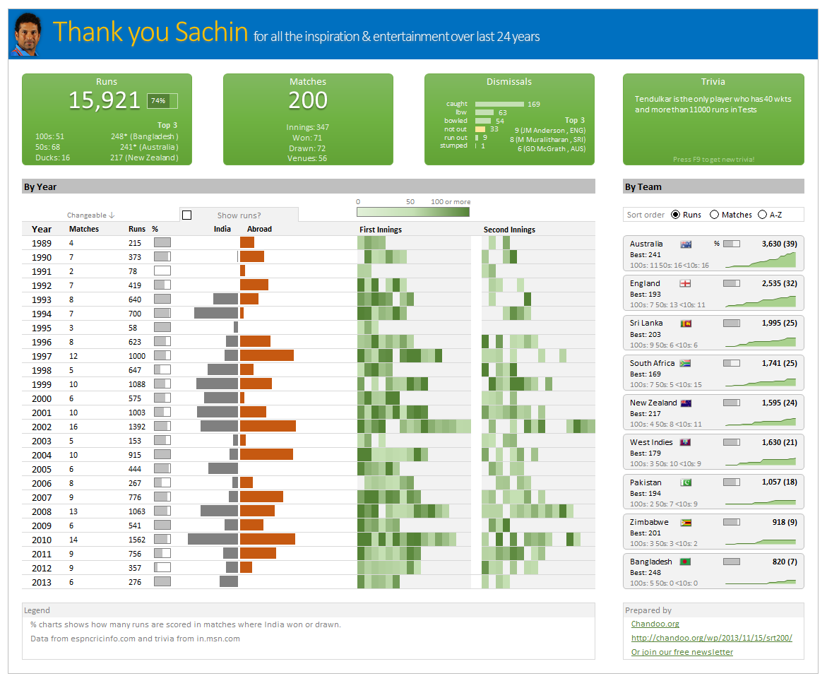
Thank you Sachin [a small tribute]
Lets talk about people who inspire us. People who show us that anything is possible. People who prove that commitment, hard work and perseverance are true ingredients of a genius.
I am talking about Sachin Tendulkar. Those of you who never heard his name, he is the most prolific cricketer in the world. He is the leading scorer in both tests (15,921 runs) and one day matches (18,426 runs). Read more about him here.
Tendulkar has been an inspiration for me (and millions of others around the world) since I was a kid. The amount of dedication & excellence he has shown constantly motivates me. It is a pity that the great man is retiring from test cricket. He is playing his last test match (200th, most by any person) as I am writing this.
So as a small tribute, I have decided do something for him. Of course, I have never been a cricketer in my life. Once in college I was reluctantly asked to be a stand-by player in a game with seniors. I did not get a chance to pad up though. That is the closest I have been to a cricketer. So I did what I do best. Create an Excel workbook celebrating Sachin’s test career.
Thank you Sachin – his test career in a dashboard
Here is a dashboard I made visualizing his test cricket statistics. It is dynamic, fun & awesome (just like Sachin).
(click on the image to enlarge)
Continue »Closing gaps in this Gender Equality Gap chart…
Today lets close some gaps.
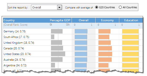
Recently I saw this interesting chart on Economist Daily Charts page. This chart is based on World Economic Forum’s survey on how women compare to men in terms of various development parameters. First take a look at the chart prepared by Economist team.
So what are the gaps in this chart?
This chart fails to communicate because,
- All country charts look same, thus making it difficult to spot any deviations.
- We cannot quickly compare one country with another on any particular indicator.
- It does not provide a better context (for eg. how did these countries perform last year?)
But criticizing someone’s work is not awesome. Fixing it and making an even better chart, that has awesome written all over it. So that is what we are going to do. You can see the improved chart above. Click on it to learn how you can create it.
Continue »7 reasons why you should use INDEX() formula in Excel

Today lets get cozy. Lets start a fling (a very long one). Lets do something that will make you smart, happy and relaxed.
Don’t get any naughty ideas. I am talking about INDEX() formula.
INDEX?!?
Of all the hundreds of formulas & thousands of features in Excel, INDEX() would rank somewhere in the top 5 for me. It is a versatile, powerful, simple & smart formula. Although it looks plain, it can make huge changes to the way you analyze data, calculate numbers and present them. It is so important that, whenever I teach (live or online), I usually dedicate 25% of teaching time to INDEX().
Enough build up. Lets get cozy with INDEX.
Continue »Last day for enrollments – Join our Power Pivot class & become awesome analyst
I have a quick announcement & a creative dashboard to share with you. First the announcement.
Only few hours left to join our Power Pivot course…
As you may know, I have opened enrollments for our 2nd batch of Power Pivot course few days ago. The aim of this course is to make you awesome in Excel, Advanced Excel, Dashboards, Power Pivot & Advanced Power Pivot.
We will be closing the doors of this program at midnight, today (11:59 PM, Pacific time, Friday, 16th of August).
If you want to join us, click here and enroll now.
Continue »
