Excel to the Next Level by Mastering Multiple Occurrences
This is a guest post by Sohail Anwar.
August 29, 1994. A day that changed my life forever. Football World Cup? Russia and China de-targeting nuclear weapons against each other? Anniversary of the Woodstock festival?
No, much bigger: Two Undertakers show up at WWE Summerslam for an epic battle. Needless to say: MIND() = BLOWN().
And thus begun one boy’s journey into understanding the phenomenon of Multiple Occurrences.
My journey continued, when just a few years later my grandfather handed me down a precious family heirloom: A few columns of meaningless data that I could take away and analyze in Excel. You may laugh but in the 90’s, every boy only wanted two things 1) Lists of pointless data and …
Download today – Introducing Excel Dashboard Templates from Chandoo.org
Friends and readers of Chandoo.org, my newest download, Excel Dashboard Templates are available for your consideration. Click here if you are ready to get them. Read on to know more.
What are Excel Dashboard Templates?
As the name suggests, these are ready to use Excel templates for creating awesome, informative, easy to understand & quick dashboards with your data. You just enter your data, set up few calculation options, decide how your dashboard should look & bingo, a beautiful & insightful dashboard will be created for you. These dashboards are optimized to look great, convey key information & prompt correct action.
Who should buy these templates?
Analysts, managers, reporting professionals, business owners & executives. These templates are designed to help anyone preparing Excel based dashboards, scorecards or KPI reports.
Benefits for you
- Design awesome dashboards in minutes, not months: Don’t waste hours trying to figure out formulas, chart settings and layouts. Instead focus on what your users want, how your business works and use those insights to tell the ‘Excel Dashboard Template’ what you want. Save time and look awesome.
- Accommodate change elegantly: People change. Businesses change. What your boss wanted last month is no longer what she wants today. So when someone asks you, “hmm, can you show me YTD data instead of last 13 months”, or “Can I see top 10 KPIs instead of all”, you just smile and tap a few clicks and bingo, the new dashboard will be ready. These templates are designed to handle change (data, requirements, design preferences and insights).
- Beautiful & Informative: These templates are designed with a delicate balance of beauty & insight. Everything is seamlessly designed, perfectly aligned and precisely calculated so that you & your boss can focus on the insights & decisions. Time tested and well honored visualization principles & guidelines are observed thru-out the reports.
- Built for starters, built for pros: Whether you are just starting with Excel or a seasoned pro, you can find the templates right up your alley. For advanced users, we have many customizations to whet your appetite. Want to build a custom calculation or include another type of sorting, you can do it by tinkering with ‘calculations’ sheet.
Ready to use Excel Dashboard Templates – Official Trailer
Hello folks,
Its almost ready. Our ready to use Excel dashboard templates are coming to a spreadsheet near you on November 13th.
Here is a teaser preview of the dashboards. Our own official trailer, rated A for awesome.
Watch it below:
http://youtu.be/2-TvjpEKf-o
(see it on our YouTube Channel, alternative link)
Excel Dashboard Templates – What are they?
As the name suggests, these a set of workbooks where you can key in your data, set up how you want the looks & bam, a beautiful, insightful, fun, easy to use dashboard pops right out. All in few minutes.
Here is how these templates can help you:
- Design awesome dashboards in minutes, not months: Don’t waste hours trying to figure out formulas, chart settings and layouts. Instead focus on what your users want, how your business works and use those insights to tell the ‘Excel Dashboard Template’ what you want. Save time and look awesome.
- Accommodate change elegantly: People change. Businesses change. What your boss wanted last month is no longer what she wants today. So when someone asks you, “hmm, can you show me YTD data instead of last 13 months”, or “Can I see top 10 KPIs instead of all”, you just smile and tap a few clicks and bingo, the new dashboard will be ready. These templates are designed to handle change (data, requirements, design preferences and insights).
- Customize everything: Unlike a template set in stone, these are designed to let you customize almost every little aspect of the output, calculations and behavior.
- Beautiful & Informative: These templates are designed with a delicate balance of beauty & insight. Everything is seamlessly designed, perfectly aligned and precisely calculated so that you & your boss can focus on the insights & decisions. Time tested and well honored visualization principles & guidelines are observed thru-out the reports.
- Built for starters, built for pros: Whether you are just starting with Excel or a seasoned pro, you can find the templates right up your alley. For advanced users, we have many customizations to whet your appetite. Want to build a custom calculation or include another type of sorting, you can do it by tinkering with ‘calculations’ sheet.
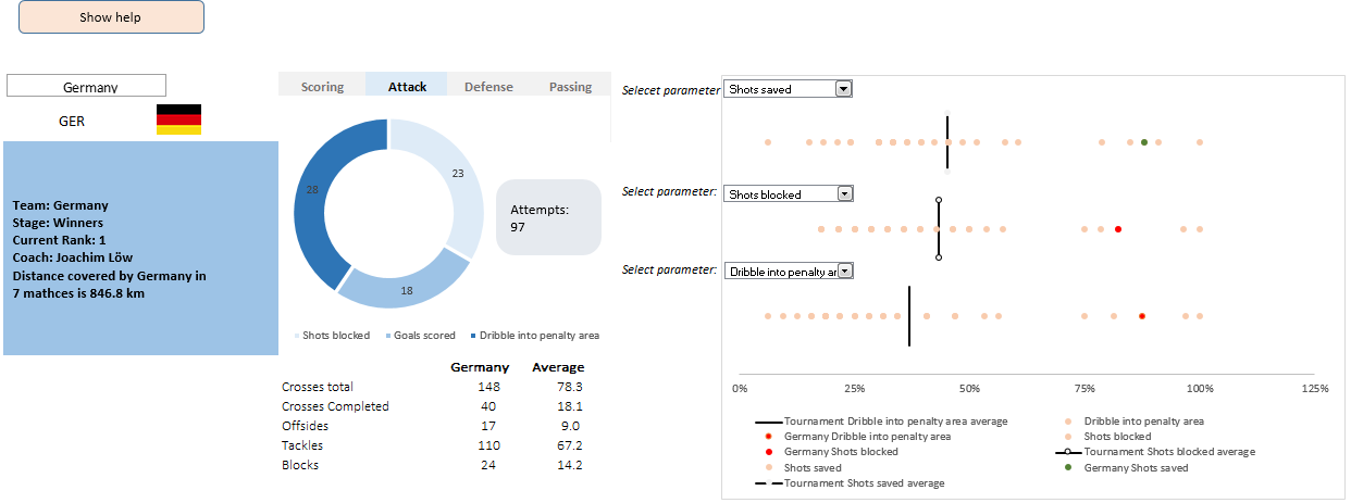
A dashboard to visualize this FIFA worldcup [guest post]
This is a guest post by Krishna, a football lover & one of our readers.
The wait for lifting the most valued priced in football for Germans was finally over. For a football fan, world cup is best time that is scheduled every four years and that if your favorite team lifting the trophy is like your crush is going on a date with you. 🙂
A sneak-peek at the final dashboard
Here is the final dashboard (it has more functionality than depicted). Click on it to enlarge.
Story of my first ever 200KM bike ride (plus an Excel dashboard with ride stats)

Ok people. Let me tell you that this post is almost not about Excel. It is about how one Excel blogger’s (yours truly) dream of long distance cycling came true. So sit back, grab your favorite drink and read between sips.
So what is this all about?
Last Sunday (27th July) & Monday (28th), I finished my first ever 200KM bicycle ride. I rode for a little more than 12 hours, burned 5,179 calories & rode 206 kilometers.
It is definitely one of the most memorable, tiresome & uplifting experiences in my life. So naturally, I want to share the story with you.
CP014: How to create awesome dashboards – 10 step process for you
Podcast: Play in new window | Download
Subscribe: Apple Podcasts | Spotify | RSS
In the 14th session of Chandoo.org podcast, lets figure out how to make awesome dashboards.
What is in this session?
Excel based dashboards are much in demand these days, thanks to advancements in Excel & growing pressure on costs. Now a days, analysts & managers are expected to quickly put together a dashboard using Excel. But how do you make a dashboard? What process you should follow? These are the questions we address in this podcast.
In this podcast, you will learn,
- Announcements about upcoming dashboard classes
- Ten step process for creating awesome dashboards
- 1. Talk to your end users
- 2. Make a sketch of the dashboard
- 3. Validate your understanding
- 4. Collect data
- 5. Structure the data
- …
Come join me at Excelapalooza conference in Dallas or Masterclass at Houston this September

If you listen carefully, you can hear my screams of joy. I have 2 very happy news to share with you.
- I am speaking at Excelapalooza Excel conference, happening at Dallas (Texas) between September 21 to 24.
- I will be conducting an Advanced Excel, Dashboards & Power Pivot masterclass at Houston (Texas) between September 15 to 18.