Winners of state migration dashboard contest
Finally the wait is over. Here are the winners of our 2014 dashboard contest. Check them out.
Top 10 things we struggle to do in Excel & awesome remedies for them
Recently we asked you, what do you struggle doing in Excel? 170 people responded to this survey and shared their struggles. In this post, lets examine the top 10 struggles according to you and awesome remedies for them.
Excel Dashboards – 49 dashboards to visualize US State to State migration trends
Hello everyone. Stop reading further and go fetch your helmet. Because what lies ahead is mind-blowingly awesome.
About a month and half ago, we held our annual dashboard contest. This time the theme is to visualize state to state migration in USA. You can find the contest data-set & details here.
We received 49 outstanding entries for this. Most of the entries are truly inspiring. They are loaded with powerful analysis, stunning visualizations, amazing display of Excel skill and design finesse. It took me almost 2 weeks to process the results and present them here.
![]()
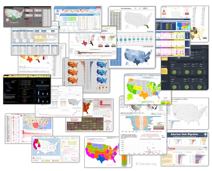
Click on the image to see the entries.
Excel Links – Delay in State migration visualization results edition
Hello friends,
First a quick update about state migration visualization contest.
We got more than 50 wonderful entries for this contest. I have compiled 50% of the entries. Due to personal reasons (its annual vacation time at our household), I had to delay the rest and resume it after first week of June. So the results will be announced in 2nd week of June. Thanks for understanding and your patience. Watch this space for mind-boggling dashboards in 3 more weeks.
Click “Read more” to get a sneak-peek at 3 random entries & 4 useful Excel links.
CP006: How to be a better analyst? – Road map for getting better at Data Analysis & Improving your career prospects
Podcast: Play in new window | Download
Subscribe: Apple Podcasts | Spotify | RSS
In the 6th session of Chandoo.org podcast, we focus on making you a better analyst and propose a road map for getting better at data analysis & improving your career prospects.
In this podcast you will learn,
- Why become a better analyst?
- The road map for becoming a better analyst – BETTER framework
- B for Business Knowledge
- E for Examining user needs
- T for Thinking about analysis
- T for Tools of Trade ie Excel
- E for Expression
- R for Refining yourself
- Conclusions
Visualize state to state migration data and you could win an iPad or Galaxy Tab [Datavis Contest 2014]
Time for another dashboard contest. Sit straight, set aside your appointments and get number-crunching.
Analyze state to state migration data between 2012 & 2010 and present your results in a dashboard (or charts) and you could walk away with glory, fame & and an iPad.
If all of this sounds tempting, read on.
The contest
- Download dataset for the contest [mirror]
- Analyze the data and create a dashboard or set of charts (see rules below)
- Submit your workbook by 20th of April (Sunday), 2014.
- If readers at chandoo.org and our panel of judges love your work, you get one of the cool prizes.
CP003: Business Intelligence for Masses – Interview with Mike Alexander
Podcast: Play in new window | Download
Subscribe: Apple Podcasts | Spotify | RSS
In the third session of Chandoo.org podcast, we are going to get BI curious. 😉
Not that kind you silly, We are talking about Business Intelligence, Big Data, Power Pivot & other Power BI family members. In this session, I am happy to feature Mike Alexander – Microsoft MVP, Author, Blogger & a good friend. Mike talks about how Excel is shaping the BI (Business Intelligence) revolution with advent of Power BI functionality.
You will learn,
- Introduction, what Mike is up to these days?
- What is BI, what does it mean to an average Excel analyst?
- What BI capabilities Excel has – brief intro to each of them
- Power Pivot & what it does
- Power Query & why it is important
- Power View & how it works (and where it sucks)
- Power Maps
- How to learn about these new technologies
- Recommended Books
- Websites
- Courses
- Live classes
- Special gift for our listeners