All articles with 'dashboards' Tag
Hello folks,
Its almost ready. Our ready to use Excel dashboard templates are coming to a spreadsheet near you on November 13th.
Here is a teaser preview of the dashboards. Our own official trailer, rated A for awesome.
Watch it below:
http://youtu.be/2-TvjpEKf-o
(see it on our YouTube Channel, alternative link)
Excel Dashboard Templates – What are they?
As the name suggests, these a set of workbooks where you can key in your data, set up how you want the looks & bam, a beautiful, insightful, fun, easy to use dashboard pops right out. All in few minutes.
Here is how these templates can help you:
- Design awesome dashboards in minutes, not months: Don’t waste hours trying to figure out formulas, chart settings and layouts. Instead focus on what your users want, how your business works and use those insights to tell the ‘Excel Dashboard Template’ what you want. Save time and look awesome.
- Accommodate change elegantly: People change. Businesses change. What your boss wanted last month is no longer what she wants today. So when someone asks you, “hmm, can you show me YTD data instead of last 13 months”, or “Can I see top 10 KPIs instead of all”, you just smile and tap a few clicks and bingo, the new dashboard will be ready. These templates are designed to handle change (data, requirements, design preferences and insights).
- Customize everything: Unlike a template set in stone, these are designed to let you customize almost every little aspect of the output, calculations and behavior.
- Beautiful & Informative: These templates are designed with a delicate balance of beauty & insight. Everything is seamlessly designed, perfectly aligned and precisely calculated so that you & your boss can focus on the insights & decisions. Time tested and well honored visualization principles & guidelines are observed thru-out the reports.
- Built for starters, built for pros: Whether you are just starting with Excel or a seasoned pro, you can find the templates right up your alley. For advanced users, we have many customizations to whet your appetite. Want to build a custom calculation or include another type of sorting, you can do it by tinkering with ‘calculations’ sheet.
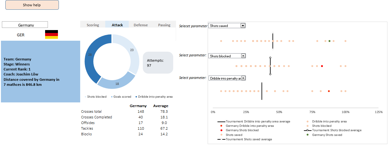
This is a guest post by Krishna, a football lover & one of our readers.
The wait for lifting the most valued priced in football for Germans was finally over. For a football fan, world cup is best time that is scheduled every four years and that if your favorite team lifting the trophy is like your crush is going on a date with you. 🙂
A sneak-peek at the final dashboard
Here is the final dashboard (it has more functionality than depicted). Click on it to enlarge.

Ok people. Let me tell you that this post is almost not about Excel. It is about how one Excel blogger’s (yours truly) dream of long distance cycling came true. So sit back, grab your favorite drink and read between sips.
So what is this all about?
Last Sunday (27th July) & Monday (28th), I finished my first ever 200KM bicycle ride. I rode for a little more than 12 hours, burned 5,179 calories & rode 206 kilometers.
It is definitely one of the most memorable, tiresome & uplifting experiences in my life. So naturally, I want to share the story with you.
Continue »{ 7 Comments }
CP014: How to create awesome dashboards – 10 step process for you
Published on Jul 10, 2014 in Chandoo.org Podcast Sessions, Charts and Graphs
Podcast: Play in new window | Download
Subscribe: Apple Podcasts | Spotify | RSS
In the 14th session of Chandoo.org podcast, lets figure out how to make awesome dashboards.
What is in this session?
Excel based dashboards are much in demand these days, thanks to advancements in Excel & growing pressure on costs. Now a days, analysts & managers are expected to quickly put together a dashboard using Excel. But how do you make a dashboard? What process you should follow? These are the questions we address in this podcast.
In this podcast, you will learn,
- Announcements about upcoming dashboard classes
- Ten step process for creating awesome dashboards
- 1. Talk to your end users
- 2. Make a sketch of the dashboard
- 3. Validate your understanding
- 4. Collect data
- 5. Structure the data
- …
{ 2 Comments }
Come join me at Excelapalooza conference in Dallas or Masterclass at Houston this September
Published on Jul 9, 2014 in Excel Workshops, Training Programs

If you listen carefully, you can hear my screams of joy. I have 2 very happy news to share with you.
- I am speaking at Excelapalooza Excel conference, happening at Dallas (Texas) between September 21 to 24.
- I will be conducting an Advanced Excel, Dashboards & Power Pivot masterclass at Houston (Texas) between September 15 to 18.
{ 29 Comments }
Winners of state migration dashboard contest
Published on Jul 7, 2014 in Charts and Graphs, Excel Challenges
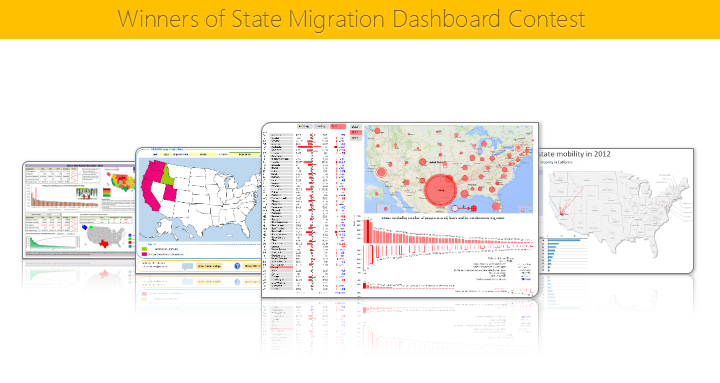
Finally the wait is over. Here are the winners of our 2014 dashboard contest. Check them out.
Continue »{ 9 Comments }
Top 10 things we struggle to do in Excel & awesome remedies for them
Published on Jun 18, 2014 in Charts and Graphs, Learn Excel, Pivot Tables & Charts, Power Pivot, VBA Macros
Recently we asked you, what do you struggle doing in Excel? 170 people responded to this survey and shared their struggles. In this post, lets examine the top 10 struggles according to you and awesome remedies for them.
Continue »Hello everyone. Stop reading further and go fetch your helmet. Because what lies ahead is mind-blowingly awesome.
About a month and half ago, we held our annual dashboard contest. This time the theme is to visualize state to state migration in USA. You can find the contest data-set & details here.
We received 49 outstanding entries for this. Most of the entries are truly inspiring. They are loaded with powerful analysis, stunning visualizations, amazing display of Excel skill and design finesse. It took me almost 2 weeks to process the results and present them here.
![]()
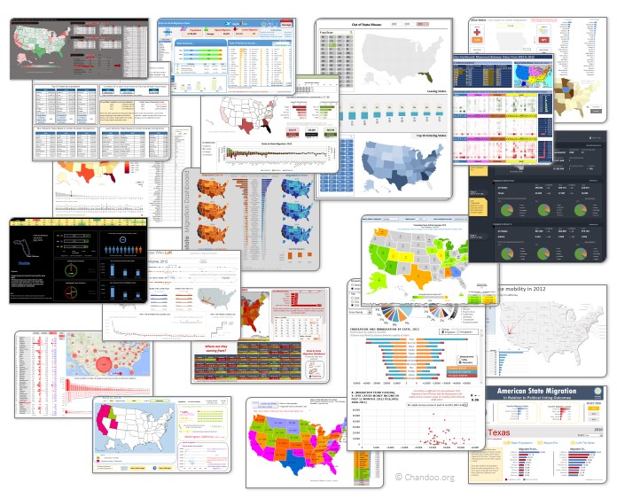
Click on the image to see the entries.
Continue »{ 16 Comments }
Excel Links – Delay in State migration visualization results edition
Published on May 20, 2014 in excel links
Hello friends,
First a quick update about state migration visualization contest.
We got more than 50 wonderful entries for this contest. I have compiled 50% of the entries. Due to personal reasons (its annual vacation time at our household), I had to delay the rest and resume it after first week of June. So the results will be announced in 2nd week of June. Thanks for understanding and your patience. Watch this space for mind-boggling dashboards in 3 more weeks.
Click “Read more” to get a sneak-peek at 3 random entries & 4 useful Excel links.
Continue »{ 12 Comments }
CP006: How to be a better analyst? – Road map for getting better at Data Analysis & Improving your career prospects
Published on Apr 24, 2014 in Chandoo.org Podcast Sessions

Podcast: Play in new window | Download
Subscribe: Apple Podcasts | Spotify | RSS
In the 6th session of Chandoo.org podcast, we focus on making you a better analyst and propose a road map for getting better at data analysis & improving your career prospects.
In this podcast you will learn,
- Why become a better analyst?
- The road map for becoming a better analyst – BETTER framework
- B for Business Knowledge
- E for Examining user needs
- T for Thinking about analysis
- T for Tools of Trade ie Excel
- E for Expression
- R for Refining yourself
- Conclusions
{ 43 Comments }
Visualize state to state migration data and you could win an iPad or Galaxy Tab [Datavis Contest 2014]
Published on Apr 9, 2014 in Excel Challenges
![Visualize state to state migration data and you could win an iPad or Galaxy Tab [Datavis Contest 2014]](https://chandoo.org/wp/wp-content/uploads/2014/04/chandoo-datavis-contest-2014-prizes.jpg)
Time for another dashboard contest. Sit straight, set aside your appointments and get number-crunching.
Analyze state to state migration data between 2012 & 2010 and present your results in a dashboard (or charts) and you could walk away with glory, fame & and an iPad.
If all of this sounds tempting, read on.
The contest
- Download dataset for the contest [mirror]
- Analyze the data and create a dashboard or set of charts (see rules below)
- Submit your workbook by 20th of April (Sunday), 2014.
- If readers at chandoo.org and our panel of judges love your work, you get one of the cool prizes.
{ 86 Comments }
CP003: Business Intelligence for Masses – Interview with Mike Alexander
Published on Mar 27, 2014 in Chandoo.org Podcast Sessions

Podcast: Play in new window | Download
Subscribe: Apple Podcasts | Spotify | RSS
In the third session of Chandoo.org podcast, we are going to get BI curious. 😉
Not that kind you silly, We are talking about Business Intelligence, Big Data, Power Pivot & other Power BI family members. In this session, I am happy to feature Mike Alexander – Microsoft MVP, Author, Blogger & a good friend. Mike talks about how Excel is shaping the BI (Business Intelligence) revolution with advent of Power BI functionality.
You will learn,
- Introduction, what Mike is up to these days?
- What is BI, what does it mean to an average Excel analyst?
- What BI capabilities Excel has – brief intro to each of them
- Power Pivot & what it does
- Power Query & why it is important
- Power View & how it works (and where it sucks)
- Power Maps
- How to learn about these new technologies
- Recommended Books
- Websites
- Courses
- Live classes
- Special gift for our listeners
{ 11 Comments }
Learn how to create these 11 amazing dashboards
Published on Feb 14, 2014 in Charts and Graphs, Cool Infographics & Data Visualizations, Power Pivot
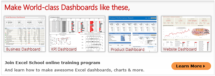
Today lets talk about how to build world-class dashboards.
What is a dashboard?
Dashboard reports allow managers to get high-level overview of the business and help them make quick decisions. A dashboard is usually a one page report that contains critical information for decision support.
How to make dashboards?
Excel is an excellent tool to make powerful dashboards that can provide analysis, insight and alert managers in timely manner. But creating a dashboard takes a lot of skill & practice. That is where a resource like Chandoo.org comes handy. In this site you can find more than 200 different dashboard examples, tutorials, samples and downloads – all designed to make you awesome.
Read on to learn more…
Continue »{ 76 Comments }
What is your favorite Excel book? [open thread]
Published on Feb 7, 2014 in Learn Excel
![What is your favorite Excel book? [open thread]](https://chandoo.org/wp/wp-content/uploads/2014/02/what-is-your-favorite-excel-book.png)
Today lets talk about Excel books. The question is simple.
What is your favorite Excel book? Please share your answers using comments.
My favorite books are..,
Continue »{ 19 Comments }
Top 10 things I learned using Excel for a decade
Published on Jan 6, 2014 in Charts and Graphs, Learn Excel

Sometime during the 2nd half of 2013, I finished 10 years of Excel usage. In the last 10 years, I completed my studies, got my first job, married, had kids, visited 15 different countries, quit my job to start a business, bought first car, first house, made dozens of new friends, read 100s of books, wrote a book and learned 1000s of new things. And all along, Excel stayed a true companion. Right from MBA entrance exam preparation in 2003 to making my summer internship project reports in 2005 to planning my wedding expenses in 2007 to getting a promotion in 2009 to planning my kids feeding schedule in 2010 to running a successful business in 2014, Excel helped me in every step.
So today, I want to tell you the top 10 things I learned using Excel in last decade. Grab a hot cup of coffee, buckle your belts and get ready for time travel.
Continue »
