All articles with 'charts of the week' Tag
{ 3 Comments }
Featured Visualizations – Jan 02
Published on Jan 2, 2009 in Cool Infographics & Data Visualizations
Every week Pointy Haired Dilbert celebrates visualization and info-graphics by showcasing some of the creative and fun charting work from around the web. Have inspiration and fun. Browse hundreds of fun visualization and graphics projects in archives.
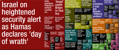
Newsmap is a creative and fun way to look at news. They organize news items on a tree map based on recency and relevancy of the news items (that are probably pulled from Google news). The background color indicates the news topic (red for world, purple for business, green for tech etc.)
Continue »{ 1 Comment }
5 visualizations to inspire you [Nov 21]
Published on Nov 21, 2008 in Cool Infographics & Data Visualizations
![5 visualizations to inspire you [Nov 21]](https://chandoo.org/wp/wp-content/uploads/2008/11/oh-shiiit-how-many-searches.jpg)
The best 3d pie chart ever We all know that 3D pies are not a very good way to express your story. I guess this one is an exception we all are happy to make [via PTS Blog] How to solve problems – Interactive visualization This interactive visualization shows how to solve problems in a […]
Continue »{ 1 Comment }
5 Visualizations for your Inspiration [Nov 07]
Published on Nov 8, 2008 in Cool Infographics & Data Visualizations
![5 Visualizations for your Inspiration [Nov 07]](https://chandoo.org/wp/wp-content/uploads/2008/11/donations-to-obama-president-thumb.jpg)
Every week Pointy Haired Dilbert features 5 beautiful & creative info-graphic visualizations for your inspiration. I like building, reading and sharing charts and info-graphics and it is a pleasure sharing these with you all. Happy weekend 🙂 Who donated to Obama and how much? This beautiful arc chart shows how much people have donated to […]
Continue »{ 5 Comments }
5 Beautiful Visualizations [Oct 24]
Published on Oct 25, 2008 in Cool Infographics & Data Visualizations
![5 Beautiful Visualizations [Oct 24]](https://chandoo.org/wp/wp-content/uploads/2008/10/awesome-graphs-of-the-week.jpg)
Every week, Pointy Haired Dilbert celebrates the art of chart making by sharing 4-5 of the most beautiful visualizations floated around the web in the last few days. Take a look at them and have some inspiration and fun 😀 Map of most popular social networks in each country This is a simple world map, […]
Continue »{ 2 Comments }
5 Superb Visualizations of the Week [Oct 17]
Published on Oct 17, 2008 in Cool Infographics & Data Visualizations
![5 Superb Visualizations of the Week [Oct 17]](https://chandoo.org/wp/wp-content/uploads/2008/10/argentina-population-and-wages-bread-chart.jpg)
Animals in the Zoo – Creative Bar Chart This creative bar chart shows the distribution of various zoo inhabitants. The yellow strip is for birds, green bar is for amphibians, orange strip is for mammals and finally the curly green bar in the end is for, you guessed it right, reptiles. Also shown in the […]
Continue »{ 1 Comment }
Visualizations of the Week [Oct 10]
Published on Oct 10, 2008 in Charts and Graphs, Cool Infographics & Data Visualizations
![Visualizations of the Week [Oct 10]](https://chandoo.org/wp/wp-content/uploads/2008/10/rocking-news-paper-visualization.jpg)
Every Friday PHD celebrates the art of chart making by showcasing some of the best visualizations around the web. See some of the awesome visualizations featured earlier. World Map Cartogram – Country Area by Population How would the world look like if each country had area proportionate to its population? The above seen cartogram is […]
Continue »{ 4 Comments }
Info-graphics of the week [Oct 3]
Published on Oct 3, 2008 in Cool Infographics & Data Visualizations
Every week Pointy Haired Dilbert celebrates the art of visualization by featuring 5 of the coolest and most awesome visualizations floated around the web. Click here to browse the full archives of featured cool infographics. US Electoral College Vote Prediction Tracker – Cool Interactive Visualization With each media house providing its own predictions on the […]
Continue »{ 1 Comment }
Charts of the Week [Sep 19]
Published on Sep 19, 2008 in Cool Infographics & Data Visualizations
![Charts of the Week [Sep 19]](https://chandoo.org/wp/wp-content/uploads/2008/09/your-life-in-bubbles.jpg)
Thankfully power is back in Ohio, almost 2 days ago to my house. There is another personal update: We are moving to Seattle. My consulting work in Columbus was over 2 weeks back and since then I have been waiting for the next assignment. Finally this week it became clear that we have to move […]
Continue »{ 4 Comments }
Infographics of the week [Sep 12]
Published on Sep 12, 2008 in Cool Infographics & Data Visualizations
![Infographics of the week [Sep 12]](https://chandoo.org/wp/wp-content/uploads/2008/09/best-pie-charts-car-logos.jpg)
Donations made to Presidential Candidates – US Elections 2008 What would you get when you take 1.4 million rows of presidential election donations made to Obama’s and McCain’s campaigns? One possibility is the above visualization. The folks at Pitch Interactive created the above visualization. The half pies in the middle represent the overall donations made […]
Continue »![5 wonderful visualizations you must see [Aug 22]](https://chandoo.org/wp/wp-content/uploads/2008/08/5-awesome-charts-thumb-aug22.jpg)
Every week Pointy Haired Dilbert celebrates the art of chart making by sharing 5 of the most beautiful, innovative and effective infographic ideas from various sites. Click here to see the visualizations featured earlier. Pop, Soda or Coke? – Countywise terms used for sweetened carbonated water The pop-vs-soda map tells how marketers have been effective […]
Continue »{ 3 Comments }
Charts of the Week [Aug 15]
Published on Aug 15, 2008 in Charts and Graphs, Cool Infographics & Data Visualizations
Every week, this blog features 5 of the best visualizations from the last week around the web. Average gas prices in US regions from 1993 plotted in dynamic bar Flowing data takes a look at the historical gasoline price data and provides us this eye candy. My friend Jon takes a look at this and […]
Continue »Time for another round of cool charting / info-graphic ideas around the web. Most Popular Baby Names – all the way from 1880 Nametrends is a cool website totally dedicated to analyzing and showing baby name trends. They have pretty interesting stuff like, how baby names ending with -lie (charlie, willie, ellie etc.) fared from […]
Continue »Starting this week I will post cool infographics from around the web, 4-5 of them a week to inspire , to give more ideas on presenting information and to provide some eye candy for awesome readers @ Pointy Haired Dilbert. Go ahead, click through these awesome graphics: California Walkability Score Heat Map Lee Byron took […]
Continue »
