Featured Visualizations – Jan 02
Cool Infographics & Data Visualizations - 3 comments
Every week Pointy Haired Dilbert celebrates visualization and info-graphics by showcasing some of the creative and fun charting work from around the web. Have inspiration and fun. Browse hundreds of fun visualization and graphics projects in archives.
New way to browse news as tree map

Newsmap is a creative and fun way to look at news. They organize news items on a tree map based on recency and relevancy of the news items (that are probably pulled from Google news). The background color indicates the news topic (red for world, purple for business, green for tech etc.)
Beautiful Time line of Apple Mac in the last 25 years
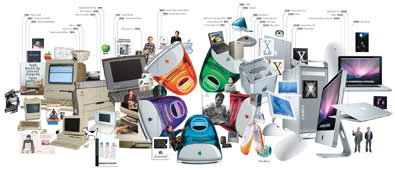
Wired Magazine celebrates 25 years of Mac by making this beautiful timeline piling all the Macs and other gorgeous gadgets Apple made over the last quarter century and loosely arranging them in a time line fashion. You can clearly see how they have migrated from dirtyish beige color to supercool white and blacks over the last few decades. [via Cool Infographics]
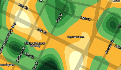
Heat maps are a popular way to explore geographical data. Oakland Crime maps article (linked above) provides insights in to creating heatmaps using geographical data.
US Elections – Understanding the Swing Vote
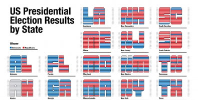
Remember Robert Kosera’s charts to understand Swing States and how they voted over the last several elections ? Well, Pedro took the same data and presented it in a different way, pretty innovative I must say. [via Simple Complexity]

We spend lots of time to create charts and graphs to make sure they don’t look like accidents. But there is whole another class of maps that are created by accident. You can see a map of Australia in the above puddle. Follow the link for more eye candy at Strange Maps
Happy weekend 🙂

Hello Awesome...
My name is Chandoo. Thanks for dropping by. My mission is to make you awesome in Excel & your work. I live in Wellington, New Zealand. When I am not F9ing my formulas, I cycle, cook or play lego with my kids. Know more about me.
I hope you enjoyed this article. Visit Excel for Beginner or Advanced Excel pages to learn more or join my online video class to master Excel.
Thank you and see you around.
Related articles:
|
Leave a Reply
| « Great News: Chandoo becomes MVP | Excel Basics – What are Combination Charts and How to Make One? » |
 At Chandoo.org, I have one goal, "to make you awesome in Excel & Power BI". I started this website in 2007 and today it has 1,000+ articles and tutorials on data analysis, visualization, reporting and automation using Excel and Power BI.

3 Responses to “Featured Visualizations – Jan 02”
i guess i posted my query in some older topic of yours......now i am posting again in your latest topic.......hope to get reply this time:
ok so i have rather lenghty PDF names in one column and want to extract text from right till the last \ appearing. there can be varied length and can be any no. of \ available.
i am trying with following formulae:
=LEFT(RIGHT(SUBSTITUTE(TRIM(B2)&"","\",REPT(" ",40)),40),40)
it workes well for smaller names but when it goes beyond 80 or 100 char it fails...............
plz help
@Azmat, your query is already answered here: http://chandoo.org/wp/2008/10/29/box-plots-excel-dashboards-tutorial/
It might help you to subscribe for e-mail alerts for your comments. That way you would know when the query is answered by someone 🙂
Thanks Chandoo..........now things are much clear to me......................