Excel Charts, Graphs and Templates
Tutorials, Examples and explanations on Excel charting. You can learn how to create almost any chart type in this section. Also learn how to create effective charts, make them interactive and add automation thru VBA
Learn Top 10 Excel Features |
|

|
Last week, we had a lovely poll on what are your favorite features of Excel? More than 120 people responded to it with various answers. So I did what any data analyst worth his salt would do, I analyzed the data and here are the top 10 features in Excel according to you. Read on to learn more. |
Some charts try to make you an April fool all the time (or why 3d pie charts are evil) |
|
|
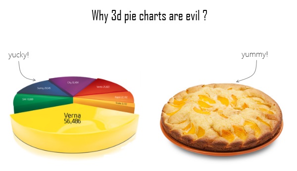
Recently I saw a big screaming ad that said “the chartbuster rules”. Of course, I know that chartbusters rule. Not just because I was one of them 🙂 So I got curious and read on. And I realized the ‘chartbuster’ is actually a car, not some cool, spreadsheet waving, goatee sporting dude like Jon Peltier. What a bummer! And then to my horror of horrors, I saw the exploding 3d pie chart, with reflection effects & glossy colors. And the sole purpose of the chart is to create an impression that Verna sells better than any car in India. Today, lets talk about this chart and alternatives for it. Read on. |
How to create interactive calendar to highlight events & appointments [Tutorial] |
|
![How to create interactive calendar to highlight events & appointments [Tutorial]](https://img.chandoo.org/vba/interactive-event-calendar-in-excel.png)
|
One of the popular uses of Excel is to maintain a list of events, appointments or other calendar related stuff. While Excel shines easily when you want to log this data, it has no quick way to visualize this information. But we can use little creativity, conditional formatting, few formulas & 3 lines of VBA code to create a slick, interactive calendar in Excel. Today, lets understand how to do this. |
10 things that wowed me in Excel 2013 |
|

|
As you may new, the newest version of Excel is out for a while. I have been using it since last 6 months and enjoying it. Today, lets understand 10 things in 2013 that wowed me (and probably you too). |
There is an Easter egg in this chart! |
|
|
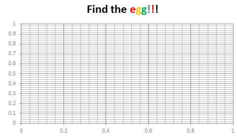
Do not worry, you are not time traveling or seeing things. Its just that, this year I have decided to publish our Easter Egg a few days early. And oh, I have 3 reasons for it:
Hence the Easter Egg is advanced a few days. But it is just as fun (or may be better) as previous Easter eggs. |
Use Advances vs. Declines chart to understand change in values |
|
|
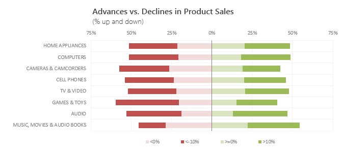
Lets say you are responsible for sales of 100s of products (which belong to handful of categories). You are looking at sales of each product in last month & this month. And you want to understand whether sales are improving or declining by category. How would you do it? Turns out, this is not a difficult problem. In fact, this question is asked every day & answered using Advances vs. Declines chart. You may have seen this chart in financial newspapers or websites. Shown above, Advances vs. Declines chart tells us how many items have advanced & how many have declined. Read on to learn how to create this chart using Excel. |
Shading above or below a line in Excel charts [tutorial] |
|
![Shading above or below a line in Excel charts [tutorial]](https://img.chandoo.org/c/shaded-line-charts-tell-a-better-story.png)
|
When comparing 2 sets of data, one question we always ask is,
A classic example of this is, lets say you are comparing productivity figures of your company with industry averages. Merely seeing both your series as lines (or columns etc.) is not going to tell you the full story. But if we can shade our productivity line in red or green when it is under or above industry average… now that would be awesome! Something like above. |
Designing a dashboard to track Employee vacations [case study] |
|
![Designing a dashboard to track Employee vacations [case study]](https://cache.chandoo.org/images/c/excel-charting-example-v1.png)
|
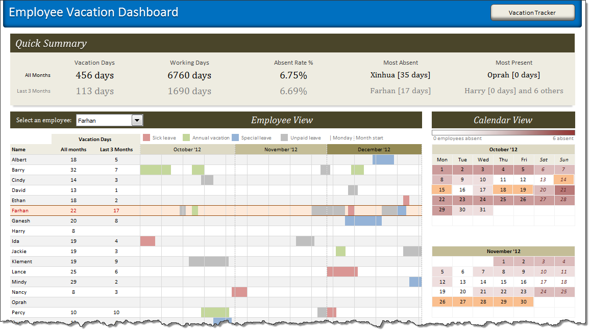
HR managers & department heads always ask, “So what is the vacation pattern of our employees? What is our average absent rate?” Today lets tackle that question and learn how to create a dashboard to monitor employee vacations. What do HR Managers need? (end user needs) There are 2 aspects tracking vacations. 1. Data entry for vacations taken by employees |
Monitoring Monthly Service Levels using Excel Charts [Example] |
|
![Monitoring Monthly Service Levels using Excel Charts [Example]](https://img.chandoo.org/c/service-levels-7-years-excel-chart.png)
|
Recently, I wrote a tutorial on tax burden in USA chart. Jared, One of our readers liked this chart very much. Jared works as a workforce scheduler and has data similar to our chart. So he applied the same technique to analyze monthly service levels for last 7 years & sent me the file so that I can share it with all of you. First take a look at the demo of Jared’s chart. And read on to know how this works. |
Highlight best week & month in a trend chart [tutorials] |
|
![Highlight best week & month in a trend chart [tutorials]](https://img.chandoo.org/c/highlight-best-week-month-in-trend-charts-excel-howtos.png)
|
When analyzing business data like sales, shop visits or productivity, one of the questions managers always ask is, What is the best month / week for this data? To answer this question, we need to make a chart that looks like above. Today, lets learn how to highlight portions of such charts that correspond to best week or best month. |
How the tax burden has changed over the years – Excellent chart by NYTimes & Redoing it in Excel |
|
|
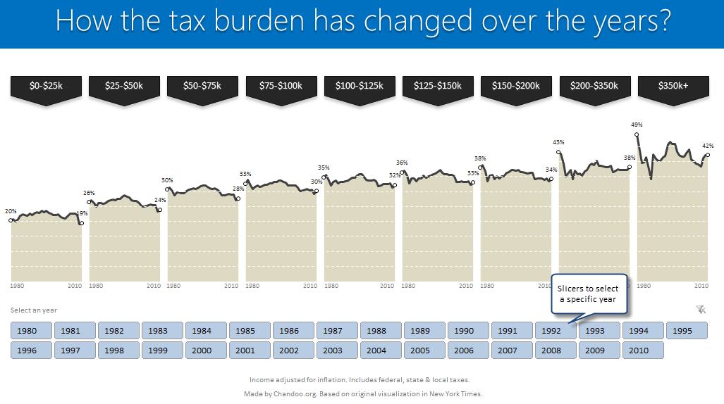
If I need some charting inspiration, I always visit New York Times. Their interactive visualizations are some of the best you can find anywhere. Clear, beautifully crafted and powerful. Long time readers of Chandoo.org knew that I like to learn from visualizations in NY Times & redo them using Excel. Today let me present you one such chart. This is based on an interactive visualization prepared by NY Times explaining how the tax burden has changed over years for various income groups. Take a look at tax burden chart – Excel implementation Read on to learn how to create this chart using Excel. |
Happy Diwali [Animated Chart inside] |
|
![Happy Diwali [Animated Chart inside]](https://img.chandoo.org/c/animated-diwali-chart-in-excel.png)
|
My heartiest Diwali wishes to all our readers. The spirit of Diwali is to encourage people to spread joy, celebrate good things and throw away darkness (evil). These ideas are universal. So let me wish you a very happy Diwali. Diwali, festival of lights, is celebrated in the month of October / November. It is one of my favorite festivals since childhood. A time when all family members get together, celebrate all the good in their life, laugh and light a few fire crackers (fire works). This year, our kids (Nishanth & Nakshatra) too are excited about the festival. They are eager to light diyas (small lamps), watch the fire works and enjoy. Naturally I do not feel like opening Excel. But then…, Sometime during my morning coffee, I thought “hey, why not create a small Diwali greeting using Excel?” So here we go. |
Pie of a Pie of a Pie chart [Good or Bad?] |
|
![Pie of a Pie of a Pie chart [Good or Bad?]](https://img.chandoo.org/c/water-stats-pie21.jpg)
|
There are some charts that look so stunning and yet confusing. You cant make up your mind whether it tells a compelling story or it is just plain wrong. Today, let me present you one such chart. I call this Pie of a Pie of a Pie chart. |
Journey of Hurricane Sandy – Animated Excel Chart |
|
|
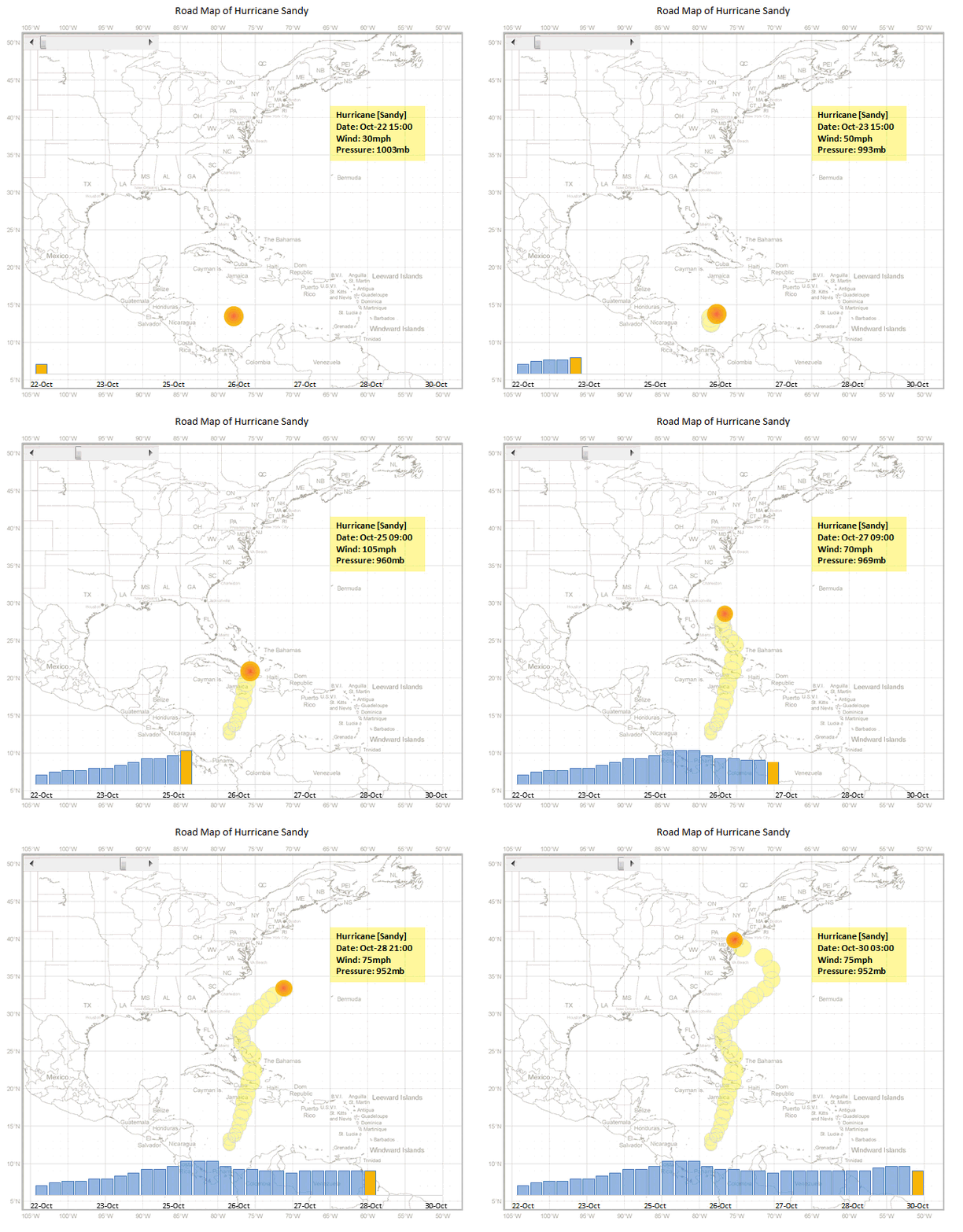
Hurricane Sandy has taken front seat in all major news channels, papers, websites even in far off places like India. I hope & pray that our readers in US East coast are safe. Today, lets understand the journey of Hurricane Sandy in this animated chart, prepared by Chris from Excel365. |
Use Indexed charts when understanding change [Charting Techniques] |
|
![Use Indexed charts when understanding change [Charting Techniques]](https://img.chandoo.org/c/example-indexed-chart-in-excel.png)
|
Today, lets talk about indexing, a technique used to compare changes in values over time. What is indexing? Enter indexing. First we need to calculate price of Gold and Silver in 2012 assuming their starting price is 100. This can be done with simple arithmetic. Now, we can easily compare the prices. Looking at the indexed prices, we can conclude that both Gold & Silver prices have gone up by similar percentage (~5%). |
Interactive Pivot Table Calendar & Chart in Excel! |
|
|
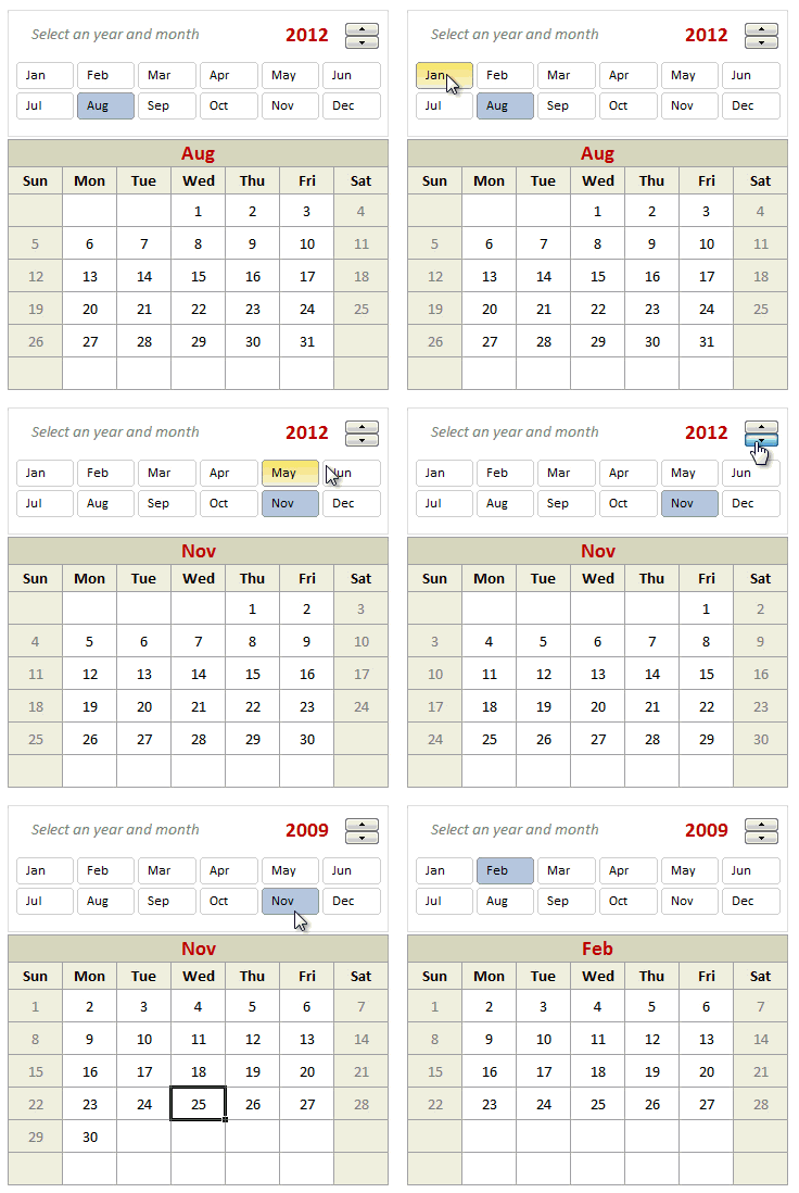
Can we make a calendar using Pivot Tables?!? Of course we can. Today let us learn a simple technique to create calendar style reports using Pivot tables. Thanks to Rob for inspiration Before making any progress, let me thank Rob from PowerPivotPro for the inspiration. Recently he wrote an article explaining how to use PowerPivot […] |
Growing a Money Mustache using Excel [for fun] |
|
|
|
Mustache and Excel?!? Sounds as unlikely as 3D pie charts & Peltier. But I have a story to tell. So grab a cup of coffee and follow me. Today, lets talk about how to construct a dynamic chart that can show us how much progress we have made against a financial goal (in this case, accumulating a big chunk of money). I call this growing mustache chart, inspired from the wonderful Mr. Money Mustache. |
One race, Every medalist ever – Interactive Excel Visualization |
|
|
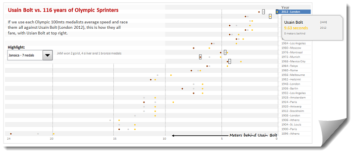
During London 2012 Olympics, Usain Bolt reached the 100mts finish line faster than anyone in just 9.63 seconds. Most of us would be still reading this paragraph before Mr. Bolt finished the race. To put this in perspective, NY Times created a highly entertaining interactive visualization. Go ahead and check it out. I am sure you will love it. So I wanted to create something similar in Excel. And here is what I came up with. |
Making your dashboards interactive [Dashboard Essentials] |
|
![Making your dashboards interactive [Dashboard Essentials]](https://img.chandoo.org/vp/grammy-bump-chart-replication-in-excel-demo.gif)
|
Everyone likes to be in control. Even my 2 year old daughter jumps with joy when she lays her hands on TV remote. She pushes the buttons and assumes it is working. It is another story that we rarely watch TV at home. By adding an element of control, we can make our dashboard reports fun. Interactive elements like form controls, slicers etc. invite users to play with your dashboard, get involved and understand data by asking questions. That is why I recommend making dashboards interactive. Today lets understand how you can make dashboards interactive. |
How to make Box plots in Excel [Dashboard Essentials] |
|
![How to make Box plots in Excel [Dashboard Essentials]](https://img.chandoo.org/dashboards/bp/box-plot-in-excel-how-to.png)
|
Whenever we deal with large amounts of data, one of the goals for analysis is, How is this data distributed? This is where a Box plot can help. According to Wikipedia, a box plot is a convenient way of graphically depicting groups of numerical data through their five-number summaries: the smallest observation (sample minimum), lower quartile (Q1), median (Q2), upper quartile (Q3), and largest observation (sample maximum) Today, let us learn how to create a box plot using MS Excel. You can also download the example workbook to play with static & interactive versions of box plots. |

