
As you may new, the newest version of Excel is out for a while. I have been using it since last 6 months and enjoying it. Today, lets understand 10 things in 2013 that wowed me (and probably you too).
Flash Fill
Imagine Flash (the super hero, not browser add-in) is using Excel to extract the middle names of all his villains. Now, flash being flash, do you think he will slowly type out the middle names one at a time? Of course, he can learn Excel formulas and do it in one stroke. But he is too busy running around & saving earth. So, obviously he would use Flash Fill.
Flash Fill works almost like magic. It looks at what you are typing and sees if there is any pattern in it (based on adjacent columns etc.) and then suggests a fill down option. See this demo.
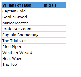
Bonus Tip: Press CTRL+E to activate flash fill.
Built-in Data Model
 The top 3 reasons why analysts & managers spend so much time with Excel:
- Searching for that mysterious flight simulator Easter egg (#)
- Formatting worksheets
- Trying to link up multiple tables of data using VLOOKUP, Copy Paste and black magic.
Fortunately Excel 2013 makes #3 a breeze, thanks to built-in data model. Using Excel 2013 data model, you can link multiple tables with each other (one to one or one to many relationships) and generate powerful Pivot reports & charts with few clicks. Now you have more time to search for flight simulator.
Timelines
These days everybody boasts of a massive spreadsheet. But almost no one needs all the data at same time. We are always filtering data for latest quarter, 6 months starting Mother’s day or 8 weeks from November 1st etc. Of course, you can use auto-filter and select all the dates. But it is a pain.
Thanks to Timelines, filtering for dates is a breeze. You can add timelines for any date column in a pivot table / pivot chart. I am sure your clients & bosses will love it.
Quick Analysis
Depending on your work, you may love or hate it. Quick analysis is a new button that appears when you select a bunch of data. Using this, you can do a lot of quick analysis tasks like adding conditional formatting, charts, sparklines or turning your data in to tables (or pivots). To be frank, I find this a bit of annoyance as my analysis work is never quick!
But I am sure there are tons of people who would find this very useful.
Excellent color scheme
The default color scheme of Excel 2013 is bold, creative and well contrasted. It is a far cry from Excel 2003’s color scheme (which is boring, glaring & poorly contrasted). Now, if you insert a default chart (or table, pivot etc.) from your data, you need to do very little clean up work. It is ready to go!!!
Distinct Counts & more in your Pivot
If you are really quiet, you can hear an analyst in your company screaming with joy once they realize that in Excel 2013, you can get distinct count of values in pivot reports!!!
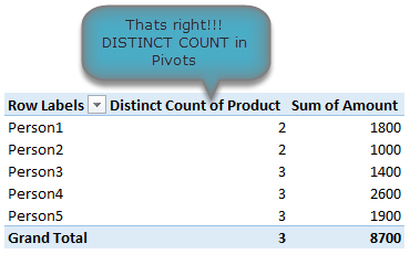
That is right, using Excel 2013 pivot reports, you can find out distinct counts. No extra formulas or no arrays or no VBA. More power to you 🙂
[Related: Using Distinct Count feature in Excel 2013 – case study]
New Formulas
In Excel 2013, there are many new formulas and improvements. My favorite new formulas are,
- Web formulas – WEBSERVICE(), FILTERXML() and ENCODEURL() (an example on these formulas)
- Information formulas – ISFORMULA(), FORMULATEXT(), SHEET() and SHEETS()
- Logical – XOR(), IFNA(), BITXOR(), BITOR(), BITAND() etc.
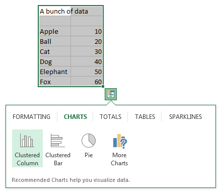
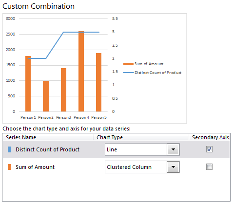
Easier Charting
In Excel 2013, there are massive changes in charting. Now you can create combination charts, add secondary axis, set up smart data labels, format the chart or switch styles with ease. Microsoft revamped the default formats too so that when you make a chart from data, it is ready for presentation (with out too many tweaks).
Some of favorite charting features are,
- Recommended charts feature that tells you which charts go well with your data.
- A screen where you can change the chart type for each series easily.
- Common chart customizations are a click away (screenshots 1, 2 & 3)
- Ability to create scatter plots based on a variety of input data layouts (Jon Peltier’s article on this).
That said not everything is rosy with 2013 charting. For example, I do not like that we have to go thru sidebar pane to customize charts (formatting etc.) instead of dialog box.
Animated Charts
One of the slickest things you will notice in Excel 2013 is the animation that you see when you move selection, do calculations or create charts. While this may be annoying to some, I find one good use for it. When you use charts coupled to interactive elements (like form controls, slicers etc.) they look sexier, thanks to Animation. See this demo to understand what I mean.
Power to you

Excel 2013 Professional Plus versions comes bundled with Power Pivot & Power View, 2 excellent features for powerful data analysis & visualization. You can think of these as full fledged BI solutions sitting right in your computer. The only glitch, Microsoft decided to give these features only Professional Plus users. I know it is annoying that home, office, professional level licenses cannot use Power Pivot even if they want to pay extra. What a pity!!!
More on Excel Power Pivot licensing issues & possible solutions.
Related: What is PowerPivot & How to use it?
3 things that are not so impressive
The whole cloud thing:
While it is understandable that Microsoft wants us all to purchase shiny new Surface tablets and use spreadsheets on the go, it seems like a bad idea. It annoys me that when I want to save a file, the first option I see is Chandoo’s sky drive. The process of saving files to sky drive and later viewing them in browsers is very slow and often results in errors or warnings. Instead, for desktop versions, why not make My computer as first preference?!?
Sharing & Social features:
Share to Facebook?!? seriously! Why would anyone want to share their spreadsheets on twitter or facebook? Do we really want facebook to know our annual budget & appraisal ratings (so that they can show us ads that say – Buy our scissors and cut your budget in half )?
Power Pivot is not for masses:
Microsoft positioned Power Pivot as BI for masses, offered it for free in Excel 2010. Then in Excel 2013, they went ahead and implemented a licensing policy that looks just as complicated as my lawyer’s invoice. Why would a for-profit company like MS want to not offer powerful tools like Power Pivot to masses for a fee? Why sell it only to corporate customers thru volume licensing program? beats me.
Bottom line
Despite these minor annoyances, I think Excel 2013 is a well designed, solid & powerful software ready to make more people awesome in their work. With features like tablet compatibility, data model, slicers & timelines, improved UI & color schemes it has quickly become my first choice when I want to use a spreadsheet (I run Excel 2010 & 2013 on same computer).
Are you using Excel 2013, what do you like about it?
Are you using Excel 2013? How do you like it? Which features are best according to you? Please share your thoughts and views using comments.


48 Responses
In general I don’t dislike Excel 2013. The stark white interface took some adjustment, and the all caps ribbon tab labels bugged me until I realized I could change them. And continuing a trend, we lose a row or two from the full screen worksheet.
There have in fact been many improvements to charting in 2013.
The recommended charts feature is so-so, partly because of all of the ineffective chart types that have been baked into Excel.
2/3 of the icons that appear next to the active chart are awesome. The plus sign icon that lets you add elements without a long journey to the ribbon: awesome, if a step back to 2003. The filtering capabilities that let you on the fly hide series or points without mucking with the worksheet: double awesome. The style paintbrush suffers from the same problems of the styles on the ribbon: too much over-the-top gratuitous formatting.
You know you can grab the title bar of the task pane and drag it away from its docked position? Now it floats wherever you want it. The task pane/dialog is painful to navigate, though, with too much scrolling, and the item you want is always hidden behind a click to activate or expand its category or to expand
The animation of chart changes is annoying at best, distracting and confusing at worst.
Also, I seem no longer to be able to edit a series formula in the formula bar.
No one has mentioned one of the best things about 2013. On dual monitors, I don’t have to create a second instance to have an Excel spreadsheet open on each screen. I can drag a file to the other monitor opened in the same instance, fixing all those copy- paste issues or moving tabs from one file to another.
I’m still using Excel 2003. I tried 2007 and it is absolute garbage.
I hear good things about 2010 and am hearing really good things about 2013.
Is it worth it to make the switch from 2003 to 2013 or would 2010 be better?
Either of them will give you “Ribbon shock effect” related headaches…
I really liked the improved Flash Fill feature in Excel 2013. Another nice feature in Excel 2013 is that it allows multiple collaborators to edit a single worksheet simultaneously.
I am agree with John Jingle…. as still I am also useing Excel 2003 becouse of lots issue with excel charting and ribbon. Jon is also right ribbon grabs one and two row of full screen excel. but we can’t avoid advance fature of excel 2007,2010 and 2013. I am also not agree with chandoo’s line “No extra formulas or no arrays or no VBA”. The value of VBA and advance function know only a good Excel Developer who can do anything in 2003 also which is in excel 20013 and 2010 with the help of APIs.
Did the Flash Fill feature actually work correctly in the demo above? To me, the sequence that it should have produced was the first letter of each new word in the adjacent cell, but the sequence it came up with was merely the first letter in the cell doubled.
Either way, “Captain Cold” and “Gorilla Grodd” would produce the same initials, but “Professor Zoom” was PP instead of PZ and Captain Boomerang was CC instead of CB.
Does Flash Fill default to the first pattern it identifies, or does it offer alternate patterns if you determine that it is not correctly identifying the nature of your intended fill?
You are right. I did not notice it. That said, Flash fill assumes the pattern based on what you input in first few cells. So I kind of misled it. 🙂
Yes, Chandoo, Excel 2013 doesn’t like our RAHUL GANDHI , it gave me RJ &
it doesn’t at all like our Priyanka Gandhi, it gave me PZ & in my case,
for Professor Zoom it gave correct PZ .Professor Zoom – PP, Ramesh Jadeja-RR , Arvind Kezriwal-AA, Captain Boomerang-CC, Rahul Gandhi-RR, Menka Gandhi-MM, Priyanka Gandhi-PP, Soniya Gandhi – SS, Professor Zoom-PP . SO , Chandoo, Must I jump to the Final Conclusion that Excel 2013 Flash Feature doesn’t like our Politicians, particularly Gandhi-Nehru Parivar? Ha Ha ha. !!!! Is it called a bug in Excel 2013 , Chandoo ?
I typed in the list above and hit enter when it suggested the list you have above. As soon as I was done with that, Arrowed down to the cell that had PP instead of PZ. I typed in PZ and it fixed the pattern for the rest of the column. Got the appropriate first and last initial for the rest of the list.
But Chandoo & my Guru, I noticed quite significant CORRECTNESS IN EXCEL 2013, & you are Absolutely Correct Chandoo, Excel 2013, adjusts all second raw onwards, evenif I wrote long Names like
Haresh Jagjivan Shrimali
Chandoo P Godzilla
Chanakya G Einstein
Ramesh Pranlal Jadeja
Arvind G Kezriwal
Professor B Zoom
Rahul R Gandhi
Menka Sanjay gandhi
Priyanka T Gandhi
Soniya Rajiv Gandhi
Professor Kanji Zoom
Haresh Jagjivan Shrimali it gave 100% correct Flash Filling from third raw onwards, it gave 100% Correct Result! Amazing Microsoft, Chandoo & my Guru.
I found that certain macros run much slower in 2013 and seems to crash a bit more than 2010- other than that it’s ok
This is not about excel, but I enjoy reading your emails because you put a great sense of humor in a topic that can be dry at time 🙂
Hey Chandoo,
Nice points. Its worth reading humored blogs, than referring MS site.
Thanks
I am yet to use Excel 2013.In fact till few days back I was using 2007 and very recently switched to 2011 version. Now after reading the article I can’t wait to grab 2013 version.
2011? for mac? there is no 2013 for mac!
It is good to read that you have 2010 and 2013 installed on your computer both.
I was not sure this was possible.
Did you need to do something fancy to have it installed next to your 2010 version or is it just a question during installation?
Regards
During installation you have a choice to “upgrade office” or “install office”. Choose install. This will keep older versions intact. Please note that Outlook will be upgraded no matter what.
I bought the 64 bit version to be ibstalled on my Windows 7 computer.
To my surprise, Office asked me to first uninstall the older versions before I was allowed to install the new version 2013. As I want to keep my older versions too I haven’t installed it.
Did anybody else face the same issue and how did you resolve it?
( it is already some time ago, but I think it also mentioned that I then have to install the 32bit version if I want to keep the older versions too on my computer)
What worked for me in the past was to: 1) uninstall the old version, 2) install the new version, 3) reinstall the old version.
Thanks for this great post Chandoo! I am sure more than 75% of excel users can’t even use the complete features of Excel 2003 – the new 2013 version is new elite product for them 🙂
By the way how do you create animated GIFs? Like the one you did to show Animated Charts?
Hi Mohit,
You might wanna check out
http://chandoo.org/wp/about/what-we-use/
You will find plenty of good stuff here… beacuse hey, chandoo’s choices just turn out that way. 🙂
Now only I use ms office 2010 I am waiting to use 2013 very soon
I’ve sent that article to my boss and crossed my fingers. He MUST purchase new office after reading)))
Dear Chadooji and my Guruji
first of all I will appreciate for your works towards excel. I am fond of excel works. Daily I used to search for a new thing in excel.
I have seen Excel 2013, in which the new things are amazing.
Thanks to be a part of the team.
T/R
Satyanarayana
like to see 10 great things in excel2013
but i am very eager and complaining to excel2013 about one (-ve) thing in excel2013
that is you can’t use ctrl+alt+F5 for refresh all pivot tables
if there is any other option please help
Any chance of getting the new color scheme for my Excel 2007 (without defining every color on my own)?
I am using Excel 2013 on Windows 8. How do I get Excel 2013 to show at the bottom of the screen all the files that are open just like in earlier versions of Excel? At the moment when in Excel 2013, I cannot see at a glance all the files I have opened unless I hover on the Excel pin/icon at the bottom of the screen. Thanks.
Waiiiiiiiiiiiiiiiiiit a minute…..
Does this mean there is no point learning Power Pivots if they are not available to most users? How much does a commercial license cost?
Furthermore, if you do have Power Pivot and you create a model for a client who doesn’t have Power Pivot in their version, does this mean that section of the model won’t be operational?
I’m sticking with 2010 as you get to keep PowerPivot and the new stuff in 2013 sees a little gimmicky?
Chandoo how could you miss the biggest benefit of all…all workbooks open in their own window now!!!
Another annoyance I have is that when you hide columns on a dashboard (everything to the right of a column for example), 2013 still shows a white sheet instead of grey like in old versions. I like the previous way so that it looked like the dashboards were a little 3d.
All I can say is… about bloody time.
I’ve been using a bitAND plug in for ages. Question is when will M$ allow the following
FFTs of vales not equal to 2^N and greater than 8192 long.
HEX2BIN and BIN2HEX of 32 and 64 bit values, ideally 128 bits or more.
And if they want to make all my macros run slower.. then they’ve just lost a sale (I suspect the comments here are from people who leave screen updates on while macros run.. lots of high level code will alway run ssssssssslllllllllllllllllloooooooooooowwwwwwwwww)
viva-assembly!
mike
using W7 hacked to make it play like 2000
excel 2010 with 2003 menus.
How about the feature where Excel crashes if you try to copy the results of a filtered table to another spreadsheet. That’s a great feature :(. It’s done it to me twice already and I’ve only been using it for a few days
You know, it hadn’t occurred to me that it was the fact that it was filtered that kept causing the crash. You might well have saved the last remaining strands of hair I had left on my head, Tom.
I spent a maddening half day with constant crashing trying to incorporate a linked filtered data sheet into another file.
Annoying to note that this is more than 6 months on from when you posted the issue …
Two things that annoy me:
– when I have a worksheet with the same name as an Excel function (which isn’t unlikely, take for example ‘Date’), I cannot use the DATE function anymore, because Excel auto-corrects the casing and sees it as my pivot table. When I rename the Excel worksheet to a normal name after that, Excel keeps auto-correcting the function to the sheet (which doesn’t exist any more) thus leaving me without a DATE function.
– When I have a Pivot Chart, I can’t set up an axis as a date axis, it always displays as a categorical axis. Maybe this is because of my local settings, and it works well in US, but it surely doesn’t in Dutch.
I learned early to avoid using existing function names for variables. For example, use Mon instead of Month, Yr instead of Year, Dt instead of Date. This is especially important when using VBA.
Great comments and thanks for summarising what’s new in 2013. I’ve been using it for a couple of months – my biggest gripe is the colour scheme – the choice of “light grey”, “grey” or “dark grey” is annoying. This might be a Windows 8 problem – not sure. I work on Excel upto 8 hours – grey and white becomes very tiring on the eyes – I need to have a bit of colour. Would love to change the ribbon/tab colour.
Hi Chandoo ji
My Excel 2013 keeps on crashing when I use solver add-in. Unfortunately I need to use the solver to do what I need to do by this in the next 2 days so disabling add-ins doesn’t really help.
I am just going through endless cycles of MS excel crashing and a message saying excel restarting then typing in a few char and going thru the same cycle again.
The machine is a Windows 7 machine with the necessary reqs needs for the install, only thing I can think of is maybe I installed it as 32-bit, instead of a 64-bit installation (as the Installer suggested).
Any suggestions.
Thanks
Manu
One aspect of 2013 that seem very interesting, although I haven’t put it to great effect, is the facility to “Drill down” with the Quick Explore button (only available for Data Model and cube data on pivot tables – that are hierarchical ). at first I thought it just added filters, but it seems to shift you column and rows around depending on what you drill into. Anyone found this feature useful ?
Also , good to see that MS are finally starting to make the PowerPivot 2013 features more accessible / affordable.
http://www.powerpivotpro.com/2013/08/power-pivot-power-view-now-available-in-2013/
I’m not extremely well-versed in excel but I’m still having difficulties locating where the display equation and display r-squared value options are.
As a whole, I do not like 2013. the extra steps to open a file, the inability to open two instances of Excel at once (or I just haven’t figured out how to do it yet), etc. It also seems to calculate changes slower than the other versions. There are some good points with it, for sure. Improved graphing capabilities, Sparklines (I skipped Excel 2010)
I have tried many pages with this list of news on excel, this is by far the best
congratulations and thanks
Hi can you please help me sum values as 02 x 40′ cell A and 04 x 40′ cell B which is in 2 different cells
If I create a chart in Excel 2013 having the animated feature, would it work in Excel 2010 or lower versions?
@VivekD
No, Those animations only work in 2013
Animations done with VBA will work in 2007+
I agree with Dan, Excel 2013 seems a bit clumsy with opening files. I used to have a “Open Recent” icon on my Quick Tool Bar but it has disappeared. To me that is reducing capability. Opening multiple files must be done within Excel through the File/Open and the annoying step immediately after.
My first Excel version was 2.0 and I have used all of the versions between. 2013 us really…really…what’s the word…STUPID. Horrible colors, clunky icons. I wonder if Microsoft is setting us up for the next version, thinking we will gladly jump into the next version to get away from 2013.
At least my macros still work. I have not jumped into the VBA editor yet. I hope that experience is not unpleasant also.