Archive for January, 2010
Fix Incorrect Percentages with this Paste-Special Trick

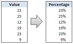
Sometimes we get values in our Excel sheets in such a way that the % sign is omitted. So instead of the value being 23%, it is 23. Now, you can very easily correct this by editing the cell and adding a % sign at the end. But what if you have 100s of rows of data. You can’t do this to every cell. (You can not just format the cells to % format either, excel shows 23 as 2300% then). There must be some simple and intuitive solution for this … umm.
Continue »Pivot Table Tricks to Make You a Star

We, data junkies, love pivot tables. We think pivot tables are solution for everything (except for may be global warming and that broken espresso machine down stairs).
Today, we are going to learn 5 awesome pivot table tricks that will make you a star.
Continue »![Delete Blank Rows in Excel [Quick Tip]](https://chandoo.org/img/q/delete-blank-rows-excel.png)
Blank rows or Blank cells is a problem we all inherit one time or another. This is very common when you try to import data from somewhere else (like a text file or a CSV file). Today we will learn a very simple trick to delete blank rows from excel spreadsheets. Read this post to findout how to delete blank rows / cells from your excel data in a snap.
Continue »Excel School Online Training – More Details
Last week I asked you “would you be interested in an online excel training program?” and quite a few of you have responded with “YES”.
So I decided to start excel school. This is a 12 week online training program that will explain various MS Excel concepts to you in an easy to understand format. I am calling it “school” because the program will be fun, exciting and playful – just like school. We will learn from each other as much as we learn from the course itself. Read the rest of the post to see “Excel School Intro” video.
Continue »Flu Trends Chart in Excel [Yes, we can edition]
![Flu Trends Chart in Excel [Yes, we can edition]](https://chandoo.org/img/p/flu-trends-chart-final-th.png)
Last week I have reviewed Google’s flu trends chart and told you that is it is very well made. Out of curiosity I made a similar chart in Excel. In this post, I am going to share the experience and results with you. Interested? Read on…
Continue »Use “Playbill” font to make your incell charts realistic [quick-tips]
![Use “Playbill” font to make your incell charts realistic [quick-tips]](https://img.chandoo.org/c/use-playbill-font-incell-charts.png)
Most of you already know that using the REPT formula along with pipe (“|”) symbol, we can make simple in-cell charts in excel. For eg. =REPT(“|”,10) looks like a bar chart of width 10. Despite the simplicity, most people don’t use in-cell charts because these charts don’t look anything like their counterparts. But you can […]
Continue »
Today we will build a mortgage payment calculator (and amortization schedule) using excel. But we will not build a boring excel sheet, we will build a mortgage calculator that is easy to play with.
A mortgage payment is a monthly installment that you pay towards a loan. Any mortgage loan will typically have, (1) loan amount, (2) duration of the loan in years, (3) interest rate per year
Given these 3 parameters, we can easily determine the monthly installment amount (this will be the same amount for all months during loan tenure)
We are going to use Excel’s form controls (more on this below) to build a mortgage payment calculator like this.
Continue »Extract usernames from E-mail IDs [using LEFT and FIND formulas in Excel]
![Extract usernames from E-mail IDs [using LEFT and FIND formulas in Excel]](https://chandoo.org/img/f/username-from-email-id-excel-formula.png)
Today we will learn to use Excel’s LEFT and FIND formulas. But what fun it is to learn a new formula on a Tuesday? So, we will actually learn to use these formulas to solve the problem: “extract the username from an email ID” How is an email ID structured? Any email ID contains 2 […]
Continue »Best Sales Dashboards, as Voted by You [Visualization Challenge #2 – Winners]
![Best Sales Dashboards, as Voted by You [Visualization Challenge #2 – Winners]](https://img.chandoo.org/v/s/sales-data-dashboard-alex-kerin-1-excel.png)
Finally, our second visualization challenge comes to an end. We got a winner. Background about Zoho Reports Visualization Challenge: (skip this section if you know what I am going to say) Back in November, 2009, I have asked the readers to come up with best possible ways to visualize a set of fictitious sales data. […]
Continue »Ok, I need some quick feedback here. For the last few months I have been thinking and planning to launch an online excel training program. And I want to know if YOU are interested in one. Read the rest of this post if you are curious.
Continue »Flu Trends in a City chart from Google is Awesome!

There is nothing awesome about flu. In fact, it is anti-awesome if you have flu. I have been fortunate enough not to get it ever (it is another story that I have cold almost 364 days of an year).
Don’t worry if you are afraid of it, Folks at Google are not letting you down. They are using google search terms to predict flu trends and present the information in a beautiful chart.
Today I want to tell you why this particular chart on flu trends made by Google is awesome…
Continue »Product Recommendation – Excel Dashboard Training Kit

If you want to make better charts and create lasting impressions, chances are you have heard about Jorge Camoes. He writes at excelcharts.com (previously charts.jorgecamoes.com). I have been reading Jorge’s blog for over 2 years now and have linked to his excellent articles on PHD several times. Jorge also has an Excel Dashboard Training Kit, which teaches us how to make a dynamic and comprehensive excel dashboard. The dashboard training kit is a culmination most of his lessons implemented in a practical way using Excel.
In this article, I review the product and tell you why you should get a copy of it.
Continue »A Brief History of Microsoft Excel – Timeline Visualization

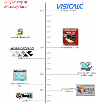
Timeline charts are great for providing quick snapshots of historical events. And hardly a day goes by without some one making a cool visualization of a time line of this or that. Time lines are easy to read, present information in a logical manner and mostly fun.
So yesterday, I set out to mimic the iconic gadgets of all time in excel, just for fun. Then it strike me, why not make a visual time line of Microsoft Excel ? So I did that instead.
Continue »Collapse, Expand Excel Charts using this hidden trick

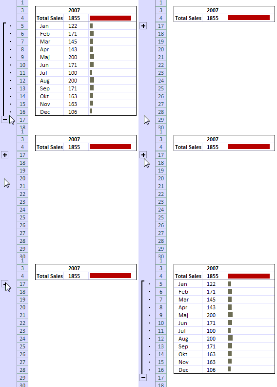
Do you know that you collapse or expand excel charts? Don’t believe me? Me neither. When I first realized that we can collapse / expand charts without writing any macros or lengthy formulas, I couldn’t wait to share it with all of you. This is such a simple yet powerful trick. See it for yourself.
The trick lies in using group / un-group data feature and carefully aligning charts with the cell grid. The whole process takes just about 2 minutes and produces wow factor worth a week. Go check it, now. Also, a downloadable template is included in the post.
Continue »Excel Links – What are your plans for 2010 Edition

So we are in 2010, dawn of a new decade. In fact everyday is a start of new decade, as my friend Jon reflects on twitter. So what are your plans for this year and decade? As for me, I haven’t really jotted down any new year resolutions. So I am using this post as […]
Continue »

