All articles with 'ideas' Tag
Tweetboards – Alternative to traditional management dashboards
Here is a fun, simple and different alternative to traditional dashboards. Introducing….
The winner for our first visualization contest is decided. Curious? Read on…
Continue »Market Segmentation Charts using Conditional Formatting

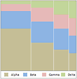
Trust Peltier to come up with solutions for even the most impossible looking charts. Today he shares a marimekko chart tutorial. I couldn’t sit still after seeing his post. So here comes market segmentation charts or marimekko charts using,
Excel Basics – What are Combination Charts and How to Make One?

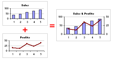
A combination chart is when you combine two different charts to make one. A popular example for combination chart is a line & bar graph combination.
Continue »Parking Tickets in New York – Cool Interactive Visualization from NYTimes

When you have the data of 9,955,441 parking tickets from New York city, what would you do with it? Of course, you will make a visualization out of it so that anyone can know where the tickets are issued most. Check out this interactive visualization of parking tickets from NY Times.
Continue »Fun way to clean up modern art with visualization
TED Talks are a great way to keep your mind nourished. They inspire you, give you a ton of new ideas. I saw this ted talk (embedded below) Tidying up art by Ursus Wehrli and couldn’t resist sharing it with you. It is an entertaining one and I recommend watching it. In this talk the […]
Continue »The new Mac vs. PC web ad by Apple is really cool

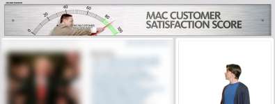
Did you checkout the new web based Mac vs. PC ads Apple is running on the CNN.com? They are totally cool. why? because, in that ad, the PC guy walks from one ad-block to another creating wow user experience for whoever seeing the ad. Here is a small animation I have created out of it […]
Continue »5 Visualizations for Your Inspiration [Nov 14]
![5 Visualizations for Your Inspiration [Nov 14]](https://chandoo.org/wp/wp-content/uploads/2008/11/dutch-coin-design.jpg)
Every Friday, PHD celebrates the art of chart making by posting 5 beautiful visualizations. These are truly outstanding visualizations providing good information and insights. Browse the last 4 weeks featured items by clicking these links: Visualizations for your inspiration [Nov 04] Must see info-graphics [Oct 31] 5 Beautiful Visualizations [Oct 24] Visualizations of the week […]
Continue »
Yesterday I have learned this cool excel charting trick and I cant wait to share it with you all. The problem: I have too many charts & want to show one based on selection You have made 3 charts to show your company performance in the last 8 years. But you don’t want to clutter […]
Continue »Infographics of the week – Food, Maps, Privacy & Politics [Oct 31]
![Infographics of the week – Food, Maps, Privacy & Politics [Oct 31]](https://chandoo.org/wp/wp-content/uploads/2008/10/indian-food-by-state-map.jpg)
Every week, PHD celebrates the art of chart making by showcasing 5 beautiful infographics for your fun, inspiration and information. Browse 100s more wonderful infographics and have fun. Flickr Privacy Settings across the World This world map shows privacy settings used by a million sample users from 2005. The spots show photosharing options – red […]
Continue »
By now everyone and their grandmother must have known about how Republican National Committee has spent $ 150,000 on Sarah Palin’s clothing and make up. I am a big fan of clothes. So much that I wear them everyday. But not all of us have a committee or fund raisers to dress up ourselves, none […]
Continue »The shower curtain & rings sense of designing products

Last weekend we moved to a new apartment and they didn’t have shower curtain in the bathroom. So yesterday night we went out to buy shower curtain and shower curtain rings. We found a neat shower curtain and a set of rings (2 separate products). We bought them and got home. I unpacked the rings […]
Continue »![KPI Dashboards – Compare 2 Decision Parameters [Part 5 of 6]](https://chandoo.org/wp/wp-content/uploads/2008/10/excel-dashboard-visualization-tips-thumb.png)
This is a Guest Post by Robert on Visualization Techniques for KPI Dashboards using Excel. This 6 Part Tutorial on Management Dashboards Teaches YOU: Creating a Scrollable List View in Dashboard Add Ability to Sort on Any KPI to the Dashboard Highlight KPIs Based on Percentile Add Microcharts to KPI Dashboards Compare 2 KPIs in […]
Continue »
In Petal Charts – an Alternative to Radar Charts I have suggested using a radar chart tweak to replace the radar charts. Both PTSBlog and Information Ocean have posted their critical reviews of these petal charts. So as a penance for proposing petals, I am going to provide a tutorial on creating a comparison table […]
Continue »
Seattle Public Library’s Central branch not only boasts unique architecture but also world class visualizations of library data. On the level 5 of the building they have six large LCD display screens dedicated to provide visualizations of data like what people are reading, which books are checked out in the last hour etc. See them […]
Continue »

