All articles with 'Charts & Graphs' Tag
{ 29 Comments }
Winners of state migration dashboard contest
Published on Jul 7, 2014 in Charts and Graphs, Excel Challenges
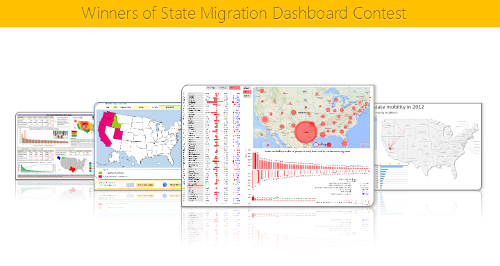
Finally the wait is over. Here are the winners of our 2014 dashboard contest. Check them out.
Continue »{ 8 Comments }
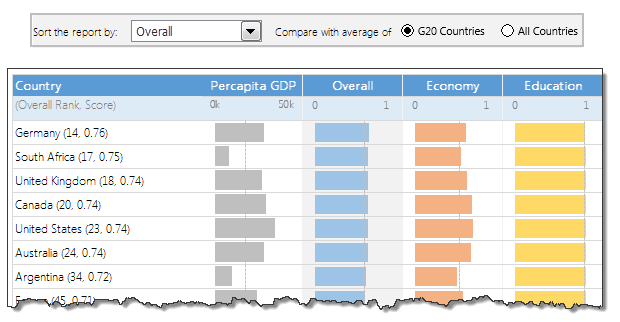
Closing gaps in this Gender Equality Gap chart…
Published on Nov 5, 2013 in Charts and Graphs
Today lets close some gaps.
Recently I saw this interesting chart on Economist Daily Charts page. This chart is based on World Economic Forum’s survey on how women compare to men in terms of various development parameters. First take a look at the chart prepared by Economist team.
So what are the gaps in this chart?
This chart fails to communicate because,
- All country charts look same, thus making it difficult to spot any deviations.
- We cannot quickly compare one country with another on any particular indicator.
- It does not provide a better context (for eg. how did these countries perform last year?)
But criticizing someone’s work is not awesome. Fixing it and making an even better chart, that has awesome written all over it. So that is what we are going to do. You can see the improved chart above. Click on it to learn how you can create it.
Continue »{ 18 Comments }
Tweetboards – Alternative to traditional management dashboards
Published on May 7, 2009 in Charts and Graphs, Featured
Here is a fun, simple and different alternative to traditional dashboards. Introducing….
Here is your chance to win a copy of The Visual Display of Quantitative Information by Edward Tufte, all you need to do is visualize budget vs. actual performance of the given data. Go!
Continue »
Learn how to use excel chart templates in this installment of spreadcheats. Save time.
Continue »{ 20 Comments }
Japanese Candlestick Chart – Excel Tutorial
Published on Mar 4, 2009 in Charts and Graphs, Learn Excel
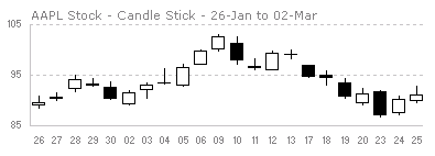
Japanese Candlestick Chart or Candlestick Chart as they are popularly known are one of the most commonly used stock charts.Today we will learn how to make a candlestick chart in Microsoft Excel in 4 simple steps.
Continue »![Adding Box Plots to Show Data Distribution in Dashboards [Part 6 of 6]](https://chandoo.org/wp/wp-content/uploads/2008/10/box-plot-excel-dashboard-visualization-thumb.png)
This is a Guest Post by Robert on Visualization Techniques for Excel KPI Dashboards. This 6 Part Tutorial on Management Dashboards Teaches YOU: Creating a Scrollable List View in Dashboard Add Ability to Sort on Any KPI to the Dashboard Highlight KPIs Based on Percentile Add Microcharts to KPI Dashboards Compare 2 KPIs in the […]
Continue »![KPI Dashboards – Compare 2 Decision Parameters [Part 5 of 6]](https://chandoo.org/wp/wp-content/uploads/2008/10/excel-dashboard-visualization-tips-thumb.png)
This is a Guest Post by Robert on Visualization Techniques for KPI Dashboards using Excel. This 6 Part Tutorial on Management Dashboards Teaches YOU: Creating a Scrollable List View in Dashboard Add Ability to Sort on Any KPI to the Dashboard Highlight KPIs Based on Percentile Add Microcharts to KPI Dashboards Compare 2 KPIs in […]
Continue »![Excel KPI Dashboards – Adding Micro Charts [Part 4 of 6]](https://chandoo.org/wp/wp-content/uploads/2008/09/kpi-dashboard-excel-thumb.jpg)
This is 4th part of Creating Management Dashboards in Microsoft Excel 6 post series by Robert. This 6 Part Tutorial on Management Dashboards Teaches YOU: Creating a Scrollable List View in Dashboard Add Ability to Sort on Any KPI to the Dashboard Highlight KPIs Based on Percentile Add Microcharts to KPI Dashboards Compare 2 KPIs […]
Continue »![KPI Dashboards – Highlight KPIs Based on Percentile [Part 3 or 6]](https://chandoo.org/wp/wp-content/uploads/2008/09/kpi-dashboard-3-thumb.jpg)
Creating KPI Dashboards in Microsoft Excel is a series of 6 posts by Robert from Munich, Germany. This 6 Part Tutorial on KPI Dashboards Teaches YOU: Creating a Scrollable List View in Dashboard Add Ability to Sort on Any KPI to the Dashboard Highlight KPIs Based on Percentile Add Microcharts to KPI Dashboards Compare 2 […]
Continue »{ 115 Comments }
73 Free Designer Quality Excel Chart Templates – Grab now and become a charting superman
How many times you created a chart in Microsoft excel and formatted it for minutes (and sometimes hours) to reduce the eye-sore? Well, I will tell you my answer, its 293049430493 times 😉 Worry not! for you can become a charting superman (or elastigirl) by using these 73 free designer quality chart templates in literally […]
Continue »
