All articles with 'visualiztion' Tag

Hello folks,
My flight to Sydney has been lengthy but fun. I have reached here on Sunday morning (8AM) and spent most of the day with Danielle’s family. (Danielle is the founder of Plum Solutions. She is the one who invited me to Australia and planned this whole experience for me).
On Monday (30th April), I went exploring the city on foot. I had coffee in the beautiful Queen Victoria Building, attended 1PM church service at the magnificent St. Mary’s cathedral, walked thru Hyde park, went to Sydney central station, took at sneak peek at the new Apple store in down town, got back to my hotel, walked to Opera house to meet up with our readers.
Reader meetup at Sydney
We had 6 people turn up for the meetup. It was fun talking about Excel & our journey with these wonderful folks. Here is a pic (you can see the harbor bridge in background & 8 awesome Excel users in foreground, Click on it to enlarge).
{ 40 Comments }
Designing a Customer Service Dashboard in Excel [Part 1 of 4]
Published on Feb 22, 2012 in Charts and Graphs, Learn Excel
![Designing a Customer Service Dashboard in Excel [Part 1 of 4]](https://img.chandoo.org/dashboards/customer-service-dashboard-excel.png)
Sawadee Krup folks. Today, we begin a new series on Chandoo.org – Making a Customer Service Dashboard using Excel. This 4 part tutorial teaches you,
Designing Customer Service Dashboard
Data and Calculations for the Dashboard
Creating the dashboard in Excel
Adding Macros & Final touches
Customer service is one area where a lot of data is collected regularly. Understanding all this and making business decisions is quite complex task. This is where dashboards shine.
Read on to learn how to design customer service dashboards.
Continue »{ 17 Comments }
Participate in Microsoft BI DataMashUp Contest & You could win $3000 Prize
Published on Sep 15, 2011 in Charts and Graphs, Excel Challenges

Hello Data Junkies & Chart Lovers, I have a fun announcement for you. If you like to analyze data and present results in charts, then you can win up to $3000 in prizes by participating in Microsoft’s BI DataMashUp Contest. The contest is on from September 8th and runs until 28th. How to Participate in […]
Continue »{ 5 Comments }
Win Loss Chart from a Series of Win, Loss Data
Published on Jun 15, 2011 in Charts and Graphs

Last week, we learned how to create win-loss charts in Excel. In the comments, Dan said,
“Incidentally, the fastest way to do this would be using SFE, just reflect your data with 1 for a win, – 1 for a loss. There’s even an option to automatically invert negative numbers.”
Of course, we can use the beautiful Sparklines for Excel addin to do this and several other charts. But if you just have a series of Wins and Losses, like below, you can use a column chart to create win loss charts too.
Today, we will learn how to create a win loss chart from a set of win, loss data in Excel.
Continue »{ 15 Comments }
How to create a Win-Loss Chart in Excel? [Tutorial & Template]
Published on Jun 9, 2011 in Charts and Graphs
![How to create a Win-Loss Chart in Excel? [Tutorial & Template]](https://img.chandoo.org/c/win-loss-chart-excel-template.png)
Win Loss Charts are an interesting way to show a range of outcomes. Lets say, you have data like this:
win, win, win, loss, loss, win, win, loss, loss, win
The Win Loss chart would look like this:

Today, we will learn, how to create Win Loss Charts in Excel.
We will learn how to create Win Loss charts using Conditional Formatting and using In-cell Charts.
Continue »{ 28 Comments }
How Would You Visualize Product Sales Data? [Excel Challenges #2]
Published on May 30, 2011 in Charts and Graphs, Excel Challenges
![How Would You Visualize Product Sales Data? [Excel Challenges #2]](https://chandoo.org/img/ec/2/ec2-visualize-product-sales-data.jpg)
We have a new Excel Challenge folks!
I know our friends in US are away celebrating Memorial Day weekend. But that should not leave rest of us from fun. So, we have a new Excel Challenge. This time, you need to make a chart, to visualize product sales data.
And what more, one lucky person could get an Amazon Kindle Reading Device (Wi-fi version) by making the chart.
Continue »{ 20 Comments }
Place Key Information in Golden Triangle on your Reports, Dashboards etc. [Quick Tips]
Published on Apr 29, 2011 in Charts and Graphs
![Place Key Information in Golden Triangle on your Reports, Dashboards etc. [Quick Tips]](https://img.chandoo.org/dashboards/golden-traingle-excel-workbooks.jpg)
Today, we will take a detour to world-wide web and learn how we can improve our dashboards, reports, presentations or workbooks by using one of the ideas, called as Golden Triangle.
Continue »{ 31 Comments }
An Excel Dashboard to Visualize 10,007 Comments [Dashboard Tutorial]
Published on Nov 24, 2010 in Charts and Graphs
![An Excel Dashboard to Visualize 10,007 Comments [Dashboard Tutorial]](https://chandoo.org/img/vp/10007-comments-dashboard-thumb.png)
First some good news, On 21st November, 2010, our little blog received its 10,000th comment!
Thank you so much for making this happen.
Those of you reading chandoo.org for a while know my penchant for comments. I have learned a lot of excel tips & ideas just by reading the comments you posted on this blog. I think comments are one of the best parts of this blog. So, naturally, I wanted to celebrate this milestone, with something big & awesome.
My intention was to download all the 10,000+ comments and play with the data to come up with something outstanding, like a dashboard. It took me 2 days to conceptualize and create this beauty.
Continue »{ 9 Comments }
Analyze Competition with Scatter Plots – A business chart example
Published on Oct 25, 2010 in Charts and Graphs

Analyzing competition is one of the key aspects of running a business. In this article, learn how to use Excel’s scatter plots to understand competition, like shown aside.
The inspiration for this comes from a recent article on Asymco analyzing mobile handset market (Apple iPhone, Nokia etc.) and how it has changed since 2007.
Read the rest of the post to learn how to create this type of chart in excel. Also, you can download the chart template. Go ahead.
Continue »{ 1 Comment }
How I Analyze Excel School Sales using Pivot Tables [video]
Published on Sep 22, 2010 in Charts and Graphs, Pivot Tables & Charts
Some of you know that I run an online excel training program called Excel School. If you want to join, click here. Only 8 days left.
I run excel school mainly to meet new students, understand their problems and learn new ways to solve them. But, Excel School also presents me with an interesting analytics challenges. In this post, I will share 2 pivot table based analytic techniques I used just yesterday to answer few questions I had about Excel School sign-ups.
Watch this 15 min. video to see how I analyzed the data
Continue »{ 12 Comments }
5 Rules for Making Better Charts (and one fun chart)
Published on Jul 30, 2010 in Charts and Graphs
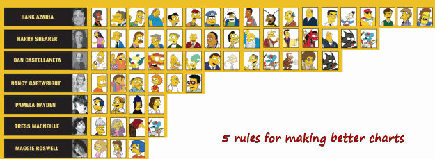
Jeff Weir, an alert reader of this blog points me this chart showcasing voice-over artist’s for various Simpson’s characters. I am a hard-core Simpon’s fan, so I naturally wasted quarter-hour looking at the chart. That is when I realize this chart is not only fun, it also teaches 5 valuable lessons on making better charts. Read the rest of this post to find out the five rules.
Continue »![How to Visualize Survey Results using Incell Panel Charts [case study]](https://chandoo.org/img/cb/survey-results-panel-chart-example.png)
A panel chart (often called as trellis display or small-multiples) shows data for multiple variables in an easy to digest format. It lets users compare in any way and draw conclusions with ease.
Today, I want to discuss how the principles of panel chart can be applied to visualize a complex set of survey results. For this we will use the recent survey conducted by Gartner on how various customers use BI (Business Intelligence) tools.
Continue »{ 9 Comments }
50 Best Cities for Finding a Job [Incell Dashboard using Excel]
Published on Aug 20, 2009 in Charts and Graphs, Learn Excel
![50 Best Cities for Finding a Job [Incell Dashboard using Excel]](https://chandoo.org/wp/wp-content/uploads/2009/08/incell-comparison-charts.png)
We all know that incell charts are a very cool way to explore and visualize data. Personally I like them so much that I have written several tutorials on it here. Today we will see how a Job dashboard on “50 best cities for finding a job” originally prepared by Indeed job search engine can be recreated in Excel using In-cell charts. The final outcome is something like this.
Continue »I was toying with the idea of creating a tag cloud in excel – as a form of new visualization, this could be useful when you have medium amounts of data (eg: 50-300 rows) and you want to emphasize on what is important and what is not. I would imagine using a tag-cloud, When you […]
Continue »
